VOCABULARY / ENTRY
Flat Design
flat-design
An interface visual style characterized by the absence of simulated three-dimensional effects such as gloss, gradients, and drop shadows, expressing interface elements through solid color blocks, simple geometric shapes, and typography itself.
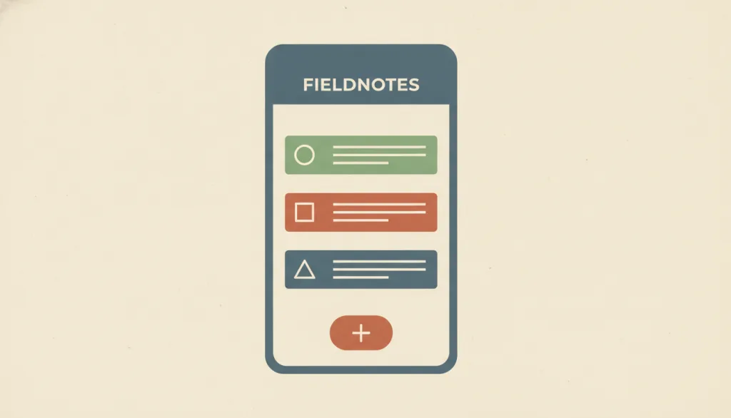
Recognizing it
- Solid-filled surfaces and controls with no gradients, textures, or glossy highlights
- Little or no drop shadow; elements are separated by color and whitespace rather than depth
- Simplified geometric icons and clear typography carry most of the information
Concept boundary
Flat design describes one visual treatment: removing simulated 3D cues. It is not a synonym for the Swiss / International Typographic Style, which is a tradition centered on grids and typography; the two can appear together or separately. Flat design is the counter-choice to skeuomorphism (imitating physical objects with textures and lighting). "Flat 2.0" or "semi-flat" reintroduces subtle shadows and layers while staying simple; this entry treats it as a variant of flat design rather than a separate style.
When to consider it
- The interface should look clean and scale easily across many screen sizes and resolutions
- The brand wants a modern, restrained, "authentically digital" character rather than imitated physical materials
- Information density is low and the layout follows common conventions, so users can judge interactive elements by position and wording
When to be cautious
- The page is dense and clickable elements are mixed with static text, so color alone cannot separate them
- Target users are unfamiliar with common interface conventions and need stronger clickability cues
- All visible cues are removed to follow the trend, leaving users to guess where they can click
Tradeoff
Visually simpler, easier to adapt and maintain, but removing depth cues weakens the clickability signals of buttons and links; contrast, whitespace, and conventional placement must compensate.
Conditional rules · Editorial advice
Related entries
The two are often conflated, but one concerns typographic and grid order while the other concerns whether 3D cues are kept; they can be chosen independently.
Glassmorphism expresses depth through translucency and blur, while flat design deliberately removes such depth cues; they rarely coexist well.
Users need visible cues to recognize actionable objects instead of relying on memory or guessing.
Sources and what they support
The article (Kate Moran, 2015-09-27) defines flat design by the absence of glossy or three-dimensional visual effects, notes that it removed the shadows, gradients, and highlights that historically signaled interactivity, traces it to Microsoft's Metro language and the reaction against skeuomorphism, and names the reintroduction of subtle shadows and layers Flat 2.0. This entry's definition and boundary paraphrase it.
Retrieved: 2026-09-15The article (Kate Moran, 2017-09-03) reports an eye-tracking study with 71 participants and 9 websites: compared with strong-signifier versions, users spent on average 22% more time and had 25% more fixations on weak-signifier versions, with fixations spread more widely; it recommends that flat interfaces rely on high contrast, whitespace, and conventional layouts. This entry's rules and avoid-conditions build on it.
Retrieved: 2026-09-15Definitions reference these sources. Digital specimens, selection advice, relationships, and recipes are editorial work and have not been validated through user research.
Type extensions and implementation notes
This entry has no operable specimen yet; the illustration is an editorial sketch. When applied to a product, verify on real pages that interactive elements stand out enough, and add depth cues where needed.
{
  "tokens": {
    "surface": "#f4efe4",
    "ink": "#2b3a3a",
    "accent": "#c9713d",
    "radiusPx": 6,
    "shadow": "none"
  },
  "tokenScope": "A recipe for this specimen; a Flat 2.0 variant may add a very light shadow, but clickability cues must be verified in the real product."
}
Full Agent entry JSON
{
  "id": "flat-design",
  "type": "visual",
  "name": {
    "zh": "扁平化设计",
    "en": "Flat Design"
  },
  "aliases": [
    "Flat UI",
    "扁平风格",
    "Flat 2.0"
  ],
  "granularity": "experience",
  "intents": [
    "express-brand",
    "organize-content"
  ],
  "tags": [
    "no shadows",
    "solid color blocks",
    "geometric icons",
    "clickability",
    "minimal"
  ],
  "definition": "An interface visual style characterized by the absence of simulated three-dimensional effects such as gloss, gradients, and drop shadows, expressing interface elements through solid color blocks, simple geometric shapes, and typography itself.",
  "boundary": "Flat design describes one visual treatment: removing simulated 3D cues. It is not a synonym for the Swiss / International Typographic Style, which is a tradition centered on grids and typography; the two can appear together or separately. Flat design is the counter-choice to skeuomorphism (imitating physical objects with textures and lighting). \"Flat 2.0\" or \"semi-flat\" reintroduces subtle shadows and layers while staying simple; this entry treats it as a variant of flat design rather than a separate style.",
  "signature": [
    "Solid-filled surfaces and controls with no gradients, textures, or glossy highlights",
    "Little or no drop shadow; elements are separated by color and whitespace rather than depth",
    "Simplified geometric icons and clear typography carry most of the information"
  ],
  "when": [
    "The interface should look clean and scale easily across many screen sizes and resolutions",
    "The brand wants a modern, restrained, \"authentically digital\" character rather than imitated physical materials",
    "Information density is low and the layout follows common conventions, so users can judge interactive elements by position and wording"
  ],
  "when_not": [
    "The page is dense and clickable elements are mixed with static text, so color alone cannot separate them",
    "Target users are unfamiliar with common interface conventions and need stronger clickability cues",
    "All visible cues are removed to follow the trend, leaving users to guess where they can click"
  ],
  "tradeoff": "Visually simpler, easier to adapt and maintain, but removing depth cues weakens the clickability signals of buttons and links; contrast, whitespace, and conventional placement must compensate.",
  "comparison": {
    "focus": "Simple surfaces without simulated 3D effects",
    "mechanism": "Solid color blocks, geometric shapes, typography, and whitespace",
    "cost": "Interactive elements need additional design work to stay recognizable"
  },
  "sources": [
    {
      "id": "flat-nng-origins",
      "title": "Nielsen Norman Group · Flat Design: Its Origins, Its Problems, and Why Flat 2.0 Is Better for Users",
      "url": "https://www.nngroup.com/articles/flat-design/",
      "claim": "The article (Kate Moran, 2015-09-27) defines flat design by the absence of glossy or three-dimensional visual effects, notes that it removed the shadows, gradients, and highlights that historically signaled interactivity, traces it to Microsoft's Metro language and the reaction against skeuomorphism, and names the reintroduction of subtle shadows and layers Flat 2.0. This entry's definition and boundary paraphrase it.",
      "checkedAt": "2026-09-15",
      "archive": {
        "lookupUrl": "https://web.archive.org/web/20260915*/https://www.nngroup.com/articles/flat-design/",
        "status": "available",
        "checkedAt": "2026-09-15T18:29:13.192Z",
        "jobId": "spn2-65e14e38bafbbcfc785ccbbbcf37a49a08a2e24b",
        "url": "https://web.archive.org/web/20260915183058/https://www.nngroup.com/articles/flat-design/",
        "timestamp": "20260915183058"
      }
    },
    {
      "id": "flat-nng-signifier-study",
      "title": "Nielsen Norman Group · Flat UI Elements Attract Less Attention and Cause Uncertainty",
      "url": "https://www.nngroup.com/articles/flat-ui-less-attention-cause-uncertainty/",
      "claim": "The article (Kate Moran, 2017-09-03) reports an eye-tracking study with 71 participants and 9 websites: compared with strong-signifier versions, users spent on average 22% more time and had 25% more fixations on weak-signifier versions, with fixations spread more widely; it recommends that flat interfaces rely on high contrast, whitespace, and conventional layouts. This entry's rules and avoid-conditions build on it.",
      "checkedAt": "2026-09-15",
      "archive": {
        "lookupUrl": "https://web.archive.org/web/20260915*/https://www.nngroup.com/articles/flat-ui-less-attention-cause-uncertainty/",
        "status": "available",
        "checkedAt": "2026-09-15T18:29:13.194Z",
        "jobId": "spn2-24ca6d47f65ab5179310072e4a2ced15f8a22cc9",
        "url": "https://web.archive.org/web/20260915183104/https://www.nngroup.com/articles/flat-ui-less-attention-cause-uncertainty/",
        "timestamp": "20260915183104"
      }
    }
  ],
  "relations": [
    {
      "target": "swiss",
      "kind": "related",
      "condition": "The same interface adopts a grid-based typographic system and also removes depth effects",
      "reason": "The two are often conflated, but one concerns typographic and grid order while the other concerns whether 3D cues are kept; they can be chosen independently.",
      "basis": "editorial"
    },
    {
      "target": "glassmorphism",
      "kind": "alternative",
      "condition": "Choosing the primary visual language for the same product",
      "reason": "Glassmorphism expresses depth through translucency and blur, while flat design deliberately removes such depth cues; they rarely coexist well.",
      "basis": "editorial"
    },
    {
      "target": "recognition",
      "kind": "conflicts_when",
      "condition": "After all shadows and outlines are removed, clickable elements look identical to static text",
      "reason": "Users need visible cues to recognize actionable objects instead of relying on memory or guessing.",
      "basis": "editorial"
    }
  ],
  "rules": [
    {
      "when": "Applying flat treatment to buttons, links, and input fields",
      "instruction": "Interactive elements must be clearly distinguished from static elements by color, shape, or position; the two must not look the same.",
      "strength": "must",
      "basis": "editorial"
    },
    {
      "when": "Whether an element is clickable is ambiguous",
      "instruction": "Reintroduce subtle depth cues such as a light shadow, outline, or background fill (the Flat 2.0 approach) instead of insisting on complete flatness.",
      "strength": "recommend",
      "basis": "editorial"
    },
    {
      "when": "The page has high information density",
      "instruction": "Separate actionable areas with sufficient whitespace and contrast, and keep them in positions users already expect.",
      "strength": "recommend",
      "basis": "editorial"
    }
  ],
  "visual": {
    "tokens": {
      "surface": "#f4efe4",
      "ink": "#2b3a3a",
      "accent": "#c9713d",
      "radiusPx": 6,
      "shadow": "none"
    },
    "tokenScope": "A recipe for this specimen; a Flat 2.0 variant may add a very light shadow, but clickability cues must be verified in the real product."
  },
  "demo": null,
  "version": "0.1.0",
  "editorialStatus": "drafted",
  "requirements": [],
  "demoCapabilities": [],
  "implementationNote": "This entry has no operable specimen yet; the illustration is an editorial sketch. When applied to a product, verify on real pages that interactive elements stand out enough, and add depth cues where needed.",
  "image": {
    "src": "/images/flat-design.webp",
    "alt": "A fictional app screen named FIELDNOTES built from solid color blocks, geometric icons, and one flat button, with no gradients or shadows, illustrating flat design."
  },
  "searchTerms": [
    "无阴影",
    "纯色块",
    "几何图标",
    "可点击性",
    "极简"
  ]
}