EDITORIAL LIST / ONE LIST
Top 10 Classic Microinteraction and UI Feedback Patterns
10 entries · every seat filled
This edition collects the distinct feedback mechanisms of microinteraction. They get lumped together as “loading” or “a toast”, but they answer different questions: what is happening now, how far along it is, and whether that last action registered.
Selection criteria
- It describes one recognisable piece of feedback, not a whole flow.
- Its difference from neighbouring mechanisms lies in what information it can carry, not how it looks.
- It is possible to say what a person loses when it is absent.
Seats in this edition
Positions marked “Editorially reconstructed seat” were filled by editorial judgement in this repository; every other seat comes from the list ledger in plan issue #1.
Skeleton Screen
Show placeholder shapes resembling the expected content structure while that content is loading.
Why it is in this edition: Sets the category's baseline: saying content is on its way when the structure is known but the content is not.
Not to be confused with: Placeholder shapes do not indicate a completion percentage or disguise unfetched data as real content.
Determinate Progress Bar
Represent the actual completed proportion with a progress bar when both total work and completed work are known.
Why it is in this edition: Covers feedback that can state how much is done, on condition that the total is knowable.
Not to be confused with: The percentage must correspond to completed work. This specimen uses a manually advanced simulated task, not real network speed.
Indeterminate Progress Indicator
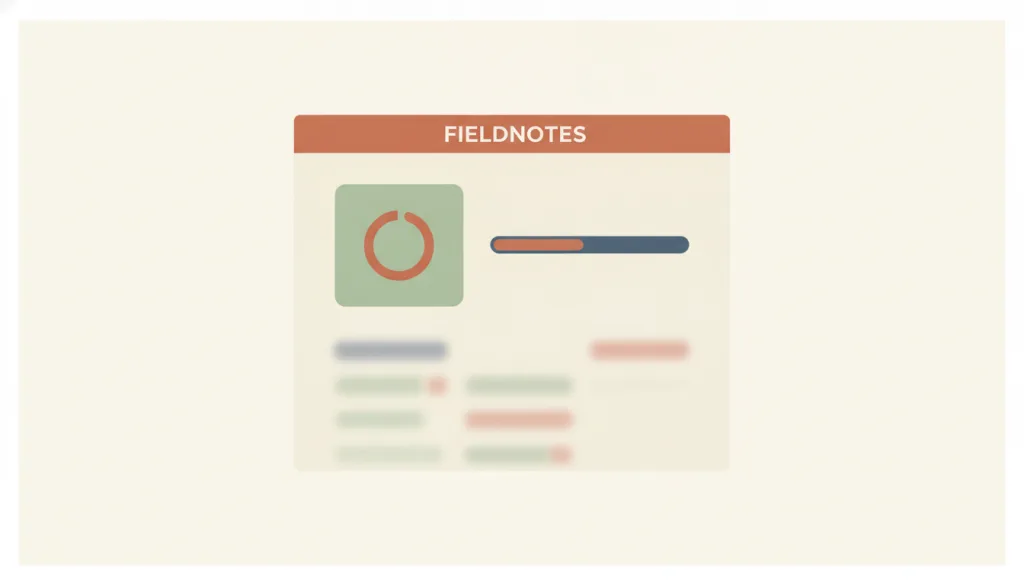
When remaining time or completed fraction cannot be known, a continuously spinning icon or looping bar shows that the system is still working, without reporting how much has actually been done.
Why it is in this edition: Covers what to show when the total is unknowable, and makes clear it must not masquerade as a percentage.
Not to be confused with: An indeterminate progress indicator only answers whether the system is still working, not how much is done or how long is left; once a reliable completed amount and total are available, switch to a determinate progress bar instead — the two are not interchangeable, and a spinner must not be used to hide progress that could in fact be quantified. A skeleton screen is for when the content structure is known and only that structure is waiting to be filled; an indeterminate indicator is for when the completion fraction itself is unknown, or the wait covers the whole interface rather than a known structure.
Inline Validation Feedback
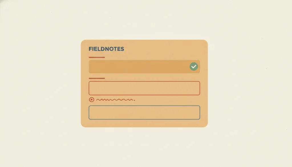
Validation feedback shown right next to an input while people fill in a form or immediately after they finish a field: it identifies the error, describes the problem in text, offers a correction when one is known, and may confirm success for complex fields.
Why it is in this edition: Separates a validation result from being in edit mode: validating is not editing.
Not to be confused with: Inline validation only reports whether a single field's input is acceptable. It is not inline editing (changing content in place) and not the whole error-prevention principle (it is one realization of that principle at the form-field level). Timing is the crux: most fields should be validated after the person leaves the field or reaches the expected length, not from the first keystroke; live constraints such as password strength are the exception. Post-submit error summaries and status messages are its neighbors and cannot replace feedback attached to the field.
Focus Indicator
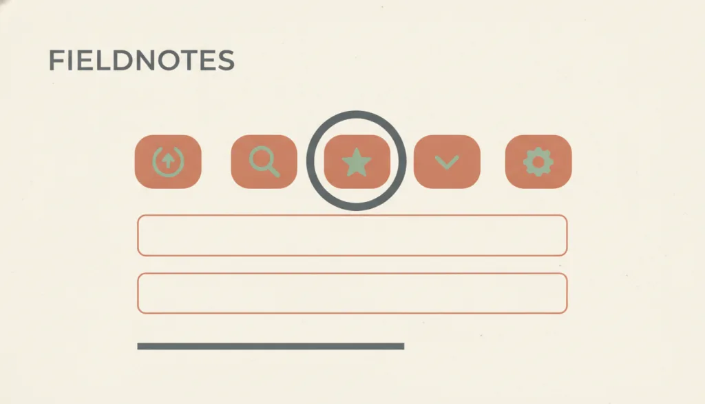
When an interface element receives keyboard focus, a visible visual marker (such as an outline ring or highlight) shows where focus currently is, so keyboard users always know where their action will land.
Why it is in this edition: Covers the visible mark that tells a keyboard user where they currently are.
Not to be confused with: A focus indicator only answers where focus is now. It is not the hover, selected, or active state; it is a state style on an element rather than a separate component, and it does not decide where focus should move.
Pressed-State Feedback
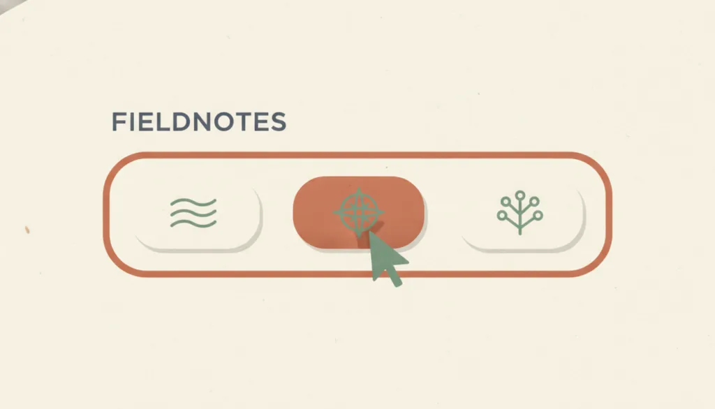
While a user is pressing or clicking an actionable control (between pointer down and release, matched by :active in CSS), the control immediately shows a visible change, optionally with haptic or audio feedback, confirming that the press was received; the action itself completes on release.
Why it is in this edition: Covers the immediate confirmation that a press registered, on a shorter timescale than any other feedback here.
Not to be confused with: The pressed state only answers whether the system received the press, in the brief window between down and release. It is not hover (pointer resting without pressing), not the focus indicator (where keyboard focus is), and not the selected or toggled state (which persists after release). It also does not show the result of the action; that is the job of a status message or content change.
Status Message
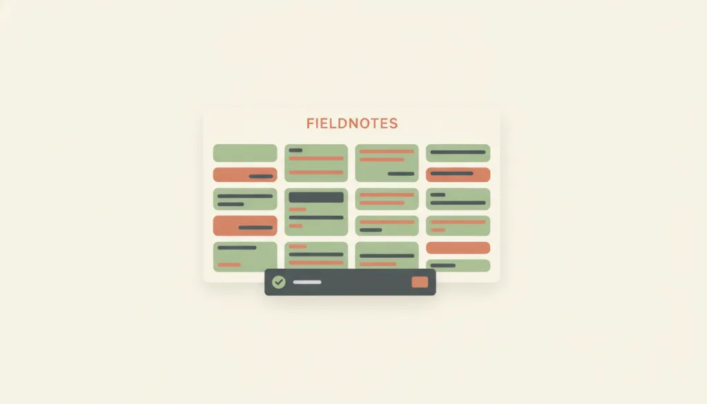
A content change that briefly reports the result of an action, a waiting state, or the existence of errors without changing the user's context, and that assistive technology can announce without receiving focus.
Why it is in this edition: Covers reporting a result without moving the person, kept apart from continuous quantified progress.
Not to be confused with: A status message reports an outcome or state only. It does not carry continuously quantified progress (that is the determinate progress bar) and does not block the current task to demand a response (that is the modal dialog). Toast and snackbar are presentation variants of it, not separate concepts.
Optimistic Feedback
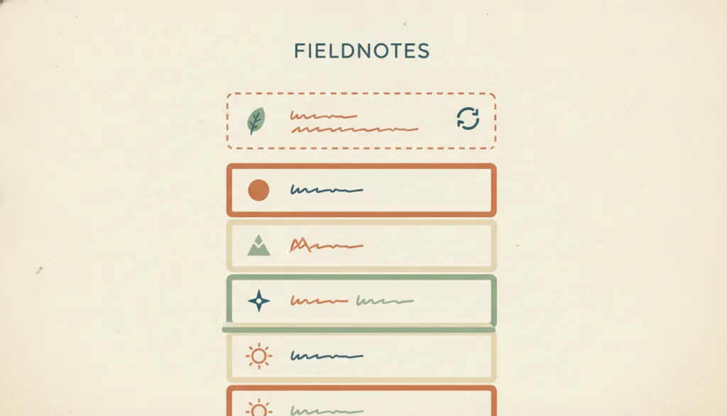
Before the server confirms an action, the interface immediately shows the result the action is expected to produce; once the request returns, the interface reconciles with the actual result, or rolls back to the prior state with a clear explanation if the request fails.
Why it is in this edition: Covers showing the expected result first and reconciling afterwards, with correction required when it fails.
Not to be confused with: Optimistic feedback presents an unconfirmed, expected result, unlike a skeleton or indeterminate progress indicator, which admit they are still waiting rather than impersonating a result; it also differs from a status message, which only reports a result that has actually happened, whereas optimistic feedback shows it before it happens. It trades honesty about uncertainty for perceived speed, so it is appropriate only where failure is rare and recovery is cheap.
Haptic Feedback
Haptic feedback uses a device's vibration or force actuator to give a brief physical confirmation the instant a press, state change, or event occurs. On the web it is mainly provided through the Vibration API (navigator.vibrate()), which only has an effect when the device has vibration hardware, is not in silent or do-not-disturb mode, and the user has already interacted with the page; the specification itself scopes it to simple tactile feedback rather than a general notification mechanism.
Why it is in this edition: Covers a perceptual channel beyond sight, showing feedback need not always be seen.
Not to be confused with: Haptic feedback is a supplementary channel layered on top of other feedback, confirming a press, state change, or event at the fingertip. It cannot substitute for the visual pressed state (which is the required baseline feedback) or for the text or graphical account a status message gives of a result. This is because many users' devices lack vibration hardware, have haptics turned off at the system level, are in silent or do-not-disturb mode, or simply are not being held so the vibration goes unfelt; web platform support for vibration is also limited and inconsistent, with some browsers never implementing it and others removing it. Haptic feedback must always accompany at least one visual or textual channel and can never carry the sole responsibility for conveying an event or state.
State Transition Animation
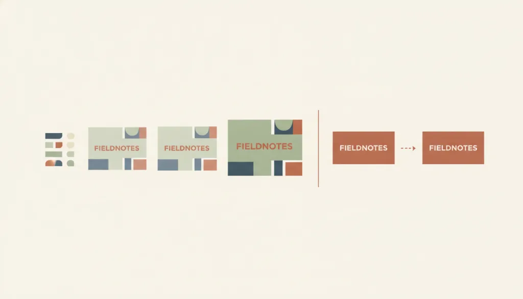
When an interface element changes from one state to another (a list row expanding into a detail panel, a card moving to a new position), a continuous change in position, form, or opacity shows the relationship between the starting and ending state, helping users understand where something went and what it became; the user who triggered the animation can disable it, and the animation must honor system-level reduced-motion preferences.
Why it is in this edition: Covers continuity between states, and treats reduced motion as an adaptation of it rather than a separate entry.
Not to be confused with: State transition animation is responsible only for explaining where a state change that has happened or is about to complete came from and where it goes; the animation is explanatory, not decorative. It is not indeterminate progress, which loops with no endpoint and reports that work is still underway, and it is not pressed-state feedback, which only confirms an input was received during the brief window between press and release, regardless of whether a state changes. "Reduced motion" is not a separate entry but an adaptation variant of this one: however carefully the animation is crafted, it must be possible for whoever triggers it to disable it, and it must obey system-level preferences such as prefers-reduced-motion; once disabled, the start and end states must still be readable.
How this pairs with the other edition
Against the 2026 focus edition, this one does not assume model-generated content. An entry in both lists is feedback being discussed again in a new setting.
2026 Trending Microinteractions: Top 6 UI Feedback Patterns in 2026
Evidence scope
Each reason says which feedback capability the entry covers; none grades effectiveness. Accessibility specifications place testable requirements on several of them — see each entry's own sources.