EDITORIAL LIST / ONE LIST
Top 10 Classic UX Design Principles and Usability Laws
10 entries · every seat filled
This edition collects the cognitive mechanisms and usability principles you can actually apply when judging an interface. They are not style preferences: saying “the grouping is unclear” is already a reference to one of them.
Selection criteria
- It comes from long-standing usability or cognition discussion and has a verifiable source.
- It can say through what mechanism it works, not merely offer advice.
- Its mechanism differs from its neighbours; it is not the same principle reworded.
Seats in this edition
Positions marked “Editorially reconstructed seat” were filled by editorial judgement in this repository; every other seat comes from the list ledger in plan issue #1.
Proximity
Elements close together tend to be perceived as a group; greater separation suggests different groups.
Why it is in this edition: Sets the category's baseline: position alone already communicates grouping.
Not to be confused with: Distance is one grouping cue. It does not replace semantic headings, form labels, or a correct reading order.
Recognition Rather Than Recall
Make objects, actions, and options visible so people need to retrieve less operating information from memory.
Why it is in this edition: Covers not making people retrieve from memory; the mechanism is keeping options visible.
Not to be confused with: This does not mean showing every option at once. Visibility still needs suitable grouping, search, or disclosure.
Similarity
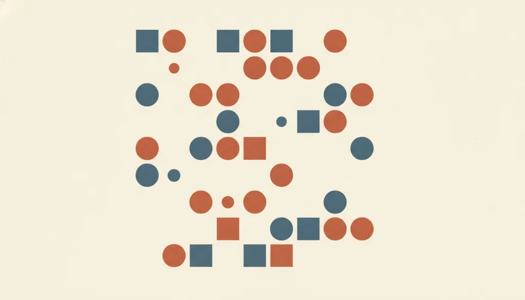
Elements that share visual characteristics such as color, shape, or size tend to be perceived as a related group, even when they are not positioned next to each other.
Why it is in this edition: Covers grouping cues beyond position, showing non-adjacent elements can still read as one group.
Not to be confused with: Similarity groups by visual attributes, not by distance. It is often overpowered by proximity or common region, and it does not replace semantic labels, headings, or accessible grouping information.
Figure–Ground
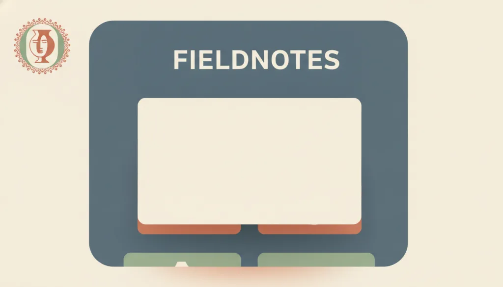
The eye automatically splits a scene into a focal figure and the ground that supports it; stronger contrast, size, and edge cues make that separation more stable.
Why it is in this edition: Covers the separation of subject from backdrop — a different mechanism from grouping.
Not to be confused with: Figure-ground works through contrast, size, edge, and depth cues, a different mechanism from proximity (which groups by distance) or similarity (which groups by shared attributes); whether the actual contrast ratio is sufficient is a separate, quantitative legibility check that this entry describes only in passing and does not cover.
Fitts’s Law
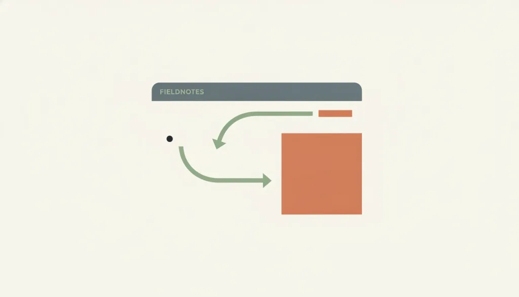
Fitts's Law is a quantitative model: the time to reach a target with a pointing device (mouse or finger) grows with the target's distance and shrinks with its size, and that relationship is logarithmic rather than linear — doubling the distance increases time, but not by double.
Why it is in this edition: Adds a quantitative model, showing this category also contains constraints you can compute.
Not to be confused with: Fitts's Law predicts how long it takes to move to a target, not how long a user takes to decide which option to choose; the latter is the Hick-Hyman Law (a separate, not-yet-written entry), and the two are often conflated despite different mechanisms. On desktop, screen edges and corners are effectively "infinite-width" targets because the pointer cannot travel past the boundary, which is a special corollary of the law rather than an added assumption. Fitts's Law itself does not claim that bigger buttons are always better: it only describes how time trends with size, and whether a given size is worth the layout space it costs is an editorial tradeoff, not a conclusion of the law.
Hick–Hyman Law
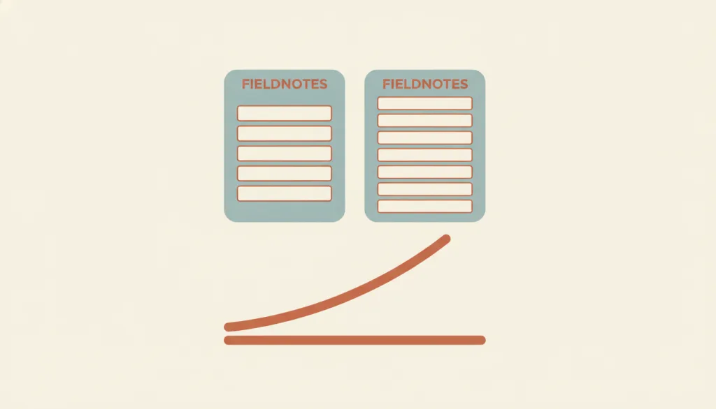
The Hick–Hyman Law is a quantitative model: when making a simple choice among several equally probable, known alternatives, the decision time grows with the number of alternatives, and that growth is logarithmic rather than linear — doubling the number of alternatives increases decision time, but not by double.
Why it is in this edition: Covers how the number of options relates to decision time — a different mechanism from recognition over recall.
Not to be confused with: The Hick–Hyman Law predicts the decision time needed to choose among several equally probable, known alternatives, not the time to move to a target — that is Fitts's Law (a separate entry), and the two mechanisms are often conflated. The law was originally derived from simple choice-reaction tasks in experimental psychology: the alternatives are known in advance, equally likely to appear, and the responder is already prepared to react immediately. Applying that result directly to a user visually scanning an on-screen menu and picking from it does not hold — the time spent scanning, recognizing, and categorizing items in that scenario is usually dominated by visual search, not by the logarithmic relationship with option count, especially when items are organized alphabetically or by category and the user relies on recognition rather than counting through each one. The law therefore cannot be reduced to a general rule that "fewer menu items is always faster"; grouping and labeling change the task itself, not just the option count.
Visibility of System Status
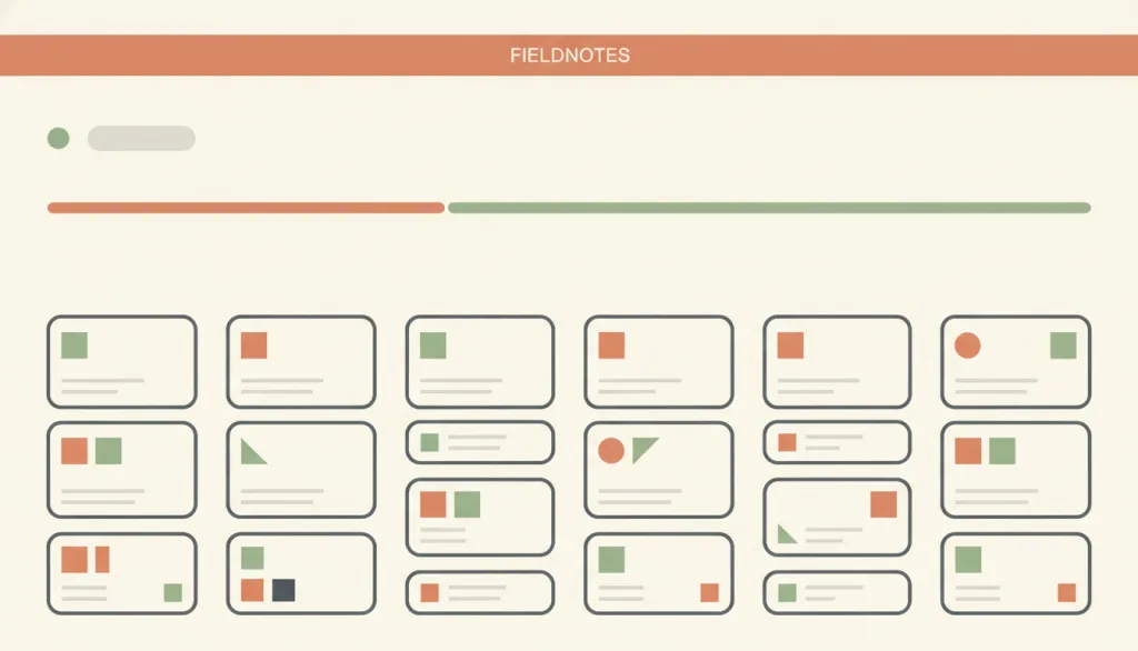
A system should always keep users informed about what is going on, through appropriate feedback within a reasonable time; this is the first of Nielsen's ten usability heuristics.
Why it is in this edition: Raises “the system must say what is going on” to the level of a principle; its realisations live in the microinteraction category.
Not to be confused with: This is a principle, not a concrete mechanism: the determinate progress bar, indeterminate progress, status message, and pressed-state feedback are all concrete realizations of it in different situations. It cares about whether state is communicated, not about how fast the system actually runs — being faster is a performance concern, outside this entry's scope.
Consistency and Standards
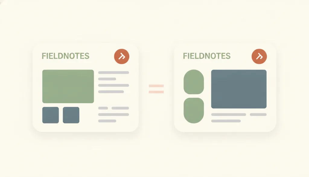
Users should not have to wonder whether different words, situations, or actions mean the same thing; a product should follow platform and industry conventions. Consistency splits into internal consistency (uniformity within one product or product family) and external consistency (following conventions established in the industry or on the web at large), and together they lower learning cost and cognitive load.
Why it is in this edition: Covers consistent wording and behaviour across contexts, together with platform convention.
Not to be confused with: Consistency and recognition-rather-than-recall support each other but are not the same principle: recognition is about whether information is visible, consistency is about whether the same meaning always appears in the same form. Consistency is not uniformity either: elements with different meanings should be deliberately and visibly different, and that difference is part of consistency (see similarity). It does not ask every product to look alike, only that the same function be identified and placed the same way everywhere.
Error Prevention
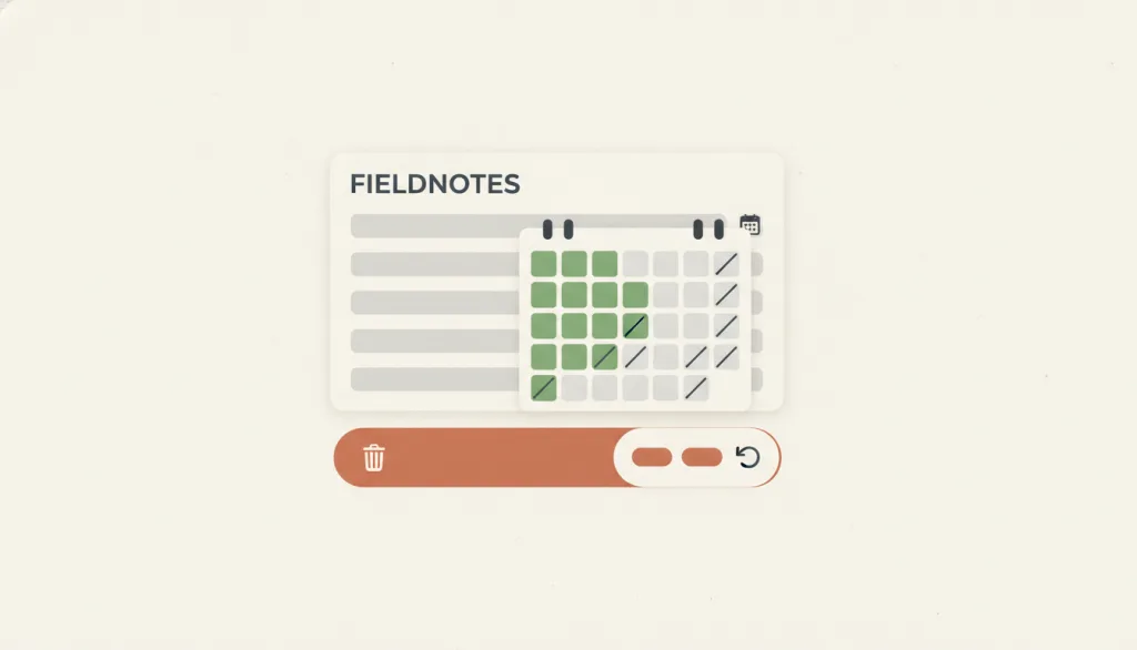
Good error messages matter, but a better design stops the problem before it happens: it eliminates error-prone conditions, or checks for them and offers a confirmation before the user commits. Errors split into unconscious slips and mistakes rooted in a wrong mental model, and the two need different prevention tactics.
Why it is in this edition: Covers removing the conditions before a problem occurs, as distinct from writing good error messages.
Not to be confused with: Error prevention is about design before an error occurs. It is not error messages and recovery (Nielsen's ninth heuristic); inline validation is only one realization of it, not the principle itself; and it does not call for a confirmation on every action.
User Control and Freedom
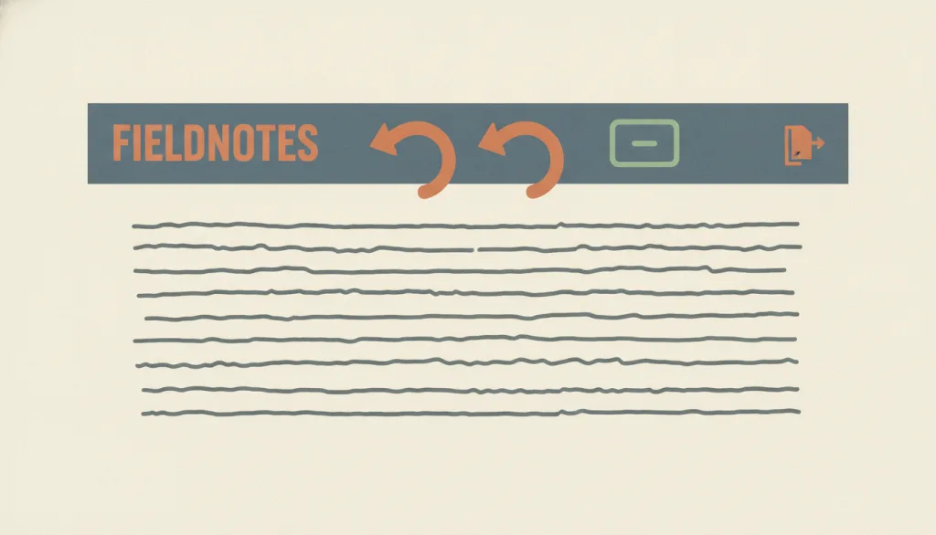
Users often act by mistake, so they need a clearly marked "emergency exit" that lets them leave an unwanted state without going through an extended process, plus support for undo and redo. Being able to get out of trouble easily gives people the confidence to explore, which supports learning and feature discovery.
Why it is in this edition: Covers the requirement for a clearly marked way out — the principle behind undo and redo.
Not to be confused with: User control and freedom is about whether the user can leave or reverse at any time; it is Nielsen's third heuristic. It is related to calm technology (respecting attention), but that principle concerns the intensity of information presentation rather than exit routes. Undo/redo is one realization of it and has no separate entry yet; obstruction is its direct violation. It is not error prevention: this principle handles mistakes after they happen, error prevention handles them before.
How this pairs with the other edition
Against the 2026 focus edition, this one depends less on a particular technical setting. An entry in both lists is a principle raised again in a new context.
2026 Trending UX Principles: Top 9 Design Principles in 2026
Evidence scope
These principles do not score against each other; they hold simultaneously from different angles. Two of them are quantitative models whose scope follows their original study conditions — see each entry's sources.