EDITORIAL LIST / ONE LIST
Top 10 Classic Visual Design Styles, Explained
10 entries · every seat filled
This edition collects the visual languages that have been named and re-named often enough to be usable as shorthand. Their value is not that one is more modern than another, but that saying “this looks Bauhaus” tells the other person something precise.
Selection criteria
- A verifiable source explains where the visual language came from and what defines it, rather than a label that only circulates on design blogs.
- It draws a clear boundary against its neighbours instead of collapsing into untestable words like “clean” or “nice”.
- It is still chosen deliberately in digital interfaces today, not only displayed as history.
Seats in this edition
Positions marked “Editorially reconstructed seat” were filled by editorial judgement in this repository; every other seat comes from the list ledger in plan issue #1.
Swiss / International Typographic Style
A visual language that builds order through grids, typographic hierarchy, and carefully organized whitespace.
Why it is in this edition: Sets the category's reference point for where order comes from: grid and hierarchy first, ornament afterwards.
Not to be confused with: This does not cover every minimal interface or every grid layout. The specimen is one adaptation of the language to a digital interface.
Neo-Brutalism
A direct, conspicuous digital visual language using pronounced outlines, hard shadows, and bold color blocks.
Why it is in this edition: Covers the opposite end from order: attention won by blunt outlines and colour blocks rather than refinement.
Not to be confused with: This entry uses the contemporary UI community meaning. It should not be equated with architectural Brutalism or Web Brutalism.
Bauhaus Graphic Style
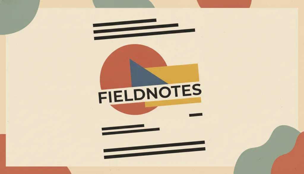
A graphic visual language built from basic geometric shapes (circles, triangles, squares), bold primary-color blocks (red, yellow, blue), and geometric sans-serif type, often set in lowercase; it strips away extra ornament so that shape, color, and typography themselves carry the expression and information hierarchy.
Why it is in this edition: Covers the strand where geometry and primary colour carry the expression, showing that removing ornament is not removing expressiveness.
Not to be confused with: This entry covers only the graphic visual language the Bauhaus school (1919-1933) left behind at the surface level -- geometric shapes, primary-color blocks, sans-serif type, and asymmetric composition -- not the school's full program in architecture, industrial design, workshop pedagogy, or design philosophy. It is historically related to, but not the same as, the Swiss / International Typographic Style: Swiss style came later, grew out of the New Typography movement among other lineages, and settled its experiments into a more systematic grid and restrained color discipline. Bauhaus graphic style never crystallized into a unified grid standard and keeps a more experimental, direct juxtaposition of shapes and color blocks.
Art Deco
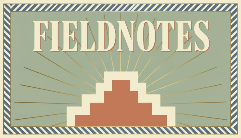
A decorative visual language originating in the 1920s and 1930s: built on symmetrical composition and cubism-influenced geometric ornament (stepped forms, sunburst rays, chevrons), typically paired with metallic accent colors and high-contrast display typography to convey a modern, refined, or nostalgic brand character.
Why it is in this edition: Represents the line that treats ornament as legitimate expression, set against the reductive tendencies elsewhere in this category.
Not to be confused with: The test is cubist-derived geometric ornament (stepped outlines, sunburst fans, chevrons), not any general "1920s retro" feeling. It is both a successor to and a reaction against Art Nouveau: Art Nouveau is defined by organic curves drawn from nature, vines, and floral lines, while Art Deco replaced those curves with the fragmented, geometric forms brought by cubism, keeping only traces of plant imagery. It is also distinct from Bauhaus: Bauhaus geometry serves functional structural reduction and rejects non-structural ornament, while Art Deco treats geometric forms as repeatable, stackable surface decoration meant to convey luxury. A symmetrical grid or a gold accent color alone is not enough for this entry; stepped, radiating, or chevron ornament must also be present.
Art Nouveau
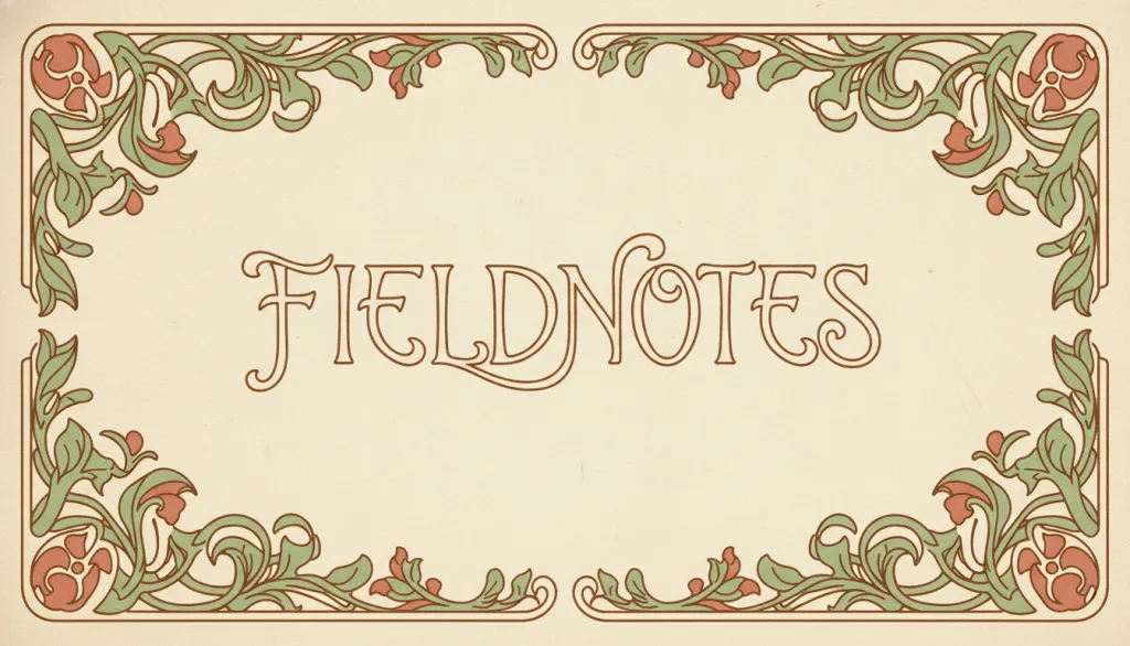
Art Nouveau is a decorative visual style that flourished in Europe and the United States from the early 1890s to the eve of the First World War, marked by flowing, asymmetric "whiplash" curves and plant and floral motifs drawn from nature, with ornament fused into structure rather than applied on top of it.
Why it is in this edition: Covers ornament fused into structure, as distinct from treating pattern as an added layer.
Not to be confused with: This entry covers roughly 1890 to 1910. It differs from the later Art Deco, which arose as a counter-reaction with geometric, symmetric, streamlined forms that express the precision of the machine age rather than Art Nouveau's hand-crafted organic curves; Art Deco is not used as a relation target for this entry. It also differs from skeuomorphism: skeuomorphism borrows the form and operation of a specific real object to explain a digital function, while Art Nouveau's curves and motifs are drawn from natural forms in general to create a decorative, hand-crafted character rather than to imitate one object's function.
Visual Minimalism
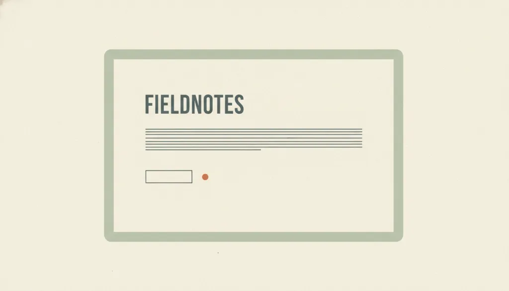
A visual style characterized by reducing the interface to its essential elements: removing elements or content that do not support user tasks, and organizing the interface with a restricted palette, maximized whitespace, and restrained but expressive typography.
Why it is in this edition: Pins down reduction as a stance in itself, so it is not used as a synonym for any one historical style.
Not to be confused with: Visual minimalism describes the orientation of reducing the number of elements. It is not limited to the Swiss / International Typographic Style, which is a specific tradition centered on grids and typography; minimalism may borrow it or not. It often appears together with flat design but has a different focus: flat design removes simulated 3D cues (shadows, gradients, gloss), while minimalism removes elements themselves; a page can be flat without being minimal, or minimal while keeping subtle shadows. It is also not the same as Nielsen's heuristic #8, "Aesthetic and minimalist design", which is about whether information is relevant to the task rather than about visual appearance: a visually minimal interface does not automatically satisfy it, and an interface that satisfies it need not look minimal. When minimalism leads to hidden navigation or removed clickability cues, it stops being a style question and becomes a usability problem.
Flat Design
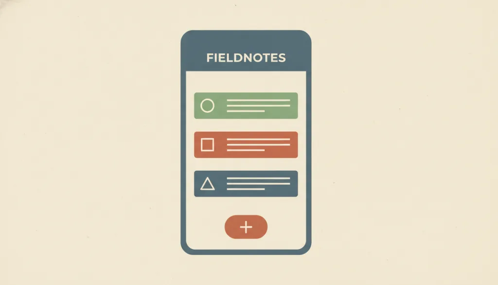
An interface visual style characterized by the absence of simulated three-dimensional effects such as gloss, gradients, and drop shadows, expressing interface elements through solid color blocks, simple geometric shapes, and typography itself.
Why it is in this edition: Separates the specific practice of removing simulated depth from the broader minimal stance.
Not to be confused with: Flat design describes one visual treatment: removing simulated 3D cues. It is not a synonym for the Swiss / International Typographic Style, which is a tradition centered on grids and typography; the two can appear together or separately. Flat design is the counter-choice to skeuomorphism (imitating physical objects with textures and lighting). "Flat 2.0" or "semi-flat" reintroduces subtle shadows and layers while staying simple; this entry treats it as a variant of flat design rather than a separate style.
Skeuomorphism
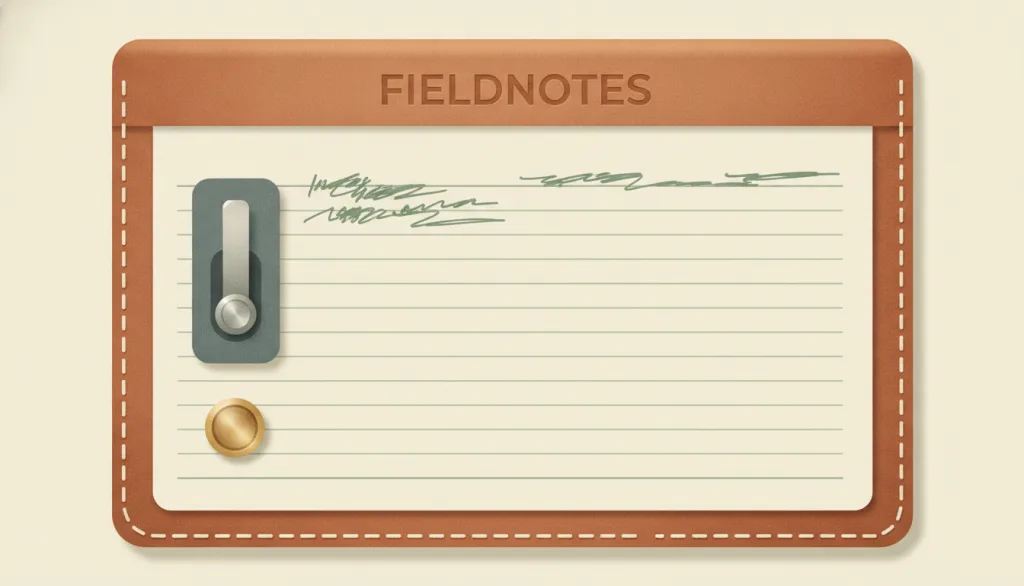
A visual approach that brings real-world objects, together with their materials, forms, and ways of operating, into digital interfaces: interface elements imitate their physical counterparts in appearance or interaction (a leather cover, paper, a toggle switch, a trash bin) so that users' existing experience explains what a new interface does.
Why it is in this edition: Supplies the pole opposite flat design, showing that imitating physical objects is a way of explaining, not just decorating.
Not to be confused with: The test for skeuomorphism is "borrowing a real object's form to explain a function", not how realistic the rendering is: a photorealistic abstract color block is not skeuomorphic, while a low-detail control that looks like a toggle switch and flips like one is. It is the opposing choice to flat design, which arose as the reaction against skeuomorphism and removed the simulated 3D and material cues. Glassmorphism is only a material effect of translucency and blur that borrows no specific object; this entry does not count it as skeuomorphism. Object metaphors at the icon level (a trash can, a folder) are the minimal form of skeuomorphism; this entry focuses on the whole-interface style.
Memphis Style
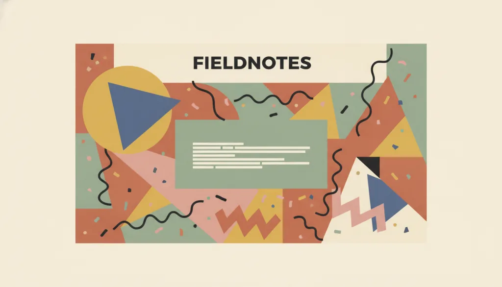
A visual language established by the Memphis Group (Memphis, founded in Milan in 1981 by Ettore Sottsass): bright clashing colors, squiggle-like curves, confetti or terrazzo-style patchwork patterns, and asymmetric geometric shapes, deliberately breaking the modernist constraint of "good taste."
Why it is in this edition: Covers the strand that deliberately breaks “good taste” constraints, in contrast to the order-seeking approaches here.
Not to be confused with: This entry refers to the specific visual signature established by the Memphis Group around 1981 and later borrowed by contemporary UI work: clashing colors, squiggles, confetti/patchwork patterns, and asymmetric geometry. It is not a synonym for the broader, still-unlisted concept of "maximalism"; Memphis is one concrete expression of that broader idea, but the two are not interchangeable. It also differs from Neo-Brutalism: Neo-Brutalism creates directness through heavy outlines, hard shadows, and system-default type, with a regular, usually restrained-color composition; Memphis creates playfulness through clashing colors, curves, and patchwork patterns, with a deliberately asymmetric composition. The two have different visual signatures and should not be treated as synonyms.
Collage
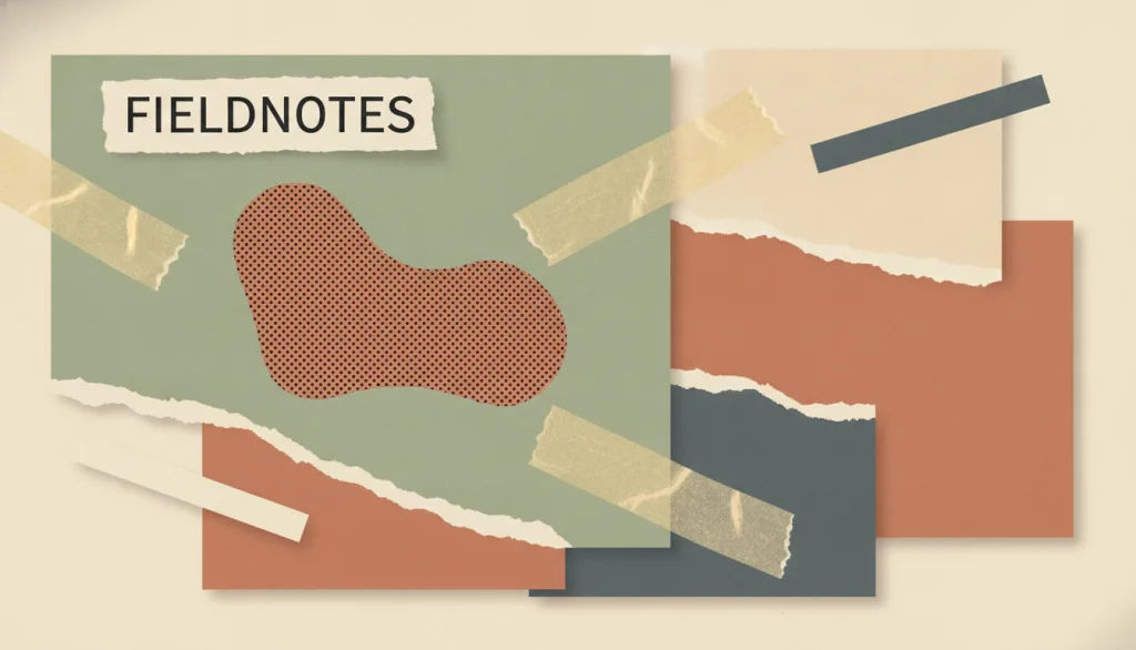
A visual approach that assembles heterogeneous fragments from different sources — cut-out or torn-edge photographs, paper, materials, and type — onto one surface while keeping the seams between them visible; the effect depends on visible joins (torn edges, uneven cuts, a taped look) and abrupt jumps in scale, not on blending the materials into one continuous image.
Why it is in this edition: Covers assembly from multiple sources with the seams left visible, as opposed to blending material into one continuous image.
Not to be confused with: Collage is defined by heterogeneous fragments being joined with visible seams, not by the number or density of elements on the page — seams, cut edges, and scale jumps are the core signal. It is not the same as maximalism, which is an abundance of ornament that can sit within one continuous material and illustration language without any fragment assembly or visible seams; plain decorative accumulation is not treated as collage here. Photocopy-textured, deliberately rough, mixed-type-size zine collage is treated as a variant of this entry rather than a separate one.
How this pairs with the other edition
Against the 2026 focus edition, this one leans on names that have settled. An entry in both lists is one that carries history and is still being discussed.
2026 Trending Visual Styles: Top 6 Design Aesthetics in 2026
Evidence scope
The reasons below are editorial: each says what gap the entry fills in this category. None claims it is more popular or more effective than another. Each entry cites its own sources for its definition.