EDITORIAL LIST / ONE LIST
Top 10 Classic Web Layout and Information Architecture Patterns
10 entries · every seat filled
This edition collects the basic skeletons of layout and information architecture — the decision you make before drawing anything. These structures do not replace one another; they answer different questions.
Selection criteria
- It describes a structural relationship between pieces of content, not the look of one component.
- It separates from its neighbours by who decides what is shown, not by what it looks like.
- It applies to arrangement within a page or to navigation across pages; this category treats both as layout.
Seats in this edition
Positions marked “Editorially reconstructed seat” were filled by editorial judgement in this repository; every other seat comes from the list ledger in plan issue #1.
Master–Detail
Keep a selectable list of items available while showing the details of the current selection.
Why it is in this edition: Sets the category's baseline: a list selection decides what the detail shows.
Not to be confused with: Columns alone do not make a master-detail layout. The defining relationship is that selecting an item updates its details.
Bento Grid
Organize a scannable set of information in differently sized content blocks aligned to a shared grid.
Why it is in this edition: Covers surveying several blocks at once, in contrast to working through items one at a time.
Not to be confused with: This is a layout, not a material or visual style. Varying card sizes alone do not create a useful hierarchy.
Modular Grid
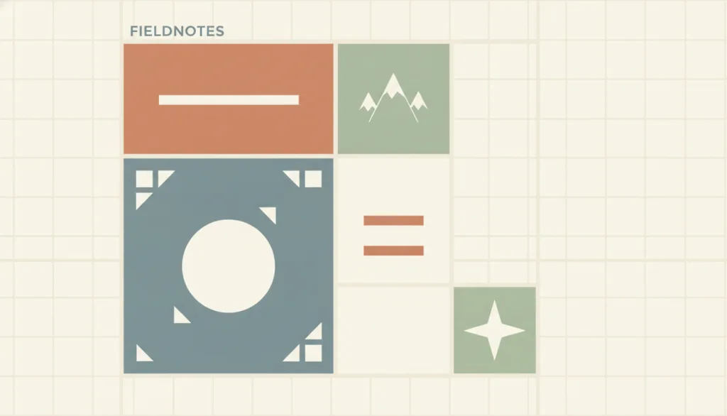
Divides a page with both horizontal rows and vertical columns at once; where the rows and columns overlap, they form uniformly sized modules, and content is placed across a predictable number of modules instead of relying on a single-direction grid whose only variable is column width. IxDF states a modular grid is built from horizontal divisions running top to bottom together with vertical divisions running left to right, a system that Müller-Brockmann and other Swiss graphic designers established. Smashing Magazine's grid-based approach article explains that grid units must stay a consistent size: short content aligns to grid boundaries, while longer content spans multiple units or is shortened to fit the standard unit.
Why it is in this edition: Shows that a grid can itself be a structural convention, not only an alignment tool.
Not to be confused with: A modular grid requires both rows and columns to participate in the division, producing modules that can be counted along two axes; a grid that only splits into columns, with row heights left free to follow content, does not qualify. Bento is a specific compositional style built on top of a modular grid: it deliberately uses blocks of different sizes to create visual hierarchy. A modular grid itself makes no assumption about which module matters more; it only supplies a shared coordinate system. A card grid is a homogeneous, repeating special case of a modular grid: every card occupies the same number of modules with an identical structure, whereas a modular grid allows different blocks to span different numbers of modules without requiring them to match. The three should be discussed separately.
Single-Column Layout
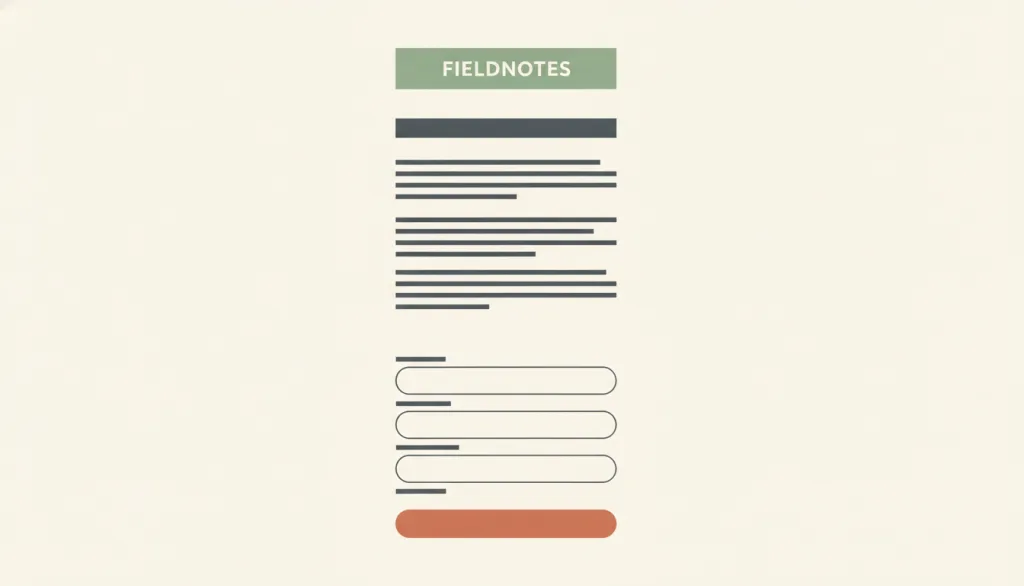
Arrange page content and form fields top to bottom in one column so attention moves in a single direction; form research finds single-column forms produce fewer skipped fields, misread fields, and errors than multi-column forms.
Why it is in this edition: Covers the simplest structure and flags that it is where several layouts converge on narrow screens.
Not to be confused with: A deliberately chosen one-column reading or task page structure, such as an article, a form, or a mobile-first page; not the single column that a master-detail layout collapses into on narrow screens. It also differs from a step-by-step linear flow: a wizard is a flow, while single-column is the page structure carrying each step. A few short fields that logically form one entity (such as city and postcode) sharing a row still counts as a single-column form.
Sidebar Layout

Keep a persistent vertical side region beside the main content for navigation, filters, or tools; NN/g reports that left-side vertical navigation is easy to scan, accommodates more categories, and reflows more easily across screen widths.
Why it is in this edition: Separates a persistent side region from master-detail: a sidebar is not necessarily a list of objects.
Not to be confused with: A sidebar is a persistent page-level region whose contents may be navigation, filters, or a tool panel; it is not necessarily a list of objects. That separates it from master-detail, where selecting an item in the side list drives the detail content; a sidebar has no such selection link with the main area. It also differs from single-column, which deliberately keeps one content column, whereas a sidebar always places a supporting region beside the main content. A sidebar that collapses into a drawer on narrow screens is still a sidebar layout.
Card Grid

Arrange a set of identically structured cards in a repeating row-and-column grid, where each card represents one content unit that can be opened and typically combines an image, a title, a summary, and an action.
Why it is in this edition: Covers repeated, uniform units, as distinct from blocks of differing size.
Not to be confused with: This is a page-level layout, not the card component itself. Unlike a Bento grid, the cards are homogeneous and usually the same size; hierarchy is not created through block size. Cards with differing structures or unpredictable field positions lose their scannability.
Holy Grail Layout

A classic web page composition made of a full-width header, a three-column body (a fixed-width left navigation column, a fluid-width centre content column, and a fixed-width right sidebar), and a full-width footer. Historically, achieving all of this with floats and table-free CSS at the same time -- centre content appearing first in the source, a full-width footer, and lean markup -- was hard enough that the pattern earned the joking name 'Holy Grail'; today it is easy with CSS Grid or Flexbox, and the name itself is a leftover from that history.
Why it is in this edition: Keeps a three-column composition that has a specific historical name, and notes it is not a list-detail relationship.
Not to be confused with: The Holy Grail layout is about one specific page-level composition: a full-width header and footer around a three-column body, with no selection link between the two fixed-width side columns and the fluid centre content. That sets it apart from master-detail, where selecting an item in the side list drives the detail content. It also differs from sidebar layout: sidebar layout only concerns a single persistent side region next to the main content, while the Holy Grail layout additionally commits to a left and a right side column, full-width header and footer, and the specific rule that the centre content appears first in the source.
Hierarchical Navigation Structure
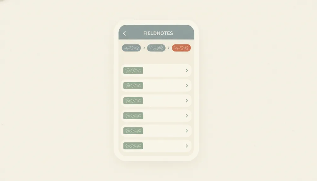
Organize content as a tree of parent and child sections, so people drill down from top-level categories to subcategories and individual items and climb back up through breadcrumbs or a back control; NN/g states that breadcrumbs show the site's hierarchical structure rather than browsing history, and that hierarchies trade breadth against depth: flat structures make content more discoverable, while overly deep ones demand too many clicks and make each level's categories more generic.
Why it is in this edition: Brings tree organisation across pages into this category, showing layout is not only within-page arrangement.
Not to be confused with: Hierarchical navigation structure is an information-architecture organization: a tree of parent and child sections plus the navigation relationships for moving up and down it, not a specific UI component. A sidebar layout is one page-level presentation of it (sidebar groups often map the first one or two levels of the tree), and breadcrumbs are its location indicator. It differs from hub-and-spoke (leave a central page and return to it before going elsewhere) and from linear flows (advance in a fixed order); neither has its own entry yet, so they are mentioned here only as boundaries. It can combine with progressive disclosure, expanding child levels on demand instead of laying everything out at once. Master-detail can carry a two-level tree, but master-detail emphasizes selection driving a detail view rather than level-by-level drilling.
Hub-and-Spoke Structure
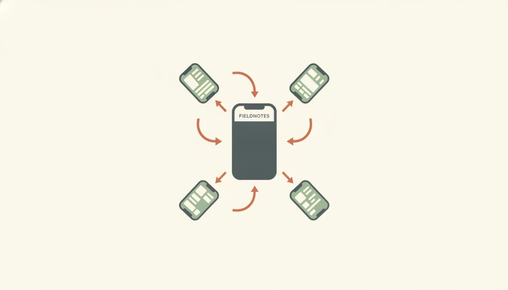
Make a single central hub screen the only entry point, with independent, mutually isolated task sections (spokes) hanging off it: people leave the hub to enter one section, and once they finish or abandon it they must return to the hub before entering another section, since sections have no direct route between them. NN/g describes this navigation hub as usually the homepage, listing every navigation option; reaching a new destination requires going back to the hub and then choosing one of the options there. Smashing Magazine describes the central screen as a launchpad for exploration, with links pointing outward to other sections of the site or to independent, siloed applications.
Why it is in this edition: Covers a single hub linking otherwise isolated tasks, unlike drilling down through levels.
Not to be confused with: Hub-and-spoke is an information architecture with a single central hub screen whose spokes are independent and share no navigation path with each other; switching tasks always means returning to the hub first. It differs from hierarchical navigation structure, which is a tree that can be drilled into level by level and whose sibling branches can be moved between laterally or revisited; the spokes in a hub-and-spoke structure are mutually isolated with no sibling relationship, and returning to the hub is the only way to switch, not a step through an intermediate tree level. It also differs from linear flow structure, which has only one predetermined sequence with no branch to choose from; hub-and-spoke instead radiates from one point to several independent branches, and moving between branches is a choice, not a step forward in a sequence.
Linear Flow Structure
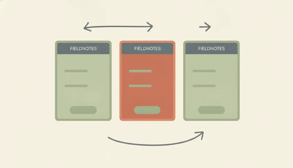
Arrange every screen a task needs into one predetermined sequence with no branches or side paths, so people move forward along a single route (account onboarding, checkout, guided setup); Baymard's checkout flow optimization guide argues the process should be completely linear, never show the same screen twice, and let backward navigation keep the data already entered.
Why it is in this edition: Covers a fixed sequence with no branches, and makes clear it is not the same as revealing on demand.
Not to be confused with: Linear flow structure describes an information-architecture-level ordering relationship - arranging a task's screens into one path - and does not by itself prescribe any interaction control. A wizard is the most common interaction pattern that realizes this structure, supplying next/back controls and progress indicators; but the same linear path can also be presented with a plain "continue" link or a full-page redirect, and the structure is still linear even without the wizard pattern. It differs from progressive disclosure, where the user decides when to expand secondary content and the number and order of screens are not fixed. It also differs from hierarchical navigation structure, which is an explorable tree that lets people move sideways between sibling branches and revisit them; a linear flow has only one path, no sibling nodes to choose among, and is not meant to be revisited.
How this pairs with the other edition
Against the 2026 focus edition, this one depends less on any single year's product shapes. An entry in both lists is a structure that is both foundational and being put to new use.
Evidence scope
Each reason says what structural gap the entry fills; together they are not an order of preference. These structures often combine, and the choice follows the task, not the position in a list.