EDITORIAL LIST / ONE LIST
2026 Trending Visual Styles: Top 6 Design Aesthetics in 2026
6 entries · fewer than 10 seats; positions without verifiable evidence are left open
This edition records the visual directions this edition was following through 2026. It answers what is being discussed, not what is most used — the latter would need adoption data that does not exist.
Selection criteria
- Verifiable public discussion, a platform release, or a creative report addressed it around 2026.
- It describes a recognisable visual practice, not one company's product look in one year.
- Where verifiable evidence is missing the position stays empty rather than being filled with something merely plausible.
Seats in this edition
Positions marked “Editorially reconstructed seat” were filled by editorial judgement in this repository; every other seat comes from the list ledger in plan issue #1.
Glassmorphism
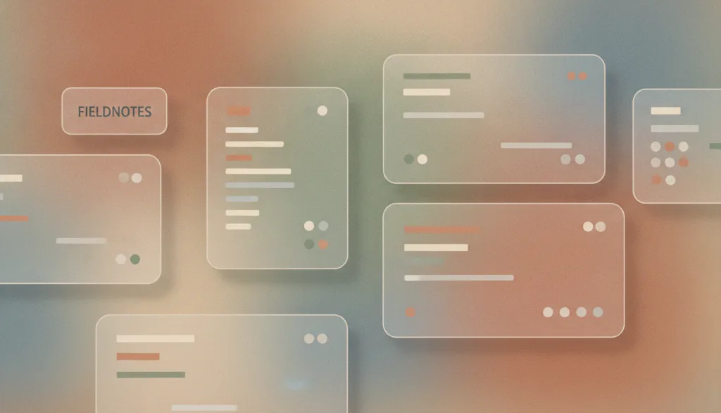
A visual style that uses varying levels of translucency and background blur so foreground elements appear to float over the background like frosted glass, establishing depth between layers.
Why it is in this edition: Discussion of platform material languages in 2026 gathered here: depth expressed through translucency and blur.
Not to be confused with: This names a family of visual styles, not one platform's implementation. Apple's Liquid Glass is one platform example of a system-level material and is not the whole Apple design system; translucent materials on other platforms are not split into separate styles here. Simply making a panel semi-transparent without treating the background does not constitute the style.
Collage
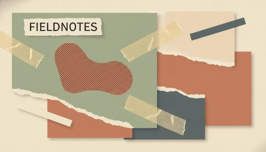
A visual approach that assembles heterogeneous fragments from different sources — cut-out or torn-edge photographs, paper, materials, and type — onto one surface while keeping the seams between them visible; the effect depends on visible joins (torn edges, uneven cuts, a taped look) and abrupt jumps in scale, not on blending the materials into one continuous image.
Why it is in this edition: In the annual context it stands for handmade, multi-source texture set against uniform templates.
Not to be confused with: Collage is defined by heterogeneous fragments being joined with visible seams, not by the number or density of elements on the page — seams, cut edges, and scale jumps are the core signal. It is not the same as maximalism, which is an abundance of ornament that can sit within one continuous material and illustration language without any fragment assembly or visible seams; plain decorative accumulation is not treated as collage here. Photocopy-textured, deliberately rough, mixed-type-size zine collage is treated as a variant of this entry rather than a separate one.
Surrealism
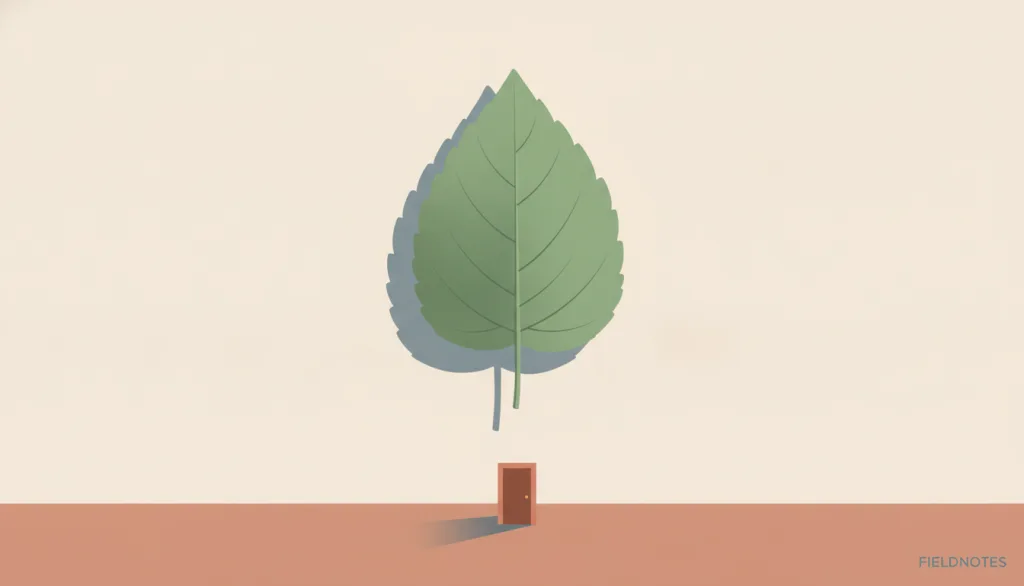
A visual style that renders real objects with precise, realistic detail, then places them in impossible juxtapositions or gives them impossible states (floating, melting, unnaturally huge or tiny) to create dream-like, illogical scenes. It traces back to the Surrealist art movement, launched when Andre Breton published the Surrealist Manifesto in 1924, which originally called for recording the unconscious and dreams through "pure psychic automatism."
Why it is in this edition: Represents realistic rendering used to build illogical scenes, named repeatedly in creative reporting around 2026.
Not to be confused with: This entry covers an image/illustration style applied to brand and editorial visual material (hero images, covers, marketing imagery) -- it is not a UI layout or interaction pattern. It does not change the interface's information architecture or how it operates, only the content of decorative imagery. "Absurd" and "dreamlike" are variants of the same tone and are treated here as variants of this entry rather than separate concepts. This style depends on precise, realistic rendering of the objects themselves to create its contrast -- crudely juxtaposed picture fragments (collage) do not count as surrealism in this sense: collage creates tension through mismatched edges and materials, while surrealism relies on a single, coherent, realistic rendering to make an impossible scene feel "credible." The historical Surrealist art movement itself is out of scope here; only its visual technique is applied to contemporary brand and editorial contexts. AI image generation tools have clearly lowered the effort and cost of producing this kind of precise, realistic rendering in recent years, but this entry does not make any unsupported claim about adoption rate or how widespread it has become.
Retro Computing Aesthetic

A style that borrows the visual language of early computers to express nostalgia or a geek sensibility: monospaced terminal type, phosphor green/amber text on black, pixel or bitmap fonts, low-color-depth dithered gradients, and the beveled window chrome and 1-bit icons of early graphical interfaces. Terminal, pixel-art, and early-GUI looks are subtypes of this one overall style, not separate entries.
Why it is in this edition: Covers nostalgic reference to early computer screens, holding terminal, pixel, and early-GUI looks under one name.
Not to be confused with: This entry covers the specific visual signature that imitates the look of actual historical computing devices and operating systems: monochrome or low-color-depth display, a monospaced character grid, bitmap icons, and beveled window chrome. It is not the same as skeuomorphism. Skeuomorphism imitates real physical objects (paper texture, leather, switches and dials); Retro Computing Aesthetic imitates the appearance of historical computer screens and systems themselves. The two reference different worlds -- the physical world versus the history of computing technology. Terminal, pixel-art, and early-GUI looks are treated as subtypes within this one entry, not as separate entries.
Visual Minimalism
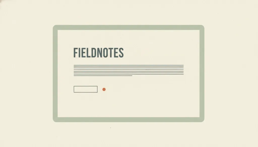
A visual style characterized by reducing the interface to its essential elements: removing elements or content that do not support user tasks, and organizing the interface with a restricted palette, maximized whitespace, and restrained but expressive typography.
Why it is in this edition: Present in the annual context as the reference point most of the year's discussed directions react against.
Not to be confused with: Visual minimalism describes the orientation of reducing the number of elements. It is not limited to the Swiss / International Typographic Style, which is a specific tradition centered on grids and typography; minimalism may borrow it or not. It often appears together with flat design but has a different focus: flat design removes simulated 3D cues (shadows, gradients, gloss), while minimalism removes elements themselves; a page can be flat without being minimal, or minimal while keeping subtle shadows. It is also not the same as Nielsen's heuristic #8, "Aesthetic and minimalist design", which is about whether information is relevant to the task rather than about visual appearance: a visually minimal interface does not automatically satisfy it, and an interface that satisfies it need not look minimal. When minimalism leads to hidden navigation or removed clickability cues, it stops being a style question and becomes a usability problem.
Visual Maximalism
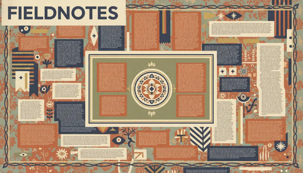
Treating abundance itself as a deliberate visual strategy: layering multiple patterns and decorative elements on the same surface, juxtaposing many colors with several typefaces and type sizes, and pursuing high information density — using density as a chosen expressive means rather than as the accidental result of piling elements on top of each other.
Why it is in this edition: Covers the stance opposite reduction and separates it from neo-brutalism, so that all rich ornament is not filed as one style.
Not to be confused with: Visual maximalism means treating abundance itself as a deliberate strategy — dense layering, many colors and typefaces together, ornament and pattern, and high information density working in concert; not every style that 'looks full' should be lumped into one category. It is not the same as neo-brutalism: neo-brutalism creates directness through heavy outlines, hard drop shadows, and near-default browser typefaces, usually with restrained color and a regular composition — its sense of boldness comes from being deliberately unpolished, not from stacking layers. It is not the same as memphis: memphis is a specific historical visual signature established around 1981 by the Memphis Group — clashing colors, doodled curves, collaged speckle patterns, and asymmetric geometry. Maximalism is a broader strategic orientation that memphis can be read as one concrete expression of, but the two terms are not interchangeable. It is also not the same as collage: collage is defined by heterogeneous fragments being joined with visible seams (torn edges, uneven cuts, abrupt jumps in scale), while maximalism can be a continuous surface of rich decoration in one material and illustration language, with no fragment assembly or visible seams required — sheer decorative accumulation is not collage just because it has many elements.
How this pairs with the other edition
Against the classic foundation edition, the evidence here is weaker and ages faster. An entry in both lists has both historical grounding and current discussion.
Evidence scope
Discussion is not usage. Forecast reports and brand-media cases can show that something is being talked about; they cannot show how widely it is used. Seat numbers are editorial positions, not places in a ranking.