EDITORIAL LIST / ONE LIST
Top 10 Classic UI Interaction Design Patterns
10 entries · every seat filled
This edition collects the recurring task shapes of interaction: choosing, changing, confirming, taking back. Recognising them lets a discussion replace “add a popup” with something more precise.
Selection criteria
- It describes a recognisable exchange between person and system, not a single visual response.
- Its difference from neighbouring patterns is statable: it lies in the shape of the task, not the look of the control.
- It holds across platforms and does not depend on one operating system's controls.
Seats in this edition
Positions marked “Editorially reconstructed seat” were filled by editorial judgement in this repository; every other seat comes from the list ledger in plan issue #1.
Progressive Disclosure
Show primary content or options first, and make secondary content available when people need it.
Why it is in this edition: Sets the category's baseline: controlling when secondary content appears.
Not to be confused with: Hidden content needs a discoverable entry point. Essential prices, risks, and actions must not disappear in the name of simplicity.
Inline Edit
Replace content in its reading position with an editing control, then return to the reading state when editing is complete.
Why it is in this edition: Covers changing something where it is read, without moving the person out of context.
Not to be confused with: Inline edit is not synonymous with autosave. Save timing, cancellation, and error handling must be specified separately.
Direct Manipulation
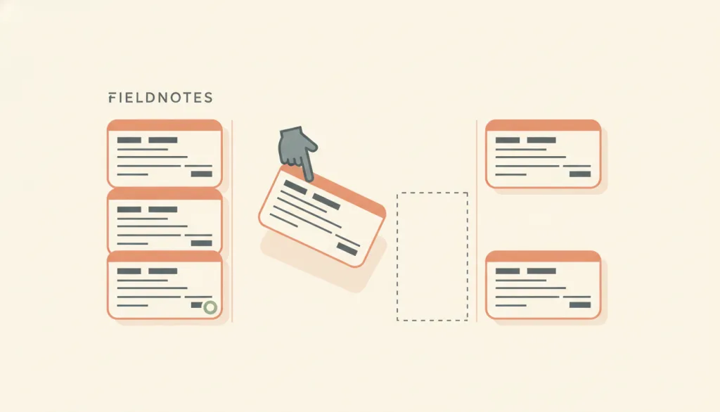
An interaction style in which people act directly on continuously displayed objects of interest, using physical actions such as clicking, dragging, and touching instead of command syntax; operations are incremental, rapid, and reversible, and their effects are immediately visible on screen. The term was coined by Shneiderman in 1983.
Why it is in this edition: Establishes that a person can act on a continuously visible object rather than through command syntax.
Not to be confused with: Direct manipulation is a concept at the level of interaction style, not a specific control: drag and drop, resize handles, sliders, and pinch-to-zoom are realizations of it, and inline edit is one concrete editing situation of it, not a synonym. The test is whether four traits hold together: the object stays visible, physical actions replace commands, operations are incremental and reversible, and effects appear immediately. An interface with gestures but no visible object, or whose effects only show after a submit, does not qualify.
Search and Filter
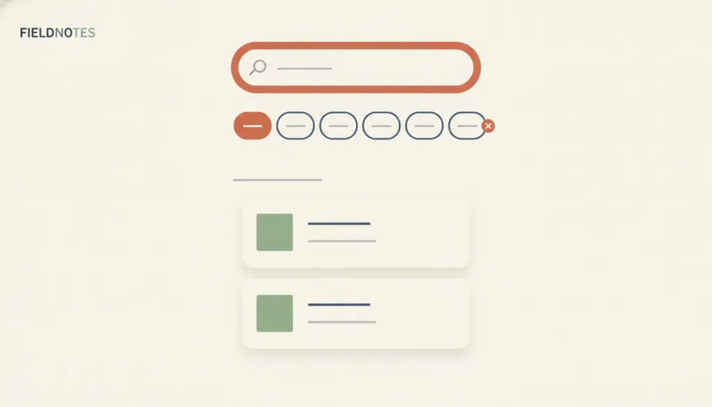
Search lets people narrow a set with a query they type; filtering lets them exclude items that do not match predefined attributes. Both must show the criteria currently in effect.
Why it is in this edition: Covers narrowing a large set, and requires the active conditions to stay visible.
Not to be confused with: Search takes free input from the person; filtering selects from predefined facets. They are often used side by side, but neither is master-detail: master-detail links a list to its detail, while search and filter decide how the set gets narrowed. If criteria are invisible, cannot be cleared, or there is no way back from zero results, it is not a complete search-and-filter pattern.
Wizard
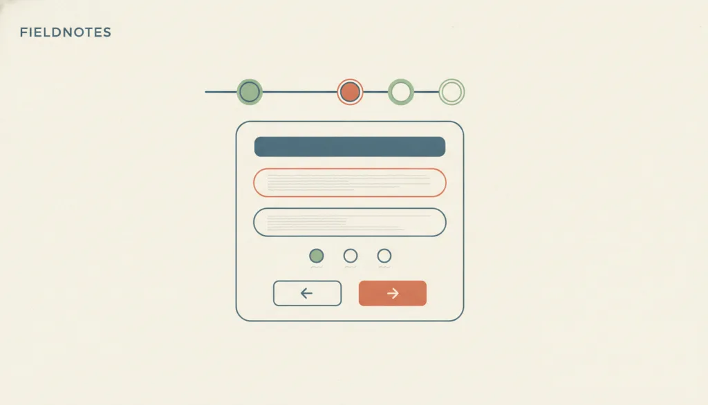
Split a task into several pages completed in a prescribed order, where later steps may depend on information entered earlier; people move between pages with Next and Back.
Why it is in this edition: Separates stepping through fixed stages from revealing on demand.
Not to be confused with: A wizard is a flow pattern, not a page structure: it prescribes fixed, ordered stages with explicit Next, Back, and progress. That differs from progressive disclosure, which expands on demand, and from a single-column long form that puts every field on one page. If every question fits on one page, or the questions do not depend on each other, a wizard is usually unnecessary.
Modal Dialog
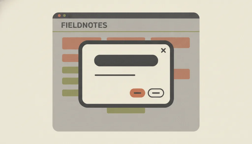
A dialog layered over the main content that moves the system into a special mode: the main content is disabled and cannot be used until the person explicitly deals with the dialog.
Why it is in this edition: Covers the kind of disclosure that blocks the main content, showing not all disclosure blocks.
Not to be confused with: Not every overlay is modal. Nonmodal dialogs, popovers, and progressive-disclosure expansions let people keep working on the page. The test is whether the rest of the page stays inert until the dialog is dismissed; if the background can still be clicked or focused, do not call it modal.
Undo and Redo
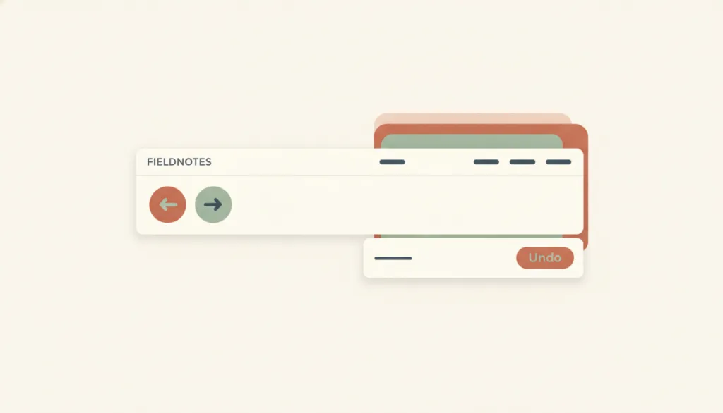
Records completed actions in a command history so people can step back through recent changes or reapply a change that was stepped back from; undo targets actions that were already committed and took effect, not actions still in progress.
Why it is in this edition: Covers taking back a change that already took effect — the precondition for acting without fear.
Not to be confused with: Undo and redo is the interaction-level realization of the user-control-and-freedom principle in editing contexts, not the principle itself: the principle calls for a clear exit, and undo/redo is one such exit among several. It differs from cancel, which abandons an action that has not yet completed (an upload in progress, a form not yet submitted); undo addresses actions that have already completed and taken effect. It also differs from error prevention, which intercepts or requires confirmation before an action happens, while undo/redo offers a way back after the action happens. An undo toast is one presentation of undo, not undo itself; a toast alone with no toolbar or menu entry is not a complete implementation.
Command Palette
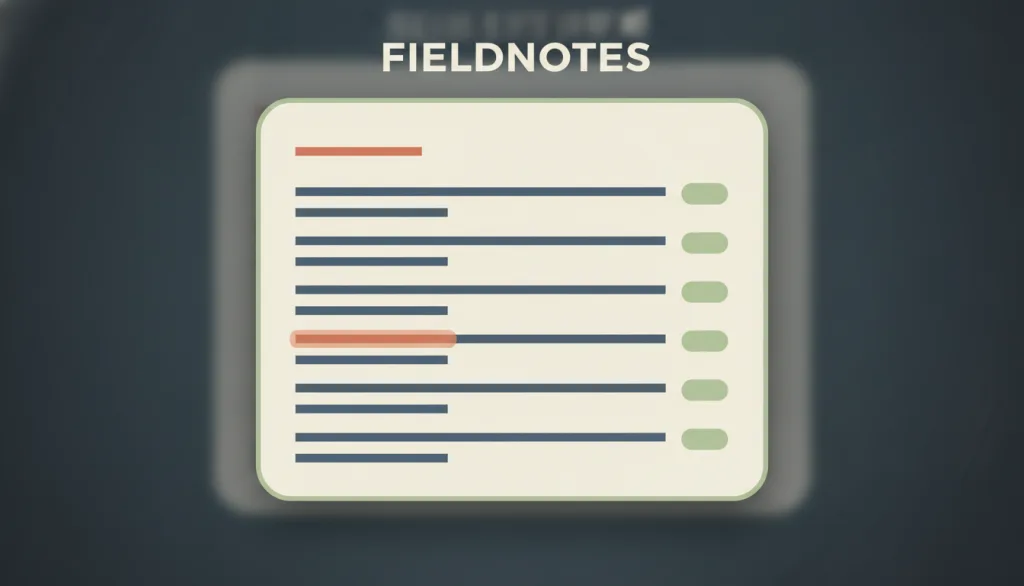
A search-box overlay invoked by a keyboard shortcut: typing a word fuzzy-matches commands, jumpable objects, and settings and runs them directly, layered on top of the visible menus as a keyboard accelerator.
Why it is in this edition: Covers reaching commands and objects directly by keyboard and text, layered over the visible interface.
Not to be confused with: A command palette is an accelerator layered on top of the visible interface, not the only route to a function: every command reachable in the palette must also be reachable through a menu, button, or other visible path, or usability ends up resting on recall rather than recognition — which is exactly its tension with Recognition Rather Than Recall. It differs from search and filter, which narrows a set of content for browsing and comparison, whereas a command palette finds and runs a single action. It borrows a modal dialog's overlay and focus capture in form, but its purpose is invoking commands, not collecting information needed to continue or preventing an irreversible error.
Batch Actions
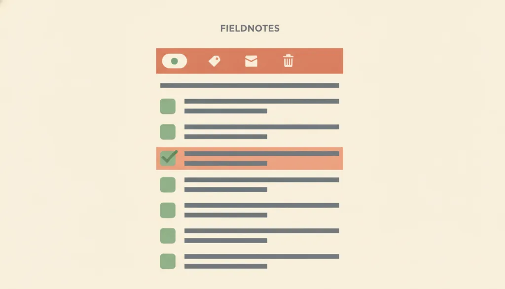
Lets the user check several objects first, then use one shared action entry point to apply the same action to the whole selection — usually shown as an action toolbar or menu that appears alongside the selection, instead of triggering the same action once per object.
Why it is in this edition: Covers the grain of selecting many and acting once, unlike changing items one by one.
Not to be confused with: Batch actions differ from contextual actions in granularity: contextual actions apply only to the single object the user currently selects or points at, and its entry point appears when that one object is targeted. Batch actions apply to a group of objects the user has checked beforehand, and its entry point appears whenever at least one item is selected, not when one object is pointed at. It also differs from inline edit — inline edit changes the content of a single field in place, while batch actions repeat one discrete action (archive, tag, delete) across several objects without changing how any single field is edited.
Contextual Actions
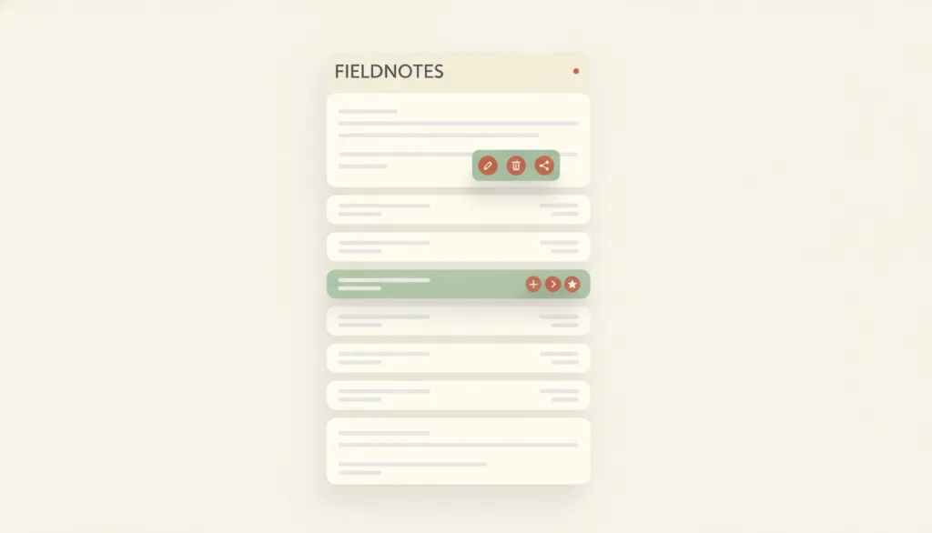
Actions offered on or next to a specific object, applying only to that object, that appear when the user selects, hovers, focuses, or long-presses it — commonly shown as a context menu, row-level action buttons, or a floating toolbar.
Why it is in this edition: Covers actions scoped to one object that appear on selection or hover.
Not to be confused with: Context menus, row action buttons, and floating toolbars are presentation variants of the same concept, not separate patterns: the test is whether the actions apply only to the selected or pointed-at object and appear on selection, hover, focus, or long-press. It differs from inline edit, which switches to an editing control in place and changes the content itself, while contextual actions only expose action entry points that may navigate, open a confirmation, or trigger inline edit. It also differs from batch actions, which apply to a multi-selection — batch actions has no entry of its own yet and is mentioned here only to draw the line.
How this pairs with the other edition
Against the 2026 focus edition, this one does not assume a system acting on its own. An entry in both lists is a pattern that has taken on new weight where automation is involved.
2026 Trending Interactions: Top 7 Interaction Patterns in 2026
Evidence scope
The reasons are editorial and say which task shape the entry covers; they are not an order of preference. Most of these patterns combine.