EDITORIAL LIST / ONE LIST
2026 Trending Layouts: Top 7 Layout Patterns in 2026
7 entries · fewer than 10 seats; positions without verifiable evidence are left open
This edition records the layout questions this edition was following in 2026, concentrated in two places: how multiple panes reorganise across sizes, and where conversational products put their content.
Selection criteria
- Verifiable design-system documentation, a product release, or experimental research discussed it around 2026.
- It addresses a structural question, not a styling update to one component.
- Positions without evidence stay empty instead of being covered by a neighbouring concept.
Seats in this edition
Positions marked “Editorially reconstructed seat” were filled by editorial judgement in this repository; every other seat comes from the list ledger in plan issue #1.
Supporting-Pane Layout
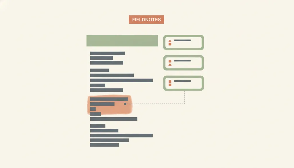
Keep a narrower supporting pane beside a wider main content column to show reference material, citations, or the source excerpts a generated response is based on; the pane's content changes with the main content itself, not because someone selected an item in a list — unlike the selection link in master-detail. A common variant is the "Aligned Sidebar": citations or sources shown alongside the body copy to help people verify it.
Why it is in this edition: Discussion of showing citations and grounding in 2026 lands here: the supporting content is not chosen by a list.
Not to be confused with: A supporting pane and master-detail both show a main area plus a secondary area, but in master-detail selecting an item in the side list drives the detail content. A supporting pane's content follows the current task, passage, or generated result instead, with no object-selection step. It also differs from a sidebar layout: a sidebar is a persistent navigation or tool region that stays largely unchanged across pages, while a supporting pane is tightly coupled to the current main content and typically focuses on reference material, citations, or sources rather than site-level navigation. The "Aligned Sidebar" pattern, which shows citations aligned beside the body copy, is a presentation variant of the supporting pane rather than a separate layout.
Adaptive Multipane Layout
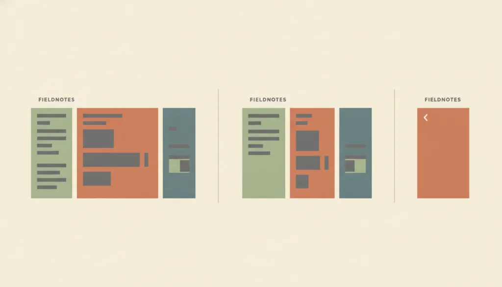
Lets the same set of panes gain, merge, or split columns based on available width or container size — two or three panes side by side on a wide window, collapsing to a single pane with a way back on a narrow one. It governs only that reorganization, not what kind of information any individual pane carries.
Why it is in this edition: Describes how panes merge and split across sizes without restating what each pane means.
Not to be confused with: Adaptive multipane layout describes how one set of panes gains, merges, or splits columns across screen widths or window shapes, and what must be preserved or may be deferred when that happens. It does not redefine what belongs inside any single pane or how panes relate to each other — a list selection driving a detail view is master-detail's job, a narrower reference or citation pane is supporting-pane's job, and a persistent cross-page navigation or tool region is sidebar-layout's job. In short, those layouts answer "what is in the panes and how do they connect," while adaptive multipane layout only answers "how does this same set of panes reflow as the window gets narrower or wider."
Card Grid
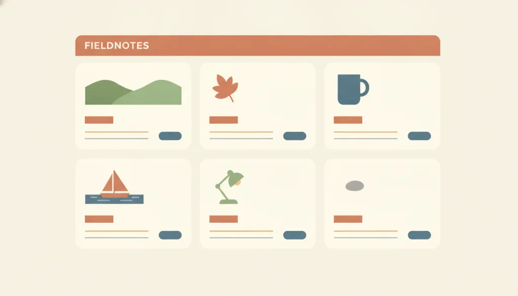
Arrange a set of identically structured cards in a repeating row-and-column grid, where each card represents one content unit that can be opened and typically combines an image, a title, a summary, and an action.
Why it is in this edition: In the annual context it is the most common container for generated content and recommended results.
Not to be confused with: This is a page-level layout, not the card component itself. Unlike a Bento grid, the cards are homogeneous and usually the same size; hierarchy is not created through block size. Cards with differing structures or unpredictable field positions lose their scannability.
Conversation-and-Workspace Layout
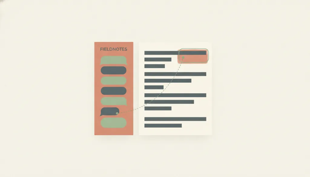
A page layout that places a conversation pane beside a workspace pane holding a persistent artifact: the workspace stores the object the conversation produces or modifies (a document, code, a board), and the conversation is the means of changing that object, not the object itself.
Why it is in this edition: Covers conversation placed beside a persistent artifact, as distinct from an input box with a list of results.
Not to be confused with: It differs from master-detail in what drives the second region's content: in master-detail, the detail content is determined by which item the user selects from a list; here, the workspace changes because the user sent a message, not because they selected an item from a list. It differs from supporting-pane in which side holds the primary task: in supporting-pane, the main content area is itself the primary task and the side pane only offers reference material or sources; here, the workspace pane holds the durable object the user actually wants to keep and deliver, and the conversation pane is only the means of changing it, even when the conversation occupies a large share of the screen. How the turn-taking conversation itself is organized, and how capability limits are disclosed, belongs to conversational interface; this entry only covers the spatial pairing of the two panes and the sync contract between them, not how conversation turns are presented.
Single-Column Layout
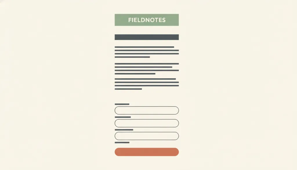
Arrange page content and form fields top to bottom in one column so attention moves in a single direction; form research finds single-column forms produce fewer skipped fields, misread fields, and errors than multi-column forms.
Why it is in this edition: In the annual context it carries the reading structure for long generated passages.
Not to be confused with: A deliberately chosen one-column reading or task page structure, such as an article, a form, or a mobile-first page; not the single column that a master-detail layout collapses into on narrow screens. It also differs from a step-by-step linear flow: a wizard is a flow, while single-column is the page structure carrying each step. A few short fields that logically form one entity (such as city and postcode) sharing a row still counts as a single-column form.
Editorial Layout
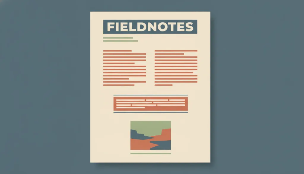
Organize a headline, deck (subhead/standfirst), body text, pull quotes, and image captions into a long-form page the way print editorial practice does, using real heading levels together with size and weight differences to signal what is a heading versus body text; pull quotes are excerpted from the body to emphasize a point rather than replace it, and each image and its caption travel as one unit.
Why it is in this edition: Covers the editorial relationship between headline, standfirst, body, quotation, and caption — a structural question for long-form pages.
Not to be confused with: This concerns the typographic relationships between headline, deck, body, pull quotes, and captions inside a long-form page, not the grid mechanics of rows and columns (modular grid) or the choice of a single sequential reading column (single-column). Editorial layout usually sits on top of a single column or a modular grid, but it addresses text hierarchy and text-image relationships within the page, not the coordinate system carrying it. Swiss style is an optional visual language spanning both layout and visual categories; editorial layout does not assume any one visual style.
Hierarchical Navigation Structure
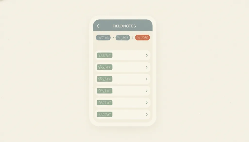
Organize content as a tree of parent and child sections, so people drill down from top-level categories to subcategories and individual items and climb back up through breadcrumbs or a back control; NN/g states that breadcrumbs show the site's hierarchical structure rather than browsing history, and that hierarchies trade breadth against depth: flat structures make content more discoverable, while overly deep ones demand too many clicks and make each level's categories more generic.
Why it is in this edition: In the annual context it notes that content still needs browsable organisation even when the main entrance is a conversation.
Not to be confused with: Hierarchical navigation structure is an information-architecture organization: a tree of parent and child sections plus the navigation relationships for moving up and down it, not a specific UI component. A sidebar layout is one page-level presentation of it (sidebar groups often map the first one or two levels of the tree), and breadcrumbs are its location indicator. It differs from hub-and-spoke (leave a central page and return to it before going elsewhere) and from linear flows (advance in a fixed order); neither has its own entry yet, so they are mentioned here only as boundaries. It can combine with progressive disclosure, expanding child levels on demand instead of laying everything out at once. Master-detail can carry a two-level tree, but master-detail emphasizes selection driving a detail view rather than level-by-level drilling.
How this pairs with the other edition
Against the classic foundation edition, this one sits closer to current product shapes. An entry in both lists is an older structure being put back to work in a new context.
Top 10 Classic Web Layout and Information Architecture Patterns
Evidence scope
Design-system documentation shows that a layout is recommended, not that it is widely adopted; experimental findings hold only under their study conditions. Neither supports a ranking.