EDITORIAL LIST / ONE LIST
Top 10 Classic Dark Patterns in UX, and How to Spot Them
10 entries · every seat filled
This edition collects deceptive design practices that have been documented repeatedly. It exists for recognition and audit only — this site's query excludes anti-patterns in select mode and returns them only in audit mode.
Selection criteria
- A verifiable taxonomy or regulatory review has documented the practice.
- Its mechanism is statable and separable from its neighbours, rather than a general “bad experience”.
- It describes harm caused by a design choice, not by careless execution.
Seats in this edition
Positions marked “Editorially reconstructed seat” were filled by editorial judgement in this repository; every other seat comes from the list ledger in plan issue #1.
Confirmshaming
Use shame, guilt, or belittling language to pressure people into accepting an option rather than declining it.
Why it is in this edition: Sets the category's baseline: wording that applies emotional pressure so a person is reluctant to decline.
Not to be confused with: Explaining objective consequences is different from shaming. This entry concerns emotional pressure on a freely made choice.
Obstruction
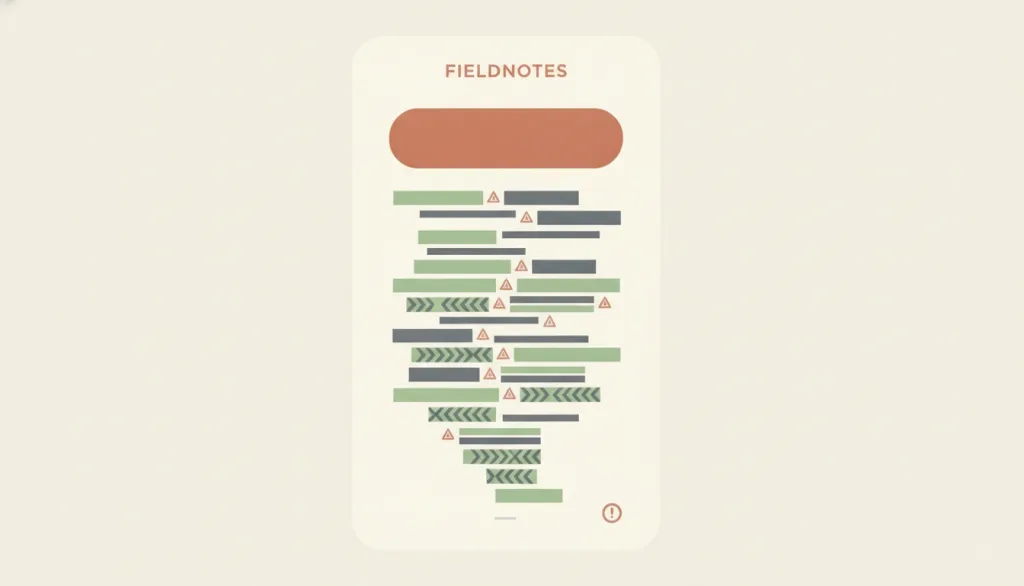
Deliberately place obstacles or extra steps on the path to an action that should be available, especially cancelling, unsubscribing, deleting an account, or declining, making it far harder than the corresponding entry action.
Why it is in this edition: Covers putting obstacles in the path, a different mechanism from withholding information.
Not to be confused with: Different from hidden costs: the mechanism here is making the exit or completion path laborious, not delaying fee disclosure. One reasonable confirmation for an irreversible action, or identity checks required by regulation or security, is not obstruction. The test is whether leaving is clearly harder than joining without a legitimate reason.
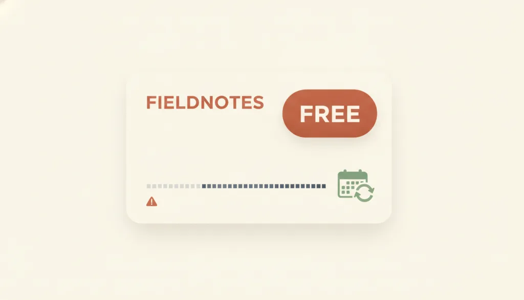
Manipulative Preselection
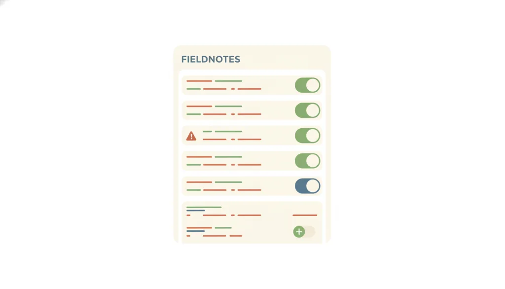
Set the option that benefits the business — a consent checkbox, an added extra, a pricier tier — as the default, exploiting the tendency not to notice or not to bother changing a default, so that money, data, or consent transfers without an active choice.
Why it is in this edition: Covers pressure applied through defaults, a different means from pressure applied through wording.
Not to be confused with: A default itself is a necessary and useful mechanism; the failure is a default that transfers money, data, or consent without an active choice. Different from confirmshaming: the pressure here comes from the default state itself, not from any belittling wording. Different from visual interference: visual interference relies on visual weight to make one option stand out; here the problem holds even with a perfectly neutral visual treatment, because the default has already made a business-favoring choice on the person's behalf.
False Urgency
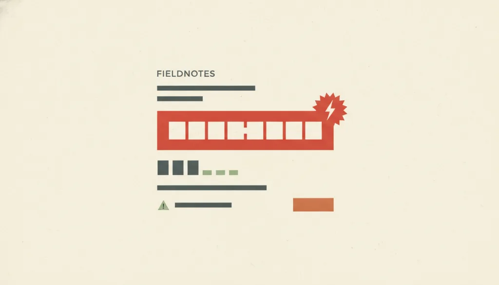
Present people with a time limit that does not really exist (a countdown that resets when it hits zero, an “offer ends soon” with no actual deadline), pressing them to rush through an action.
Why it is in this edition: Covers fabricated time limits.
Not to be confused with: Different from confirmshaming: the mechanism here is fabricated time pressure, not emotional belittling of a choice. False scarcity (fabricated limited quantity, such as a fake “only 2 left”) is a neighbouring concept not yet recorded in this vocabulary; watch for it during audits but record it separately. A genuine, accurately stated deadline, with a specific date and time that really ends the offer, is not this anti-pattern.
False Scarcity
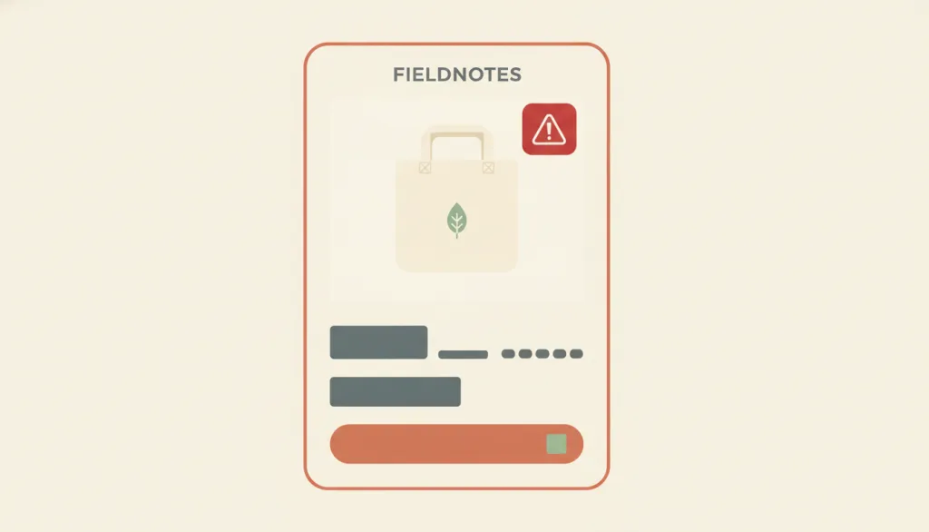
Show people signals of limited supply or strong demand that do not actually exist or cannot be verified (a fabricated "only # left" stock badge, a "# people are viewing/buying this" counter), creating a pressured sense of scarcity that pushes them into a purchase without proper evaluation.
Why it is in this edition: Covers fabricated scarcity of supply, recorded separately from fabricated time limits.
Not to be confused with: Different from false urgency: the mechanism here is fabricating a quantity or demand signal, not a time deadline; the two often appear together but should be logged separately. A stock or activity number that genuinely traces back to a real inventory system or real concurrent-user data is not this anti-pattern. The test is whether the number is computed from real underlying data, not whether it sounds alarming.
Nagging
After a person has clearly declined a request, showing the same request again and again to wear down their attention and patience until they finally "agree" — rather than re-earning consent with one persuasive explanation.
Why it is in this edition: Covers repeated interruption after a refusal, with consent-fatigue induction folded in as a variant.
Not to be confused with: Different from confirmshaming: that entry is about emotionally loaded wording inside a single prompt at the moment of declining. This entry is about the same request reappearing over time, ignoring a decision already recorded. "Consent-fatigue induction" is merged into this entry as a variant — repeated consent or permission prompts that wear down willpower through repetition itself, not through wording in any one prompt. A single, well-timed reminder spaced out after a genuine change in relevance is not this pattern; the test is whether the product recorded and respected a prior "no."
Visual Interference
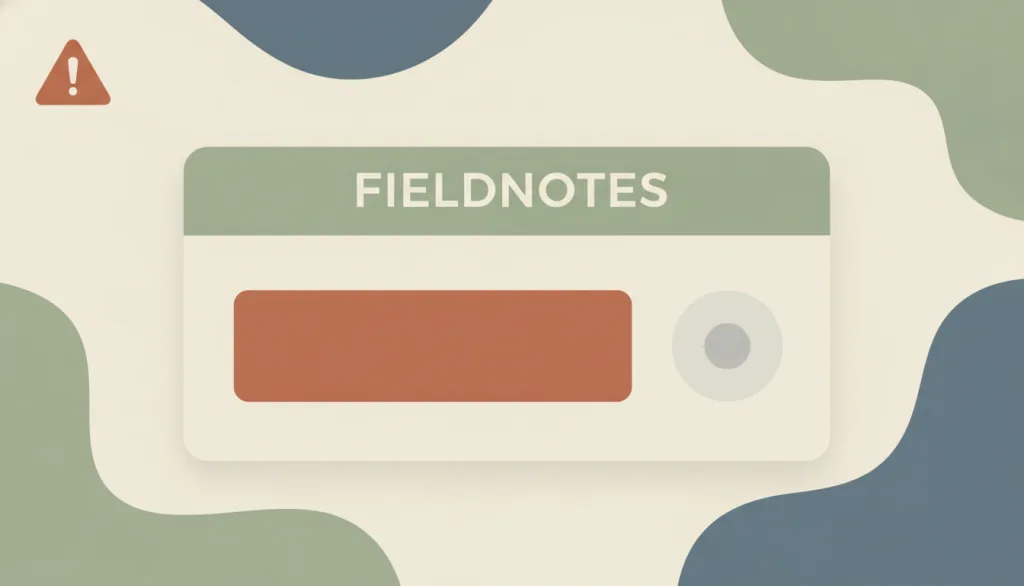
Use visual weight -- size, color, contrast, position, or whitespace -- to make the option that benefits the business stand out, while suppressing an equally valid alternative the person could otherwise choose, so the choice is made under an unequal presentation of information.
Why it is in this edition: Covers pressure applied visually rather than through wording.
Not to be confused with: Visual hierarchy itself is a legitimate design tool for directing attention to what actually matters most; this entry targets only hierarchy used against the person's own interest to suppress an option that deserves equal attention, not hierarchy as such. It differs from confirmshaming: the mechanism here is visual design (size, color, contrast, position, whitespace), not belittling or pressuring wording; both tactics can appear in the same interface and should be logged separately.
Disguised Ads
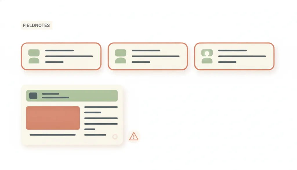
Style an ad or sponsored placement to look like an ordinary interface element, navigation item, system message, or download button, so that people clicking it do not recognize they are clicking an ad.
Why it is in this edition: Covers advertising disguised as interface; the harm is misjudging what you are clicking.
Not to be confused with: Different from clearly labelled native or sponsored content: disclosing "Ad" or "Sponsored" in text right next to the placement is the repair, not the pattern this entry describes. Also different from "interface interference" (a companion anti-pattern being drafted in parallel and not yet in the data file, which concerns the visual prominence of real choices being distorted): this entry's mechanism is an ad impersonating something else, while interface interference distorts the prominence of genuine options. The two can co-occur but should be recorded separately.
How this pairs with the other edition
Against the 2026 focus edition, this one has fuller coverage. An entry in both lists is a practice still being documented recently.
2026 Trending Dark Patterns: Top 6 Deceptive Design Tactics in 2026
Evidence scope
A taxonomy shows the practice exists and has a name; it does not mean every observed case is unlawful. Regulatory findings hold only within their scope and period. This list counts no rates of occurrence.