EDITORIAL LIST / ONE LIST
2026 Trending Microinteractions: Top 6 UI Feedback Patterns in 2026
6 entries · fewer than 10 seats; positions without verifiable evidence are left open
This edition records the feedback questions this edition was following in 2026: when an interface carries model-generated content of unknowable duration, what tells a person where things stand.
Selection criteria
- Verifiable design-system guidance, a specification, or a platform release discussed it around 2026.
- It describes one concrete piece of visible or perceivable feedback, not an attitude.
- Positions without dependable annual evidence stay empty.
Seats in this edition
Positions marked “Editorially reconstructed seat” were filled by editorial judgement in this repository; every other seat comes from the list ledger in plan issue #1.
Indeterminate Progress Indicator
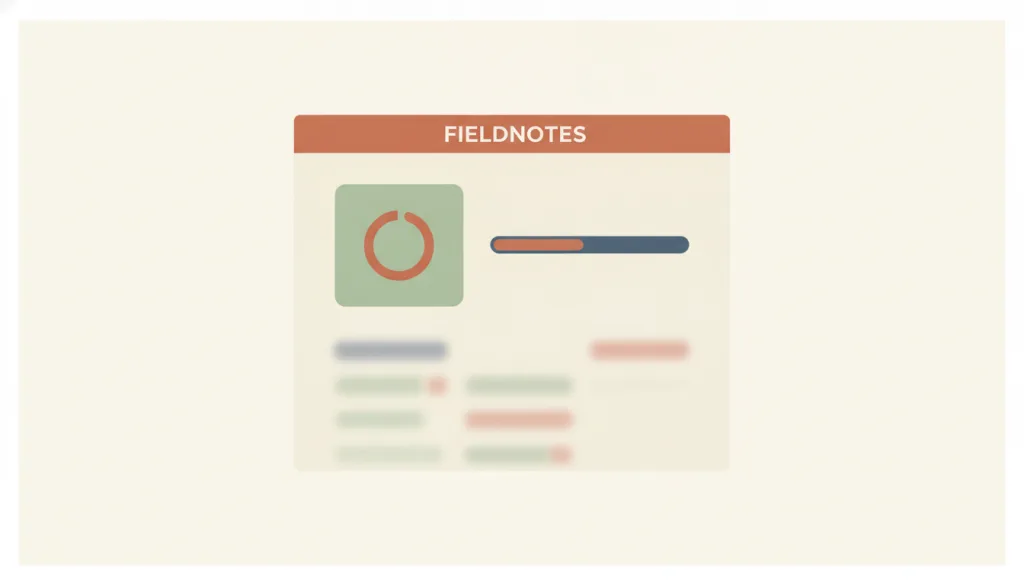
When remaining time or completed fraction cannot be known, a continuously spinning icon or looping bar shows that the system is still working, without reporting how much has actually been done.
Why it is in this edition: Much of the waiting in 2026 is of unknowable length, which makes this one central again.
Not to be confused with: An indeterminate progress indicator only answers whether the system is still working, not how much is done or how long is left; once a reliable completed amount and total are available, switch to a determinate progress bar instead — the two are not interchangeable, and a spinner must not be used to hide progress that could in fact be quantified. A skeleton screen is for when the content structure is known and only that structure is waiting to be filled; an indeterminate indicator is for when the completion fraction itself is unknown, or the wait covers the whole interface rather than a known structure.
AI Content Label
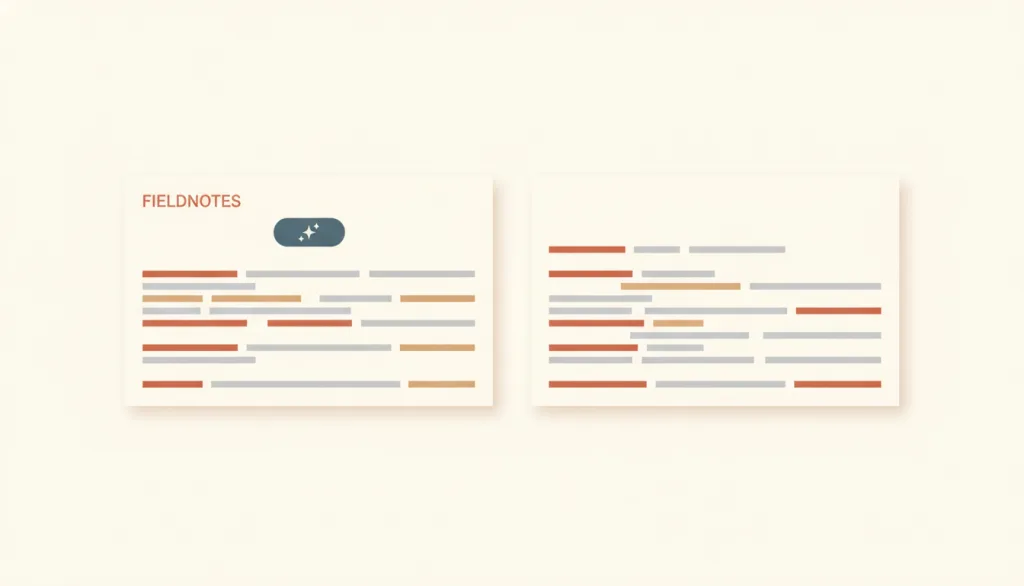
When a piece of content in an interface is generated by a model or substantially modified by one, a visible marker that is also identifiable to assistive technology is placed in the same location as that content, telling people that AI was involved. The label only carries this existence disclosure; it does not mean the content has been verified as accurate or trustworthy.
Why it is in this edition: Covers the visible mark saying a passage was model-generated; it defines the mark only and settles nothing about trustworthiness.
Not to be confused with: An AI content label only flags the fact that a piece of content was generated by or involved AI. It does not vouch for the content's accuracy or trustworthiness — calibrating a person's trust in the result is the job of trust-calibration. It is also not provenance-metadata infrastructure of the C2PA Content Credentials kind: content credentials record and let people verify a technical chain of how content was made and edited, while an AI content label serves an immediate, human-visible notice at the point where the content appears. The two can sit side by side, but they are not the same layer.
Focus Indicator
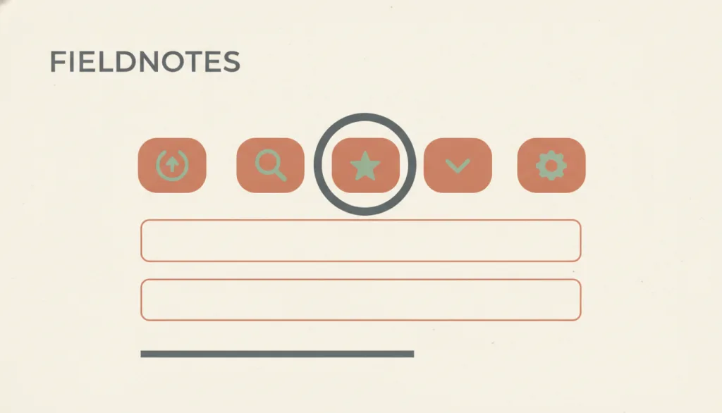
When an interface element receives keyboard focus, a visible visual marker (such as an outline ring or highlight) shows where focus currently is, so keyboard users always know where their action will land.
Why it is in this edition: In the annual context it notes that new interface shapes must still show keyboard users where they are.
Not to be confused with: A focus indicator only answers where focus is now. It is not the hover, selected, or active state; it is a state style on an element rather than a separate component, and it does not decide where focus should move.
Status Message
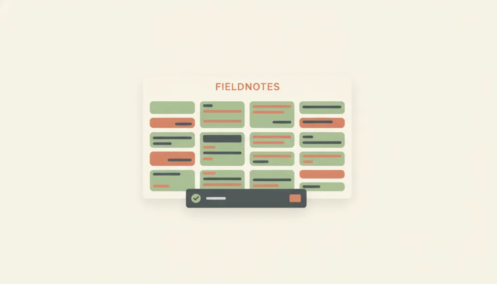
A content change that briefly reports the result of an action, a waiting state, or the existence of errors without changing the user's context, and that assistive technology can announce without receiving focus.
Why it is in this edition: In the annual context it carries the report of what the system is doing on your behalf.
Not to be confused with: A status message reports an outcome or state only. It does not carry continuously quantified progress (that is the determinate progress bar) and does not block the current task to demand a response (that is the modal dialog). Toast and snackbar are presentation variants of it, not separate concepts.
Haptic Feedback
Haptic feedback uses a device's vibration or force actuator to give a brief physical confirmation the instant a press, state change, or event occurs. On the web it is mainly provided through the Vibration API (navigator.vibrate()), which only has an effect when the device has vibration hardware, is not in silent or do-not-disturb mode, and the user has already interacted with the page; the specification itself scopes it to simple tactile feedback rather than a general notification mechanism.
Why it is in this edition: In the annual context it stands for non-visual confirmation, discussed again as platform expression systems were updated.
Not to be confused with: Haptic feedback is a supplementary channel layered on top of other feedback, confirming a press, state change, or event at the fingertip. It cannot substitute for the visual pressed state (which is the required baseline feedback) or for the text or graphical account a status message gives of a result. This is because many users' devices lack vibration hardware, have haptics turned off at the system level, are in silent or do-not-disturb mode, or simply are not being held so the vibration goes unfelt; web platform support for vibration is also limited and inconsistent, with some browsers never implementing it and others removing it. Haptic feedback must always accompany at least one visual or textual channel and can never carry the sole responsibility for conveying an event or state.
State Transition Animation
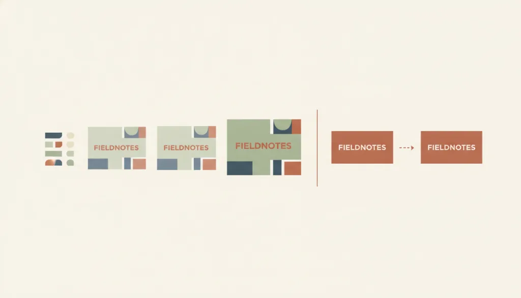
When an interface element changes from one state to another (a list row expanding into a detail panel, a card moving to a new position), a continuous change in position, form, or opacity shows the relationship between the starting and ending state, helping users understand where something went and what it became; the user who triggered the animation can disable it, and the animation must honor system-level reduced-motion preferences.
Why it is in this edition: What was discussed again in the annual context is that it can be reduced or turned off, not that it should be showier.
Not to be confused with: State transition animation is responsible only for explaining where a state change that has happened or is about to complete came from and where it goes; the animation is explanatory, not decorative. It is not indeterminate progress, which loops with no endpoint and reports that work is still underway, and it is not pressed-state feedback, which only confirms an input was received during the brief window between press and release, regardless of whether a state changes. "Reduced motion" is not a separate entry but an adaptation variant of this one: however carefully the animation is crafted, it must be possible for whoever triggers it to disable it, and it must obey system-level preferences such as prefers-reduced-motion; once disabled, the start and end states must still be readable.
How this pairs with the other edition
Against the classic foundation edition, this one deals more with unpredictable waits and marking where content came from. An entry in both lists is an older mechanism carrying a new job.
Evidence scope
Design-system guidance shows a practice is advised, not that it is widely implemented. This list counts no rates of occurrence.