EDITORIAL LIST / ONE LIST
2026 Trending Interactions: Top 7 Interaction Patterns in 2026
7 entries · fewer than 10 seats; positions without verifiable evidence are left open
This edition records the interaction questions this edition was following in 2026, gathered around people working with automated systems: what the system is doing, when it should stop and ask, and how a person checks what it produced.
Selection criteria
- Verifiable guidelines, product design documentation, or experimental research discussed it around 2026.
- It describes an interaction arrangement, not a model capability.
- Positions without verifiable discussion stay empty; this edition is therefore not full.
Seats in this edition
Positions marked “Editorially reconstructed seat” were filled by editorial judgement in this repository; every other seat comes from the list ledger in plan issue #1.
Conversational Interface
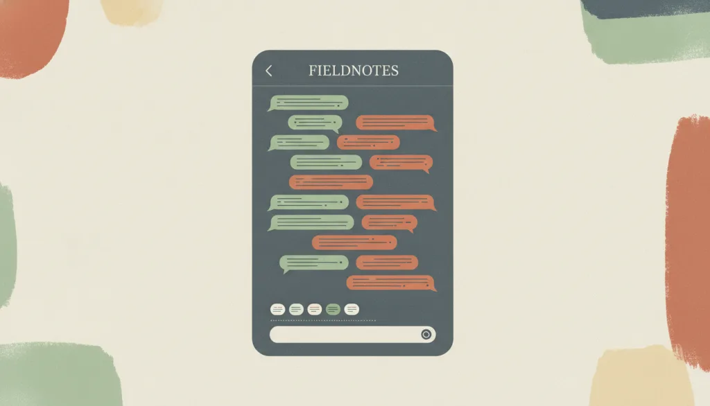
Organizes interaction as turn-taking in natural language: the user states intent instead of operating visible controls. Common in chat windows and voice assistants.
Why it is in this edition: Where 2026 discussion concentrated: stating an intent in place of operating visible controls.
Not to be confused with: Sits on a different axis from progressive disclosure, and the two are not alternatives — progressive disclosure manages when visible controls appear, while a conversational interface manages how the whole interaction is organized. A conversational surface does not by itself mean the system can understand or execute the request. Free-text input also removes the menu-like view of what the system can do, and that discoverability cost has to be made up for explicitly in the interface.
Human Approval Checkpoint
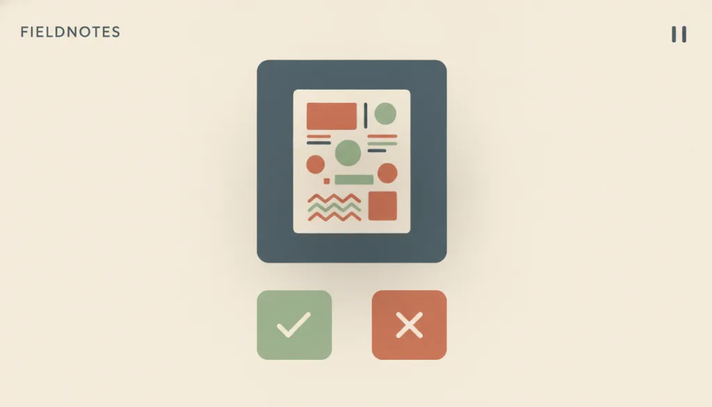
An explicit pause point set into an automated or agentic process: the system stops before taking an action with real consequences and hands the decision to continue to a person; the action only takes effect once that person approves it.
Why it is in this edition: Covers the checkpoint where a system stops and asks before doing something consequential, kept separate from autonomy as a philosophical position.
Not to be confused with: This is a concrete interaction mechanism, distinct from the philosophy-level question of whether human autonomy should be preserved at all — that is a design-goal tradeoff, while this entry only covers how the interface implements the decision point once preserving human control has already been decided. It is also not the same as a modal dialog: a modal dialog is just one blocking presentation form that anything requiring the person to deal with it first can use (such as collecting required information), and it does not inherently carry an 'approval' meaning; a checkpoint can be presented through a modal dialog, or through a non-blocking form such as a to-do item that only takes effect once clicked. Nor is it the same as the error-prevention principle: error prevention is about reducing the likelihood that mistakes happen at all, while a human approval checkpoint is only one concrete mechanism for realizing error prevention — introducing human judgment before an action takes effect — not the principle itself.
Undo and Redo
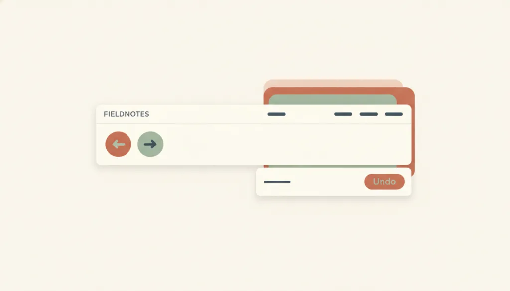
Records completed actions in a command history so people can step back through recent changes or reapply a change that was stepped back from; undo targets actions that were already committed and took effect, not actions still in progress.
Why it is in this edition: Carries more weight in the annual context: changes made automatically also need to be reversible.
Not to be confused with: Undo and redo is the interaction-level realization of the user-control-and-freedom principle in editing contexts, not the principle itself: the principle calls for a clear exit, and undo/redo is one such exit among several. It differs from cancel, which abandons an action that has not yet completed (an upload in progress, a form not yet submitted); undo addresses actions that have already completed and taken effect. It also differs from error prevention, which intercepts or requires confirmation before an action happens, while undo/redo offers a way back after the action happens. An undo toast is one presentation of undo, not undo itself; a toast alone with no toolbar or menu entry is not a complete implementation.
Source Inspection
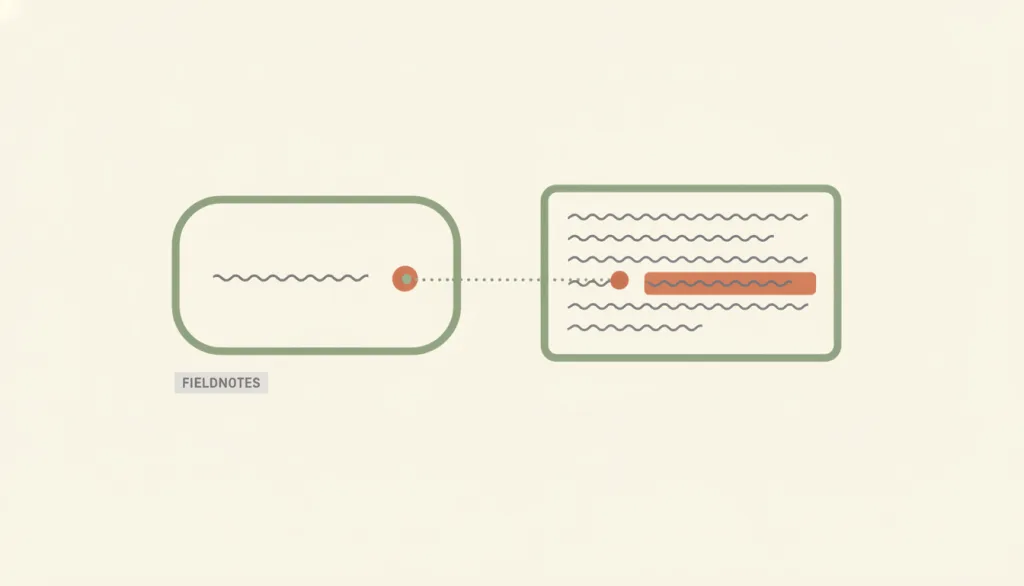
Check what a specific claim in generated content is based on: open the cited source, see the passage that supports the claim in its original context, and judge whether that passage actually supports the claim.
Why it is in this edition: Covers checking the grounding of one specific claim — a narrower goal than disclosure in general.
Not to be confused with: Source inspection is a more specific use of progressive disclosure applied to verification: progressive disclosure decides whether to reveal more content at all, while source inspection decides whether the passage revealed can actually support a specific claim. Hover cards and side panels are presentation variants of it, not separate patterns. It also differs from explainability, which answers why the system produced this result — what inputs it used, what reasoning path it followed. Source inspection is about whether the cited external source itself exists and whether its content matches the quoted passage. A system can offer an explanation with no checkable source, and it can also show citation-styled markers it never actually verified against the claim — neither counts as completed source inspection.
Contextual Actions
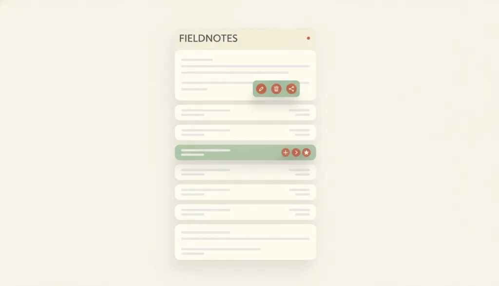
Actions offered on or next to a specific object, applying only to that object, that appear when the user selects, hovers, focuses, or long-presses it — commonly shown as a context menu, row-level action buttons, or a floating toolbar.
Why it is in this edition: In the annual context it is how an action gets bound back to one specific passage of generated content.
Not to be confused with: Context menus, row action buttons, and floating toolbars are presentation variants of the same concept, not separate patterns: the test is whether the actions apply only to the selected or pointed-at object and appear on selection, hover, focus, or long-press. It differs from inline edit, which switches to an editing control in place and changes the content itself, while contextual actions only expose action entry points that may navigate, open a confirmation, or trigger inline edit. It also differs from batch actions, which apply to a multi-selection — batch actions has no entry of its own yet and is mentioned here only to draw the line.
Command Palette
A search-box overlay invoked by a keyboard shortcut: typing a word fuzzy-matches commands, jumpable objects, and settings and runs them directly, layered on top of the visible menus as a keyboard accelerator.
Why it is in this edition: Appears in the annual context as the keyboard counterpart to a natural-language entrance; annual evidence for it is thin.
Not to be confused with: A command palette is an accelerator layered on top of the visible interface, not the only route to a function: every command reachable in the palette must also be reachable through a menu, button, or other visible path, or usability ends up resting on recall rather than recognition — which is exactly its tension with Recognition Rather Than Recall. It differs from search and filter, which narrows a set of content for browsing and comparison, whereas a command palette finds and runs a single action. It borrows a modal dialog's overlay and focus capture in form, but its purpose is invoking commands, not collecting information needed to continue or preventing an irreversible error.
Batch Actions
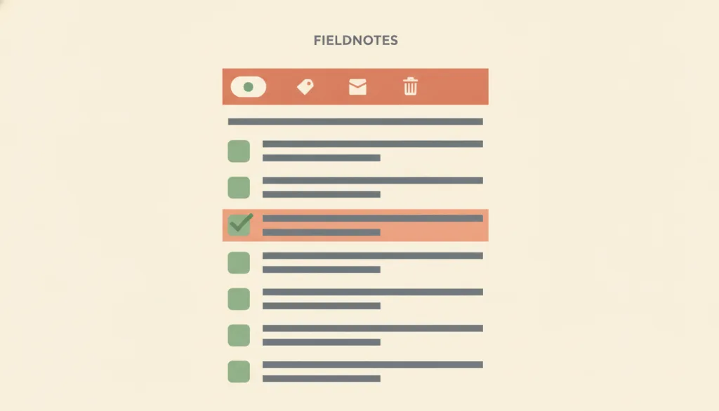
Lets the user check several objects first, then use one shared action entry point to apply the same action to the whole selection — usually shown as an action toolbar or menu that appears alongside the selection, instead of triggering the same action once per object.
Why it is in this edition: In the annual context it corresponds to handling batches of automatic results at once; annual evidence for it is thin.
Not to be confused with: Batch actions differ from contextual actions in granularity: contextual actions apply only to the single object the user currently selects or points at, and its entry point appears when that one object is targeted. Batch actions apply to a group of objects the user has checked beforehand, and its entry point appears whenever at least one item is selected, not when one object is pointed at. It also differs from inline edit — inline edit changes the content of a single field in place, while batch actions repeat one discrete action (archive, tag, delete) across several objects without changing how any single field is edited.
How this pairs with the other edition
Against the classic foundation edition, this one assumes a system that initiates actions. An entry in both lists is an older pattern now used to constrain new behaviour.
Evidence scope
Vendor design guidance shows an arrangement is recommended, not that it has become convention; preprint studies have not been peer reviewed. Neither is evidence of adoption.