EDITORIAL LIST / ONE LIST
2026 Trending UX Principles: Top 9 Design Principles in 2026
9 entries · fewer than 10 seats; positions without verifiable evidence are left open
This edition records the principle questions this edition was following in 2026, concentrated in three places: whether a result can be checked, whether trust in a system matches its actual reliability, and whether information holds across perceptual channels.
Selection criteria
- A verifiable specification, industry outlook, or study discussed it around 2026.
- It lands on something checkable rather than a statement of values.
- Its difference from existing principles in the category is statable.
Seats in this edition
Positions marked “Editorially reconstructed seat” were filled by editorial judgement in this repository; every other seat comes from the list ledger in plan issue #1.
Visibility of System Status
A system should always keep users informed about what is going on, through appropriate feedback within a reasonable time; this is the first of Nielsen's ten usability heuristics.
Why it is in this edition: When a system acts on its own, the load this principle carries grows noticeably.
Not to be confused with: This is a principle, not a concrete mechanism: the determinate progress bar, indeterminate progress, status message, and pressed-state feedback are all concrete realizations of it in different situations. It cares about whether state is communicated, not about how fast the system actually runs — being faster is a performance concern, outside this entry's scope.
Consistency and Standards
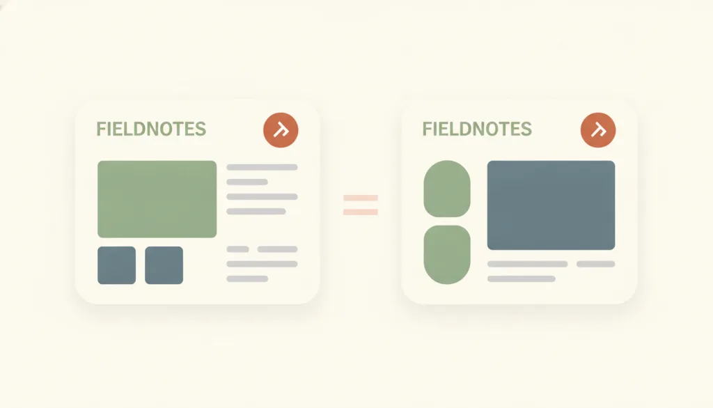
Users should not have to wonder whether different words, situations, or actions mean the same thing; a product should follow platform and industry conventions. Consistency splits into internal consistency (uniformity within one product or product family) and external consistency (following conventions established in the industry or on the web at large), and together they lower learning cost and cognitive load.
Why it is in this edition: In the annual context, natural-language entrances make it harder to guarantee that the same wording means the same thing.
Not to be confused with: Consistency and recognition-rather-than-recall support each other but are not the same principle: recognition is about whether information is visible, consistency is about whether the same meaning always appears in the same form. Consistency is not uniformity either: elements with different meanings should be deliberately and visibly different, and that difference is part of consistency (see similarity). It does not ask every product to look alike, only that the same function be identified and placed the same way everywhere.
Error Prevention

Good error messages matter, but a better design stops the problem before it happens: it eliminates error-prone conditions, or checks for them and offers a confirmation before the user commits. Errors split into unconscious slips and mistakes rooted in a wrong mental model, and the two need different prevention tactics.
Why it is in this edition: In the annual context it corresponds to stopping an automatic action before it takes effect.
Not to be confused with: Error prevention is about design before an error occurs. It is not error messages and recovery (Nielsen's ninth heuristic); inline validation is only one realization of it, not the principle itself; and it does not call for a confirmation on every action.
User Control and Freedom
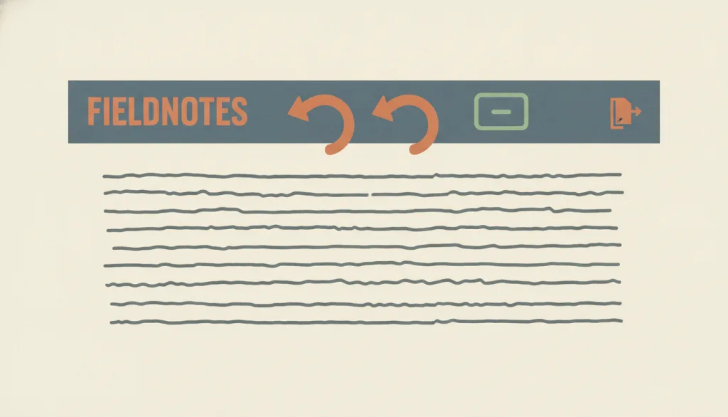
Users often act by mistake, so they need a clearly marked "emergency exit" that lets them leave an unwanted state without going through an extended process, plus support for undo and redo. Being able to get out of trouble easily gives people the confidence to explore, which supports learning and feature discovery.
Why it is in this edition: In the annual context it corresponds to a person being able to stop and undo what a system has already done.
Not to be confused with: User control and freedom is about whether the user can leave or reverse at any time; it is Nielsen's third heuristic. It is related to calm technology (respecting attention), but that principle concerns the intensity of information presentation rather than exit routes. Undo/redo is one realization of it and has no separate entry yet; obstruction is its direct violation. It is not error prevention: this principle handles mistakes after they happen, error prevention handles them before.
Contrast and Legibility
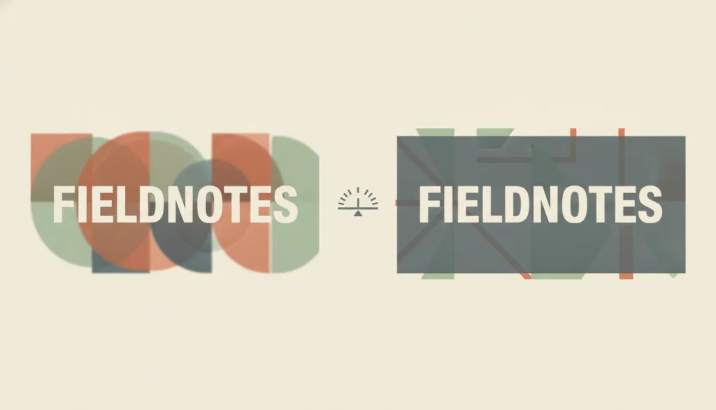
Body text must reach a specified minimum contrast against its background, and interface control boundaries and state indicators must reach a separate, lower minimum contrast; this is a measurable pass/fail check, not the name of a visual style.
Why it is in this edition: Adds something you can check numerically, and makes clear that low contrast is a measurable problem, not the name of a style.
Not to be confused with: Figure-ground describes the perceptual mechanism by which the eye separates a foreground from its background. This entry is the quantified check for whether that separation is "clear enough" — using a contrast-ratio number to decide whether text and controls can actually be read. The two address different questions and can apply at the same time. Low contrast is not shorthand for any one visual style: glassmorphism, minimalism, flat design, maximalism, and Memphis can all produce low contrast when implemented carelessly, and the fix is to bring that style's text and controls up to the measured threshold, not to abandon the style.
Cognitive Load
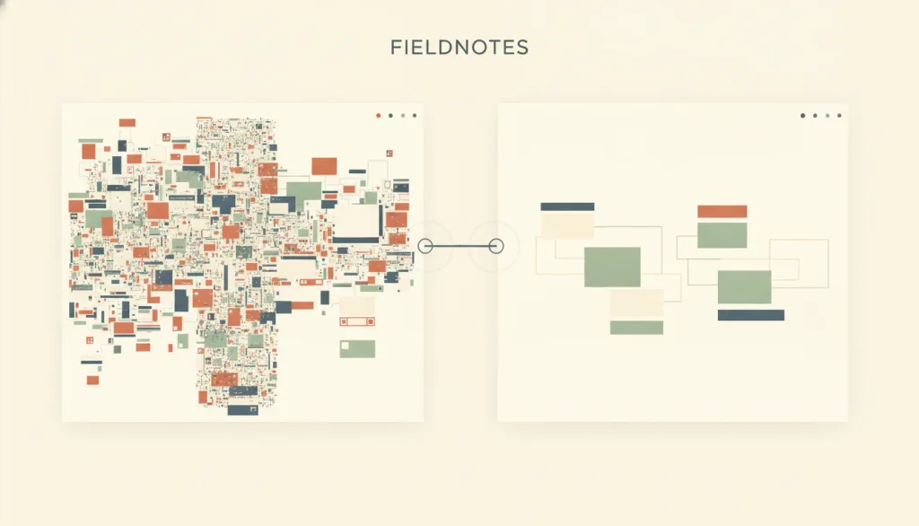
Cognitive load is the total mental effort a task places on working memory. Intrinsic load comes from the complexity inherent to the task itself; extraneous load comes from how the interface presents that task. Design can mainly reduce the extraneous part.
Why it is in this edition: Adds a frame for where load comes from and which part design can reduce.
Not to be confused with: Cognitive load is a general concept of mental effort, not a synonym for recognition rather than recall — the latter is one concrete mechanism for lowering load (specifically the memory-retrieval part), not the concept itself. This entry also does not treat "7±2" as a design rule for menu length or similar option counts: that number describes short-term memory's capacity for unrelated recalled items, while menus and similar choices rely on recognition rather than recall, so the number cannot be applied directly as a cap on option count.
Trust Calibration

When a system's signals about its own capability and limits match its actual reliability, the user's trust matches it too: they neither accept output blindly where the system tends to be wrong, nor doubt it needlessly where it tends to be right. Trust calibration is about the correspondence between confidence signals and real performance, not about making people trust the system more overall.
Why it is in this edition: Covers matching trust to actual reliability, and makes explicit that the goal is not to maximise trust.
Not to be confused with: The goal of trust calibration is to make trust match the system's actual capability, not to maximize trust; over-trust (accepting a wrong output that should have been questioned) and under-trust (ignoring a correct output that could have been used) are both calibration failures, and neither is worse than the other. It concerns the correspondence between confidence signals and real accuracy, distinct from "explainability" — which concerns why the system produced a given result and what reasoning it used, a separate entry not yet written; this entry only mentions it without drawing out the comparison.
Explainability

The system shows why it produced a given result using evidence the user can check, and states just as clearly when that result is unreliable; this covers only what a user can see and understand about a result, not model interpretability as an engineering discipline.
Why it is in this edition: Covers giving reasons and limits a person can check; this is not the same as making an interface recognisable.
Not to be confused with: Explainability is about whether the system's basis and known failure modes are both stated clearly. That differs from Recognition Rather Than Recall, which is about whether options and actions are visible so people don't need to remember them, not about a result's underlying basis. It also differs from Trust Calibration, which measures whether confidence signals match real accuracy; explainability supplies one raw material for that calibration, but an explanation on its own, however coherent, does not prove a result is correct: an explanation can raise a user's confidence without raising accuracy, and the two must be judged separately.
Perceivable Alternatives
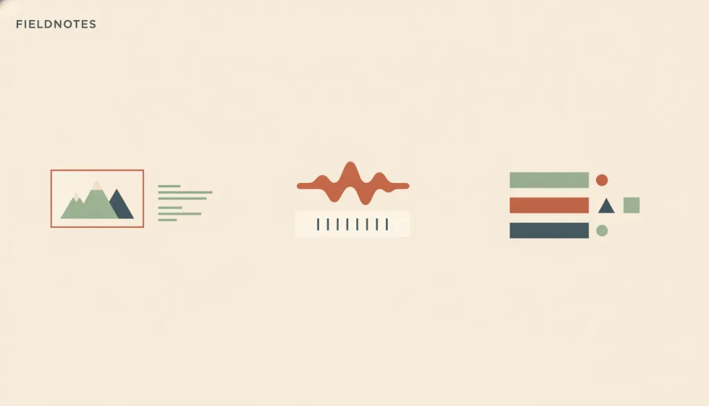
Information conveyed through one perceptual channel — a visual image, sound, or color — must also be available through at least one other channel a person can perceive: images get a text alternative serving the equivalent purpose, audio/video gets captions or a transcript, and any state distinguished only by color also gets a visible text, pattern, or shape marker.
Why it is in this edition: Covers providing equivalents per perceptual channel — more specific and more checkable than inclusive design as a whole.
Not to be confused with: This entry is more specific than inclusive design: inclusive design is the overall stance of identifying exclusion and offering adapted paths for different groups, while this entry covers only the operational question of how information carried in one sensory channel gets an equivalent form in another — it does not restate inclusive design's methodology. It is also not a new visual style; it adds alternative presentations by perceptual channel and does not change the existing visual design language. Universal design's "perceptible information" principle is the higher-level philosophical stance explaining why key information should be perceivable through redundant channels; this entry is that stance's executable rule set for images, audio/video, and color.
How this pairs with the other edition
Against the classic foundation edition, this one deals more with judging automatically produced results. An entry in both lists is an older principle carrying more weight in that context.
Evidence scope
An industry outlook expresses where practitioners are looking, not proof of effect; accessibility specifications set testable minimums, not the whole of design quality.