VOCABULARY / ENTRY
Modal Dialog
modal-dialog
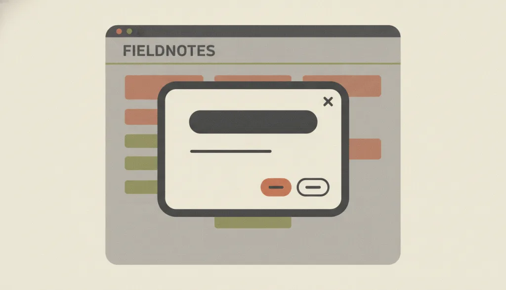
A dialog layered over the main content that moves the system into a special mode: the main content is disabled and cannot be used until the person explicitly deals with the dialog.
Recognizing it
- Content outside the dialog is obscured and cannot be operated
- Focus moves into the dialog on open, and Tab cycles only inside it
- A clear way to close, with focus returning to the trigger afterwards
Concept boundary
Not every overlay is modal. Nonmodal dialogs, popovers, and progressive-disclosure expansions let people keep working on the page. The test is whether the rest of the page stays inert until the dialog is dismissed; if the background can still be clicked or focused, do not call it modal.
When to consider it
- A critical error must be prevented before an irreversible action
- A user-initiated flow cannot continue without one essential piece of information
- A complex flow needs to be broken into small steps that must be completed in order
When to be cautious
- The content is unrelated to the person's current goal, such as newsletter promotions or nonessential notices
- People need to consult information outside the dialog to decide
- The task can be completed in place or alongside without interrupting
Tradeoff
Buys concentrated attention and error prevention at the cost of interrupting the current task; interruptions unrelated to the goal read as annoying and erode trust.
Conditional rules · Editorial advice
Related entries
Progressive disclosure lets people keep working on the page, while a modal demands handling first; secondary content is not a reason to make it modal.
Editing in place keeps the context visible, whereas a modal covers information people may need to consult.
The blocking power of a modal must not be used to pressure people; the decline option must be as clear and neutral as the confirm option.
Sources and what they support
Modal dialogs sit over the main content and put the system into a special mode that requires interaction first; they suit preventing critical errors and collecting information needed to continue, while modals unrelated to the person's goal are perceived as annoying and diminish trust.
Retrieved: 2026-09-15 · Snapshot unconfirmedWindows under a modal dialog are inert; focus moves into the dialog on open, Tab cycles inside it, Escape closes it, and focus returns to the invoking element on close; the container uses the dialog role with aria-modal.
Retrieved: 2026-09-15A dialog opened with showModal() makes the rest of the page inert and closes on Esc, whereas a nonmodal dialog opened with show() does not; an explicit close button should be provided.
Retrieved: 2026-09-15Definitions reference these sources. Digital specimens, selection advice, relationships, and recipes are editorial work and have not been validated through user research.
Type extensions and implementation notes
This entry has no operable specimen yet; the illustration is an editorial sketch, and focus management and keyboard access must be verified when applied to a product.
{
  "states": [
    "closed",
    "open",
    "confirmed",
    "dismissed"
  ],
  "a11y": [
    "The container uses the dialog role, is marked modal, and has an accessible title",
    "Focus enters the dialog on open and returns to the trigger on close",
    "Both Escape and an explicit close control can close it"
  ],
  "motion": "Backdrop and entrance animation can be omitted; show immediately under reduced-motion preference"
}
Full Agent entry JSON
{
  "id": "modal-dialog",
  "type": "interaction",
  "name": {
    "zh": "模态对话框",
    "en": "Modal Dialog"
  },
  "aliases": [
    "模态窗口",
    "弹窗",
    "模态框",
    "modal"
  ],
  "granularity": "component",
  "intents": [
    "confirm-action",
    "focus-task"
  ],
  "tags": [
    "dialog",
    "confirmation",
    "interruption",
    "focus",
    "overlay"
  ],
  "definition": "A dialog layered over the main content that moves the system into a special mode: the main content is disabled and cannot be used until the person explicitly deals with the dialog.",
  "boundary": "Not every overlay is modal. Nonmodal dialogs, popovers, and progressive-disclosure expansions let people keep working on the page. The test is whether the rest of the page stays inert until the dialog is dismissed; if the background can still be clicked or focused, do not call it modal.",
  "signature": [
    "Content outside the dialog is obscured and cannot be operated",
    "Focus moves into the dialog on open, and Tab cycles only inside it",
    "A clear way to close, with focus returning to the trigger afterwards"
  ],
  "when": [
    "A critical error must be prevented before an irreversible action",
    "A user-initiated flow cannot continue without one essential piece of information",
    "A complex flow needs to be broken into small steps that must be completed in order"
  ],
  "when_not": [
    "The content is unrelated to the person's current goal, such as newsletter promotions or nonessential notices",
    "People need to consult information outside the dialog to decide",
    "The task can be completed in place or alongside without interrupting"
  ],
  "tradeoff": "Buys concentrated attention and error prevention at the cost of interrupting the current task; interruptions unrelated to the goal read as annoying and erode trust.",
  "comparison": {
    "focus": "Making people handle one thing before continuing",
    "mechanism": "Obscuring and disabling the main content so interaction is confined to the dialog",
    "cost": "Breaking the task flow, plus the responsibility of implementing focus management and an exit route"
  },
  "sources": [
    {
      "id": "nng-modal-nonmodal",
      "title": "NN/g · Modal & Nonmodal Dialogs: When (& When Not) to Use Them",
      "url": "https://www.nngroup.com/articles/modal-nonmodal-dialog/",
      "claim": "Modal dialogs sit over the main content and put the system into a special mode that requires interaction first; they suit preventing critical errors and collecting information needed to continue, while modals unrelated to the person's goal are perceived as annoying and diminish trust.",
      "checkedAt": "2026-09-15",
      "archive": {
        "lookupUrl": "https://web.archive.org/web/20260915*/https://www.nngroup.com/articles/modal-nonmodal-dialog/",
        "status": "unconfirmed",
        "checkedAt": "2026-09-15T18:05:14.105Z",
        "error": "status-request-failed",
        "jobId": "spn2-42b9d1bde63dee38bec054ca6b77099df0a12208"
      }
    },
    {
      "id": "apg-dialog-modal",
      "title": "WAI-ARIA APG · Dialog (Modal) Pattern",
      "url": "https://www.w3.org/WAI/ARIA/apg/patterns/dialog-modal/",
      "claim": "Windows under a modal dialog are inert; focus moves into the dialog on open, Tab cycles inside it, Escape closes it, and focus returns to the invoking element on close; the container uses the dialog role with aria-modal.",
      "checkedAt": "2026-09-15",
      "archive": {
        "lookupUrl": "https://web.archive.org/web/20260915*/https://www.w3.org/WAI/ARIA/apg/patterns/dialog-modal/",
        "status": "available",
        "checkedAt": "2026-09-15T18:05:58.794Z",
        "jobId": "spn2-399060bd1635b97ac2d04c6443f46faf4dc5b8ed",
        "url": "https://web.archive.org/web/20260915180710/https://www.w3.org/WAI/ARIA/apg/patterns/dialog-modal/",
        "timestamp": "20260915180710"
      }
    },
    {
      "id": "mdn-dialog",
      "title": "MDN · <dialog>: The Dialog element",
      "url": "https://developer.mozilla.org/en-US/docs/Web/HTML/Element/dialog",
      "claim": "A dialog opened with showModal() makes the rest of the page inert and closes on Esc, whereas a nonmodal dialog opened with show() does not; an explicit close button should be provided.",
      "checkedAt": "2026-09-15",
      "archive": {
        "lookupUrl": "https://web.archive.org/web/20260915*/https://developer.mozilla.org/en-US/docs/Web/HTML/Element/dialog",
        "status": "available",
        "checkedAt": "2026-09-15T18:05:59.233Z",
        "jobId": "spn2-b4866376b185c337617d6b9f564715f6bc7d624c",
        "url": "https://web.archive.org/web/20260915180623/https://developer.mozilla.org/en-US/docs/Web/HTML/Reference/Elements/dialog",
        "timestamp": "20260915180623"
      }
    }
  ],
  "relations": [
    {
      "target": "progressive-disclosure",
      "kind": "related",
      "condition": "Only expanding secondary content without needing to block the page",
      "reason": "Progressive disclosure lets people keep working on the page, while a modal demands handling first; secondary content is not a reason to make it modal.",
      "basis": "editorial"
    },
    {
      "target": "inline-edit",
      "kind": "alternative",
      "condition": "Editing a short field where nearby content is useful context",
      "reason": "Editing in place keeps the context visible, whereas a modal covers information people may need to consult.",
      "basis": "editorial"
    },
    {
      "target": "confirmshaming",
      "kind": "misused_as",
      "condition": "Blocking people from leaving with a shaming decline option",
      "reason": "The blocking power of a modal must not be used to pressure people; the decline option must be as clear and neutral as the confirm option.",
      "basis": "editorial"
    }
  ],
  "rules": [
    {
      "when": "The dialog opens",
      "instruction": "Move focus into the dialog and keep the Tab cycle inside it; return focus to the triggering element on close.",
      "strength": "must",
      "basis": "editorial"
    },
    {
      "when": "People want to abandon the current dialog",
      "instruction": "Provide an explicit close or cancel control and support closing with Escape.",
      "strength": "must",
      "basis": "editorial"
    },
    {
      "when": "The dialog holds unsubmitted input",
      "instruction": "Clicking the backdrop should not silently discard the input; confirm first or close only through buttons.",
      "strength": "recommend",
      "basis": "editorial"
    }
  ],
  "behavior": {
    "states": [
      "closed",
      "open",
      "confirmed",
      "dismissed"
    ],
    "a11y": [
      "The container uses the dialog role, is marked modal, and has an accessible title",
      "Focus enters the dialog on open and returns to the trigger on close",
      "Both Escape and an explicit close control can close it"
    ],
    "motion": "Backdrop and entrance animation can be omitted; show immediately under reduced-motion preference"
  },
  "demo": null,
  "version": "0.1.0",
  "editorialStatus": "drafted",
  "requirements": [],
  "demoCapabilities": [],
  "implementationNote": "This entry has no operable specimen yet; the illustration is an editorial sketch, and focus management and keyboard access must be verified when applied to a product.",
  "image": {
    "src": "/images/modal-dialog.webp",
    "alt": "A fictional FIELDNOTES app screen dimmed by a backdrop, with a centered dialog card showing a title, one line of body text, primary and secondary buttons, and a close control."
  },
  "searchTerms": [
    "对话框",
    "确认",
    "打断",
    "焦点",
    "遮罩"
  ]
}