VOCABULARY / ENTRY
Single-Column Layout
single-column
Arrange page content and form fields top to bottom in one column so attention moves in a single direction; form research finds single-column forms produce fewer skipped fields, misread fields, and errors than multi-column forms.
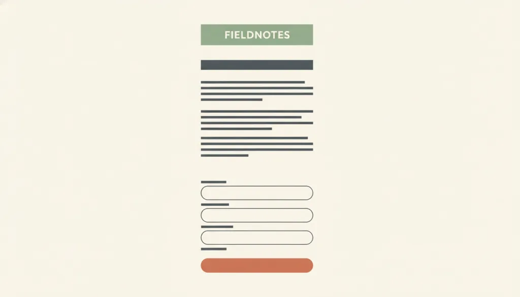
Recognizing it
- One centered content column whose side margins change with width while the content never reflows into columns
- Headings, paragraphs, fields, and buttons stacked top to bottom in one order
- Form labels sit directly above their fields, with the primary button at the end of the column
Concept boundary
A deliberately chosen one-column reading or task page structure, such as an article, a form, or a mobile-first page; not the single column that a master-detail layout collapses into on narrow screens. It also differs from a step-by-step linear flow: a wizard is a flow, while single-column is the page structure carrying each step. A few short fields that logically form one entity (such as city and postcode) sharing a row still counts as a single-column form.
When to consider it
- Long-form reading, explanatory pages, or documentation that needs a steady reading rhythm
- Checkout, sign-up, or application forms filled in field by field
- Mobile-first pages, or one template that must be reused across screen widths
When to be cautious
- People need to compare several items or fields side by side; a table, master-detail, or grid works better
- Content has a clear primary-secondary hierarchy and needs an at-a-glance overview; consider a Bento grid
- Unrelated modules from a wide screen are merely stacked on a narrow one without re-prioritizing them
Tradeoff
Reading and completion paths are clear and one structure serves wide and narrow screens; but pages grow long and depend on headings, grouping, and anchors to stay scannable, and on wide screens an unconstrained column produces lines too long to read comfortably.
Conditional rules · Editorial advice
Related entries
Master-detail relies on a list linked to a detail view, and it remains master-detail when collapsed to one column on narrow screens; single-column organizes content sequentially from the start.
Labels next to their fields and related fields grouped together depend on the law of proximity; otherwise a single column degrades into a string of evenly spaced fragments.
Bento expresses hierarchy and parallel items through block size; single-column expresses order through sequence and white space.
Sources and what they support
Reports from multiple rounds of usability testing that single-column forms produce fewer skipped fields, misread fields, and errors than multi-column forms; multiple columns draw attention in several directions; and 2-3 fields that logically belong to one entity (such as dates or city/state/ZIP) can share a row without causing problems.
Retrieved: 2026-09-15Recommends keeping forms in a single column because multiple columns interrupt the vertical momentum of moving down the form; labels should be close to their fields, placed immediately above them for mobile and shorter desktop forms, and only short, related fields such as city, state, and ZIP code should share a row.
Retrieved: 2026-09-15States that about 50-75 characters per line is comfortable for body text and cites WCAG 1.4.8's limit of 80 characters per line; lines that are too wide make it hard to find where a line starts and ends, lines that are too narrow force frequent returns that break rhythm; suggests a max-width of around 70ch or 34em.
Retrieved: 2026-09-15Definitions reference these sources. Digital specimens, selection advice, relationships, and recipes are editorial work and have not been validated through user research.
Type extensions and implementation notes
No operable specimen yet; the illustration is an editorial sketch. When applied to a product, still verify the actual line length on wide screens, that fields are truly single-column with correctly associated labels, that heading levels and anchors keep a long page scannable, and that the narrow-screen stacking order has been re-prioritized by task.
{
  "states": [
    "narrow",
    "wide-with-margins"
  ],
  "a11y": [
    "DOM order is the reading order, and heading levels support skipping through the page",
    "Every field has a visible, programmatically associated label"
  ],
  "motion": "None"
}
Full Agent entry JSON
{
  "id": "single-column",
  "type": "layout",
  "name": {
    "zh": "单列布局",
    "en": "Single-Column Layout"
  },
  "aliases": [
    "单栏布局",
    "One-Column Layout",
    "Single Column"
  ],
  "granularity": "page",
  "intents": [
    "organize-content",
    "read-content"
  ],
  "tags": [
    "single column",
    "reading",
    "forms",
    "mobile-first",
    "layout"
  ],
  "definition": "Arrange page content and form fields top to bottom in one column so attention moves in a single direction; form research finds single-column forms produce fewer skipped fields, misread fields, and errors than multi-column forms.",
  "boundary": "A deliberately chosen one-column reading or task page structure, such as an article, a form, or a mobile-first page; not the single column that a master-detail layout collapses into on narrow screens. It also differs from a step-by-step linear flow: a wizard is a flow, while single-column is the page structure carrying each step. A few short fields that logically form one entity (such as city and postcode) sharing a row still counts as a single-column form.",
  "signature": [
    "One centered content column whose side margins change with width while the content never reflows into columns",
    "Headings, paragraphs, fields, and buttons stacked top to bottom in one order",
    "Form labels sit directly above their fields, with the primary button at the end of the column"
  ],
  "when": [
    "Long-form reading, explanatory pages, or documentation that needs a steady reading rhythm",
    "Checkout, sign-up, or application forms filled in field by field",
    "Mobile-first pages, or one template that must be reused across screen widths"
  ],
  "when_not": [
    "People need to compare several items or fields side by side; a table, master-detail, or grid works better",
    "Content has a clear primary-secondary hierarchy and needs an at-a-glance overview; consider a Bento grid",
    "Unrelated modules from a wide screen are merely stacked on a narrow one without re-prioritizing them"
  ],
  "tradeoff": "Reading and completion paths are clear and one structure serves wide and narrow screens; but pages grow long and depend on headings, grouping, and anchors to stay scannable, and on wide screens an unconstrained column produces lines too long to read comfortably.",
  "comparison": {
    "focus": "Keeping reading or form completion moving in one direction",
    "mechanism": "One content column with a constrained width",
    "cost": "Longer pages; line length must be limited and internal grouping maintained"
  },
  "sources": [
    {
      "id": "single-column-baymard-forms",
      "title": "Baymard Institute · Avoid Multi-Column Layouts for Checkout Forms",
      "url": "https://baymard.com/blog/avoid-multi-column-forms",
      "claim": "Reports from multiple rounds of usability testing that single-column forms produce fewer skipped fields, misread fields, and errors than multi-column forms; multiple columns draw attention in several directions; and 2-3 fields that logically belong to one entity (such as dates or city/state/ZIP) can share a row without causing problems.",
      "checkedAt": "2026-09-15",
      "archive": {
        "lookupUrl": "https://web.archive.org/web/20260915*/https://baymard.com/blog/avoid-multi-column-forms",
        "status": "available",
        "checkedAt": "2026-09-15T18:30:00.883Z",
        "jobId": "spn2-e536ba729fd025f76ee2741ee0c7b4adcce4ef1d",
        "url": "https://web.archive.org/web/20260915183153/https://baymard.com/blog/avoid-multi-column-forms",
        "timestamp": "20260915183153"
      }
    },
    {
      "id": "single-column-nng-forms",
      "title": "Nielsen Norman Group · Website Forms Usability: Top 10 Recommendations",
      "url": "https://www.nngroup.com/articles/web-form-design/",
      "claim": "Recommends keeping forms in a single column because multiple columns interrupt the vertical momentum of moving down the form; labels should be close to their fields, placed immediately above them for mobile and shorter desktop forms, and only short, related fields such as city, state, and ZIP code should share a row.",
      "checkedAt": "2026-09-15",
      "archive": {
        "lookupUrl": "https://web.archive.org/web/20260915*/https://www.nngroup.com/articles/web-form-design/",
        "status": "available",
        "checkedAt": "2026-09-15T18:30:44.112Z",
        "jobId": "spn2-6fbac744d7c1e3fe83dcaa4b7fea006f37525eb1",
        "url": "https://web.archive.org/web/20260915183306/https://www.nngroup.com/articles/web-form-design/",
        "timestamp": "20260915183306"
      }
    },
    {
      "id": "single-column-baymard-line-length",
      "title": "Baymard Institute · Readability: The Optimal Line Length",
      "url": "https://baymard.com/blog/line-length-readability",
      "claim": "States that about 50-75 characters per line is comfortable for body text and cites WCAG 1.4.8's limit of 80 characters per line; lines that are too wide make it hard to find where a line starts and ends, lines that are too narrow force frequent returns that break rhythm; suggests a max-width of around 70ch or 34em.",
      "checkedAt": "2026-09-15",
      "archive": {
        "lookupUrl": "https://web.archive.org/web/20260915*/https://baymard.com/blog/line-length-readability",
        "status": "available",
        "checkedAt": "2026-09-15T18:30:46.871Z",
        "jobId": "spn2-b5f16cdb5afcd12cc6585cba9a2f891754d04092",
        "url": "https://web.archive.org/web/20260915183224/https://baymard.com/blog/line-length-readability",
        "timestamp": "20260915183224"
      }
    }
  ],
  "relations": [
    {
      "target": "master-detail",
      "kind": "alternative",
      "condition": "Deciding whether a page is for inspecting items one by one or for reading and filling in sequence",
      "reason": "Master-detail relies on a list linked to a detail view, and it remains master-detail when collapsed to one column on narrow screens; single-column organizes content sequentially from the start.",
      "basis": "editorial"
    },
    {
      "target": "proximity",
      "kind": "informs",
      "condition": "Arranging labels, fields, and groups within a long single column",
      "reason": "Labels next to their fields and related fields grouped together depend on the law of proximity; otherwise a single column degrades into a string of evenly spaced fragments.",
      "basis": "editorial"
    },
    {
      "target": "bento",
      "kind": "alternative",
      "condition": "Content needs an at-a-glance overview rather than sequential reading",
      "reason": "Bento expresses hierarchy and parallel items through block size; single-column expresses order through sequence and white space.",
      "basis": "editorial"
    }
  ],
  "rules": [
    {
      "when": "The column contains body paragraphs",
      "instruction": "Constrain the column width so body text runs roughly 50-75 characters per line (no more than 80), for example with a max-width of about 70ch.",
      "strength": "recommend",
      "basis": "editorial"
    },
    {
      "when": "The page is a form filled in field by field",
      "instruction": "Keep fields in one column with labels directly above them; let only short fields that logically form one entity share a row.",
      "strength": "recommend",
      "basis": "editorial"
    },
    {
      "when": "A multi-column page on wide screens becomes single-column on narrow screens",
      "instruction": "Re-order and prune modules by task; do not stack unrelated modules as-is just because the viewport is narrow.",
      "strength": "recommend",
      "basis": "editorial"
    }
  ],
  "behavior": {
    "states": [
      "narrow",
      "wide-with-margins"
    ],
    "a11y": [
      "DOM order is the reading order, and heading levels support skipping through the page",
      "Every field has a visible, programmatically associated label"
    ],
    "motion": "None"
  },
  "demo": null,
  "version": "0.1.0",
  "editorialStatus": "drafted",
  "requirements": [],
  "demoCapabilities": [],
  "implementationNote": "No operable specimen yet; the illustration is an editorial sketch. When applied to a product, still verify the actual line length on wide screens, that fields are truly single-column with correctly associated labels, that heading levels and anchors keep a long page scannable, and that the narrow-screen stacking order has been re-prioritized by task.",
  "image": {
    "src": "/images/single-column.webp",
    "alt": "A fictional FIELDNOTES article-and-form page laid out as one centered column: a heading, a few paragraphs, stacked form fields, and one button, with generous margins on both sides."
  },
  "searchTerms": [
    "单列",
    "阅读",
    "表单",
    "移动优先",
    "布局"
  ]
}