VOCABULARY / ENTRY
Card Grid
card-grid
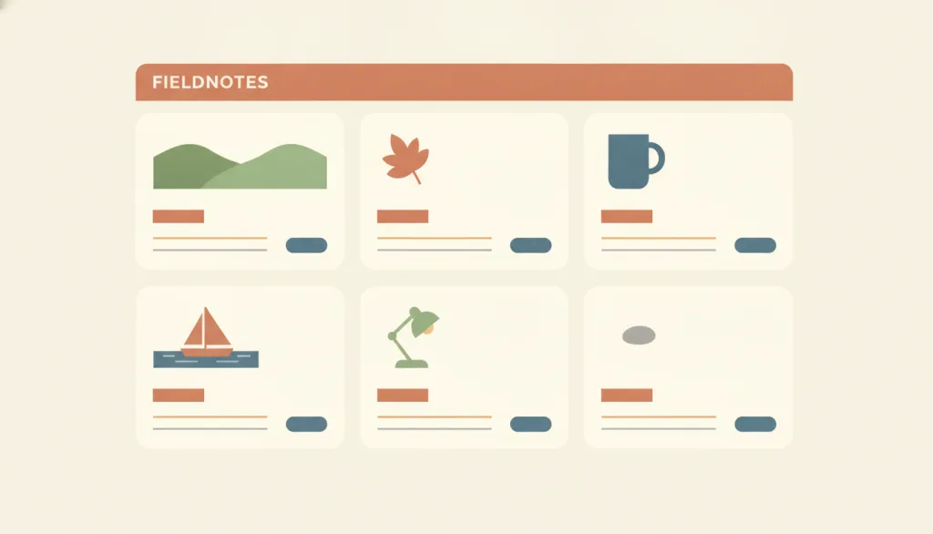
Arrange a set of identically structured cards in a repeating row-and-column grid, where each card represents one content unit that can be opened and typically combines an image, a title, a summary, and an action.
Recognizing it
- A repeating row-and-column grid whose column count changes with width
- Every card shares one structure: image area, title, short text, action
- Each card maps to one content unit the user can enter
Concept boundary
This is a page-level layout, not the card component itself. Unlike a Bento grid, the cards are homogeneous and usually the same size; hierarchy is not created through block size. Cards with differing structures or unpredictable field positions lose their scannability.
When to consider it
- Browsing a set of parallel, same-type items recognized by image or title, such as works, products, or articles
- Each item needs an image-and-text summary together with its entry point
- The number of items grows with content and needs automatic wrapping and a responsive column count
When to be cautious
- Users need to compare many items field by field; a table or vertical list is easier to scan
- Content needs a clear primary-secondary hierarchy; consider a Bento grid or master-detail instead
- Items are a single line of text with no image; the card container only adds noise
Tradeoff
Image and text side by side aid recognition and browsing, but compared with a list, card positions are less predictable for the eye, and inconsistent internal structure makes comparison harder. Whole-card clicks and secondary actions inside the card require deliberate focus and click-target handling.
Conditional rules · Editorial advice
Related entries
Bento expresses hierarchy through varied block sizes; a card grid expresses parallel items through homogeneous cards.
The card grid can serve as the master list while a detail panel holds the selected item.
Homogeneous cards rely on the law of similarity so users recognize them as the same kind of item.
Sources and what they support
Defines a card as a linked container for a few related pieces of information representing one conceptual unit, and notes that card layouts are less scannable than lists and poor for comparison when card structure is unpredictable.
Retrieved: 2026-09-15Recommends one descriptive primary link per card as its focus stop, extending the click area with pseudo-content rather than wrapping the whole card in a link, and using Grid or Flexbox for equal-height cards.
Retrieved: 2026-09-15States that visual rearrangement in grid layout does not change document order or keyboard traversal order, and that grid placement may only be used for visual, not logical, reordering.
Retrieved: 2026-09-15Definitions reference these sources. Digital specimens, selection advice, relationships, and recipes are editorial work and have not been validated through user research.
Type extensions and implementation notes
No operable specimen yet; the illustration is an editorial sketch. When applied to a product, still verify that card fields are truly homogeneous, how many focus stops each card has, conflicts between whole-card clicks and secondary actions, and the reading order in a single column.
{
  "states": [
    "multi-column",
    "single-column"
  ],
  "a11y": [
    "One primary focus stop per card, with secondary actions separately focusable",
    "DOM order matches the visual reading order"
  ],
  "motion": "None"
}
Full Agent entry JSON
{
  "id": "card-grid",
  "type": "layout",
  "name": {
    "zh": "卡片网格",
    "en": "Card Grid"
  },
  "aliases": [
    "卡片流",
    "Card Layout",
    "Card Collection"
  ],
  "granularity": "page",
  "intents": [
    "overview",
    "organize-content",
    "browse-detail"
  ],
  "tags": [
    "grid",
    "cards",
    "homogeneous",
    "scannable",
    "layout"
  ],
  "definition": "Arrange a set of identically structured cards in a repeating row-and-column grid, where each card represents one content unit that can be opened and typically combines an image, a title, a summary, and an action.",
  "boundary": "This is a page-level layout, not the card component itself. Unlike a Bento grid, the cards are homogeneous and usually the same size; hierarchy is not created through block size. Cards with differing structures or unpredictable field positions lose their scannability.",
  "signature": [
    "A repeating row-and-column grid whose column count changes with width",
    "Every card shares one structure: image area, title, short text, action",
    "Each card maps to one content unit the user can enter"
  ],
  "when": [
    "Browsing a set of parallel, same-type items recognized by image or title, such as works, products, or articles",
    "Each item needs an image-and-text summary together with its entry point",
    "The number of items grows with content and needs automatic wrapping and a responsive column count"
  ],
  "when_not": [
    "Users need to compare many items field by field; a table or vertical list is easier to scan",
    "Content needs a clear primary-secondary hierarchy; consider a Bento grid or master-detail instead",
    "Items are a single line of text with no image; the card container only adds noise"
  ],
  "tradeoff": "Image and text side by side aid recognition and browsing, but compared with a list, card positions are less predictable for the eye, and inconsistent internal structure makes comparison harder. Whole-card clicks and secondary actions inside the card require deliberate focus and click-target handling.",
  "comparison": {
    "focus": "Browsing a set of same-type content units side by side",
    "mechanism": "A repeating grid and homogeneous cards",
    "cost": "Requires consistent card structure and a sensible number of keyboard focus stops"
  },
  "sources": [
    {
      "id": "card-grid-nng",
      "title": "Nielsen Norman Group · Cards: UI-Component Definition",
      "url": "https://www.nngroup.com/articles/cards-component/",
      "claim": "Defines a card as a linked container for a few related pieces of information representing one conceptual unit, and notes that card layouts are less scannable than lists and poor for comparison when card structure is unpredictable.",
      "checkedAt": "2026-09-15",
      "archive": {
        "lookupUrl": "https://web.archive.org/web/20260915*/https://www.nngroup.com/articles/cards-component/",
        "status": "available",
        "checkedAt": "2026-09-15T18:20:13.921Z",
        "jobId": "spn2-ec8dcda9b31912f63635197722e033f5da5ffae4",
        "url": "https://web.archive.org/web/20260915182038/https://www.nngroup.com/articles/cards-component/",
        "timestamp": "20260915182038"
      }
    },
    {
      "id": "card-grid-inclusive-components",
      "title": "Inclusive Components · Cards",
      "url": "https://inclusive-components.design/cards/",
      "claim": "Recommends one descriptive primary link per card as its focus stop, extending the click area with pseudo-content rather than wrapping the whole card in a link, and using Grid or Flexbox for equal-height cards.",
      "checkedAt": "2026-09-15",
      "archive": {
        "lookupUrl": "https://web.archive.org/web/20260915*/https://inclusive-components.design/cards/",
        "status": "available",
        "checkedAt": "2026-09-15T18:20:13.923Z",
        "jobId": "spn2-8c80527d9fe01765b97d02918311e726760877e2",
        "url": "https://web.archive.org/web/20260915182139/https://inclusive-components.design/cards/",
        "timestamp": "20260915182139"
      }
    },
    {
      "id": "card-grid-mdn-a11y",
      "title": "MDN · Grid layout and accessibility",
      "url": "https://developer.mozilla.org/en-US/docs/Web/CSS/CSS_grid_layout/Grid_layout_and_accessibility",
      "claim": "States that visual rearrangement in grid layout does not change document order or keyboard traversal order, and that grid placement may only be used for visual, not logical, reordering.",
      "checkedAt": "2026-09-15",
      "archive": {
        "lookupUrl": "https://web.archive.org/web/20260915*/https://developer.mozilla.org/en-US/docs/Web/CSS/CSS_grid_layout/Grid_layout_and_accessibility",
        "status": "available",
        "checkedAt": "2026-09-15T18:29:58.748Z",
        "jobId": "spn2-bf1ca2741c8446f855c995e13f036afd2ef6e6ab",
        "url": "https://web.archive.org/web/20260915183028/https://developer.mozilla.org/en-US/docs/Web/CSS/Guides/Grid_layout/Accessibility",
        "timestamp": "20260915183028"
      }
    }
  ],
  "relations": [
    {
      "target": "bento",
      "kind": "alternative",
      "condition": "Content has a clear primary-secondary hierarchy",
      "reason": "Bento expresses hierarchy through varied block sizes; a card grid expresses parallel items through homogeneous cards.",
      "basis": "editorial"
    },
    {
      "target": "master-detail",
      "kind": "composes_with",
      "condition": "Opening a card should show its detail on the same page",
      "reason": "The card grid can serve as the master list while a detail panel holds the selected item.",
      "basis": "editorial"
    },
    {
      "target": "similarity",
      "kind": "informs",
      "condition": "Deciding the visual structure of the cards",
      "reason": "Homogeneous cards rely on the law of similarity so users recognize them as the same kind of item.",
      "basis": "editorial"
    }
  ],
  "rules": [
    {
      "when": "Cards in the grid carry items of the same type",
      "instruction": "Keep the kind, order, and position of fields identical on every card so users can scan and compare item by item.",
      "strength": "must",
      "basis": "editorial"
    },
    {
      "when": "The whole card is clickable",
      "instruction": "Keep exactly one focusable primary link per card and extend the click area with styling; make secondary actions inside the card separately focusable and never nested in the primary link.",
      "strength": "must",
      "basis": "editorial"
    },
    {
      "when": "The column count changes with the viewport",
      "instruction": "Change only the visual arrangement; do not use grid placement to change the logical order of cards.",
      "strength": "recommend",
      "basis": "editorial"
    }
  ],
  "behavior": {
    "states": [
      "multi-column",
      "single-column"
    ],
    "a11y": [
      "One primary focus stop per card, with secondary actions separately focusable",
      "DOM order matches the visual reading order"
    ],
    "motion": "None"
  },
  "demo": null,
  "version": "0.1.0",
  "editorialStatus": "drafted",
  "requirements": [],
  "demoCapabilities": [],
  "implementationNote": "No operable specimen yet; the illustration is an editorial sketch. When applied to a product, still verify that card fields are truly homogeneous, how many focus stops each card has, conflicts between whole-card clicks and secondary actions, and the reading order in a single column.",
  "image": {
    "src": "/images/card-grid.webp",
    "alt": "A fictional FIELDNOTES page with six identically structured cards in three columns and two rows, each with an image area, a title bar, two lines of text, and a small action button."
  },
  "searchTerms": [
    "网格",
    "卡片",
    "同构",
    "可扫视",
    "布局"
  ]
}