VOCABULARY / ENTRY
Coach Marks
coach-marks
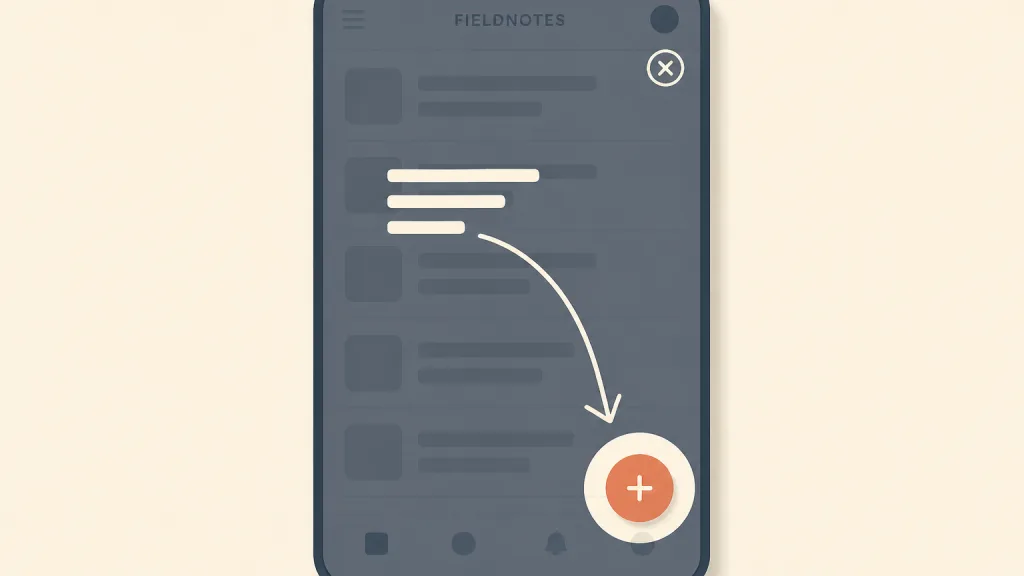
A semi-transparent layer laid over the real interface that cuts out and highlights one control or area and explains its purpose in a sentence or two with an arrow; the user dismisses the layer before going back to work in the interface.
Recognizing it
- A semi-transparent layer covers the interface, cutting out or highlighting only the target control
- A short text with an arrow or circle points directly at a real element of the interface
- The layer itself is not interactive; the interface returns only after it is dismissed
Concept boundary
A coach mark is an annotation laid over the real interface, pointing at the very control the user is looking at. It is not progressive disclosure: progressive disclosure tucks secondary content away and expands it when needed, changing how much the interface itself shows, whereas a coach mark hides and expands nothing — it only annotates a control that is already there. Nor is it an onboarding tour: a tour is a sequence of explanatory screens or steps played in order, usually all at once on first launch; a single coach mark explains one interaction, ideally just as the user is about to need it. Chain several coach marks into one continuous run and it has become a tour, with all a tour’s problems. It also differs from a tooltip, which the user triggers by hovering or focusing and which does not cover the rest of the interface.
When to consider it
- A gesture or control position is not obvious, and first-time users are likely to miss it
- The interface gains an important new feature that needs pointing out without changing the layout
- It can be triggered just as the user is about to use the feature, rather than played all at once at launch
When to be cautious
- The interface can only be understood with explanations, so the design should change rather than gain annotations
- Many things must be explained at once, and the overlays turn into a long chain of steps
- It reappears every time the screen opens, or cannot be found again once dismissed
- The annotation looks so much like a real button that users try to tap the annotation itself
Tradeoff
A coach mark can draw attention to one specific control without changing the layout; the cost is that it interrupts the user and asks them to remember the instructions before acting, and most people close it as fast as they can. The more it explains at once, the less is remembered and the more complicated the interface appears.
Conditional rules · Editorial advice
Related entries
Progressive disclosure changes how much the interface itself shows by collapsing and expanding, while a coach mark leaves the interface unchanged and annotates it; when the former lets a feature surface naturally, an extra layer of explanation is usually unnecessary.
The empty state is itself the place to explain what the page is for and offer a first action; there is no need to cover it with an overlay saying the same thing.
Users must remember the instructions before they act, and the more hints there are the harder that becomes, so explain one thing at a time.
An annotation meant to explain an interaction becomes nagging once it turns into a repeatedly interrupting promotion.
Sources and what they support
The article describes a coach mark as a UI hint, often shown on first launch, that explains part of the interface as a transparent overlay. It notes that users rarely read instructions, that showing too many hints at once strains memory, that chained hints make users dismiss them faster and make the app seem complicated, and that hints can be mistaken for interactive elements. It recommends that each tip explain a single interaction, that hints appear one at a time at the right moment, that visuals carry the message with minimal text, and that hints look visually distinct from the real interface. This entry’s definition, conditions of use and rules are paraphrased from it.
Retrieved: 2026-10-20 · Snapshot unconfirmedThe article distinguishes “push revelations” delivered at times the system chooses, such as onboarding tutorials, from contextual help (“pull revelations”) that appears when the user needs it. It argues that tutorials are often skipped and hard to recall when needed, stresses that help must be easy to dismiss and easy to find again, and recommends progressive disclosure and avoiding multistep instructions users must memorise. This entry uses it to distinguish a single coach mark from an onboarding tour and to advise showing it at the point of use and keeping it recoverable after dismissal.
Retrieved: 2026-10-20 · Snapshot unconfirmedDefinitions reference these sources. Digital specimens, selection advice, relationships, and recipes are editorial work and have not been validated through user research.
Type extensions and implementation notes
This entry has no runnable specimen; the illustration is an editorial sketch of an overlay cutting out one control with a short annotation, not a verified implementation. Before applying it to a product, test where focus goes after closing, the way to view it again, and whether the annotation is mistaken for something tappable.
{
  "states": [
    "hidden",
    "shown",
    "dismissed"
  ],
  "a11y": [
    "When the overlay appears, focus moves to its text; when it closes, focus returns to the highlighted control",
    "The explanation is read by screen readers, and the close button works from the keyboard and responds to Esc",
    "The text names the control it refers to instead of relying only on the arrow and the cut-out position"
  ],
  "motion": "A simple fade in and out is enough; respect the system’s reduced-motion setting"
}
Open the Agent JSON file for this entryThis file repeats every field of this entry verbatim and adds its sources, archive status, and editorial scope.