VOCABULARY / ENTRY
Figure–Ground
figure-ground
The eye automatically splits a scene into a focal figure and the ground that supports it; stronger contrast, size, and edge cues make that separation more stable.
Recognizing it
- The primary content or action has clearly higher contrast, size, or elevation
- Background elements have reduced contrast or are blurred to recede
- The figure has a crisp edge so viewers don't have to guess where to focus
Concept boundary
Figure-ground works through contrast, size, edge, and depth cues, a different mechanism from proximity (which groups by distance) or similarity (which groups by shared attributes); whether the actual contrast ratio is sufficient is a separate, quantitative legibility check that this entry describes only in passing and does not cover.
When to consider it
- The primary action or core content needs to be recognized as the focal point immediately
- An overlay (modal, drawer, toast) needs a clear front-to-back relationship with the main content
When to be cautious
- Using figure-ground to imply a grouping relationship that doesn't actually exist (use proximity or similarity instead)
- Using a reversible figure-ground illusion (like the classic vase/faces image) in a functional UI, leaving users unsure where to focus
Tradeoff
Stronger figure contrast speeds up focus recognition, but overusing high contrast or heavy shadows makes an interface feel heavy and can undermine the legibility of secondary content.
Conditional rules · Editorial advice
Related entries
Proximity groups by distance, while figure-ground separates foreground from background using contrast, size, and edges; the mechanisms differ but the two are often discussed together.
A dimmed backdrop is itself an application of figure-ground: it makes the overlay content the figure and pushes the original page into the ground.
Glassmorphism lets the background show through and weakens foreground-background contrast, which can conflict with the clear separation figure-ground calls for.
Sources and what they support
Users perceive interface elements that stand apart from the background as things to focus on or interact with.
Retrieved: 2026-09-15 · Archived 2026-09-16The figure-ground relationship is usually stable but can be designed to be unstable (as in the vase/faces illusion), and the principle is a distinct grouping mechanism from proximity and similarity.
Retrieved: 2026-09-15 · Snapshot unconfirmedViewers first split a composition into a figure (the focal element) and ground (what the figure rests on), reinforced by cues such as area and convexity.
Retrieved: 2026-09-15Definitions reference these sources. Digital specimens, selection advice, relationships, and recipes are editorial work and have not been validated through user research.
Type extensions and implementation notes
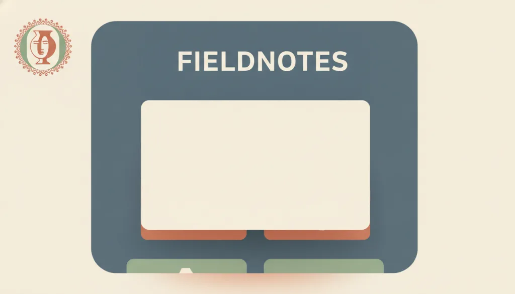
No operable specimen yet; the illustration is editorial, meant to convey the concept, and does not represent a verified implementation. Contrast, elevation cues, and accessibility behavior still need to be verified in a real interface before use in a product.
{
  "evidenceType": "A design interpretation of a Gestalt perceptual principle",
  "limit": "This entry does not measure whether a specific contrast ratio meets a legibility threshold, and does not prescribe universal pixel or color values; quantitative contrast checking is a separate topic."
}
Full Agent entry JSON
{
  "id": "figure-ground",
  "type": "principle",
  "name": {
    "zh": "图形与背景",
    "en": "Figure–Ground"
  },
  "aliases": [
    "Figure-Ground",
    "图底关系",
    "图形背景原则"
  ],
  "granularity": "component",
  "intents": [
    "organize-content",
    "reduce-complexity"
  ],
  "tags": [
    "Gestalt",
    "contrast",
    "visual hierarchy",
    "focus",
    "whitespace"
  ],
  "definition": "The eye automatically splits a scene into a focal figure and the ground that supports it; stronger contrast, size, and edge cues make that separation more stable.",
  "boundary": "Figure-ground works through contrast, size, edge, and depth cues, a different mechanism from proximity (which groups by distance) or similarity (which groups by shared attributes); whether the actual contrast ratio is sufficient is a separate, quantitative legibility check that this entry describes only in passing and does not cover.",
  "signature": [
    "The primary content or action has clearly higher contrast, size, or elevation",
    "Background elements have reduced contrast or are blurred to recede",
    "The figure has a crisp edge so viewers don't have to guess where to focus"
  ],
  "when": [
    "The primary action or core content needs to be recognized as the focal point immediately",
    "An overlay (modal, drawer, toast) needs a clear front-to-back relationship with the main content"
  ],
  "when_not": [
    "Using figure-ground to imply a grouping relationship that doesn't actually exist (use proximity or similarity instead)",
    "Using a reversible figure-ground illusion (like the classic vase/faces image) in a functional UI, leaving users unsure where to focus"
  ],
  "tradeoff": "Stronger figure contrast speeds up focus recognition, but overusing high contrast or heavy shadows makes an interface feel heavy and can undermine the legibility of secondary content.",
  "comparison": {
    "focus": "What should currently be perceived as the foreground focus, and what recedes into the background",
    "mechanism": "Contrast, size, edge clarity, and elevation (shadow/scrim) cues working together",
    "cost": "Requires ongoing maintenance of foreground-background contrast so overlays don't compete with the main content for focus"
  },
  "sources": [
    {
      "id": "nng-figure-ground",
      "title": "NN/g · Figure/Ground: Gestalt Principle for User Interface Design",
      "url": "https://www.nngroup.com/videos/figure-ground-gestalt/",
      "claim": "Users perceive interface elements that stand apart from the background as things to focus on or interact with.",
      "checkedAt": "2026-09-15",
      "archive": {
        "lookupUrl": "https://web.archive.org/web/20260915*/https://www.nngroup.com/videos/figure-ground-gestalt/",
        "status": "available",
        "checkedAt": "2026-09-16T04:01:02.792Z",
        "jobId": "spn2-ec499a940ea6a4724156fbe791feb36cef243a5b",
        "url": "https://web.archive.org/web/20260916040138/https://www.nngroup.com/videos/figure-ground-gestalt/",
        "timestamp": "20260916040138"
      }
    },
    {
      "id": "ixdf-gestalt-principles",
      "title": "Interaction Design Foundation · Gestalt Principles",
      "url": "https://www.interaction-design.org/literature/topics/gestalt-principles",
      "claim": "The figure-ground relationship is usually stable but can be designed to be unstable (as in the vase/faces illusion), and the principle is a distinct grouping mechanism from proximity and similarity.",
      "checkedAt": "2026-09-15",
      "archive": {
        "lookupUrl": "https://web.archive.org/web/20260915*/https://www.interaction-design.org/literature/topics/gestalt-principles",
        "status": "unconfirmed",
        "checkedAt": "2026-09-16T03:53:53.725Z",
        "error": "status-request-failed",
        "jobId": "spn2-fca606d2c17132695574266e9759dc9805cadef9"
      }
    },
    {
      "id": "smashing-gestalt-principles",
      "title": "Smashing Magazine · Design Principles: Visual Perception And The Principles Of Gestalt",
      "url": "https://www.smashingmagazine.com/2014/03/design-principles-visual-perception-and-the-principles-of-gestalt/",
      "claim": "Viewers first split a composition into a figure (the focal element) and ground (what the figure rests on), reinforced by cues such as area and convexity.",
      "checkedAt": "2026-09-15",
      "archive": {
        "lookupUrl": "https://web.archive.org/web/20260915*/https://www.smashingmagazine.com/2014/03/design-principles-visual-perception-and-the-principles-of-gestalt/",
        "status": "available",
        "checkedAt": "2026-09-15T18:07:23.177Z",
        "jobId": "spn2-6a63687ff50fcbb4c132638ee0b4c05237b75c63",
        "url": "https://web.archive.org/web/20260915180846/https://www.smashingmagazine.com/2014/03/design-principles-visual-perception-and-the-principles-of-gestalt/",
        "timestamp": "20260915180846"
      }
    }
  ],
  "relations": [
    {
      "target": "proximity",
      "kind": "related",
      "condition": "Both are Gestalt grouping/perceptual principles",
      "reason": "Proximity groups by distance, while figure-ground separates foreground from background using contrast, size, and edges; the mechanisms differ but the two are often discussed together.",
      "basis": "editorial"
    },
    {
      "target": "modal-dialog",
      "kind": "informs",
      "condition": "An overlay needs a clear front-to-back relationship with the main content",
      "reason": "A dimmed backdrop is itself an application of figure-ground: it makes the overlay content the figure and pushes the original page into the ground.",
      "basis": "editorial"
    },
    {
      "target": "glassmorphism",
      "kind": "conflicts_when",
      "condition": "A translucent frosted layer reduces the contrast between foreground and background",
      "reason": "Glassmorphism lets the background show through and weakens foreground-background contrast, which can conflict with the clear separation figure-ground calls for.",
      "basis": "editorial"
    }
  ],
  "rules": [
    {
      "when": "Presenting the primary action or core content",
      "instruction": "Make it read as the figure through contrast, size, or elevation (shadow/lift), not through decorative effects alone.",
      "strength": "must",
      "basis": "editorial"
    },
    {
      "when": "Using a modal or a dimmed backdrop",
      "instruction": "Keep a clear figure-ground separation between the foreground and the dimmed background instead of letting them compete for focus.",
      "strength": "recommend",
      "basis": "editorial"
    },
    {
      "when": "Using decorative patterns or illustrations in a functional UI",
      "instruction": "Avoid reversible, ambiguous figure-ground patterns that could leave users unsure of the visual focus.",
      "strength": "recommend",
      "basis": "editorial"
    }
  ],
  "principle": {
    "evidenceType": "A design interpretation of a Gestalt perceptual principle",
    "limit": "This entry does not measure whether a specific contrast ratio meets a legibility threshold, and does not prescribe universal pixel or color values; quantitative contrast checking is a separate topic."
  },
  "demo": null,
  "version": "0.1.0",
  "editorialStatus": "drafted",
  "requirements": [],
  "demoCapabilities": [],
  "implementationNote": "No operable specimen yet; the illustration is editorial, meant to convey the concept, and does not represent a verified implementation. Contrast, elevation cues, and accessibility behavior still need to be verified in a real interface before use in a product.",
  "image": {
    "src": "/images/figure-ground.webp",
    "alt": "A fictional FIELDNOTES interface with one card clearly lifted above a slightly dimmed background, crisp edges, and a classic vase/faces silhouette hinted at in a corner ornament, in a warm palette of cream, terracotta, and sage."
  },
  "searchTerms": [
    "格式塔",
    "对比",
    "视觉层级",
    "焦点",
    "留白"
  ]
}