VOCABULARY / ENTRY
Focus Indicator
focus-indicator
When an interface element receives keyboard focus, a visible visual marker (such as an outline ring or highlight) shows where focus currently is, so keyboard users always know where their action will land.
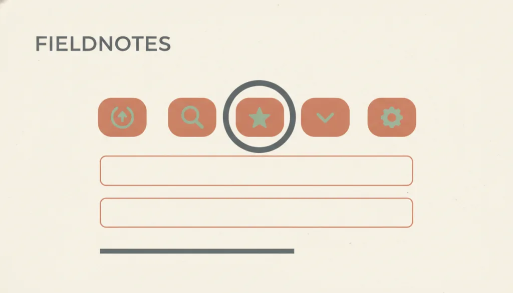
Recognizing it
- The element with keyboard focus differs visibly from its neighbors
- The indicator stays visible while focus remains and does not fade out on its own
- The indicated area is not entirely covered by sticky headers, overlays, or other author content
Concept boundary
A focus indicator only answers where focus is now. It is not the hover, selected, or active state; it is a state style on an element rather than a separate component, and it does not decide where focus should move.
When to consider it
- The interface can be operated with a keyboard or other non-pointer input
- Buttons, links, or form controls have custom styling that overrides browser defaults
- The page has sticky headers, footers, or non-modal overlays that could cover the focused element
When to be cautious
- Do not remove the default outline for aesthetics without providing an equivalent
- Do not substitute an effect that appears only on hover or fades quickly for a persistent focus indicator
- Do not make the focus indicator identical to the selected style, leaving users unable to tell position from selection
Tradeoff
A prominent focus ring can clash with brand visuals, but showing it only for keyboard input via :focus-visible keeps keyboard access while sparing mouse users an unwanted outline.
Conditional rules · Editorial advice
Related entries
After focus is moved programmatically, a visible indicator is the only way users know they are now inside the dialog.
Visible focus is a precondition for these users to complete tasks, not a decoration.
A focus ring must keep enough contrast against the actual background; blurred translucent surfaces can weaken it.
Sources and what they support
WCAG 2.2 SC 2.4.7 (Level AA) requires that any keyboard-operable interface has a mode of operation where the keyboard focus indicator is visible; using the platform default focus indicator is one sufficient technique.
Retrieved: 2026-09-15WCAG 2.2 SC 2.4.11 (Level AA) requires that a component receiving keyboard focus is not entirely hidden by author-created content such as sticky headers, footers, or non-modal dialogs.
Retrieved: 2026-09-15WCAG 2.2 SC 2.4.13 (Level AAA) requires the focus indicator area to be at least a 2 CSS pixel thick perimeter of the component, with at least 3:1 contrast between the same pixels in focused and unfocused states.
Retrieved: 2026-09-15:focus-visible matches when an element has focus and the browser's input heuristics determine focus should be shown; use it to provide a custom indicator rather than removing focus styles with outline: none.
Retrieved: 2026-09-15 · Snapshot unconfirmedDefinitions reference these sources. Digital specimens, selection advice, relationships, and recipes are editorial work and have not been validated through user research.
Type extensions and implementation notes
This entry has no operable specimen yet; the illustration is an editorial sketch. When applied to a product, tab through the page with a keyboard to verify that every focusable element type shows a visible, sufficiently contrasting indicator that is not covered by fixed content.
{
  "states": [
    "unfocused",
    "focus-visible",
    "focus-hidden"
  ],
  "a11y": [
    "The focus indicator is always visible and unobscured during keyboard use",
    "A custom indicator contrasts sufficiently with the background and the unfocused state",
    "Focus, selected, and hover states are distinguishable"
  ],
  "motion": "The indicator should appear immediately; any optional fade-in is omitted under reduced motion"
}
Full Agent entry JSON
{
  "id": "focus-indicator",
  "type": "micro",
  "name": {
    "zh": "焦点指示",
    "en": "Focus Indicator"
  },
  "aliases": [
    "Focus Ring",
    "焦点环",
    "Visible Focus"
  ],
  "granularity": "state",
  "intents": [
    "include-users",
    "show-focus"
  ],
  "tags": [
    "keyboard",
    "focus",
    "accessibility",
    "visible state",
    "focus"
  ],
  "definition": "When an interface element receives keyboard focus, a visible visual marker (such as an outline ring or highlight) shows where focus currently is, so keyboard users always know where their action will land.",
  "boundary": "A focus indicator only answers where focus is now. It is not the hover, selected, or active state; it is a state style on an element rather than a separate component, and it does not decide where focus should move.",
  "signature": [
    "The element with keyboard focus differs visibly from its neighbors",
    "The indicator stays visible while focus remains and does not fade out on its own",
    "The indicated area is not entirely covered by sticky headers, overlays, or other author content"
  ],
  "when": [
    "The interface can be operated with a keyboard or other non-pointer input",
    "Buttons, links, or form controls have custom styling that overrides browser defaults",
    "The page has sticky headers, footers, or non-modal overlays that could cover the focused element"
  ],
  "when_not": [
    "Do not remove the default outline for aesthetics without providing an equivalent",
    "Do not substitute an effect that appears only on hover or fades quickly for a persistent focus indicator",
    "Do not make the focus indicator identical to the selected style, leaving users unable to tell position from selection"
  ],
  "tradeoff": "A prominent focus ring can clash with brand visuals, but showing it only for keyboard input via :focus-visible keeps keyboard access while sparing mouse users an unwanted outline.",
  "comparison": {
    "focus": "Telling keyboard users which element their action will land on",
    "mechanism": "A persistently visible outline or highlight in the focused state, kept unobscured",
    "cost": "Requires maintaining a sufficiently contrasting focus style for every focusable element type"
  },
  "sources": [
    {
      "id": "wcag22-focus-visible",
      "title": "W3C WAI · Understanding SC 2.4.7 Focus Visible (Level AA)",
      "url": "https://www.w3.org/WAI/WCAG22/Understanding/focus-visible.html",
      "claim": "WCAG 2.2 SC 2.4.7 (Level AA) requires that any keyboard-operable interface has a mode of operation where the keyboard focus indicator is visible; using the platform default focus indicator is one sufficient technique.",
      "checkedAt": "2026-09-15",
      "archive": {
        "lookupUrl": "https://web.archive.org/web/20260915*/https://www.w3.org/WAI/WCAG22/Understanding/focus-visible.html",
        "status": "available",
        "checkedAt": "2026-09-15T18:15:08.051Z",
        "jobId": "spn2-9fcf85e43df14f575a270e45053db1df538e579c",
        "url": "https://web.archive.org/web/20260915181618/https://www.w3.org/WAI/WCAG22/Understanding/focus-visible.html",
        "timestamp": "20260915181618"
      }
    },
    {
      "id": "wcag22-focus-not-obscured",
      "title": "W3C WAI · Understanding SC 2.4.11 Focus Not Obscured (Minimum) (Level AA)",
      "url": "https://www.w3.org/WAI/WCAG22/Understanding/focus-not-obscured-minimum.html",
      "claim": "WCAG 2.2 SC 2.4.11 (Level AA) requires that a component receiving keyboard focus is not entirely hidden by author-created content such as sticky headers, footers, or non-modal dialogs.",
      "checkedAt": "2026-09-15",
      "archive": {
        "lookupUrl": "https://web.archive.org/web/20260915*/https://www.w3.org/WAI/WCAG22/Understanding/focus-not-obscured-minimum.html",
        "status": "available",
        "checkedAt": "2026-09-15T18:15:08.942Z",
        "jobId": "spn2-801ec8d206de4b85b09e56485c3a229ddb0e834b",
        "url": "https://web.archive.org/web/20260915181537/https://www.w3.org/WAI/WCAG22/Understanding/focus-not-obscured-minimum.html",
        "timestamp": "20260915181537"
      }
    },
    {
      "id": "wcag22-focus-appearance",
      "title": "W3C WAI · Understanding SC 2.4.13 Focus Appearance (Level AAA)",
      "url": "https://www.w3.org/WAI/WCAG22/Understanding/focus-appearance.html",
      "claim": "WCAG 2.2 SC 2.4.13 (Level AAA) requires the focus indicator area to be at least a 2 CSS pixel thick perimeter of the component, with at least 3:1 contrast between the same pixels in focused and unfocused states.",
      "checkedAt": "2026-09-15",
      "archive": {
        "lookupUrl": "https://web.archive.org/web/20260915*/https://www.w3.org/WAI/WCAG22/Understanding/focus-appearance.html",
        "status": "available",
        "checkedAt": "2026-09-15T18:15:52.982Z",
        "jobId": "spn2-a9fd9a9b13e84404118824f029bc61f053195d6d",
        "url": "https://web.archive.org/web/20260915181656/https://www.w3.org/WAI/WCAG22/Understanding/focus-appearance.html",
        "timestamp": "20260915181656"
      }
    },
    {
      "id": "mdn-focus-visible",
      "title": "MDN · :focus-visible",
      "url": "https://developer.mozilla.org/en-US/docs/Web/CSS/:focus-visible",
      "claim": ":focus-visible matches when an element has focus and the browser's input heuristics determine focus should be shown; use it to provide a custom indicator rather than removing focus styles with outline: none.",
      "checkedAt": "2026-09-15",
      "archive": {
        "lookupUrl": "https://web.archive.org/web/20260915*/https://developer.mozilla.org/en-US/docs/Web/CSS/:focus-visible",
        "status": "pending",
        "checkedAt": "2026-09-15T18:15:53.975Z",
        "error": "status-request-failed",
        "jobId": "spn2-056d7e4736cb9f64b02f029a127a4fa01f20be72"
      }
    }
  ],
  "relations": [
    {
      "target": "modal-dialog",
      "kind": "composes_with",
      "condition": "A dialog opens and moves focus inside it",
      "reason": "After focus is moved programmatically, a visible indicator is the only way users know they are now inside the dialog.",
      "basis": "editorial"
    },
    {
      "target": "inclusive-design",
      "kind": "informs",
      "condition": "Serving keyboard, switch, or low-vision users",
      "reason": "Visible focus is a precondition for these users to complete tasks, not a decoration.",
      "basis": "editorial"
    },
    {
      "target": "glassmorphism",
      "kind": "conflicts_when",
      "condition": "Translucent blurred backgrounds leave too little contrast between outline and background",
      "reason": "A focus ring must keep enough contrast against the actual background; blurred translucent surfaces can weaken it.",
      "basis": "editorial"
    }
  ],
  "rules": [
    {
      "when": "An element receives keyboard focus",
      "instruction": "Show a persistently visible focus indicator and ensure it is not entirely covered by sticky headers, footers, or overlays.",
      "strength": "must",
      "basis": "editorial"
    },
    {
      "when": "You want to drop the browser's default outline",
      "instruction": "Never write outline: none alone; provide an equivalent indicator with sufficient contrast at the same time, preferably via :focus-visible.",
      "strength": "must",
      "basis": "editorial"
    },
    {
      "when": "Designing a custom focus style",
      "instruction": "Treat SC 2.4.13's 2 CSS pixel perimeter and 3:1 contrast change as the target, even if AA is the compliance baseline.",
      "strength": "recommend",
      "basis": "editorial"
    }
  ],
  "behavior": {
    "states": [
      "unfocused",
      "focus-visible",
      "focus-hidden"
    ],
    "a11y": [
      "The focus indicator is always visible and unobscured during keyboard use",
      "A custom indicator contrasts sufficiently with the background and the unfocused state",
      "Focus, selected, and hover states are distinguishable"
    ],
    "motion": "The indicator should appear immediately; any optional fade-in is omitted under reduced motion"
  },
  "demo": null,
  "version": "0.1.0",
  "editorialStatus": "drafted",
  "requirements": [],
  "demoCapabilities": [],
  "implementationNote": "This entry has no operable specimen yet; the illustration is an editorial sketch. When applied to a product, tab through the page with a keyboard to verify that every focusable element type shows a visible, sufficiently contrasting indicator that is not covered by fixed content.",
  "image": {
    "src": "/images/focus-indicator.webp",
    "alt": "On a fictional FIELDNOTES form toolbar, one button in a row is surrounded by a thick, high-contrast focus ring while the other buttons keep a plain default style."
  },
  "searchTerms": [
    "键盘",
    "焦点",
    "无障碍",
    "可见状态",
    "focus"
  ]
}