VOCABULARY / ENTRY
Memphis Style
memphis
A visual language established by the Memphis Group (Memphis, founded in Milan in 1981 by Ettore Sottsass): bright clashing colors, squiggle-like curves, confetti or terrazzo-style patchwork patterns, and asymmetric geometric shapes, deliberately breaking the modernist constraint of "good taste."
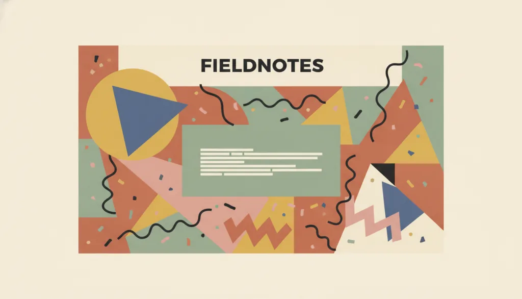
Recognizing it
- Multiple groups of highly saturated, deliberately clashing color blocks within one composition
- Hand-drawn-looking squiggle curves, confetti dots, or terrazzo patterns used as decoration or background
- Deliberately tilted, misaligned geometric shapes that break the conventional grid
Concept boundary
This entry refers to the specific visual signature established by the Memphis Group around 1981 and later borrowed by contemporary UI work: clashing colors, squiggles, confetti/patchwork patterns, and asymmetric geometry. It is not a synonym for the broader, still-unlisted concept of "maximalism"; Memphis is one concrete expression of that broader idea, but the two are not interchangeable. It also differs from Neo-Brutalism: Neo-Brutalism creates directness through heavy outlines, hard shadows, and system-default type, with a regular, usually restrained-color composition; Memphis creates playfulness through clashing colors, curves, and patchwork patterns, with a deliberately asymmetric composition. The two have different visual signatures and should not be treated as synonyms.
When to consider it
- The product targets a lighthearted, creative, or youth-oriented context that calls for playfulness and anti-convention attitude
- The brand wants a strong, memorable identity through bold patterns and clashing colors, and can tolerate a high level of visual noise
- The information structure is already clear, so the style adds personality rather than substituting for the hierarchy it should have
When to be cautious
- Busy patterns are laid behind body text or interactive controls, reducing contrast to the point of harming legibility
- Decorative patterns are used to disguise a weak information structure instead of fixing the structure first
- The product targets a serious, professional, or high-frequency task context where users need fast, low-distraction completion
Tradeoff
The style is highly distinctive and memorable, but clashing colors and patchwork patterns inherently produce unstable contrast and high visual noise; on dense or long-use interfaces this can cause reading fatigue, so calm areas must be deliberately reserved for text and controls.
Conditional rules · Editorial advice
Related entries
Neo-Brutalism creates directness through heavy outlines and hard shadows with a regular composition; Memphis creates playfulness through clashing colors, curves, and patchwork patterns with a deliberately asymmetric composition. The visual signatures differ.
Minimalism reduces elements to the essential and relies on whitespace to express restraint; Memphis does the opposite, using dense patterns and clashing colors to express abundance and playfulness. The two rarely coexist well.
Swiss / International Typographic Style builds order through grids, typographic hierarchy, and restrained whitespace; Memphis deliberately breaks grid alignment and embraces asymmetry. The two represent opposite expressive directions.
Sources and what they support
This page states that the Memphis design movement was founded in Milan in 1981 by Ettore Sottsass, characterized by bold clashing colors, geometric patchwork patterns, and a stance that broke with modernist "good taste," quoting its rejection of the "tyranny of smart, but soulless good taste." This entry's founding year, founder, city, and clash/patchwork characteristics are paraphrased from it.
Retrieved: 2026-09-15 · Archived 2026-09-16This page states that the Memphis group was founded in Milan in 1981 by Ettore Sottsass, that its work is characterized by "brightly coloured, patterned surfaces," and that it deliberately used irregular forms to challenge the modernist tradition of "form follows function," drawing on plastic laminate materials from 1950s American diner culture. This entry's "asymmetric geometry" and "anti-modernist good taste" boundary are paraphrased from it.
Retrieved: 2026-09-15 · Archived 2026-09-16This exhibition page states that the Memphis group formed in the winter of 1980/81 around Ettore Sottsass, made up of young designers wanting to break from functionalist dogma, and caused an international sensation at its first showing at the Arc'74 gallery in Milan in September 1981; its work featured "garish colours and wild patterns," colored light bulbs, and patterned laminates. This entry's founding time, first-showing location, and patterned characteristics are paraphrased from it.
Retrieved: 2026-09-15 · Archived 2026-09-16Definitions reference these sources. Digital specimens, selection advice, relationships, and recipes are editorial work and have not been validated through user research.
Type extensions and implementation notes
This entry has no interactive specimen yet; the illustration is an editorial sketch. Applying it to a product still requires verifying, on real pages, whether text and controls behind the patterns hold sufficient contrast across real backgrounds, and whether the style is being used to mask problems in the information structure itself.
{
  "tokens": {
    "surface": "#fdf3e0",
    "ink": "#241f1a",
    "accent": "#e2445c",
    "radiusPx": 4,
    "shadow": "none"
  },
  "tokenScope": "A recipe for this specimen showing one adaptation of clashing colors and geometric shapes; it is not a standard token set for the Memphis Group's historical work."
}
Full Agent entry JSON
{
  "id": "memphis",
  "type": "visual",
  "name": {
    "zh": "孟菲斯风格",
    "en": "Memphis Style"
  },
  "aliases": [
    "Memphis Group",
    "Memphis Milano",
    "孟菲斯派"
  ],
  "granularity": "experience",
  "intents": [
    "express-brand",
    "organize-content"
  ],
  "tags": [
    "clashing colors",
    "squiggle lines",
    "confetti patterns",
    "asymmetric geometry",
    "anti-convention"
  ],
  "definition": "A visual language established by the Memphis Group (Memphis, founded in Milan in 1981 by Ettore Sottsass): bright clashing colors, squiggle-like curves, confetti or terrazzo-style patchwork patterns, and asymmetric geometric shapes, deliberately breaking the modernist constraint of \"good taste.\"",
  "boundary": "This entry refers to the specific visual signature established by the Memphis Group around 1981 and later borrowed by contemporary UI work: clashing colors, squiggles, confetti/patchwork patterns, and asymmetric geometry. It is not a synonym for the broader, still-unlisted concept of \"maximalism\"; Memphis is one concrete expression of that broader idea, but the two are not interchangeable. It also differs from Neo-Brutalism: Neo-Brutalism creates directness through heavy outlines, hard shadows, and system-default type, with a regular, usually restrained-color composition; Memphis creates playfulness through clashing colors, curves, and patchwork patterns, with a deliberately asymmetric composition. The two have different visual signatures and should not be treated as synonyms.",
  "signature": [
    "Multiple groups of highly saturated, deliberately clashing color blocks within one composition",
    "Hand-drawn-looking squiggle curves, confetti dots, or terrazzo patterns used as decoration or background",
    "Deliberately tilted, misaligned geometric shapes that break the conventional grid"
  ],
  "when": [
    "The product targets a lighthearted, creative, or youth-oriented context that calls for playfulness and anti-convention attitude",
    "The brand wants a strong, memorable identity through bold patterns and clashing colors, and can tolerate a high level of visual noise",
    "The information structure is already clear, so the style adds personality rather than substituting for the hierarchy it should have"
  ],
  "when_not": [
    "Busy patterns are laid behind body text or interactive controls, reducing contrast to the point of harming legibility",
    "Decorative patterns are used to disguise a weak information structure instead of fixing the structure first",
    "The product targets a serious, professional, or high-frequency task context where users need fast, low-distraction completion"
  ],
  "tradeoff": "The style is highly distinctive and memorable, but clashing colors and patchwork patterns inherently produce unstable contrast and high visual noise; on dense or long-use interfaces this can cause reading fatigue, so calm areas must be deliberately reserved for text and controls.",
  "comparison": {
    "focus": "Playful, anti-convention brand expression",
    "mechanism": "Clashing colors, squiggle curves, confetti/patchwork patterns, asymmetric geometry",
    "cost": "Patterns and clashing colors inherently squeeze legibility, requiring dedicated calm areas"
  },
  "sources": [
    {
      "id": "memphis-design-museum",
      "title": "Design Museum · Memphis",
      "url": "https://designmuseum.org/memphis",
      "claim": "This page states that the Memphis design movement was founded in Milan in 1981 by Ettore Sottsass, characterized by bold clashing colors, geometric patchwork patterns, and a stance that broke with modernist \"good taste,\" quoting its rejection of the \"tyranny of smart, but soulless good taste.\" This entry's founding year, founder, city, and clash/patchwork characteristics are paraphrased from it.",
      "checkedAt": "2026-09-15",
      "archive": {
        "lookupUrl": "https://web.archive.org/web/20260915*/https://designmuseum.org/memphis",
        "status": "available",
        "checkedAt": "2026-09-16T05:16:44.467Z",
        "jobId": "spn2-ece1002f668ec6292d690a17e1f2f23343fb9225",
        "url": "https://web.archive.org/web/20260916051651/https://designmuseum.org/memphis",
        "timestamp": "20260916051651"
      }
    },
    {
      "id": "memphis-vam-casablanca",
      "title": "V&A · Casablanca Sideboard, Ettore Sottsass",
      "url": "https://collections.vam.ac.uk/item/O58652/casablanca-sideboard-sottsass-ettore-junior/",
      "claim": "This page states that the Memphis group was founded in Milan in 1981 by Ettore Sottsass, that its work is characterized by \"brightly coloured, patterned surfaces,\" and that it deliberately used irregular forms to challenge the modernist tradition of \"form follows function,\" drawing on plastic laminate materials from 1950s American diner culture. This entry's \"asymmetric geometry\" and \"anti-modernist good taste\" boundary are paraphrased from it.",
      "checkedAt": "2026-09-15",
      "archive": {
        "lookupUrl": "https://web.archive.org/web/20260915*/https://collections.vam.ac.uk/item/O58652/casablanca-sideboard-sottsass-ettore-junior/",
        "status": "available",
        "checkedAt": "2026-09-16T05:17:12.401Z",
        "jobId": "spn2-9fadfe309c3cb5bebbd84f44ee349e66b4429709",
        "url": "https://web.archive.org/web/20260916051812/https://collections.vam.ac.uk/item/O58652/casablanca-sideboard-sottsass-ettore-junior/",
        "timestamp": "20260916051812"
      }
    },
    {
      "id": "memphis-vitra",
      "title": "Vitra Design Museum · Memphis: 40 Years of Kitsch and Elegance",
      "url": "https://www.design-museum.de/en/exhibitions/detailpages/memphis-40-years-of-kitsch-and-elegance.html",
      "claim": "This exhibition page states that the Memphis group formed in the winter of 1980/81 around Ettore Sottsass, made up of young designers wanting to break from functionalist dogma, and caused an international sensation at its first showing at the Arc'74 gallery in Milan in September 1981; its work featured \"garish colours and wild patterns,\" colored light bulbs, and patterned laminates. This entry's founding time, first-showing location, and patterned characteristics are paraphrased from it.",
      "checkedAt": "2026-09-15",
      "archive": {
        "lookupUrl": "https://web.archive.org/web/20260915*/https://www.design-museum.de/en/exhibitions/detailpages/memphis-40-years-of-kitsch-and-elegance.html",
        "status": "available",
        "checkedAt": "2026-09-16T05:17:12.440Z",
        "jobId": "spn2-8d295fdb09a3671066bfbe58f89feefda317efaa",
        "url": "https://web.archive.org/web/20260916051718/https://www.design-museum.de/en/exhibitions/detailpages/memphis-40-years-of-kitsch-and-elegance.html",
        "timestamp": "20260916051718"
      }
    }
  ],
  "relations": [
    {
      "target": "neo-brutalism",
      "kind": "related",
      "condition": "Both are often grouped together as \"bold, anti-convention\" visual languages, which invites confusion",
      "reason": "Neo-Brutalism creates directness through heavy outlines and hard shadows with a regular composition; Memphis creates playfulness through clashing colors, curves, and patchwork patterns with a deliberately asymmetric composition. The visual signatures differ.",
      "basis": "editorial"
    },
    {
      "target": "minimalism",
      "kind": "alternative",
      "condition": "Choosing the primary visual language for the same product",
      "reason": "Minimalism reduces elements to the essential and relies on whitespace to express restraint; Memphis does the opposite, using dense patterns and clashing colors to express abundance and playfulness. The two rarely coexist well.",
      "basis": "editorial"
    },
    {
      "target": "swiss",
      "kind": "alternative",
      "condition": "Choosing the primary visual language for the same product",
      "reason": "Swiss / International Typographic Style builds order through grids, typographic hierarchy, and restrained whitespace; Memphis deliberately breaks grid alignment and embraces asymmetry. The two represent opposite expressive directions.",
      "basis": "editorial"
    }
  ],
  "rules": [
    {
      "when": "Using squiggle lines, confetti patterns, or other busy decoration as the background behind body text or interactive controls",
      "instruction": "Contrast between the patterned area and the text or control must not be degraded by the pattern. If legibility cannot be reliably guaranteed, reserve a solid-color or low-distraction calm area for text and controls rather than letting the pattern run directly behind them.",
      "strength": "must",
      "basis": "editorial"
    },
    {
      "when": "Deciding whether to adopt the Memphis style for a product",
      "instruction": "Use the style where its playfulness matches the product's purpose, not to disguise weaknesses in the information structure itself; settle the information hierarchy first, then decide whether to layer this visual language on top.",
      "strength": "recommend",
      "basis": "editorial"
    }
  ],
  "visual": {
    "tokens": {
      "surface": "#fdf3e0",
      "ink": "#241f1a",
      "accent": "#e2445c",
      "radiusPx": 4,
      "shadow": "none"
    },
    "tokenScope": "A recipe for this specimen showing one adaptation of clashing colors and geometric shapes; it is not a standard token set for the Memphis Group's historical work."
  },
  "demo": null,
  "version": "0.1.0",
  "editorialStatus": "drafted",
  "requirements": [],
  "demoCapabilities": [],
  "implementationNote": "This entry has no interactive specimen yet; the illustration is an editorial sketch. Applying it to a product still requires verifying, on real pages, whether text and controls behind the patterns hold sufficient contrast across real backgrounds, and whether the style is being used to mask problems in the information structure itself.",
  "image": {
    "src": "/images/memphis.webp",
    "alt": "A fictional FIELDNOTES card interface covered in clashing color blocks, squiggle curves, and colorful confetti-like patches, with geometric shapes deliberately tilted, leaving one calm area in the center for text bars."
  },
  "searchTerms": [
    "撞色",
    "涂鸦线条",
    "拼贴图案",
    "不对称几何",
    "反常规"
  ]
}