VOCABULARY / ENTRY
Visual Minimalism
minimalism
A visual style characterized by reducing the interface to its essential elements: removing elements or content that do not support user tasks, and organizing the interface with a restricted palette, maximized whitespace, and restrained but expressive typography.
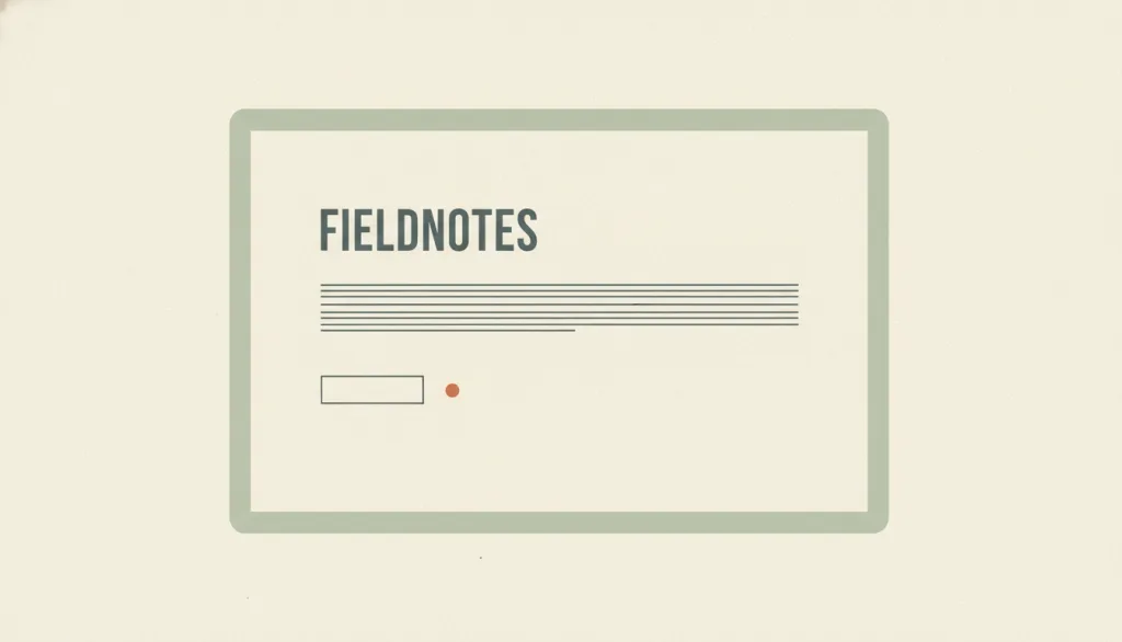
Recognizing it
- A restricted, often one- or two-color palette with very few accent colors
- Large areas of whitespace, wide spacing between elements, and very little content per screen
- A small amount of prominent typography carries the hierarchy, while decorative graphics and feature entry points are reduced to a minimum
Concept boundary
Visual minimalism describes the orientation of reducing the number of elements. It is not limited to the Swiss / International Typographic Style, which is a specific tradition centered on grids and typography; minimalism may borrow it or not. It often appears together with flat design but has a different focus: flat design removes simulated 3D cues (shadows, gradients, gloss), while minimalism removes elements themselves; a page can be flat without being minimal, or minimal while keeping subtle shadows. It is also not the same as Nielsen's heuristic #8, "Aesthetic and minimalist design", which is about whether information is relevant to the task rather than about visual appearance: a visually minimal interface does not automatically satisfy it, and an interface that satisfies it need not look minimal. When minimalism leads to hidden navigation or removed clickability cues, it stops being a style question and becomes a usability problem.
When to consider it
- The content itself is the protagonist (portfolios, long-form reading, a single product page) and attention should be focused on a few pieces of information
- The brand wants to express restraint, premium quality, or calm, and is willing to give up information density per screen for it
- Content priority has already been decided, so it is clear which elements can be removed without harming task completion
When to be cautious
- User tasks depend on many feature entry points or comparative information (admin consoles, data-dense tools, e-commerce listings)
- Navigation, filters, or primary actions are tucked into collapsed menus to "look clean", so users need an extra step to find them
- Content priority has not been decided, so reducing elements is an aesthetic choice rather than a task-based trade-off
Tradeoff
More focused visuals, stronger brand character, and easier adaptation, but less information per screen, so users may scroll or click more; if a removed element happens to be needed for the task, usability suffers directly.
Conditional rules · Editorial advice
Related entries
The two are often conflated, but flat design concerns whether 3D cues are kept, while minimalism concerns whether elements are necessary; either can be chosen alone.
The Swiss / International Typographic Style is a typographic tradition minimalism often borrows, but minimalism is not limited to it.
Users rely on visible cues to recognize actionable objects; minimalism should not come at the cost of discoverability.
Sources and what they support
The article (Kate Moran, 2015-07-12) defines minimalism as simplifying interfaces "by removing unnecessary elements or content that does not support user tasks" and, from a sample of 112 minimalist websites, identifies the defining characteristics: flat patterns and textures (96%), limited or monochromatic palettes (95%), restricted features and graphic elements (87%), maximized negative space (84%), and dramatic typography (75%). It also warns against hiding content or navigation users need for the sake of whitespace. This entry's definition, signature, and avoid-conditions paraphrase it.
Retrieved: 2026-09-15The article (Kate Moran, 2015-06-28) traces web minimalism to 1960s minimalist art, the Bauhaus, and practitioners such as Müller-Brockmann, Rams, and Mies van der Rohe, as well as Tufte's data-ink ratio and Carroll's minimalism in technical communication; it notes that web minimalism overlaps with but is not identical to trends such as flat design, and warns that adhering too rigidly to minimalism risks "wastefully low information density". This entry's boundary on "not limited to the Swiss tradition" and "overlapping with but distinct from flat design" builds on it.
Retrieved: 2026-09-15The article (Therese Fessenden, 2021-01-24) explains heuristic #8, that interfaces should not contain irrelevant or rarely needed information, and explicitly states that minimalist visual design (sometimes called flat design) does not satisfy this heuristic by default and is often guilty of removing necessary elements, while designs that satisfy it are not obligated to be minimalist. This entry's separation of visual minimalism from the content-relevance heuristic builds on it.
Retrieved: 2026-09-15 · Snapshot unconfirmedDefinitions reference these sources. Digital specimens, selection advice, relationships, and recipes are editorial work and have not been validated through user research.
Type extensions and implementation notes
This entry has no operable specimen yet; the illustration is an editorial sketch. When applied to a product, verify on real pages that the removed elements truly do not support the task and that primary actions and navigation remain discoverable at a glance.
{
  "tokens": {
    "surface": "#f6f1e6",
    "ink": "#3a4747",
    "accent": "#c9713d",
    "radiusPx": 2,
    "shadow": "none"
  },
  "tokenScope": "A recipe for this specimen: mostly two colors with a single accent; a real product may keep very light shadows, but the discoverability of interactive elements must be verified."
}
Full Agent entry JSON
{
  "id": "minimalism",
  "type": "visual",
  "name": {
    "zh": "极简视觉风格",
    "en": "Visual Minimalism"
  },
  "aliases": [
    "Minimalism",
    "极简主义",
    "Minimalist Design"
  ],
  "granularity": "experience",
  "intents": [
    "express-brand",
    "reduce-complexity"
  ],
  "tags": [
    "whitespace",
    "few colors",
    "restrained typography",
    "element reduction",
    "discoverability"
  ],
  "definition": "A visual style characterized by reducing the interface to its essential elements: removing elements or content that do not support user tasks, and organizing the interface with a restricted palette, maximized whitespace, and restrained but expressive typography.",
  "boundary": "Visual minimalism describes the orientation of reducing the number of elements. It is not limited to the Swiss / International Typographic Style, which is a specific tradition centered on grids and typography; minimalism may borrow it or not. It often appears together with flat design but has a different focus: flat design removes simulated 3D cues (shadows, gradients, gloss), while minimalism removes elements themselves; a page can be flat without being minimal, or minimal while keeping subtle shadows. It is also not the same as Nielsen's heuristic #8, \"Aesthetic and minimalist design\", which is about whether information is relevant to the task rather than about visual appearance: a visually minimal interface does not automatically satisfy it, and an interface that satisfies it need not look minimal. When minimalism leads to hidden navigation or removed clickability cues, it stops being a style question and becomes a usability problem.",
  "signature": [
    "A restricted, often one- or two-color palette with very few accent colors",
    "Large areas of whitespace, wide spacing between elements, and very little content per screen",
    "A small amount of prominent typography carries the hierarchy, while decorative graphics and feature entry points are reduced to a minimum"
  ],
  "when": [
    "The content itself is the protagonist (portfolios, long-form reading, a single product page) and attention should be focused on a few pieces of information",
    "The brand wants to express restraint, premium quality, or calm, and is willing to give up information density per screen for it",
    "Content priority has already been decided, so it is clear which elements can be removed without harming task completion"
  ],
  "when_not": [
    "User tasks depend on many feature entry points or comparative information (admin consoles, data-dense tools, e-commerce listings)",
    "Navigation, filters, or primary actions are tucked into collapsed menus to \"look clean\", so users need an extra step to find them",
    "Content priority has not been decided, so reducing elements is an aesthetic choice rather than a task-based trade-off"
  ],
  "tradeoff": "More focused visuals, stronger brand character, and easier adaptation, but less information per screen, so users may scroll or click more; if a removed element happens to be needed for the task, usability suffers directly.",
  "comparison": {
    "focus": "A visual orientation that reduces the interface to essential elements",
    "mechanism": "Restricted color, maximized whitespace, restrained typography, and pruned feature entry points and decoration",
    "cost": "Lower information density and the risk of removing necessary cues and entry points"
  },
  "sources": [
    {
      "id": "minimalism-nng-characteristics",
      "title": "Nielsen Norman Group · The Characteristics of Minimalism in Web Design",
      "url": "https://www.nngroup.com/articles/characteristics-minimalism/",
      "claim": "The article (Kate Moran, 2015-07-12) defines minimalism as simplifying interfaces \"by removing unnecessary elements or content that does not support user tasks\" and, from a sample of 112 minimalist websites, identifies the defining characteristics: flat patterns and textures (96%), limited or monochromatic palettes (95%), restricted features and graphic elements (87%), maximized negative space (84%), and dramatic typography (75%). It also warns against hiding content or navigation users need for the sake of whitespace. This entry's definition, signature, and avoid-conditions paraphrase it.",
      "checkedAt": "2026-09-15",
      "archive": {
        "lookupUrl": "https://web.archive.org/web/20260915*/https://www.nngroup.com/articles/characteristics-minimalism/",
        "status": "available",
        "checkedAt": "2026-09-15T18:39:41.717Z",
        "jobId": "spn2-eaf288b009dda65f86cf27df6cea79b0ac18a1c4",
        "url": "https://web.archive.org/web/20260915184105/https://www.nngroup.com/articles/characteristics-minimalism/",
        "timestamp": "20260915184105"
      }
    },
    {
      "id": "minimalism-nng-roots",
      "title": "Nielsen Norman Group · The Roots of Minimalism in Web Design",
      "url": "https://www.nngroup.com/articles/roots-minimalism-web-design/",
      "claim": "The article (Kate Moran, 2015-06-28) traces web minimalism to 1960s minimalist art, the Bauhaus, and practitioners such as Müller-Brockmann, Rams, and Mies van der Rohe, as well as Tufte's data-ink ratio and Carroll's minimalism in technical communication; it notes that web minimalism overlaps with but is not identical to trends such as flat design, and warns that adhering too rigidly to minimalism risks \"wastefully low information density\". This entry's boundary on \"not limited to the Swiss tradition\" and \"overlapping with but distinct from flat design\" builds on it.",
      "checkedAt": "2026-09-15",
      "archive": {
        "lookupUrl": "https://web.archive.org/web/20260915*/https://www.nngroup.com/articles/roots-minimalism-web-design/",
        "status": "available",
        "checkedAt": "2026-09-15T18:39:41.719Z",
        "jobId": "spn2-5dc96a8c557716c6077a4f4b6db269dad83d0d90",
        "url": "https://web.archive.org/web/20260915184117/https://www.nngroup.com/articles/roots-minimalism-web-design/",
        "timestamp": "20260915184117"
      }
    },
    {
      "id": "minimalism-nng-heuristic-8",
      "title": "Nielsen Norman Group · Aesthetic and Minimalist Design (Usability Heuristic #8)",
      "url": "https://www.nngroup.com/articles/aesthetic-minimalist-design/",
      "claim": "The article (Therese Fessenden, 2021-01-24) explains heuristic #8, that interfaces should not contain irrelevant or rarely needed information, and explicitly states that minimalist visual design (sometimes called flat design) does not satisfy this heuristic by default and is often guilty of removing necessary elements, while designs that satisfy it are not obligated to be minimalist. This entry's separation of visual minimalism from the content-relevance heuristic builds on it.",
      "checkedAt": "2026-09-15",
      "archive": {
        "lookupUrl": "https://web.archive.org/web/20260915*/https://www.nngroup.com/articles/aesthetic-minimalist-design/",
        "status": "pending",
        "checkedAt": "2026-09-15T18:45:01.171Z",
        "error": "status-request-failed",
        "jobId": "spn2-49f0bf1e2d09b265a5e8d894b52ad77a20fd0c14"
      }
    }
  ],
  "relations": [
    {
      "target": "flat-design",
      "kind": "related",
      "condition": "The same interface both reduces the number of elements and removes depth cues such as shadows and gradients",
      "reason": "The two are often conflated, but flat design concerns whether 3D cues are kept, while minimalism concerns whether elements are necessary; either can be chosen alone.",
      "basis": "editorial"
    },
    {
      "target": "swiss",
      "kind": "informs",
      "condition": "A minimalist page uses a grid and sans-serif typography to organize its few elements",
      "reason": "The Swiss / International Typographic Style is a typographic tradition minimalism often borrows, but minimalism is not limited to it.",
      "basis": "editorial"
    },
    {
      "target": "recognition",
      "kind": "conflicts_when",
      "condition": "Navigation is hidden or clickability cues are removed to reduce elements, so users must recall where entry points are",
      "reason": "Users rely on visible cues to recognize actionable objects; minimalism should not come at the cost of discoverability.",
      "basis": "editorial"
    }
  ],
  "rules": [
    {
      "when": "Removing an element, outline, or shadow to simplify a page",
      "instruction": "Do not remove cues or entry points users need to complete their primary tasks; anything removed must be an element that does not support the task, not merely one that spoils the clean look.",
      "strength": "must",
      "basis": "editorial"
    },
    {
      "when": "Deciding which elements a page keeps",
      "instruction": "Decide content and task priority first, then reduce according to that priority; do not start with visual subtraction while priorities are unclear.",
      "strength": "recommend",
      "basis": "editorial"
    },
    {
      "when": "A minimalist page's information density is clearly below what user tasks require",
      "instruction": "Restore the necessary structure and entry points, or use progressive disclosure instead of hiding them completely.",
      "strength": "recommend",
      "basis": "editorial"
    }
  ],
  "visual": {
    "tokens": {
      "surface": "#f6f1e6",
      "ink": "#3a4747",
      "accent": "#c9713d",
      "radiusPx": 2,
      "shadow": "none"
    },
    "tokenScope": "A recipe for this specimen: mostly two colors with a single accent; a real product may keep very light shadows, but the discoverability of interactive elements must be verified."
  },
  "demo": null,
  "version": "0.1.0",
  "editorialStatus": "drafted",
  "requirements": [],
  "demoCapabilities": [],
  "implementationNote": "This entry has no operable specimen yet; the illustration is an editorial sketch. When applied to a product, verify on real pages that the removed elements truly do not support the task and that primary actions and navigation remain discoverable at a glance.",
  "image": {
    "src": "/images/minimalism.webp",
    "alt": "A fictional page named FIELDNOTES with only a small headline, one line of text bars, and one thin-outlined button in a large field of cream whitespace, using just two colors, illustrating visual minimalism."
  },
  "searchTerms": [
    "留白",
    "少色",
    "克制排版",
    "去元素",
    "可发现性"
  ]
}