VOCABULARY / ENTRY
Status Message
status-message
A content change that briefly reports the result of an action, a waiting state, or the existence of errors without changing the user's context, and that assistive technology can announce without receiving focus.
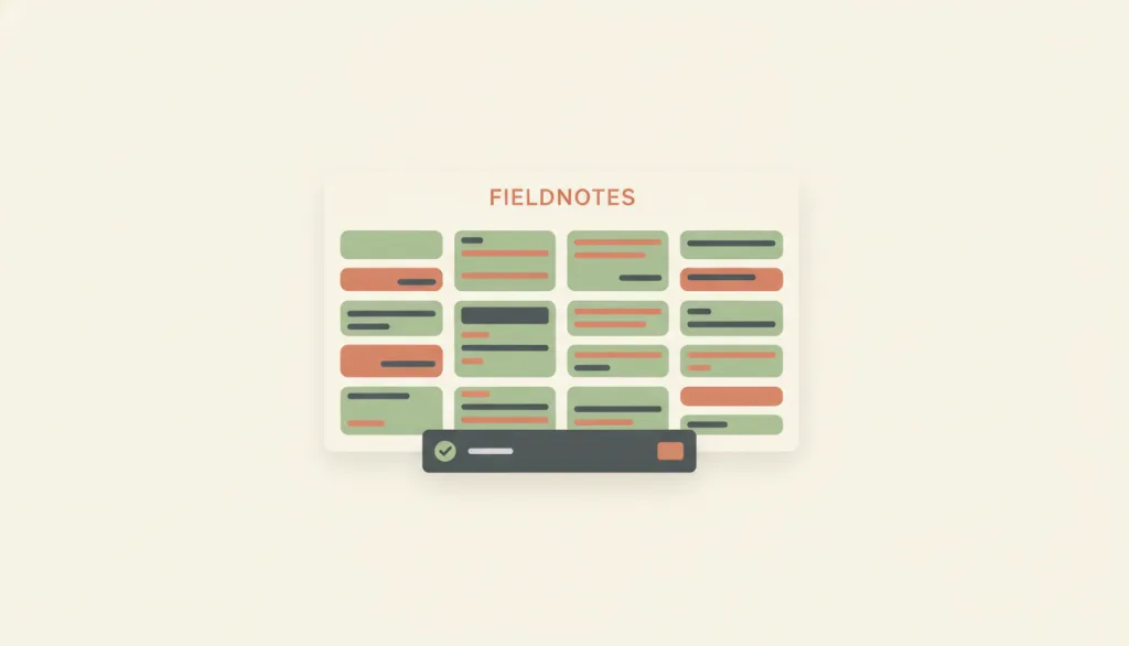
Recognizing it
- Appears right after the action, brief and tied to a specific object
- Does not cover content or take focus; the main content stays usable
- Carries a clear success, error, or informational meaning
Concept boundary
A status message reports an outcome or state only. It does not carry continuously quantified progress (that is the determinate progress bar) and does not block the current task to demand a response (that is the modal dialog). Toast and snackbar are presentation variants of it, not separate concepts.
When to consider it
- An action has completed or failed and people need a one-line confirmation
- The feedback does not require an immediate response or decision
- Content on the same page updates but the current task should not be interrupted
When to be cautious
- An error must be handled before continuing, yet the message dismisses itself
- Quantified, ongoing progress needs to be reported
- People must make an irreversible decision
Tradeoff
Non-blocking feedback keeps the task flowing, but briefly shown messages are easy to miss, and frequent announcements feel noisy to screen reader users.
Conditional rules · Editorial advice
Related entries
The progress bar expresses completed work during the process; the status message reports the final outcome.
Use a non-blocking status message when no response is needed; escalate to a modal dialog only when a decision or confirmation is required.
A status message keeps information at the periphery of attention, one way calm technology is realized at the micro-interaction level.
Sources and what they support
The Level AA criterion requires that status messages be programmatically determinable through role or properties so assistive technology can present them without receiving focus; a status message is defined as a non-context change reporting the success or result of an action, a waiting state, progress, or the existence of errors.
Retrieved: 2026-09-15 · Snapshot unconfirmedAn alert displays a brief, important message without interrupting the task and must not affect keyboard focus; alerts that disappear automatically and overly frequent interruptions should be avoided.
Retrieved: 2026-09-15 · Snapshot unconfirmedDistinguishes action-required messages from passive ones: the former should interrupt and require handling before dismissal, while the latter suit an unobtrusive nonmodal popover that may disappear automatically.
Retrieved: 2026-09-15 · Snapshot unconfirmedDefinitions reference these sources. Digital specimens, selection advice, relationships, and recipes are editorial work and have not been validated through user research.
Type extensions and implementation notes
No operable specimen yet; the illustration is editorial. A product must still verify that screen readers actually announce the message, how long it persists, keyboard reachability of the action button, and behavior under reduced motion.
{
  "states": [
    "hidden",
    "success",
    "info",
    "error"
  ],
  "a11y": [
    "Announce through a live region without moving focus",
    "Use status for general states and alert for errors needing immediate attention; avoid being too chatty"
  ],
  "motion": "The slide-in may be simplified to a fade; appear instantly when reduced motion is enabled"
}
Full Agent entry JSON
{
  "id": "status-message",
  "type": "micro",
  "name": {
    "zh": "状态消息",
    "en": "Status Message"
  },
  "aliases": [
    "Toast",
    "Snackbar",
    "轻提示"
  ],
  "granularity": "state",
  "intents": [
    "inform",
    "reduce-interruption"
  ],
  "tags": [
    "feedback",
    "action outcome",
    "non-blocking",
    "notification",
    "toast"
  ],
  "definition": "A content change that briefly reports the result of an action, a waiting state, or the existence of errors without changing the user's context, and that assistive technology can announce without receiving focus.",
  "boundary": "A status message reports an outcome or state only. It does not carry continuously quantified progress (that is the determinate progress bar) and does not block the current task to demand a response (that is the modal dialog). Toast and snackbar are presentation variants of it, not separate concepts.",
  "signature": [
    "Appears right after the action, brief and tied to a specific object",
    "Does not cover content or take focus; the main content stays usable",
    "Carries a clear success, error, or informational meaning"
  ],
  "when": [
    "An action has completed or failed and people need a one-line confirmation",
    "The feedback does not require an immediate response or decision",
    "Content on the same page updates but the current task should not be interrupted"
  ],
  "when_not": [
    "An error must be handled before continuing, yet the message dismisses itself",
    "Quantified, ongoing progress needs to be reported",
    "People must make an irreversible decision"
  ],
  "tradeoff": "Non-blocking feedback keeps the task flowing, but briefly shown messages are easy to miss, and frequent announcements feel noisy to screen reader users.",
  "comparison": {
    "focus": "Telling people how the action they just took turned out",
    "mechanism": "A brief content change inside a live region",
    "cost": "Easy to miss; needs persistence and frequency control"
  },
  "sources": [
    {
      "id": "wcag22-status-messages",
      "title": "W3C · Understanding SC 4.1.3 Status Messages (WCAG 2.2)",
      "url": "https://www.w3.org/WAI/WCAG22/Understanding/status-messages.html",
      "claim": "The Level AA criterion requires that status messages be programmatically determinable through role or properties so assistive technology can present them without receiving focus; a status message is defined as a non-context change reporting the success or result of an action, a waiting state, progress, or the existence of errors.",
      "checkedAt": "2026-09-15",
      "archive": {
        "lookupUrl": "https://web.archive.org/web/20260915*/https://www.w3.org/WAI/WCAG22/Understanding/status-messages.html",
        "status": "pending",
        "checkedAt": "2026-09-15T18:35:44.910Z",
        "error": "status-request-failed",
        "jobId": "spn2-2f1c0e8f56c74acc0181032b2c86b53260ff4025"
      }
    },
    {
      "id": "apg-alert",
      "title": "W3C · ARIA Authoring Practices Guide · Alert Pattern",
      "url": "https://www.w3.org/WAI/ARIA/apg/patterns/alert/",
      "claim": "An alert displays a brief, important message without interrupting the task and must not affect keyboard focus; alerts that disappear automatically and overly frequent interruptions should be avoided.",
      "checkedAt": "2026-09-15",
      "archive": {
        "lookupUrl": "https://web.archive.org/web/20260915*/https://www.w3.org/WAI/ARIA/apg/patterns/alert/",
        "status": "pending",
        "checkedAt": "2026-09-15T18:36:00.855Z",
        "error": "status-request-failed",
        "jobId": "spn2-b5545afc78a86863c008b6e5d498847f905a438a"
      }
    },
    {
      "id": "nng-indicators-validations-notifications",
      "title": "NN/g · Indicators, Validations, and Notifications",
      "url": "https://www.nngroup.com/articles/indicators-validations-notifications/",
      "claim": "Distinguishes action-required messages from passive ones: the former should interrupt and require handling before dismissal, while the latter suit an unobtrusive nonmodal popover that may disappear automatically.",
      "checkedAt": "2026-09-15",
      "archive": {
        "lookupUrl": "https://web.archive.org/web/20260915*/https://www.nngroup.com/articles/indicators-validations-notifications/",
        "status": "pending",
        "checkedAt": "2026-09-15T18:36:07.048Z",
        "error": "status-request-failed",
        "jobId": "spn2-271c1c4765ed6d069b4967ea3c07dd0586e6ede2"
      }
    }
  ],
  "relations": [
    {
      "target": "determinate-progress",
      "kind": "related",
      "condition": "A task has a start, a middle, and an end",
      "reason": "The progress bar expresses completed work during the process; the status message reports the final outcome.",
      "basis": "editorial"
    },
    {
      "target": "modal-dialog",
      "kind": "alternative",
      "condition": "Whether the feedback needs a response first",
      "reason": "Use a non-blocking status message when no response is needed; escalate to a modal dialog only when a decision or confirmation is required.",
      "basis": "editorial"
    },
    {
      "target": "calm-technology",
      "kind": "realized_by",
      "condition": "Feedback stays brief and does not seize attention",
      "reason": "A status message keeps information at the periphery of attention, one way calm technology is realized at the micro-interaction level.",
      "basis": "editorial"
    }
  ],
  "rules": [
    {
      "when": "The status message is implemented in a markup language",
      "instruction": "Announce it through a live region such as role=status, role=alert, or aria-live, and never move focus.",
      "strength": "must",
      "basis": "editorial"
    },
    {
      "when": "An error must be handled before people can continue",
      "instruction": "The message must persist until it is handled; it must not dismiss itself.",
      "strength": "must",
      "basis": "editorial"
    },
    {
      "when": "Writing the message text",
      "instruction": "Name the specific action and object; avoid generic wording such as \"Success\" or \"Something went wrong\".",
      "strength": "recommend",
      "basis": "editorial"
    }
  ],
  "requirements": [],
  "behavior": {
    "states": [
      "hidden",
      "success",
      "info",
      "error"
    ],
    "a11y": [
      "Announce through a live region without moving focus",
      "Use status for general states and alert for errors needing immediate attention; avoid being too chatty"
    ],
    "motion": "The slide-in may be simplified to a fade; appear instantly when reduced motion is enabled"
  },
  "demo": null,
  "version": "0.1.0",
  "editorialStatus": "drafted",
  "demoCapabilities": [],
  "implementationNote": "No operable specimen yet; the illustration is editorial. A product must still verify that screen readers actually announce the message, how long it persists, keyboard reachability of the action button, and behavior under reduced motion.",
  "image": {
    "src": "/images/status-message.webp",
    "alt": "A small dark bar slides up from the bottom of a fictional FIELDNOTES page: a green check icon on the left, a short text bar in the middle, and a small button on the right, while the card grid above stays uncovered and unchanged."
  },
  "searchTerms": [
    "反馈",
    "操作结果",
    "非阻断",
    "通知",
    "toast"
  ]
}