VOCABULARY / ENTRY
Visual Interference
visual-interference
Use visual weight -- size, color, contrast, position, or whitespace -- to make the option that benefits the business stand out, while suppressing an equally valid alternative the person could otherwise choose, so the choice is made under an unequal presentation of information.
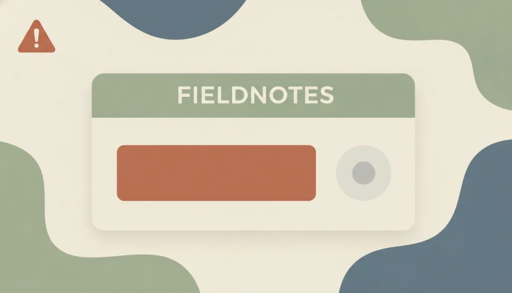
Recognizing it
- Two options with comparable consequences are given noticeably unequal size, color saturation, or contrast
- The decline or secondary option uses low-contrast gray-on-gray text, often placed in an inconspicuous spot or hidden past whitespace
- Only the button steering people toward acceptance carries the interface's single saturated color, forming a pre-attentive cue
Concept boundary
Visual hierarchy itself is a legitimate design tool for directing attention to what actually matters most; this entry targets only hierarchy used against the person's own interest to suppress an option that deserves equal attention, not hierarchy as such. It differs from confirmshaming: the mechanism here is visual design (size, color, contrast, position, whitespace), not belittling or pressuring wording; both tactics can appear in the same interface and should be logged separately.
When to consider it
- Auditing the visual weight given to parallel options in consent banners, subscription confirmations, or permission dialogs
- Auditing the size, color, and placement contrast between "accept" and "decline/not now" buttons on checkout or renewal screens
When to be cautious
- Recommending it as a conversion-boosting tactic
- Justifying an unequal hierarchy between options of comparable consequence as "highlighting the primary action"
Tradeoff
Keep visual hierarchy for genuinely primary versus secondary content, but options with comparable consequences must receive comparable size, contrast, and visible placement; the interface's only saturated color or only strong-contrast element must not be reserved for steering a consequential choice.
Conditional rules · Editorial advice
Related entries
Both suppress free choice, but through different mechanisms: one is visual-hierarchy suppression, the other is shaming wording.
Figure-ground is meant to help people tell what matters most from what doesn't; using it to sink an option that serves the person's own interest into the background conflicts with that intent.
Fitts's Law shows that larger, closer targets are easier to hit; this entry concerns that regularity being applied one-sidedly to enlarge the accept button and shrink the decline button as a form of pressure.
Sources and what they support
Defines "visual interference" as hiding, blurring, or obscuring information that should be clearly visible through low contrast, undersized text, or a chaotic interface, citing Tesla's low-contrast refund-terms text that led to accidental purchases as an example.
Retrieved: 2026-09-15 · Archived 2026-09-16Relays the EDPB's Guidelines 3/2022 on deceptive design patterns in social media platform interfaces, noting that presenting information in a small font or with insufficient color contrast makes people more likely to overlook it, and recommending that data-protection-related actions or elements be made equally conspicuous and presented in an objective, neutral manner; this entry cites only that secondary account, was unable to read the EDPB guideline PDF directly, and does not claim to have verified the original text in full.
Retrieved: 2026-09-15 · Archived 2026-09-16Definitions reference these sources. Digital specimens, selection advice, relationships, and recipes are editorial work and have not been validated through user research.
Type extensions and implementation notes
This entry has no working specimen yet; the illustration is an editorial sketch. Before shipping, still verify: the actual measured contrast of both options, the decline control's tappable target size, where saturated color is actually used in the interface, and any jurisdiction-specific requirements for visual presentation in consent interfaces.
{
  "harm": "Steers people toward the option that benefits the business rather than the person, under an unequal visual presentation, undermining informed and voluntary choice",
  "repair": "Give options of comparable consequence the same size, contrast, position, and whitespace, and reserve visual hierarchy for clarifying content, not suppressing an option."
}
Full Agent entry JSON
{
  "id": "visual-interference",
  "type": "anti",
  "name": {
    "zh": "视觉干扰式诱导",
    "en": "Visual Interference"
  },
  "aliases": [
    "视觉诱导",
    "视觉压制",
    "Interface Interference (visual)"
  ],
  "granularity": "component",
  "intents": [
    "audit-choice"
  ],
  "tags": [
    "anti-pattern",
    "visual hierarchy",
    "contrast",
    "consent",
    "manipulation"
  ],
  "definition": "Use visual weight -- size, color, contrast, position, or whitespace -- to make the option that benefits the business stand out, while suppressing an equally valid alternative the person could otherwise choose, so the choice is made under an unequal presentation of information.",
  "boundary": "Visual hierarchy itself is a legitimate design tool for directing attention to what actually matters most; this entry targets only hierarchy used against the person's own interest to suppress an option that deserves equal attention, not hierarchy as such. It differs from confirmshaming: the mechanism here is visual design (size, color, contrast, position, whitespace), not belittling or pressuring wording; both tactics can appear in the same interface and should be logged separately.",
  "signature": [
    "Two options with comparable consequences are given noticeably unequal size, color saturation, or contrast",
    "The decline or secondary option uses low-contrast gray-on-gray text, often placed in an inconspicuous spot or hidden past whitespace",
    "Only the button steering people toward acceptance carries the interface's single saturated color, forming a pre-attentive cue"
  ],
  "when": [
    "Auditing the visual weight given to parallel options in consent banners, subscription confirmations, or permission dialogs",
    "Auditing the size, color, and placement contrast between \"accept\" and \"decline/not now\" buttons on checkout or renewal screens"
  ],
  "when_not": [
    "Recommending it as a conversion-boosting tactic",
    "Justifying an unequal hierarchy between options of comparable consequence as \"highlighting the primary action\""
  ],
  "tradeoff": "Keep visual hierarchy for genuinely primary versus secondary content, but options with comparable consequences must receive comparable size, contrast, and visible placement; the interface's only saturated color or only strong-contrast element must not be reserved for steering a consequential choice.",
  "comparison": {
    "focus": "Whether a choice rests on an equal visual presentation",
    "mechanism": "Suppressing an option's visibility through size, color, contrast, position, or whitespace",
    "cost": "People choose under an unequal presentation of information, which is not a genuinely informed choice, undermining autonomy and trust"
  },
  "sources": [
    {
      "id": "deceptive-visual-interference",
      "title": "Deceptive Patterns · Visual interference",
      "url": "https://www.deceptive.design/types/visual-interference",
      "claim": "Defines \"visual interference\" as hiding, blurring, or obscuring information that should be clearly visible through low contrast, undersized text, or a chaotic interface, citing Tesla's low-contrast refund-terms text that led to accidental purchases as an example.",
      "checkedAt": "2026-09-15",
      "archive": {
        "lookupUrl": "https://web.archive.org/web/20260915*/https://www.deceptive.design/types/visual-interference",
        "status": "available",
        "checkedAt": "2026-09-16T05:58:18.781Z",
        "jobId": "spn2-3f61b309252e529c37e1623c0943a841c4359df4",
        "url": "https://web.archive.org/web/20260916055945/https://deceptive.design/types/visual-interference/",
        "timestamp": "20260916055945"
      }
    },
    {
      "id": "securiti-edpb-dark-patterns",
      "title": "Securiti · EDPB Guidance on Deceptive Patterns in Social Media Interfaces",
      "url": "https://securiti.ai/blog/edpb-guidelines-on-dark-patterns-in-social-media/",
      "claim": "Relays the EDPB's Guidelines 3/2022 on deceptive design patterns in social media platform interfaces, noting that presenting information in a small font or with insufficient color contrast makes people more likely to overlook it, and recommending that data-protection-related actions or elements be made equally conspicuous and presented in an objective, neutral manner; this entry cites only that secondary account, was unable to read the EDPB guideline PDF directly, and does not claim to have verified the original text in full.",
      "checkedAt": "2026-09-15",
      "archive": {
        "lookupUrl": "https://web.archive.org/web/20260915*/https://securiti.ai/blog/edpb-guidelines-on-dark-patterns-in-social-media/",
        "status": "available",
        "checkedAt": "2026-09-16T05:59:00.082Z",
        "jobId": "spn2-a319b91f4c43cc153f5c67d96d0a34613b9dcc4d",
        "url": "https://web.archive.org/web/20260916055926/https://securiti.ai/blog/edpb-guidelines-on-dark-patterns-in-social-media/",
        "timestamp": "20260916055926"
      }
    }
  ],
  "relations": [
    {
      "target": "confirmshaming",
      "kind": "related",
      "condition": "Auditing whether a consent or exit option is being improperly steered",
      "reason": "Both suppress free choice, but through different mechanisms: one is visual-hierarchy suppression, the other is shaming wording.",
      "basis": "editorial"
    },
    {
      "target": "figure-ground",
      "kind": "conflicts_when",
      "condition": "Figure-ground hierarchy is used to suppress information rather than clarify it",
      "reason": "Figure-ground is meant to help people tell what matters most from what doesn't; using it to sink an option that serves the person's own interest into the background conflicts with that intent.",
      "basis": "editorial"
    },
    {
      "target": "fitts-law",
      "kind": "related",
      "condition": "Auditing whether button size and reach distance are being used as pressure levers",
      "reason": "Fitts's Law shows that larger, closer targets are easier to hit; this entry concerns that regularity being applied one-sidedly to enlarge the accept button and shrink the decline button as a form of pressure.",
      "basis": "editorial"
    }
  ],
  "rules": [
    {
      "when": "Presenting options of comparable consequence side by side (e.g., accept/decline, subscribe/not now)",
      "instruction": "Give both options comparable size, color contrast, and visible placement.",
      "strength": "must",
      "basis": "editorial"
    },
    {
      "when": "Providing a decline or opt-out control",
      "instruction": "The decline or opt-out control's contrast and tappable target size must meet the same standard as the accept control.",
      "strength": "must",
      "basis": "editorial"
    },
    {
      "when": "Designing a consequential choice interface",
      "instruction": "Do not reserve the interface's single saturated color or other pre-attentive cue for steering a consequential option.",
      "strength": "recommend",
      "basis": "editorial"
    }
  ],
  "anti": {
    "harm": "Steers people toward the option that benefits the business rather than the person, under an unequal visual presentation, undermining informed and voluntary choice",
    "repair": "Give options of comparable consequence the same size, contrast, position, and whitespace, and reserve visual hierarchy for clarifying content, not suppressing an option."
  },
  "demo": null,
  "version": "0.1.0",
  "editorialStatus": "drafted",
  "requirements": [],
  "demoCapabilities": [],
  "implementationNote": "This entry has no working specimen yet; the illustration is an editorial sketch. Before shipping, still verify: the actual measured contrast of both options, the decline control's tappable target size, where saturated color is actually used in the interface, and any jurisdiction-specific requirements for visual presentation in consent interfaces.",
  "image": {
    "src": "/images/visual-interference.webp",
    "alt": "A fictional FIELDNOTES consent card: a large saturated terracotta primary button stands out, beside it an equally important but barely visible gray-on-gray secondary link, with a small warning triangle in the corner."
  },
  "searchTerms": [
    "反模式",
    "视觉层级",
    "对比度",
    "同意",
    "操纵"
  ]
}