VOCABULARY / ENTRY
Adaptive Multipane Layout
adaptive-multipane
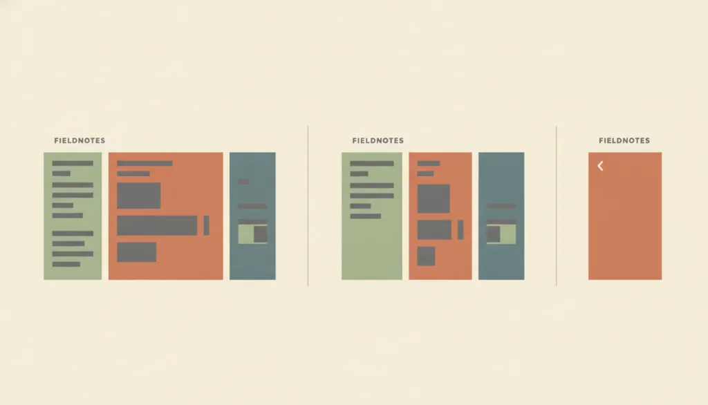
Lets the same set of panes gain, merge, or split columns based on available width or container size — two or three panes side by side on a wide window, collapsing to a single pane with a way back on a narrow one. It governs only that reorganization, not what kind of information any individual pane carries.
Recognizing it
- The same set of panes shows two or three columns side by side on a wide window and collapses to a single column with a back or switch affordance on a narrow one
- Merging or splitting the pane count is triggered by viewport or container-width breakpoints, not by the person manually switching layout modes
- The current selection and scroll position are preserved across the pane-count change wherever feasible, rather than resetting to an initial state
Concept boundary
Adaptive multipane layout describes how one set of panes gains, merges, or splits columns across screen widths or window shapes, and what must be preserved or may be deferred when that happens. It does not redefine what belongs inside any single pane or how panes relate to each other — a list selection driving a detail view is master-detail's job, a narrower reference or citation pane is supporting-pane's job, and a persistent cross-page navigation or tool region is sidebar-layout's job. In short, those layouts answer "what is in the panes and how do they connect," while adaptive multipane layout only answers "how does this same set of panes reflow as the window gets narrower or wider."
When to consider it
- A multi-pane experience needs to work on phones, tablets, and wide windows alike, and content on a narrow screen must not simply disappear
- The app can run at in-between sizes such as split screen or a resizable desktop window, and needs a smooth transition rather than an abrupt jump at fixed breakpoints
- The product already uses master-detail, supporting-pane, or sidebar-layout (or a combination of them) and needs one consistent reflow rule shared across all of them
When to be cautious
- The product targets only one fixed device width and never needs to reflow across sizes
- The problem to solve is what belongs inside a pane, or how panes relate to each other — that is master-detail's, supporting-pane's, or sidebar-layout's job, not this one
- The plan is to drop a pane's content on narrow screens with no substitute entry point — that violates the baseline of keeping content reachable and should not be adopted as an adaptive approach
Tradeoff
Experience stays coherent and content stays reachable across devices and window shapes, but each breakpoint needs its own merge/split rule, and in-between sizes such as a resizable window must be tested for a smooth transition rather than an abrupt jump between two or three fixed breakpoints.
Conditional rules · Editorial advice
Related entries
Adaptive multipane layout only defines how this set of panes merges into one column or splits into more, without changing master-detail's own semantics of a list selection driving the detail content.
Adaptive multipane layout is responsible for letting the supporting pane collapse into a reachable entry point on narrow screens, while the reference or source content shown inside it is still defined by supporting-pane layout.
Single-column layout only describes the single-pane experience itself; adaptive multipane layout describes the process of converging from multiple columns down to one, and that narrow-screen end state is often single-column layout.
Sources and what they support
Explains that container queries let a layout change style and arrangement based on a container's own inline size rather than the viewport, so the same component or pane structure can reorganize its presentation at different container widths without relying on global viewport breakpoints.
Retrieved: 2026-09-15 · Archived 2026-09-16Requires that content be presentable at a width equivalent to 320 CSS pixels without loss of information or functionality and without requiring two-dimensional scrolling (except for parts of the content that require two-dimensional layout for their use or meaning); this Success Criterion is Level AA, and it sets the floor for how narrow a collapsed multipane view may go and whether horizontal scrolling is allowed.
Retrieved: 2026-09-15 · Archived 2026-09-16Definitions reference these sources. Digital specimens, selection advice, relationships, and recipes are editorial work and have not been validated through user research.
Type extensions and implementation notes
No operable specimen yet; the illustration is an editorial sketch. When applied to a product, still verify: whether the merge/split at each breakpoint meets the requirement of no two-dimensional scrolling at a width equivalent to 320 CSS pixels; whether the collapsed pane's entry point has a text or accessible name; whether the current selection and scroll position are preserved across a pane-count change; and whether in-between sizes such as a resizable window or split screen transition smoothly rather than jumping abruptly.
{
  "states": [
    "three-pane",
    "two-pane",
    "single-pane"
  ],
  "a11y": [
    "The pane-count change does not disrupt the current focus order; the element focused before the change remains keyboard-reachable in the new layout",
    "The collapsed navigation affordance (such as a back button or tab) has a text or accessible name, not just an icon",
    "When collapsed to a single pane, the reading order matches the visual order and no leftover horizontal scrolling remains"
  ],
  "motion": "The pane-count transition may use a brief animation and should respect the reduced-motion preference"
}
Full Agent entry JSON
{
  "id": "adaptive-multipane",
  "type": "layout",
  "name": {
    "zh": "自适应多面板布局",
    "en": "Adaptive Multipane Layout"
  },
  "aliases": [
    "自适应分栏布局",
    "响应式多面板布局",
    "Responsive Multi-Pane Layout"
  ],
  "granularity": "page",
  "intents": [
    "organize-content",
    "adapt-layout"
  ],
  "tags": [
    "responsive layout",
    "breakpoint",
    "pane reflow",
    "narrow-screen adaptation",
    "cross-device consistency"
  ],
  "definition": "Lets the same set of panes gain, merge, or split columns based on available width or container size — two or three panes side by side on a wide window, collapsing to a single pane with a way back on a narrow one. It governs only that reorganization, not what kind of information any individual pane carries.",
  "boundary": "Adaptive multipane layout describes how one set of panes gains, merges, or splits columns across screen widths or window shapes, and what must be preserved or may be deferred when that happens. It does not redefine what belongs inside any single pane or how panes relate to each other — a list selection driving a detail view is master-detail's job, a narrower reference or citation pane is supporting-pane's job, and a persistent cross-page navigation or tool region is sidebar-layout's job. In short, those layouts answer \"what is in the panes and how do they connect,\" while adaptive multipane layout only answers \"how does this same set of panes reflow as the window gets narrower or wider.\"",
  "signature": [
    "The same set of panes shows two or three columns side by side on a wide window and collapses to a single column with a back or switch affordance on a narrow one",
    "Merging or splitting the pane count is triggered by viewport or container-width breakpoints, not by the person manually switching layout modes",
    "The current selection and scroll position are preserved across the pane-count change wherever feasible, rather than resetting to an initial state"
  ],
  "when": [
    "A multi-pane experience needs to work on phones, tablets, and wide windows alike, and content on a narrow screen must not simply disappear",
    "The app can run at in-between sizes such as split screen or a resizable desktop window, and needs a smooth transition rather than an abrupt jump at fixed breakpoints",
    "The product already uses master-detail, supporting-pane, or sidebar-layout (or a combination of them) and needs one consistent reflow rule shared across all of them"
  ],
  "when_not": [
    "The product targets only one fixed device width and never needs to reflow across sizes",
    "The problem to solve is what belongs inside a pane, or how panes relate to each other — that is master-detail's, supporting-pane's, or sidebar-layout's job, not this one",
    "The plan is to drop a pane's content on narrow screens with no substitute entry point — that violates the baseline of keeping content reachable and should not be adopted as an adaptive approach"
  ],
  "tradeoff": "Experience stays coherent and content stays reachable across devices and window shapes, but each breakpoint needs its own merge/split rule, and in-between sizes such as a resizable window must be tested for a smooth transition rather than an abrupt jump between two or three fixed breakpoints.",
  "comparison": {
    "focus": "Reorganizing the column count of the same set of panes based on available width, without dictating what any individual pane contains",
    "mechanism": "Adding or removing side-by-side columns by breakpoint or container width, collapsing to a single column with a navigation affordance on narrow screens",
    "cost": "A merge/split rule is needed for every size, and selection state and scroll position must stay continuous across the reflow"
  },
  "sources": [
    {
      "id": "adaptive-multipane-mdn-container-queries",
      "title": "MDN Web Docs · CSS containment / Container queries",
      "url": "https://developer.mozilla.org/en-US/docs/Web/CSS/CSS_containment/Container_queries",
      "claim": "Explains that container queries let a layout change style and arrangement based on a container's own inline size rather than the viewport, so the same component or pane structure can reorganize its presentation at different container widths without relying on global viewport breakpoints.",
      "checkedAt": "2026-09-15",
      "archive": {
        "lookupUrl": "https://web.archive.org/web/20260915*/https://developer.mozilla.org/en-US/docs/Web/CSS/CSS_containment/Container_queries",
        "status": "available",
        "checkedAt": "2026-09-16T05:40:09.474Z",
        "jobId": "spn2-a4f5f84cfd5ea1e3a53422fd0c4b64322503ae77",
        "url": "https://web.archive.org/web/20260916054131/https://developer.mozilla.org/en-US/docs/Web/CSS/Guides/Containment/Container_queries",
        "timestamp": "20260916054131"
      }
    },
    {
      "id": "adaptive-multipane-wcag-reflow",
      "title": "W3C WAI · WCAG 2.2 Understanding Success Criterion 1.4.10: Reflow",
      "url": "https://www.w3.org/WAI/WCAG22/Understanding/reflow.html",
      "claim": "Requires that content be presentable at a width equivalent to 320 CSS pixels without loss of information or functionality and without requiring two-dimensional scrolling (except for parts of the content that require two-dimensional layout for their use or meaning); this Success Criterion is Level AA, and it sets the floor for how narrow a collapsed multipane view may go and whether horizontal scrolling is allowed.",
      "checkedAt": "2026-09-15",
      "archive": {
        "lookupUrl": "https://web.archive.org/web/20260915*/https://www.w3.org/WAI/WCAG22/Understanding/reflow.html",
        "status": "available",
        "checkedAt": "2026-09-16T05:40:47.748Z",
        "jobId": "spn2-6485fb0b5cd24ce204985b64d578556e776712cf",
        "url": "https://web.archive.org/web/20260916054204/https://www.w3.org/WAI/WCAG22/Understanding/reflow.html",
        "timestamp": "20260916054204"
      }
    }
  ],
  "relations": [
    {
      "target": "master-detail",
      "kind": "composes_with",
      "condition": "Master-detail's list and detail act as two of the panes participating in the column reorganization",
      "reason": "Adaptive multipane layout only defines how this set of panes merges into one column or splits into more, without changing master-detail's own semantics of a list selection driving the detail content.",
      "basis": "editorial"
    },
    {
      "target": "supporting-pane",
      "kind": "composes_with",
      "condition": "A supporting pane acts as the extra column that needs to collapse on narrow screens",
      "reason": "Adaptive multipane layout is responsible for letting the supporting pane collapse into a reachable entry point on narrow screens, while the reference or source content shown inside it is still defined by supporting-pane layout.",
      "basis": "editorial"
    },
    {
      "target": "single-column",
      "kind": "related",
      "condition": "Deciding how many columns the layout ultimately converges to on a narrow or very constrained container",
      "reason": "Single-column layout only describes the single-pane experience itself; adaptive multipane layout describes the process of converging from multiple columns down to one, and that narrow-screen end state is often single-column layout.",
      "basis": "editorial"
    }
  ],
  "rules": [
    {
      "when": "The viewport or container width narrows to the point where the current column count no longer fits side by side",
      "instruction": "Content must reflow to a layout usable at a width equivalent to 320 CSS pixels without requiring two-dimensional scrolling (except for parts of the content that require two-dimensional layout for their use or meaning).",
      "strength": "must",
      "basis": "editorial"
    },
    {
      "when": "A pane from before the reflow still holds content or an action the person needs to reach",
      "instruction": "When merging or collapsing columns, that pane's content or entry point must not become completely unreachable in the new layout — keep a tappable, textually or accessibly named navigation or expand control.",
      "strength": "must",
      "basis": "editorial"
    },
    {
      "when": "The pane count changes at a breakpoint, for example a wide three-pane view collapsing to two panes or one",
      "instruction": "Preserve the person's current selection and scroll position rather than resetting the view to its initial state.",
      "strength": "recommend",
      "basis": "editorial"
    }
  ],
  "behavior": {
    "states": [
      "three-pane",
      "two-pane",
      "single-pane"
    ],
    "a11y": [
      "The pane-count change does not disrupt the current focus order; the element focused before the change remains keyboard-reachable in the new layout",
      "The collapsed navigation affordance (such as a back button or tab) has a text or accessible name, not just an icon",
      "When collapsed to a single pane, the reading order matches the visual order and no leftover horizontal scrolling remains"
    ],
    "motion": "The pane-count transition may use a brief animation and should respect the reduced-motion preference"
  },
  "demo": null,
  "version": "0.1.0",
  "editorialStatus": "drafted",
  "requirements": [],
  "demoCapabilities": [],
  "implementationNote": "No operable specimen yet; the illustration is an editorial sketch. When applied to a product, still verify: whether the merge/split at each breakpoint meets the requirement of no two-dimensional scrolling at a width equivalent to 320 CSS pixels; whether the collapsed pane's entry point has a text or accessible name; whether the current selection and scroll position are preserved across a pane-count change; and whether in-between sizes such as a resizable window or split screen transition smoothly rather than jumping abruptly.",
  "image": {
    "src": "/images/adaptive-multipane.webp",
    "alt": "A fictional FIELDNOTES app screen shown side by side at three widths: the widest version on the left shows three panes of content, the middle version collapses to two panes, and the narrowest version on the right shows a single pane with a back-arrow icon; flat, muted warm-toned editorial illustration style."
  },
  "searchTerms": [
    "响应式布局",
    "断点",
    "面板重组",
    "窄屏适配",
    "跨设备一致性"
  ]
}