VOCABULARY / ENTRY
Art Deco
art-deco
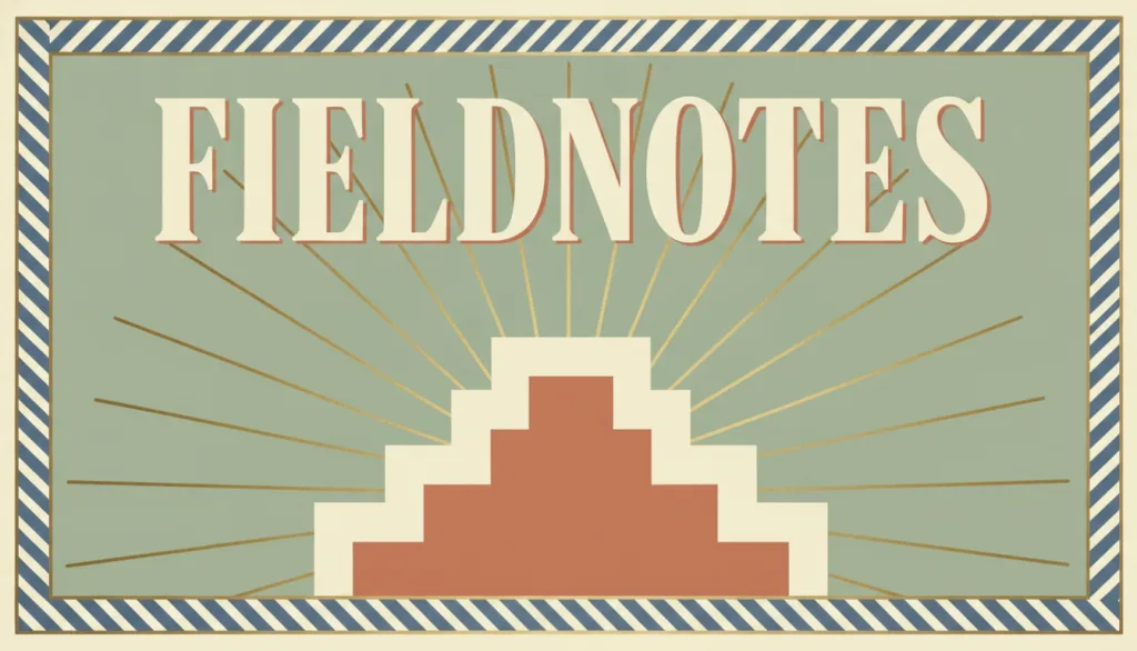
A decorative visual language originating in the 1920s and 1930s: built on symmetrical composition and cubism-influenced geometric ornament (stepped forms, sunburst rays, chevrons), typically paired with metallic accent colors and high-contrast display typography to convey a modern, refined, or nostalgic brand character.
Recognizing it
- Symmetrical composition with stepped, arched, or ziggurat-like outlines
- Repeating geometric motifs such as sunburst fans and chevrons used as borders or backgrounds
- High-contrast display typography paired with metallic accent colors (gold, copper, brass)
Concept boundary
The test is cubist-derived geometric ornament (stepped outlines, sunburst fans, chevrons), not any general "1920s retro" feeling. It is both a successor to and a reaction against Art Nouveau: Art Nouveau is defined by organic curves drawn from nature, vines, and floral lines, while Art Deco replaced those curves with the fragmented, geometric forms brought by cubism, keeping only traces of plant imagery. It is also distinct from Bauhaus: Bauhaus geometry serves functional structural reduction and rejects non-structural ornament, while Art Deco treats geometric forms as repeatable, stackable surface decoration meant to convey luxury. A symmetrical grid or a gold accent color alone is not enough for this entry; stepped, radiating, or chevron ornament must also be present.
When to consider it
- The content has a nostalgic, premium, celebratory, or "modern retro" brand positioning that the geometric ornament can reinforce
- A display-focused context such as a cover, poster, or emblem-style mark, where borders and backgrounds can carry repeating motifs
- The layout has room for symmetrical borders and radiating patterns without crowding body text or key controls
When to be cautious
- Dense, frequently scanned interfaces (long forms, data lists), where repeating geometric borders distract and slow reading
- A product positioning built on functional restraint or minimalism, which conflicts with the ornamental approach
- The goal is only "symmetry" or "order" without any historical or luxury association, where a grid-based style fits better than Art Deco's specific motifs
Tradeoff
Art Deco quickly signals a modern, refined, or nostalgic brand association, and its repeating geometric motifs are highly recognizable; but the ornament itself carries no information, so outside display contexts it tends to crowd out content space and reduce body-text readability, and high-contrast display type is unsuited to long passages of body copy.
Conditional rules · Editorial advice
Related entries
Both make heavy use of geometric form, but Swiss / International Typographic Style (part of the same functionalist tradition as Bauhaus) uses geometry to build restrained grids and order while rejecting non-functional ornament, whereas Art Deco treats geometric motifs as repeatable, stackable surface decoration; usually only one can serve as the primary visual language.
Art Deco's recognizability comes from its repeatable geometric ornament itself, while visual minimalism requires removing elements that carry no information; the two pull in opposite directions.
Both may use metallic color or textured detail to evoke nostalgia or refinement, but Art Deco's core is geometric ornamental motifs; it does not require imitating a specific object's form and operation, and should not be conflated with skeuomorphism.
Sources and what they support
This entry defines Art Deco as a design style of the 1920s and 1930s, states that its chief difference from Art Nouveau is the influence of cubism, which gives Art Deco a more fragmented, geometric character, notes its use in furniture, pottery, textiles, jewelry, and glass, and describes it as a successor to and a reaction against Art Nouveau. This entry's date range and the boundary against Art Nouveau are drawn from it.
Retrieved: 2026-09-15 · Archived 2026-09-16This article states that Art Deco is not a single style but a pastiche of different sources and influences, identifies the 1925 Exposition Internationale des Arts Décoratifs et Industriels Modernes in Paris as a pivotal moment, notes that geometric forms worked their way into all aspects of life, links the 1922 excavation of Tutankhamun's tomb to Egyptian motifs, and notes that by the mid-1930s the style was being derided as "a gaudy, false image of luxury." This entry's historical period and geometric-motif characterization are drawn from it.
Retrieved: 2026-09-15 · Archived 2026-09-16Definitions reference these sources. Digital specimens, selection advice, relationships, and recipes are editorial work and have not been validated through user research.
Type extensions and implementation notes
This entry has no operable specimen yet; the illustration is an editorial sketch. When applied to a product, verify that ornamental borders and radiating motifs do not reduce the contrast of body text and controls or encroach on touch targets, and confirm the period or luxury association the style implies actually matches the product's positioning.
{
  "tokens": {
    "surface": "#f2e6d3",
    "ink": "#241b14",
    "accent": "#b8862f",
    "radiusPx": 0,
    "shadow": "none"
  },
  "tokenScope": "A recipe for this specimen: a warm cream surface, dark brown ink, and a brass-toned accent; a real product should choose its own palette to fit the brand context and verify text-and-control contrast within ornamental border areas."
}
Full Agent entry JSON
{
  "id": "art-deco",
  "type": "visual",
  "name": {
    "zh": "装饰艺术",
    "en": "Art Deco"
  },
  "aliases": [
    "Art Deco Style",
    "装饰风艺术",
    "1925风格"
  ],
  "granularity": "experience",
  "intents": [
    "express-brand",
    "organize-content"
  ],
  "tags": [
    "symmetry",
    "geometric ornament",
    "sunburst motif",
    "high-contrast display type",
    "metallic accent"
  ],
  "definition": "A decorative visual language originating in the 1920s and 1930s: built on symmetrical composition and cubism-influenced geometric ornament (stepped forms, sunburst rays, chevrons), typically paired with metallic accent colors and high-contrast display typography to convey a modern, refined, or nostalgic brand character.",
  "boundary": "The test is cubist-derived geometric ornament (stepped outlines, sunburst fans, chevrons), not any general \"1920s retro\" feeling. It is both a successor to and a reaction against Art Nouveau: Art Nouveau is defined by organic curves drawn from nature, vines, and floral lines, while Art Deco replaced those curves with the fragmented, geometric forms brought by cubism, keeping only traces of plant imagery. It is also distinct from Bauhaus: Bauhaus geometry serves functional structural reduction and rejects non-structural ornament, while Art Deco treats geometric forms as repeatable, stackable surface decoration meant to convey luxury. A symmetrical grid or a gold accent color alone is not enough for this entry; stepped, radiating, or chevron ornament must also be present.",
  "signature": [
    "Symmetrical composition with stepped, arched, or ziggurat-like outlines",
    "Repeating geometric motifs such as sunburst fans and chevrons used as borders or backgrounds",
    "High-contrast display typography paired with metallic accent colors (gold, copper, brass)"
  ],
  "when": [
    "The content has a nostalgic, premium, celebratory, or \"modern retro\" brand positioning that the geometric ornament can reinforce",
    "A display-focused context such as a cover, poster, or emblem-style mark, where borders and backgrounds can carry repeating motifs",
    "The layout has room for symmetrical borders and radiating patterns without crowding body text or key controls"
  ],
  "when_not": [
    "Dense, frequently scanned interfaces (long forms, data lists), where repeating geometric borders distract and slow reading",
    "A product positioning built on functional restraint or minimalism, which conflicts with the ornamental approach",
    "The goal is only \"symmetry\" or \"order\" without any historical or luxury association, where a grid-based style fits better than Art Deco's specific motifs"
  ],
  "tradeoff": "Art Deco quickly signals a modern, refined, or nostalgic brand association, and its repeating geometric motifs are highly recognizable; but the ornament itself carries no information, so outside display contexts it tends to crowd out content space and reduce body-text readability, and high-contrast display type is unsuited to long passages of body copy.",
  "comparison": {
    "focus": "Using geometric ornament to signal modernity and luxury",
    "mechanism": "Symmetry, stepped and sunburst motifs, metallic accent color, display typography",
    "cost": "The ornament carries no information; misapplied it crowds content and reduces readability"
  },
  "sources": [
    {
      "id": "art-deco-tate",
      "title": "Tate · Art Deco",
      "url": "https://www.tate.org.uk/art/art-terms/a/art-deco",
      "claim": "This entry defines Art Deco as a design style of the 1920s and 1930s, states that its chief difference from Art Nouveau is the influence of cubism, which gives Art Deco a more fragmented, geometric character, notes its use in furniture, pottery, textiles, jewelry, and glass, and describes it as a successor to and a reaction against Art Nouveau. This entry's date range and the boundary against Art Nouveau are drawn from it.",
      "checkedAt": "2026-09-15",
      "archive": {
        "lookupUrl": "https://web.archive.org/web/20260915*/https://www.tate.org.uk/art/art-terms/a/art-deco",
        "status": "available",
        "checkedAt": "2026-09-16T04:50:23.280Z",
        "jobId": "spn2-e53528cdf20e395ea8f92d5c0a74f4caae10ac47",
        "url": "https://web.archive.org/web/20260916045030/https://www.tate.org.uk/art/art-terms/a/art-deco",
        "timestamp": "20260916045030"
      }
    },
    {
      "id": "art-deco-vam",
      "title": "V&A · An introduction to Art Deco",
      "url": "https://www.vam.ac.uk/articles/an-introduction-to-art-deco",
      "claim": "This article states that Art Deco is not a single style but a pastiche of different sources and influences, identifies the 1925 Exposition Internationale des Arts Décoratifs et Industriels Modernes in Paris as a pivotal moment, notes that geometric forms worked their way into all aspects of life, links the 1922 excavation of Tutankhamun's tomb to Egyptian motifs, and notes that by the mid-1930s the style was being derided as \"a gaudy, false image of luxury.\" This entry's historical period and geometric-motif characterization are drawn from it.",
      "checkedAt": "2026-09-15",
      "archive": {
        "lookupUrl": "https://web.archive.org/web/20260915*/https://www.vam.ac.uk/articles/an-introduction-to-art-deco",
        "status": "available",
        "checkedAt": "2026-09-16T04:50:47.158Z",
        "jobId": "spn2-a6976106a3c423209ae504ac3d4b4612d8205bf0",
        "url": "https://web.archive.org/web/20260916045056/https://www.vam.ac.uk/articles/an-introduction-to-art-deco",
        "timestamp": "20260916045056"
      }
    }
  ],
  "relations": [
    {
      "target": "swiss",
      "kind": "alternative",
      "condition": "Choosing a geometry-centered visual language for the same brand or page",
      "reason": "Both make heavy use of geometric form, but Swiss / International Typographic Style (part of the same functionalist tradition as Bauhaus) uses geometry to build restrained grids and order while rejecting non-functional ornament, whereas Art Deco treats geometric motifs as repeatable, stackable surface decoration; usually only one can serve as the primary visual language.",
      "basis": "editorial"
    },
    {
      "target": "minimalism",
      "kind": "conflicts_when",
      "condition": "The same interface both requires removing non-essential ornament and relies on symmetrical borders and radiating motifs to convey brand character",
      "reason": "Art Deco's recognizability comes from its repeatable geometric ornament itself, while visual minimalism requires removing elements that carry no information; the two pull in opposite directions.",
      "basis": "editorial"
    },
    {
      "target": "skeuomorphism",
      "kind": "related",
      "condition": "Both draw on historical or physical-material cues (metallic sheen, texture) to convey brand association",
      "reason": "Both may use metallic color or textured detail to evoke nostalgia or refinement, but Art Deco's core is geometric ornamental motifs; it does not require imitating a specific object's form and operation, and should not be conflated with skeuomorphism.",
      "basis": "editorial"
    }
  ],
  "rules": [
    {
      "when": "Layering symmetrical borders, sunburst patterns, or chevrons around text, buttons, or tappable areas",
      "instruction": "The ornament must not reduce the contrast of body text and controls, nor encroach on the effective tap area of touch targets; reduce the ornament's intensity or move it outside the tappable region when needed.",
      "strength": "must",
      "basis": "editorial"
    },
    {
      "when": "Deciding whether to adopt Art Deco as the overall visual language",
      "instruction": "Use it only when the content genuinely calls for a specific period feel or luxury association, not as a default way to look \"refined\"; avoid it for dense content or a functionally restrained positioning.",
      "strength": "recommend",
      "basis": "editorial"
    }
  ],
  "visual": {
    "tokens": {
      "surface": "#f2e6d3",
      "ink": "#241b14",
      "accent": "#b8862f",
      "radiusPx": 0,
      "shadow": "none"
    },
    "tokenScope": "A recipe for this specimen: a warm cream surface, dark brown ink, and a brass-toned accent; a real product should choose its own palette to fit the brand context and verify text-and-control contrast within ornamental border areas."
  },
  "demo": null,
  "version": "0.1.0",
  "editorialStatus": "drafted",
  "requirements": [],
  "demoCapabilities": [],
  "implementationNote": "This entry has no operable specimen yet; the illustration is an editorial sketch. When applied to a product, verify that ornamental borders and radiating motifs do not reduce the contrast of body text and controls or encroach on touch targets, and confirm the period or luxury association the style implies actually matches the product's positioning.",
  "image": {
    "src": "/images/art-deco.webp",
    "alt": "A fictional magazine cover named FIELDNOTES showing a symmetric stepped arch, a sunburst-ray background, a chevron border, and a tall geometric display-type title, in a muted warm palette with one brass-like accent, illustrating Art Deco style."
  },
  "searchTerms": [
    "对称",
    "几何装饰",
    "放射纹",
    "高对比排版",
    "金属质感"
  ]
}