VOCABULARY / ENTRY
Skeuomorphism
skeuomorphism
A visual approach that brings real-world objects, together with their materials, forms, and ways of operating, into digital interfaces: interface elements imitate their physical counterparts in appearance or interaction (a leather cover, paper, a toggle switch, a trash bin) so that users' existing experience explains what a new interface does.
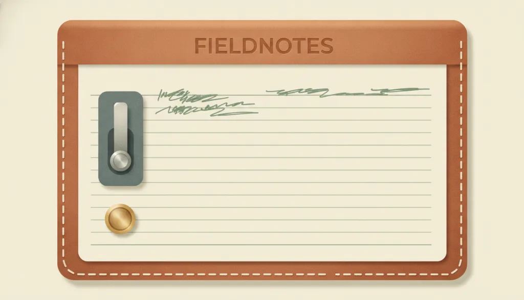
Recognizing it
- Elements imitate specific physical objects and their materials: leather, paper, wood, metal, glass highlights
- The form and operation of controls mirror physical actions: toggle switches, knobs, page turns, pressed buttons
- Lighting, texture, and details such as stitching convey the thickness and tactility of real objects
Concept boundary
The test for skeuomorphism is "borrowing a real object's form to explain a function", not how realistic the rendering is: a photorealistic abstract color block is not skeuomorphic, while a low-detail control that looks like a toggle switch and flips like one is. It is the opposing choice to flat design, which arose as the reaction against skeuomorphism and removed the simulated 3D and material cues. Glassmorphism is only a material effect of translucency and blur that borrows no specific object; this entry does not count it as skeuomorphism. Object metaphors at the icon level (a trash can, a folder) are the minimal form of skeuomorphism; this entry focuses on the whole-interface style.
When to consider it
- Target users are unfamiliar with this kind of digital interface but very familiar with the imitated physical object and how it is used
- The product deliberately pursues a warm, tactile, narrative brand character and its content is not dense
- The borrowed physical operation maps one-to-one onto the actual interaction (flipping toggles, turning turns a page)
When to be cautious
- The imitated object is obsolete and younger users do not recognize it (a floppy disk, an old telephone handset)
- The interface is dense and frequently scanned, so textures and ornament interfere with reading and reduce contrast
- The metaphor and the actual interaction disagree, for example a switch drawn as flippable that can only be tapped, or a bookshelf that cannot be browsed
Tradeoff
Skeuomorphism borrows real-world experience to lower the learning cost of a new interface and adds emotional warmth, at the price of more visual noise, higher asset and maintenance cost, and, once users know digital conventions, imitation that can feel cumbersome or even misleading; its effect depends on the metaphor matching the actual interaction, not on how realistic the details are.
Conditional rules · Editorial advice
Related entries
Flat design is the counter-choice to skeuomorphism: one borrows physical forms to explain function, the other removes every cue that simulates a physical object; usually only one can be the primary visual language.
Both employ a sense of material, but glassmorphism is only a surface effect that borrows no specific object's form or operation, so it should not be treated as skeuomorphism.
Skeuomorphism lets users judge what the interface can do by recognizing the object rather than memorizing abstract conventions, which is one way of realizing recognition rather than recall.
Skeuomorphism's persuasiveness comes from decorative detail, while visual minimalism requires removing elements that carry no information; the two pull in opposite directions.
Sources and what they support
The article (Megan Chan, 2024-03-15) defines skeuomorphism as a design practice that incorporates real-world elements into digital interfaces to create familiarity, cites examples such as trash bins, folders, wooden bookshelves, and leather notebooks, notes that overuse led to cluttered, slower, dated-looking interfaces followed by the rise of flat design, and argues for a balance between innovation and familiarity. This entry's definition, tradeoff, and recommended rule paraphrase it.
Retrieved: 2026-09-15 · Archived 2026-09-16The topic page (published 2016-06-04, updated 2024-12-06, no named author) defines skeuomorphism as interface objects that mimic their real-world counterparts in appearance and/or interaction, links it to Gibson's concept of affordances, notes that it helped users unfamiliar with touch screens operate intuitively, and lists drawbacks such as clutter, replicating obsolete objects (the floppy-disk icon), and looking dated as users become digitally fluent. This entry's "form must match interaction" boundary and avoid-conditions build on it.
Retrieved: 2026-09-15 · Snapshot unconfirmedThe article (Kate Moran, 2015-09-27) describes skeuomorphic design as having unnecessary ornamental features that mimic a real-world precedent, states that flat design emerged as a reaction against 3D, skeuomorphic, and realistic styles, and notes that early pseudo-3D GUIs and skeuomorphism often produced heavy, clunky interfaces. This entry's opposition to flat design is based on it.
Retrieved: 2026-09-15Definitions reference these sources. Digital specimens, selection advice, relationships, and recipes are editorial work and have not been validated through user research.
Type extensions and implementation notes
This entry has no operable specimen yet; the illustration is an editorial sketch. When applied to a product, verify with real users that the borrowed objects are still recognized and that metaphors match the actual interaction, and measure the contrast of text and controls over textured backgrounds.
{
  "tokens": {
    "surface": "#e8dcc4",
    "ink": "#3a2e26",
    "accent": "#8c5a3c",
    "radiusPx": 10,
    "shadow": "0 2px 4px rgba(58,46,38,0.35), inset 0 1px 0 rgba(255,255,255,0.4)"
  },
  "tokenScope": "A recipe for this specimen: a paper-toned surface, dark brown ink, a leather-like accent, and an outer shadow plus inner highlight that simulate thickness; a real product should derive values from the material it imitates and verify text contrast over textures."
}
Full Agent entry JSON
{
  "id": "skeuomorphism",
  "type": "visual",
  "name": {
    "zh": "拟物化设计",
    "en": "Skeuomorphism"
  },
  "aliases": [
    "Skeuomorphic Design",
    "拟物风格",
    "拟物化"
  ],
  "granularity": "experience",
  "intents": [
    "express-brand",
    "organize-content"
  ],
  "tags": [
    "real-world metaphor",
    "material texture",
    "familiarity",
    "affordance",
    "physical controls"
  ],
  "definition": "A visual approach that brings real-world objects, together with their materials, forms, and ways of operating, into digital interfaces: interface elements imitate their physical counterparts in appearance or interaction (a leather cover, paper, a toggle switch, a trash bin) so that users' existing experience explains what a new interface does.",
  "boundary": "The test for skeuomorphism is \"borrowing a real object's form to explain a function\", not how realistic the rendering is: a photorealistic abstract color block is not skeuomorphic, while a low-detail control that looks like a toggle switch and flips like one is. It is the opposing choice to flat design, which arose as the reaction against skeuomorphism and removed the simulated 3D and material cues. Glassmorphism is only a material effect of translucency and blur that borrows no specific object; this entry does not count it as skeuomorphism. Object metaphors at the icon level (a trash can, a folder) are the minimal form of skeuomorphism; this entry focuses on the whole-interface style.",
  "signature": [
    "Elements imitate specific physical objects and their materials: leather, paper, wood, metal, glass highlights",
    "The form and operation of controls mirror physical actions: toggle switches, knobs, page turns, pressed buttons",
    "Lighting, texture, and details such as stitching convey the thickness and tactility of real objects"
  ],
  "when": [
    "Target users are unfamiliar with this kind of digital interface but very familiar with the imitated physical object and how it is used",
    "The product deliberately pursues a warm, tactile, narrative brand character and its content is not dense",
    "The borrowed physical operation maps one-to-one onto the actual interaction (flipping toggles, turning turns a page)"
  ],
  "when_not": [
    "The imitated object is obsolete and younger users do not recognize it (a floppy disk, an old telephone handset)",
    "The interface is dense and frequently scanned, so textures and ornament interfere with reading and reduce contrast",
    "The metaphor and the actual interaction disagree, for example a switch drawn as flippable that can only be tapped, or a bookshelf that cannot be browsed"
  ],
  "tradeoff": "Skeuomorphism borrows real-world experience to lower the learning cost of a new interface and adds emotional warmth, at the price of more visual noise, higher asset and maintenance cost, and, once users know digital conventions, imitation that can feel cumbersome or even misleading; its effect depends on the metaphor matching the actual interaction, not on how realistic the details are.",
  "comparison": {
    "focus": "Borrowing real objects' forms to explain interface functions",
    "mechanism": "Material textures, lit depth, and physical-style controls",
    "cost": "High visual noise and maintenance cost; misleads users when the metaphor is outdated or mismatched"
  },
  "sources": [
    {
      "id": "skeuo-nng-definition",
      "title": "Nielsen Norman Group · Skeuomorphism",
      "url": "https://www.nngroup.com/articles/skeuomorphism/",
      "claim": "The article (Megan Chan, 2024-03-15) defines skeuomorphism as a design practice that incorporates real-world elements into digital interfaces to create familiarity, cites examples such as trash bins, folders, wooden bookshelves, and leather notebooks, notes that overuse led to cluttered, slower, dated-looking interfaces followed by the rise of flat design, and argues for a balance between innovation and familiarity. This entry's definition, tradeoff, and recommended rule paraphrase it.",
      "checkedAt": "2026-09-15",
      "archive": {
        "lookupUrl": "https://web.archive.org/web/20260915*/https://www.nngroup.com/articles/skeuomorphism/",
        "status": "available",
        "checkedAt": "2026-09-16T03:48:11.915Z",
        "jobId": "spn2-2ede01adbaf3c16e510c3b4578e7aab30e4fa6db",
        "url": "https://web.archive.org/web/20260916034939/https://www.nngroup.com/articles/skeuomorphism/",
        "timestamp": "20260916034939"
      }
    },
    {
      "id": "skeuo-ixdf-topic",
      "title": "Interaction Design Foundation · Skeuomorphism",
      "url": "https://www.interaction-design.org/literature/topics/skeuomorphism",
      "claim": "The topic page (published 2016-06-04, updated 2024-12-06, no named author) defines skeuomorphism as interface objects that mimic their real-world counterparts in appearance and/or interaction, links it to Gibson's concept of affordances, notes that it helped users unfamiliar with touch screens operate intuitively, and lists drawbacks such as clutter, replicating obsolete objects (the floppy-disk icon), and looking dated as users become digitally fluent. This entry's \"form must match interaction\" boundary and avoid-conditions build on it.",
      "checkedAt": "2026-09-15",
      "archive": {
        "lookupUrl": "https://web.archive.org/web/20260915*/https://www.interaction-design.org/literature/topics/skeuomorphism",
        "status": "unconfirmed",
        "checkedAt": "2026-09-16T03:48:12.822Z",
        "error": "error:no-request",
        "jobId": "spn2-649b4ca65ff8a534604c8c7da68534c2074b8d39"
      }
    },
    {
      "id": "skeuo-nng-flat-origins",
      "title": "Nielsen Norman Group · Flat Design: Its Origins, Its Problems, and Why Flat 2.0 Is Better for Users",
      "url": "https://www.nngroup.com/articles/flat-design/",
      "claim": "The article (Kate Moran, 2015-09-27) describes skeuomorphic design as having unnecessary ornamental features that mimic a real-world precedent, states that flat design emerged as a reaction against 3D, skeuomorphic, and realistic styles, and notes that early pseudo-3D GUIs and skeuomorphism often produced heavy, clunky interfaces. This entry's opposition to flat design is based on it.",
      "checkedAt": "2026-09-15",
      "archive": {
        "lookupUrl": "https://web.archive.org/web/20260915*/https://www.nngroup.com/articles/flat-design/",
        "status": "available",
        "checkedAt": "2026-09-15T18:29:13.192Z",
        "jobId": "spn2-65e14e38bafbbcfc785ccbbbcf37a49a08a2e24b",
        "url": "https://web.archive.org/web/20260915183058/https://www.nngroup.com/articles/flat-design/",
        "timestamp": "20260915183058"
      }
    }
  ],
  "relations": [
    {
      "target": "flat-design",
      "kind": "alternative",
      "condition": "Choosing whether the same product keeps simulated materials and 3D cues",
      "reason": "Flat design is the counter-choice to skeuomorphism: one borrows physical forms to explain function, the other removes every cue that simulates a physical object; usually only one can be the primary visual language.",
      "basis": "editorial"
    },
    {
      "target": "glassmorphism",
      "kind": "related",
      "condition": "The interface uses material effects such as translucency, blur, or highlights",
      "reason": "Both employ a sense of material, but glassmorphism is only a surface effect that borrows no specific object's form or operation, so it should not be treated as skeuomorphism.",
      "basis": "editorial"
    },
    {
      "target": "recognition",
      "kind": "informs",
      "condition": "Users are unfamiliar with digital conventions but familiar with the imitated physical object",
      "reason": "Skeuomorphism lets users judge what the interface can do by recognizing the object rather than memorizing abstract conventions, which is one way of realizing recognition rather than recall.",
      "basis": "editorial"
    },
    {
      "target": "minimalism",
      "kind": "conflicts_when",
      "condition": "The same interface both demands the removal of non-essential ornament and imitates objects with textures, stitching, and lighting",
      "reason": "Skeuomorphism's persuasiveness comes from decorative detail, while visual minimalism requires removing elements that carry no information; the two pull in opposite directions.",
      "basis": "editorial"
    }
  ],
  "rules": [
    {
      "when": "Representing a control with a physical form (switch, knob, page, button)",
      "instruction": "The borrowed metaphor must match the actual interaction: what looks flippable must flip and what looks turnable must turn; do not borrow the look without the behavior.",
      "strength": "must",
      "basis": "editorial"
    },
    {
      "when": "Placing leather, paper, or other textures and lighting beneath text, icons, or controls",
      "instruction": "Decorative texture must not reduce the contrast and legibility of text and controls; lower the texture intensity or add a solid backing behind text when needed.",
      "strength": "must",
      "basis": "editorial"
    },
    {
      "when": "Deciding whether to adopt skeuomorphism as the overall style",
      "instruction": "Adopt it only when target users benefit from physical familiarity and the imitated objects are still widely recognized, not as a default or a mere trend choice.",
      "strength": "recommend",
      "basis": "editorial"
    }
  ],
  "visual": {
    "tokens": {
      "surface": "#e8dcc4",
      "ink": "#3a2e26",
      "accent": "#8c5a3c",
      "radiusPx": 10,
      "shadow": "0 2px 4px rgba(58,46,38,0.35), inset 0 1px 0 rgba(255,255,255,0.4)"
    },
    "tokenScope": "A recipe for this specimen: a paper-toned surface, dark brown ink, a leather-like accent, and an outer shadow plus inner highlight that simulate thickness; a real product should derive values from the material it imitates and verify text contrast over textures."
  },
  "demo": null,
  "version": "0.1.0",
  "editorialStatus": "drafted",
  "requirements": [],
  "demoCapabilities": [],
  "implementationNote": "This entry has no operable specimen yet; the illustration is an editorial sketch. When applied to a product, verify with real users that the borrowed objects are still recognized and that metaphors match the actual interaction, and measure the contrast of text and controls over textured backgrounds.",
  "image": {
    "src": "/images/skeuomorphism.webp",
    "alt": "A fictional note-taking app named FIELDNOTES rendered as a stitched leather cover with a paper page, a physical-style toggle switch, and a brass-colored button, illustrating skeuomorphism."
  },
  "searchTerms": [
    "现实隐喻",
    "材质纹理",
    "熟悉感",
    "可供性",
    "实体控件"
  ]
}