VOCABULARY / ENTRY
Bauhaus Graphic Style
bauhaus
A graphic visual language built from basic geometric shapes (circles, triangles, squares), bold primary-color blocks (red, yellow, blue), and geometric sans-serif type, often set in lowercase; it strips away extra ornament so that shape, color, and typography themselves carry the expression and information hierarchy.
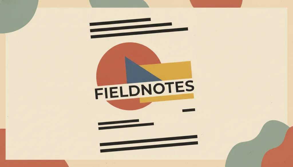
Recognizing it
- Basic geometric shapes -- circles, triangles, squares -- as the primary visual elements, with little figurative or decorative imagery
- Bold primary-color blocks (red, yellow, blue) set against strong black-and-white contrast
- Sans-serif, often all-lowercase geometric type paired with an asymmetric page composition
Concept boundary
This entry covers only the graphic visual language the Bauhaus school (1919-1933) left behind at the surface level -- geometric shapes, primary-color blocks, sans-serif type, and asymmetric composition -- not the school's full program in architecture, industrial design, workshop pedagogy, or design philosophy. It is historically related to, but not the same as, the Swiss / International Typographic Style: Swiss style came later, grew out of the New Typography movement among other lineages, and settled its experiments into a more systematic grid and restrained color discipline. Bauhaus graphic style never crystallized into a unified grid standard and keeps a more experimental, direct juxtaposition of shapes and color blocks.
When to consider it
- The brand wants a modern, experimental character expressed through simple geometric marks and bold primary-color blocks
- A poster, wordmark, or promotional piece needs to stay legible and recognizable at small sizes or a quick glance
- The content itself is simple enough to be compressed into shapes, color blocks, and typography alone, without relying on detailed illustration
When to be cautious
- Applying red/yellow/blue blocks or geometric icons alone and calling it Bauhaus style, without keeping the underlying function-first, clearly hierarchical typography
- The page is dense with long text or data, where geometric color blocks would compete with reading instead of supporting hierarchy
- Treating it as equivalent to the Swiss / International Typographic Style's grid system -- the two are historically related but differ in visual rules and stage of maturity
Tradeoff
Geometric primary-color blocks and bold asymmetric layouts create strong visual recognition and a modern, experimental feel, but borrowing only the shapes and colors while losing the function-first, clearly hierarchical typographic intent easily turns into surface-level retro decoration; large primary-color blocks also need their contrast against text and icons verified case by case, or legibility suffers.
Conditional rules · Editorial advice
Related entries
The Swiss / International Typographic Style historically inherited some experiments from the Bauhaus and the New Typography movement, but developed them into a more systematic grid and restrained color discipline; Bauhaus graphic style keeps geometric primary-color blocks and freer, asymmetric composition. The two are historically related but not the same style.
Both pursue removing unnecessary ornament, but minimalism's core orientation is reducing the number of elements, while Bauhaus graphic style emphasizes expression carried by geometric primary-color blocks and experimental typography itself, without necessarily minimizing element count.
Flat design is concerned with whether simulated 3D visual cues are kept, while Bauhaus graphic style is concerned with geometric primary colors and experimental typography themselves; a flat interface may or may not borrow the Bauhaus geometric vocabulary.
Sources and what they support
The page's description metadata states that the Bauhaus-Archiv / Museum fur Gestaltung holds the world's largest collection on the Bauhaus and calls the Bauhaus (1919-1933) the most important school of architecture, design, and art of the 20th century. This entry's founding and closing years rely on it.
Retrieved: 2026-09-15 · Archived 2026-09-16The entry states that the Bauhaus was founded by Walter Gropius in Weimar in 1919, moved to Dessau in 1925-26, moved to Berlin in 1932, and was closed in 1933 under pressure from the Nazi regime; it also states the school's aim was to bring art back into contact with everyday life. This entry's founding, relocation, and closing years and its orientation paraphrase it.
Retrieved: 2026-09-15 · Archived 2026-09-16The article states that the Bauhaus was founded by Walter Gropius in Weimar on April 1, 1919, and was closed by its own leadership under pressure from the Nazi regime in 1933; it emphasizes simple geometric shapes (such as rectangles and spheres) over elaborate ornament, and harmony between an object's or building's function and its design, with color theory included in the foundational curriculum. This entry's description of geometric shapes, the anti-ornament tendency, and the functional orientation paraphrases it.
Retrieved: 2026-09-15 · Archived 2026-09-16The article states that Bauhaus teacher Herbert Bayer adopted all-lowercase sans-serif type for most Bauhaus publications in a reductive style, and designed a geometric sans-serif "universal" typeface proposal between 1925 and 1930, with early sketches already emphasizing geometric forms. This entry's signature trait of sans-serif, geometric type paraphrases it.
Retrieved: 2026-09-15 · Archived 2026-09-16Definitions reference these sources. Digital specimens, selection advice, relationships, and recipes are editorial work and have not been validated through user research.
Type extensions and implementation notes
This entry has no operable specimen yet; the illustration is an editorial sketch. When applied to a product, still verify: whether contrast between primary-color blocks and text/icons meets requirements, and whether the geometric ornament keeps a clear typographic hierarchy rather than being a purely decorative style borrowing.
{
  "tokens": {
    "surface": "#f4efe0",
    "ink": "#1a1a1a",
    "accent": "#c8102e",
    "radiusPx": 0,
    "shadow": "none"
  },
  "tokenScope": "A recipe for this specimen: a cream surface, near-black ink, and one high-saturation red accent illustrate the primary-color, geometric orientation of Bauhaus graphic style; these are not historical standard values. A real project would typically also pair in yellow and blue and verify contrast for each combination."
}
Full Agent entry JSON
{
  "id": "bauhaus",
  "type": "visual",
  "name": {
    "zh": "包豪斯视觉语言",
    "en": "Bauhaus Graphic Style"
  },
  "aliases": [
    "Bauhaus Style",
    "包豪斯风格",
    "包豪斯平面设计"
  ],
  "granularity": "experience",
  "intents": [
    "express-brand",
    "organize-content"
  ],
  "tags": [
    "geometric shapes",
    "primary colors",
    "sans-serif type",
    "asymmetric composition",
    "functionalism"
  ],
  "definition": "A graphic visual language built from basic geometric shapes (circles, triangles, squares), bold primary-color blocks (red, yellow, blue), and geometric sans-serif type, often set in lowercase; it strips away extra ornament so that shape, color, and typography themselves carry the expression and information hierarchy.",
  "boundary": "This entry covers only the graphic visual language the Bauhaus school (1919-1933) left behind at the surface level -- geometric shapes, primary-color blocks, sans-serif type, and asymmetric composition -- not the school's full program in architecture, industrial design, workshop pedagogy, or design philosophy. It is historically related to, but not the same as, the Swiss / International Typographic Style: Swiss style came later, grew out of the New Typography movement among other lineages, and settled its experiments into a more systematic grid and restrained color discipline. Bauhaus graphic style never crystallized into a unified grid standard and keeps a more experimental, direct juxtaposition of shapes and color blocks.",
  "signature": [
    "Basic geometric shapes -- circles, triangles, squares -- as the primary visual elements, with little figurative or decorative imagery",
    "Bold primary-color blocks (red, yellow, blue) set against strong black-and-white contrast",
    "Sans-serif, often all-lowercase geometric type paired with an asymmetric page composition"
  ],
  "when": [
    "The brand wants a modern, experimental character expressed through simple geometric marks and bold primary-color blocks",
    "A poster, wordmark, or promotional piece needs to stay legible and recognizable at small sizes or a quick glance",
    "The content itself is simple enough to be compressed into shapes, color blocks, and typography alone, without relying on detailed illustration"
  ],
  "when_not": [
    "Applying red/yellow/blue blocks or geometric icons alone and calling it Bauhaus style, without keeping the underlying function-first, clearly hierarchical typography",
    "The page is dense with long text or data, where geometric color blocks would compete with reading instead of supporting hierarchy",
    "Treating it as equivalent to the Swiss / International Typographic Style's grid system -- the two are historically related but differ in visual rules and stage of maturity"
  ],
  "tradeoff": "Geometric primary-color blocks and bold asymmetric layouts create strong visual recognition and a modern, experimental feel, but borrowing only the shapes and colors while losing the function-first, clearly hierarchical typographic intent easily turns into surface-level retro decoration; large primary-color blocks also need their contrast against text and icons verified case by case, or legibility suffers.",
  "comparison": {
    "focus": "Visual recognition through geometric primary colors and experimental typography",
    "mechanism": "Basic geometric shapes, primary-color blocks, geometric sans-serif type, asymmetric composition",
    "cost": "Decorative borrowing easily loses the functional intent; contrast of text over primary-color blocks must be checked individually"
  },
  "sources": [
    {
      "id": "bauhaus-archiv-home",
      "title": "Bauhaus-Archiv / Museum für Gestaltung · Startseite",
      "url": "https://www.bauhaus.de/en/",
      "claim": "The page's description metadata states that the Bauhaus-Archiv / Museum fur Gestaltung holds the world's largest collection on the Bauhaus and calls the Bauhaus (1919-1933) the most important school of architecture, design, and art of the 20th century. This entry's founding and closing years rely on it.",
      "checkedAt": "2026-09-15",
      "archive": {
        "lookupUrl": "https://web.archive.org/web/20260915*/https://www.bauhaus.de/en/",
        "status": "available",
        "checkedAt": "2026-09-16T04:41:59.682Z",
        "jobId": "spn2-2fca268b139ebe2bf5cca04a582c6285b6798012",
        "url": "https://web.archive.org/web/20260916044206/https://www.bauhaus.de/en/",
        "timestamp": "20260916044206"
      }
    },
    {
      "id": "tate-bauhaus",
      "title": "Tate · Art Term: Bauhaus",
      "url": "https://www.tate.org.uk/art/art-terms/b/bauhaus",
      "claim": "The entry states that the Bauhaus was founded by Walter Gropius in Weimar in 1919, moved to Dessau in 1925-26, moved to Berlin in 1932, and was closed in 1933 under pressure from the Nazi regime; it also states the school's aim was to bring art back into contact with everyday life. This entry's founding, relocation, and closing years and its orientation paraphrase it.",
      "checkedAt": "2026-09-15",
      "archive": {
        "lookupUrl": "https://web.archive.org/web/20260915*/https://www.tate.org.uk/art/art-terms/b/bauhaus",
        "status": "available",
        "checkedAt": "2026-09-16T04:41:59.691Z",
        "jobId": "spn2-cc24351b3372ee2b687c0bdfc2f1450b62952fb7",
        "url": "https://web.archive.org/web/20260916044207/https://www.tate.org.uk/art/art-terms/b/bauhaus",
        "timestamp": "20260916044207"
      }
    },
    {
      "id": "wikipedia-bauhaus",
      "title": "Wikipedia · Bauhaus",
      "url": "https://en.wikipedia.org/wiki/Bauhaus",
      "claim": "The article states that the Bauhaus was founded by Walter Gropius in Weimar on April 1, 1919, and was closed by its own leadership under pressure from the Nazi regime in 1933; it emphasizes simple geometric shapes (such as rectangles and spheres) over elaborate ornament, and harmony between an object's or building's function and its design, with color theory included in the foundational curriculum. This entry's description of geometric shapes, the anti-ornament tendency, and the functional orientation paraphrases it.",
      "checkedAt": "2026-09-15",
      "archive": {
        "lookupUrl": "https://web.archive.org/web/20260915*/https://en.wikipedia.org/wiki/Bauhaus",
        "status": "available",
        "checkedAt": "2026-09-16T04:42:23.594Z",
        "jobId": "spn2-15fdaecac64222d3f16f5b5e81d5b2be622e5073",
        "url": "https://web.archive.org/web/20260916044228/https://en.wikipedia.org/wiki/Bauhaus",
        "timestamp": "20260916044228"
      }
    },
    {
      "id": "wikipedia-herbert-bayer",
      "title": "Wikipedia · Herbert Bayer",
      "url": "https://en.wikipedia.org/wiki/Herbert_Bayer",
      "claim": "The article states that Bauhaus teacher Herbert Bayer adopted all-lowercase sans-serif type for most Bauhaus publications in a reductive style, and designed a geometric sans-serif \"universal\" typeface proposal between 1925 and 1930, with early sketches already emphasizing geometric forms. This entry's signature trait of sans-serif, geometric type paraphrases it.",
      "checkedAt": "2026-09-15",
      "archive": {
        "lookupUrl": "https://web.archive.org/web/20260915*/https://en.wikipedia.org/wiki/Herbert_Bayer",
        "status": "available",
        "checkedAt": "2026-09-16T04:50:22.909Z",
        "jobId": "spn2-28a1029ace4bcab15d13829751a244edf97bfb7c",
        "url": "https://web.archive.org/web/20260916045030/https://en.wikipedia.org/wiki/Herbert_Bayer",
        "timestamp": "20260916045030"
      }
    }
  ],
  "relations": [
    {
      "target": "swiss",
      "kind": "related",
      "condition": "The same project mixes sans-serif type with geometric layout, and it is unclear whether that reads as Bauhaus graphic style or the Swiss / International Typographic Style's grid system",
      "reason": "The Swiss / International Typographic Style historically inherited some experiments from the Bauhaus and the New Typography movement, but developed them into a more systematic grid and restrained color discipline; Bauhaus graphic style keeps geometric primary-color blocks and freer, asymmetric composition. The two are historically related but not the same style.",
      "basis": "editorial"
    },
    {
      "target": "minimalism",
      "kind": "related",
      "condition": "Using a restricted palette and geometric elements to remove excess ornament",
      "reason": "Both pursue removing unnecessary ornament, but minimalism's core orientation is reducing the number of elements, while Bauhaus graphic style emphasizes expression carried by geometric primary-color blocks and experimental typography itself, without necessarily minimizing element count.",
      "basis": "editorial"
    },
    {
      "target": "flat-design",
      "kind": "related",
      "condition": "An interface uses solid color blocks and geometric icons together, without light, shadow, or texture",
      "reason": "Flat design is concerned with whether simulated 3D visual cues are kept, while Bauhaus graphic style is concerned with geometric primary colors and experimental typography themselves; a flat interface may or may not borrow the Bauhaus geometric vocabulary.",
      "basis": "editorial"
    }
  ],
  "rules": [
    {
      "when": "Borrowing the Bauhaus geometric color-block and typographic language",
      "instruction": "Keep the underlying function-first, clearly hierarchical typographic intent (readable hierarchy and alignment), rather than only borrowing the decorative effect of geometric shapes and primary-color blocks.",
      "strength": "recommend",
      "basis": "editorial"
    },
    {
      "when": "Placing text or icons over a primary-color block",
      "instruction": "Verify text contrast against the actual foreground/background color combination; do not assume a high-saturation primary color is inherently readable.",
      "strength": "must",
      "basis": "editorial"
    }
  ],
  "visual": {
    "tokens": {
      "surface": "#f4efe0",
      "ink": "#1a1a1a",
      "accent": "#c8102e",
      "radiusPx": 0,
      "shadow": "none"
    },
    "tokenScope": "A recipe for this specimen: a cream surface, near-black ink, and one high-saturation red accent illustrate the primary-color, geometric orientation of Bauhaus graphic style; these are not historical standard values. A real project would typically also pair in yellow and blue and verify contrast for each combination."
  },
  "demo": null,
  "version": "0.1.0",
  "editorialStatus": "drafted",
  "requirements": [],
  "demoCapabilities": [],
  "implementationNote": "This entry has no operable specimen yet; the illustration is an editorial sketch. When applied to a product, still verify: whether contrast between primary-color blocks and text/icons meets requirements, and whether the geometric ornament keeps a clear typographic hierarchy rather than being a purely decorative style borrowing.",
  "image": {
    "src": "/images/bauhaus.webp",
    "alt": "A fictional poster named FIELDNOTES made of flat circles, triangles, and squares in red, blue, and yellow, paired with black sans-serif type bars and an asymmetric grid composition, illustrating Bauhaus graphic style."
  },
  "searchTerms": [
    "几何图形",
    "原色",
    "无衬线排版",
    "不对称构图",
    "功能主义"
  ]
}