VOCABULARY / ENTRY
Character Counter
character-counter
A continuously displayed count beside a length-limited text field showing how much has been entered and how much remains (such as "120/280" or "40 characters left"), updated live as the user types and changing its style or wording as the limit nears or is passed.
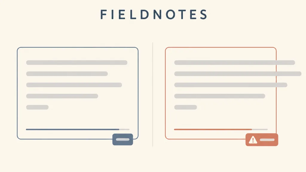
Recognizing it
- A number near the field changes live with the input, usually as "used/limit" or "remaining"
- Near or past the limit, the number's colour, icon, or wording changes accordingly
- The limit itself is visible, or can be read out, before the user starts typing
Concept boundary
A character counter answers a single question — how much have I written and how much more can I write — and it is a standing preview rather than an error message: it is present before the user has done anything wrong. It sits next to inline validation but differs from it: inline validation points out an error after the input breaks a rule and says how to fix it, while the counter puts the remaining room in view before any limit is crossed; only once the limit is exceeded does a validation message take over. Nor is it decoration: a field without a real length limit does not need one, and if users keep hitting the limit, the limit itself is usually what should change. Design systems differ on whether to block further input once the limit is reached, and that is the main choice this entry asks for.
When to consider it
- The field has a real length limit, such as a text message, a profile bio, or copy published to an external platform
- Users weigh their wording as they write, and the remaining room is itself a writing constraint
- Text over the limit will be truncated or rejected, so saying so beforehand costs less than an error afterwards
When to be cautious
- The field has no limit the business actually needs, and the count was added only to look tidy
- Users frequently hit the limit — raising the limit should be considered first
- Pasted content is silently truncated at the limit and the user cannot see what was dropped
Tradeoff
A live count turns an invisible limit into visible room, so users can adjust while writing instead of being rejected on submit; the cost is that it holds attention continuously and can make people write to the number. Blocking input at the limit rules out overflow entirely but may quietly truncate a pasted passage, while allowing overflow and then warning keeps the full text but needs a clear error message alongside it.
Conditional rules · Editorial advice
Related entries
The counter previews the remaining room before the limit is crossed, and inline validation explains the problem and the fix beside the field afterwards; the two divide the work, and a count turning red does not by itself count as an error message.
Showing the remaining room early lets users adjust before they make the error, which is error prevention at the level of a single field.
Count updates need to be announced without interrupting typing — for example after the user pauses — rather than on every keystroke.
Both show how much is done out of a total, but determinate progress describes a system task while the counter describes the room left in the user's own input; a full bar is a boundary, not a goal.
Sources and what they support
The component guidance advises using a character count only when there is a good reason to limit input, and, if users often hit a backend limit, raising the limit rather than adding a count. The component lets users type past the limit and tells them how far over they are, so they can paste a full answer and then edit it down; the count can be set to appear only after a proportion of the limit is reached, or to count words instead. The guidance records a 2017 test with 17 users, including people with low digital skills and disabled users, and known issues with screen reader announcements and with counting characters such as emoji.
Retrieved: 2026-10-20 · Snapshot unconfirmedThe usage guidance describes the character counter as an optional part of a text area that shows the number of characters entered and the total allowed, and states that once the maximum is reached the text area should prevent further input and show a message that the limit has been met. This entry uses it as the alternative approach set against GOV.UK's allow-then-warn behaviour.
Retrieved: 2026-10-20 · Snapshot unconfirmedThe text field documentation of Material Design's official web component library states that text fields with a maxlength attribute display a character counter, maxLength being the maximum number of characters a user can enter. This entry takes from it that in the Material system the counter appears together with a length limit.
Retrieved: 2026-10-20 · Snapshot unconfirmedDefinitions reference these sources. Digital specimens, selection advice, relationships, and recipes are editorial work and have not been validated through user research.
Type extensions and implementation notes
This entry has no runnable specimen; the illustration is an editorial sketch with the input shown as placeholder bars. Before shipping, confirm with a screen reader when the limit and remaining room are announced, check how over-length pasted content is handled, and confirm that the way emoji and non-Latin characters are counted matches the backend's actual limit.
{
  "states": [
    "idle",
    "typing",
    "near-limit",
    "at-limit",
    "over-limit"
  ],
  "a11y": [
    "The count is associated with the field through a description so screen reader users hear the limit on focus",
    "Changes to the remaining room are announced after the user stops typing, to avoid interrupting each keystroke",
    "The over-limit state is described in text, not by colour alone"
  ],
  "motion": "The number updates instantly with the input, without rolling or bouncing animation; under a reduced-motion preference state changes stay instant"
}
Open the Agent JSON file for this entryThis file repeats every field of this entry verbatim and adds its sources, archive status, and editorial scope.