VOCABULARY / ENTRY
Inline Validation Feedback
inline-validation
Validation feedback shown right next to an input while people fill in a form or immediately after they finish a field: it identifies the error, describes the problem in text, offers a correction when one is known, and may confirm success for complex fields.
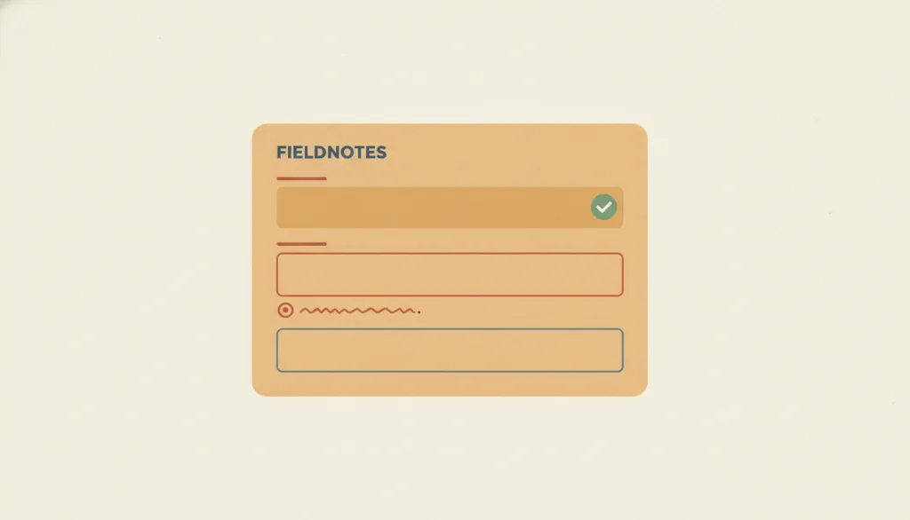
Recognizing it
- Feedback appears attached to its field, below or beside it
- Errors are described in text; color and icons are only supplements
- The message disappears as soon as the input is corrected; complex fields may show a success confirmation
Concept boundary
Inline validation only reports whether a single field's input is acceptable. It is not inline editing (changing content in place) and not the whole error-prevention principle (it is one realization of that principle at the form-field level). Timing is the crux: most fields should be validated after the person leaves the field or reaches the expected length, not from the first keystroke; live constraints such as password strength are the exception. Post-submit error summaries and status messages are its neighbors and cannot replace feedback attached to the field.
When to consider it
- Form fields have automatically checkable format or range constraints that people commonly get wrong
- The form has many fields or is long, so batching errors after submit would force people to hunt back and forth
- Complex fields such as card numbers or email addresses benefit from confirming that nothing was mistyped
When to be cautious
- The result depends on the server and cannot be judged reliably while the person is typing
- There are only one or two fields with trivial constraints and a single check on submit is enough
- Security reasons argue against revealing the specific cause, such as not saying whether the account or the password was wrong at sign-in
Tradeoff
Immediate feedback attached to the field lets people fix errors in context, but validation that fires too early interrupts and blames people before they have finished typing; each field type needs its own trigger decision, and the feedback must be perceivable to screen reader users.
Conditional rules · Editorial advice
Related entries
Inline validation is one concrete realization of the error-prevention principle on form fields: it identifies and helps fix problems before submission.
Inline editing changes how content enters an editable state; inline validation reports whether the content is acceptable. They often co-occur but are separate concepts.
A status message reports the outcome of a whole action without binding to a field; field-level errors belong beside the field, and only a submit-failure summary suits a status message as a supplement.
Validation fires when a field loses focus, and a visible focus indicator shows which field was just left, so people can pair the error with its field.
Sources and what they support
Recommends inline validation wherever possible, with an actionable error message below or next to the problem field; in most cases errors should wait until the person has finished and left the field; icons should supplement color for colorblind users; error messages should be explicit, polite, precise, and give constructive advice.
Retrieved: 2026-09-15 · Snapshot unconfirmedPremature inline validation tells people their input is wrong before they have had a chance to type it correctly and hurts the overall experience; validation should trigger on leaving the field (onblur) or on reaching the expected length; error messages should disappear the moment a valid value is entered; test participants welcomed positive confirmation such as a checkmark.
Retrieved: 2026-09-15 · Snapshot unconfirmedThe Level A criterion requires that when an input error is automatically detected, the item in error is identified and the error is described to the user in text; visual cues such as color or highlighting may only supplement, not replace, the text description.
Retrieved: 2026-09-15 · Snapshot unconfirmedThe Level AA criterion requires that when an input error is automatically detected and suggestions for correction are known, those suggestions are provided, unless doing so would jeopardize the security or purpose of the content.
Retrieved: 2026-09-15 · Snapshot unconfirmedDefinitions reference these sources. Digital specimens, selection advice, relationships, and recipes are editorial work and have not been validated through user research.
Type extensions and implementation notes
No operable specimen yet; the illustration is editorial. A product must still verify that each field type's trigger timing is appropriate, that screen readers announce the error text after blur, that errors disappear in real time once corrected, and how server-side validation results are mapped back to their fields.
{
  "states": [
    "neutral",
    "validating",
    "valid",
    "invalid"
  ],
  "a11y": [
    "Associate the error text with the field via aria-describedby and mark the field aria-invalid",
    "Do not force focus to move on error; after submit, a summary may move focus to the first field in error"
  ],
  "motion": "The error bar may simply appear or fade in; no shake or other emphasis animation; appear instantly when reduced motion is enabled"
}
Full Agent entry JSON
{
  "id": "inline-validation",
  "type": "micro",
  "name": {
    "zh": "行内校验反馈",
    "en": "Inline Validation Feedback"
  },
  "aliases": [
    "Inline Validation",
    "Field-level Validation",
    "即时表单校验"
  ],
  "granularity": "state",
  "intents": [
    "prevent-error",
    "inform"
  ],
  "tags": [
    "form",
    "validation",
    "error feedback",
    "field-level",
    "validation"
  ],
  "definition": "Validation feedback shown right next to an input while people fill in a form or immediately after they finish a field: it identifies the error, describes the problem in text, offers a correction when one is known, and may confirm success for complex fields.",
  "boundary": "Inline validation only reports whether a single field's input is acceptable. It is not inline editing (changing content in place) and not the whole error-prevention principle (it is one realization of that principle at the form-field level). Timing is the crux: most fields should be validated after the person leaves the field or reaches the expected length, not from the first keystroke; live constraints such as password strength are the exception. Post-submit error summaries and status messages are its neighbors and cannot replace feedback attached to the field.",
  "signature": [
    "Feedback appears attached to its field, below or beside it",
    "Errors are described in text; color and icons are only supplements",
    "The message disappears as soon as the input is corrected; complex fields may show a success confirmation"
  ],
  "when": [
    "Form fields have automatically checkable format or range constraints that people commonly get wrong",
    "The form has many fields or is long, so batching errors after submit would force people to hunt back and forth",
    "Complex fields such as card numbers or email addresses benefit from confirming that nothing was mistyped"
  ],
  "when_not": [
    "The result depends on the server and cannot be judged reliably while the person is typing",
    "There are only one or two fields with trivial constraints and a single check on submit is enough",
    "Security reasons argue against revealing the specific cause, such as not saying whether the account or the password was wrong at sign-in"
  ],
  "tradeoff": "Immediate feedback attached to the field lets people fix errors in context, but validation that fires too early interrupts and blames people before they have finished typing; each field type needs its own trigger decision, and the feedback must be perceivable to screen reader users.",
  "comparison": {
    "focus": "Letting people know while filling in a form whether a field is acceptable and how to fix it",
    "mechanism": "Validation triggered on leaving or completing the field, with text feedback shown beside it",
    "cost": "Trigger timing and wording must be designed per field; premature or overly frequent validation backfires"
  },
  "sources": [
    {
      "id": "nng-form-error-guidelines",
      "title": "NN/g · How to Report Errors in Forms: 10 Design Guidelines",
      "url": "https://www.nngroup.com/articles/errors-forms-design-guidelines/",
      "claim": "Recommends inline validation wherever possible, with an actionable error message below or next to the problem field; in most cases errors should wait until the person has finished and left the field; icons should supplement color for colorblind users; error messages should be explicit, polite, precise, and give constructive advice.",
      "checkedAt": "2026-09-15",
      "archive": {
        "lookupUrl": "https://web.archive.org/web/20260915*/https://www.nngroup.com/articles/errors-forms-design-guidelines/",
        "status": "pending",
        "checkedAt": "2026-09-15T18:45:47.752Z",
        "error": "status-request-failed",
        "jobId": "spn2-bb2aad81c1e0acfb4debf0edc2d9a7566b661c6d"
      }
    },
    {
      "id": "baymard-inline-form-validation",
      "title": "Baymard Institute · Inline Form Validation",
      "url": "https://baymard.com/blog/inline-form-validation",
      "claim": "Premature inline validation tells people their input is wrong before they have had a chance to type it correctly and hurts the overall experience; validation should trigger on leaving the field (onblur) or on reaching the expected length; error messages should disappear the moment a valid value is entered; test participants welcomed positive confirmation such as a checkmark.",
      "checkedAt": "2026-09-15",
      "archive": {
        "lookupUrl": "https://web.archive.org/web/20260915*/https://baymard.com/blog/inline-form-validation",
        "status": "pending",
        "checkedAt": "2026-09-15T18:46:04.072Z",
        "error": "status-request-failed",
        "jobId": "spn2-d819c57bd1f1820412d7ffee5ff39c659bbcdaa0"
      }
    },
    {
      "id": "wcag22-error-identification",
      "title": "W3C · Understanding SC 3.3.1 Error Identification (WCAG 2.2)",
      "url": "https://www.w3.org/WAI/WCAG22/Understanding/error-identification.html",
      "claim": "The Level A criterion requires that when an input error is automatically detected, the item in error is identified and the error is described to the user in text; visual cues such as color or highlighting may only supplement, not replace, the text description.",
      "checkedAt": "2026-09-15",
      "archive": {
        "lookupUrl": "https://web.archive.org/web/20260915*/https://www.w3.org/WAI/WCAG22/Understanding/error-identification.html",
        "status": "pending",
        "checkedAt": "2026-09-15T18:46:09.779Z",
        "error": "status-request-failed",
        "jobId": "spn2-f803a00afa2accacab1a2c65e328ea436c8591cd"
      }
    },
    {
      "id": "wcag22-error-suggestion",
      "title": "W3C · Understanding SC 3.3.3 Error Suggestion (WCAG 2.2)",
      "url": "https://www.w3.org/WAI/WCAG22/Understanding/error-suggestion.html",
      "claim": "The Level AA criterion requires that when an input error is automatically detected and suggestions for correction are known, those suggestions are provided, unless doing so would jeopardize the security or purpose of the content.",
      "checkedAt": "2026-09-15",
      "archive": {
        "lookupUrl": "https://web.archive.org/web/20260915*/https://www.w3.org/WAI/WCAG22/Understanding/error-suggestion.html",
        "status": "pending",
        "checkedAt": "2026-09-15T18:46:49.092Z",
        "error": "status-request-failed",
        "jobId": "spn2-f2c3a50e77ce96998fc70581d9194e7772ba71b3"
      }
    }
  ],
  "relations": [
    {
      "target": "error-prevention",
      "kind": "realized_by",
      "condition": "Errors can be detected automatically at the field level",
      "reason": "Inline validation is one concrete realization of the error-prevention principle on form fields: it identifies and helps fix problems before submission.",
      "basis": "editorial"
    },
    {
      "target": "inline-edit",
      "kind": "related",
      "condition": "The same field is both edited in place and validated",
      "reason": "Inline editing changes how content enters an editable state; inline validation reports whether the content is acceptable. They often co-occur but are separate concepts.",
      "basis": "editorial"
    },
    {
      "target": "status-message",
      "kind": "related",
      "condition": "Deciding whether an error belongs beside the field or in a global announcement",
      "reason": "A status message reports the outcome of a whole action without binding to a field; field-level errors belong beside the field, and only a submit-failure summary suits a status message as a supplement.",
      "basis": "editorial"
    },
    {
      "target": "focus-indicator",
      "kind": "composes_with",
      "condition": "Keyboard users move between fields",
      "reason": "Validation fires when a field loses focus, and a visible focus indicator shows which field was just left, so people can pair the error with its field.",
      "basis": "editorial"
    }
  ],
  "rules": [
    {
      "when": "A field input error is detected automatically",
      "instruction": "Identify the field in error and describe the problem in text; never rely on color or border changes alone (WCAG 2.2 SC 3.3.1, Level A).",
      "strength": "must",
      "basis": "editorial"
    },
    {
      "when": "The correction is known and not security-sensitive",
      "instruction": "Include a concrete correction suggestion in the error message, such as the expected format or an example (WCAG 2.2 SC 3.3.3, Level AA).",
      "strength": "recommend",
      "basis": "editorial"
    },
    {
      "when": "Deciding when validation triggers",
      "instruction": "Validate after the person leaves the field or reaches the expected length, not from the first keystroke; live constraints such as password strength may be exceptions, and errors should disappear immediately once corrected.",
      "strength": "recommend",
      "basis": "editorial"
    }
  ],
  "requirements": [],
  "behavior": {
    "states": [
      "neutral",
      "validating",
      "valid",
      "invalid"
    ],
    "a11y": [
      "Associate the error text with the field via aria-describedby and mark the field aria-invalid",
      "Do not force focus to move on error; after submit, a summary may move focus to the first field in error"
    ],
    "motion": "The error bar may simply appear or fade in; no shake or other emphasis animation; appear instantly when reduced motion is enabled"
  },
  "demo": null,
  "version": "0.1.0",
  "editorialStatus": "drafted",
  "demoCapabilities": [],
  "implementationNote": "No operable specimen yet; the illustration is editorial. A product must still verify that each field type's trigger timing is appropriate, that screen readers announce the error text after blur, that errors disappear in real time once corrected, and how server-side validation results are mapped back to their fields.",
  "image": {
    "src": "/images/inline-validation.webp",
    "alt": "A fictional FIELDNOTES form with three stacked inputs: the first has a small check mark for a valid entry, the second has a red outline with a short error bar beneath it, and the third stays neutral and unvalidated."
  },
  "searchTerms": [
    "表单",
    "校验",
    "错误反馈",
    "字段级",
    "validation"
  ]
}