VOCABULARY / ENTRY
Contextual Actions
contextual-actions
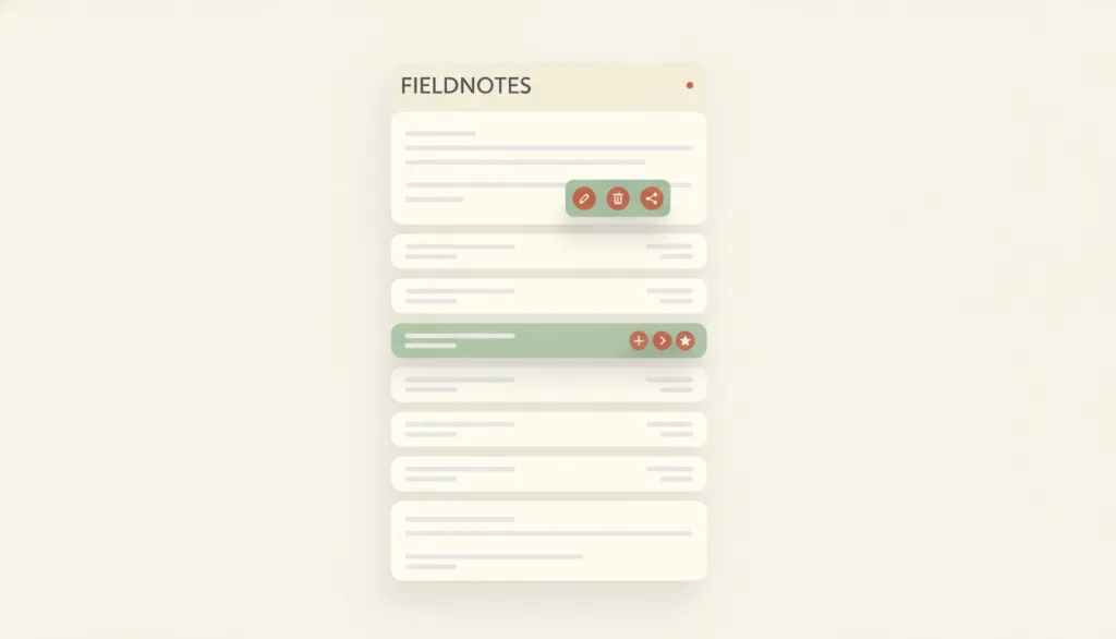
Actions offered on or next to a specific object, applying only to that object, that appear when the user selects, hovers, focuses, or long-presses it — commonly shown as a context menu, row-level action buttons, or a floating toolbar.
Recognizing it
- Action entry points appear on or right next to the target object, not in a global toolbar
- Triggers include selection, hover, focus, or long-press, with at least one that does not depend on mouse hover
- The same actions can be reached by keyboard or touch, not only by hovering with a mouse
Concept boundary
Context menus, row action buttons, and floating toolbars are presentation variants of the same concept, not separate patterns: the test is whether the actions apply only to the selected or pointed-at object and appear on selection, hover, focus, or long-press. It differs from inline edit, which switches to an editing control in place and changes the content itself, while contextual actions only expose action entry points that may navigate, open a confirmation, or trigger inline edit. It also differs from batch actions, which apply to a multi-selection — batch actions has no entry of its own yet and is mentioned here only to draw the line.
When to consider it
- There are many objects, and giving each one a permanent action button would crowd the interface
- The actions only apply to the currently selected or pointed-at object and don't need global visibility
- A visible trigger elsewhere already covers users who can't rely on hover
When to be cautious
- The action is high-frequency or essential, so hiding it behind hover or long-press alone would make it unreachable for touch and keyboard users
- The same action must apply to a multi-selected group of objects — that is batch actions, not a single object's contextual actions
- The content needs to be edited in place; hand that to inline edit rather than opening a menu first and a separate edit panel after
Tradeoff
Keeps the default interface simpler and places actions close to their object, but discoverability drops: hover-only actions are invisible to touch and keyboard users and need an additional reachable trigger.
Conditional rules · Editorial advice
Related entries
Contextual actions supply the action entry point; inline edit changes the content in place. The two can be chained, but the entry point is not the edit itself.
Direct manipulation covers continuous, spatial actions; contextual actions add discrete, clearly named actions such as delete or archive.
Contextual actions suit one-step, lightweight actions; once an action grows complex enough to need its own interface, a modal dialog fits better than cramming it into a menu item.
Sources and what they support
Contextual menus should be reserved for genuinely secondary actions and must not hide high-frequency or essential actions behind an extra click; the menu must be openable and navigable by keyboard and fully readable and operable by screen readers, not reachable by click or tap alone.
Retrieved: 2026-09-15 · Archived 2026-09-16A menu button is a button that, when activated, opens a menu; it needs aria-haspopup and aria-expanded, and supports Enter, Space, and arrow keys to open the menu while the button has focus — one keyboard-reachable way to trigger contextual actions.
Retrieved: 2026-09-15 · Archived 2026-09-16Extra content that appears on hover or focus (such as a submenu or non-modal popup) must be dismissible, must let the pointer move onto it without it disappearing, and must stay visible while the trigger condition holds or the content remains valid; native browser title tooltips are exempt.
Retrieved: 2026-09-15 · Archived 2026-09-16Definitions reference these sources. Digital specimens, selection advice, relationships, and recipes are editorial work and have not been validated through user research.
Type extensions and implementation notes
This entry has no working specimen yet; the illustration is editorial. A real product still needs to verify that hover actions have keyboard and touch equivalents, that hover content meets the dismissible/hoverable/persistent requirements, and that high-frequency or essential actions have an entry point independent of the contextual menu.
{
  "states": [
    "idle",
    "hovered",
    "focused",
    "long-pressed",
    "open",
    "closed"
  ],
  "a11y": [
    "The trigger control has an accessible name and exposes aria-haspopup and aria-expanded",
    "The menu or toolbar can be fully operated with Tab, arrow keys, and Enter, not only by hovering with a mouse",
    "Content triggered by hover or focus is dismissible, hoverable, and stays visible"
  ],
  "motion": "Appearance and dismissal can skip animation; show or hide instantly under reduced motion"
}
Full Agent entry JSON
{
  "id": "contextual-actions",
  "type": "interaction",
  "name": {
    "zh": "上下文操作",
    "en": "Contextual Actions"
  },
  "aliases": [
    "上下文菜单",
    "行级操作",
    "浮动工具条"
  ],
  "granularity": "component",
  "intents": [
    "manipulate-object",
    "reveal-actions"
  ],
  "tags": [
    "menu",
    "hover",
    "long-press",
    "toolbar",
    "discoverability"
  ],
  "definition": "Actions offered on or next to a specific object, applying only to that object, that appear when the user selects, hovers, focuses, or long-presses it — commonly shown as a context menu, row-level action buttons, or a floating toolbar.",
  "boundary": "Context menus, row action buttons, and floating toolbars are presentation variants of the same concept, not separate patterns: the test is whether the actions apply only to the selected or pointed-at object and appear on selection, hover, focus, or long-press. It differs from inline edit, which switches to an editing control in place and changes the content itself, while contextual actions only expose action entry points that may navigate, open a confirmation, or trigger inline edit. It also differs from batch actions, which apply to a multi-selection — batch actions has no entry of its own yet and is mentioned here only to draw the line.",
  "signature": [
    "Action entry points appear on or right next to the target object, not in a global toolbar",
    "Triggers include selection, hover, focus, or long-press, with at least one that does not depend on mouse hover",
    "The same actions can be reached by keyboard or touch, not only by hovering with a mouse"
  ],
  "when": [
    "There are many objects, and giving each one a permanent action button would crowd the interface",
    "The actions only apply to the currently selected or pointed-at object and don't need global visibility",
    "A visible trigger elsewhere already covers users who can't rely on hover"
  ],
  "when_not": [
    "The action is high-frequency or essential, so hiding it behind hover or long-press alone would make it unreachable for touch and keyboard users",
    "The same action must apply to a multi-selected group of objects — that is batch actions, not a single object's contextual actions",
    "The content needs to be edited in place; hand that to inline edit rather than opening a menu first and a separate edit panel after"
  ],
  "tradeoff": "Keeps the default interface simpler and places actions close to their object, but discoverability drops: hover-only actions are invisible to touch and keyboard users and need an additional reachable trigger.",
  "comparison": {
    "focus": "Offering executable actions scoped to a single selected or pointed-at object",
    "mechanism": "Showing an action entry point near the object on selection, hover, focus, or long-press",
    "cost": "Hover triggers are invisible to touch and keyboard users and need extra discoverability work"
  },
  "sources": [
    {
      "id": "nng-contextual-menus-guidelines",
      "title": "NN/g · Designing Effective Contextual Menus: 10 Guidelines",
      "url": "https://www.nngroup.com/articles/contextual-menus-guidelines/",
      "claim": "Contextual menus should be reserved for genuinely secondary actions and must not hide high-frequency or essential actions behind an extra click; the menu must be openable and navigable by keyboard and fully readable and operable by screen readers, not reachable by click or tap alone.",
      "checkedAt": "2026-09-15",
      "archive": {
        "lookupUrl": "https://web.archive.org/web/20260915*/https://www.nngroup.com/articles/contextual-menus-guidelines/",
        "status": "available",
        "checkedAt": "2026-09-16T04:27:49.069Z",
        "jobId": "spn2-ac84d3f557cd7d5b42cf7796e7a5d92fcd69c3a9",
        "url": "https://web.archive.org/web/20260916042758/https://www.nngroup.com/articles/contextual-menus-guidelines/",
        "timestamp": "20260916042758"
      }
    },
    {
      "id": "apg-menu-button",
      "title": "WAI-ARIA APG · Menu Button Pattern",
      "url": "https://www.w3.org/WAI/ARIA/apg/patterns/menu-button/",
      "claim": "A menu button is a button that, when activated, opens a menu; it needs aria-haspopup and aria-expanded, and supports Enter, Space, and arrow keys to open the menu while the button has focus — one keyboard-reachable way to trigger contextual actions.",
      "checkedAt": "2026-09-15",
      "archive": {
        "lookupUrl": "https://web.archive.org/web/20260915*/https://www.w3.org/WAI/ARIA/apg/patterns/menu-button/",
        "status": "available",
        "checkedAt": "2026-09-16T04:19:36.676Z",
        "jobId": "spn2-cdab2adcd7243d24575772450e906c15ac4aab07",
        "url": "https://web.archive.org/web/20260916042000/https://www.w3.org/WAI/ARIA/apg/patterns/menu-button/",
        "timestamp": "20260916042000"
      }
    },
    {
      "id": "wcag-content-on-hover-or-focus",
      "title": "W3C · Understanding SC 1.4.13: Content on Hover or Focus (WCAG 2.2, Level AA)",
      "url": "https://www.w3.org/WAI/WCAG22/Understanding/content-on-hover-or-focus.html",
      "claim": "Extra content that appears on hover or focus (such as a submenu or non-modal popup) must be dismissible, must let the pointer move onto it without it disappearing, and must stay visible while the trigger condition holds or the content remains valid; native browser title tooltips are exempt.",
      "checkedAt": "2026-09-15",
      "archive": {
        "lookupUrl": "https://web.archive.org/web/20260915*/https://www.w3.org/WAI/WCAG22/Understanding/content-on-hover-or-focus.html",
        "status": "available",
        "checkedAt": "2026-09-16T04:19:38.787Z",
        "jobId": "spn2-24616a3000407505f0db944cbc6a0d5c3474bcb4",
        "url": "https://web.archive.org/web/20260916042058/https://www.w3.org/WAI/WCAG22/Understanding/content-on-hover-or-focus.html",
        "timestamp": "20260916042058"
      }
    }
  ],
  "relations": [
    {
      "target": "inline-edit",
      "kind": "composes_with",
      "condition": "One of the contextual actions is to edit that field",
      "reason": "Contextual actions supply the action entry point; inline edit changes the content in place. The two can be chained, but the entry point is not the edit itself.",
      "basis": "editorial"
    },
    {
      "target": "direct-manipulation",
      "kind": "composes_with",
      "condition": "The object supports direct manipulation gestures as well as actions that don't map well to a gesture",
      "reason": "Direct manipulation covers continuous, spatial actions; contextual actions add discrete, clearly named actions such as delete or archive.",
      "basis": "editorial"
    },
    {
      "target": "modal-dialog",
      "kind": "alternative",
      "condition": "The action needs more explanation, confirmation, or several fields to complete",
      "reason": "Contextual actions suit one-step, lightweight actions; once an action grows complex enough to need its own interface, a modal dialog fits better than cramming it into a menu item.",
      "basis": "editorial"
    }
  ],
  "rules": [
    {
      "when": "An action appears only on hover",
      "instruction": "Also provide an equivalent keyboard-reachable entry point (such as becoming visible on focus, or a menu button) and a touch-reachable one (such as long-press or a persistent \"more actions\" button).",
      "strength": "must",
      "basis": "editorial"
    },
    {
      "when": "Content triggered by hover or focus appears",
      "instruction": "Make it dismissible, let the pointer move onto it without it disappearing, and keep it visible while the trigger condition holds, satisfying WCAG 2.2 SC 1.4.13.",
      "strength": "must",
      "basis": "editorial"
    },
    {
      "when": "Deciding whether an action should live only inside contextual actions",
      "instruction": "Do not make a hover menu or long-press the only path to a high-frequency or essential action such as delete or publish; keep a persistent or more discoverable path available too.",
      "strength": "recommend",
      "basis": "editorial"
    }
  ],
  "behavior": {
    "states": [
      "idle",
      "hovered",
      "focused",
      "long-pressed",
      "open",
      "closed"
    ],
    "a11y": [
      "The trigger control has an accessible name and exposes aria-haspopup and aria-expanded",
      "The menu or toolbar can be fully operated with Tab, arrow keys, and Enter, not only by hovering with a mouse",
      "Content triggered by hover or focus is dismissible, hoverable, and stays visible"
    ],
    "motion": "Appearance and dismissal can skip animation; show or hide instantly under reduced motion"
  },
  "demo": null,
  "version": "0.1.0",
  "editorialStatus": "drafted",
  "requirements": [],
  "demoCapabilities": [],
  "implementationNote": "This entry has no working specimen yet; the illustration is editorial. A real product still needs to verify that hover actions have keyboard and touch equivalents, that hover content meets the dismissible/hoverable/persistent requirements, and that high-frequency or essential actions have an entry point independent of the contextual menu.",
  "image": {
    "src": "/images/contextual-actions.webp",
    "alt": "A fictional FIELDNOTES list: one row is highlighted with a cluster of row-level action buttons revealed at its right edge, and a floating toolbar hovers above a separately selected block."
  },
  "searchTerms": [
    "菜单",
    "悬停",
    "长按",
    "工具条",
    "可发现性"
  ]
}