VOCABULARY / ENTRY
Hierarchical Navigation Structure
hierarchical-navigation
Organize content as a tree of parent and child sections, so people drill down from top-level categories to subcategories and individual items and climb back up through breadcrumbs or a back control; NN/g states that breadcrumbs show the site's hierarchical structure rather than browsing history, and that hierarchies trade breadth against depth: flat structures make content more discoverable, while overly deep ones demand too many clicks and make each level's categories more generic.
Recognizing it
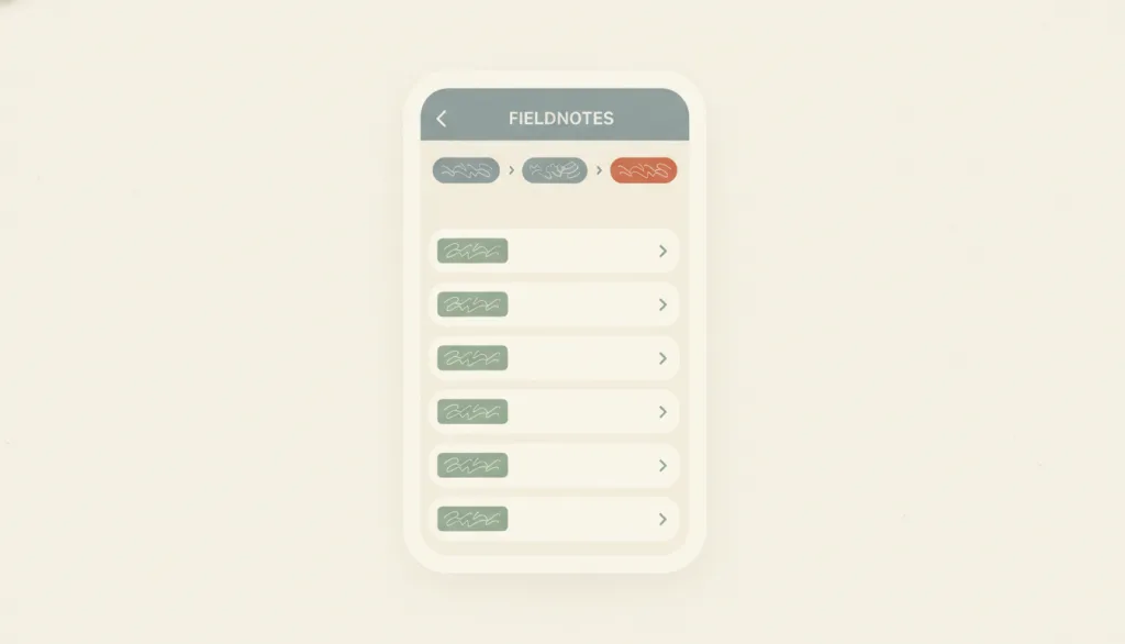
- A small set of mutually exclusive categories at the top; items on each level open the next level until an individual item is reached
- Every level shows the current location and its ancestor path: breadcrumbs, or a back control carrying the parent's title
- Sibling items on the same level share one labeling scheme and style, and page titles get more specific the deeper you go
Concept boundary
Hierarchical navigation structure is an information-architecture organization: a tree of parent and child sections plus the navigation relationships for moving up and down it, not a specific UI component. A sidebar layout is one page-level presentation of it (sidebar groups often map the first one or two levels of the tree), and breadcrumbs are its location indicator. It differs from hub-and-spoke (leave a central page and return to it before going elsewhere) and from linear flows (advance in a fixed order); neither has its own entry yet, so they are mentioned here only as boundaries. It can combine with progressive disclosure, expanding child levels on demand instead of laying everything out at once. Master-detail can carry a two-level tree, but master-detail emphasizes selection driving a detail view rather than level-by-level drilling.
When to consider it
- There is a large amount of content that fits a stable classification into mutually exclusive categories, and people can predict which category an item belongs to
- People mainly browse rather than look up a known item and need to keep their bearings while narrowing scope level by level
- Space-constrained contexts such as mobile, where all sections cannot be laid out at once and only one level can be shown at a time
When to be cautious
- The hierarchy is only one or two levels deep, or the content is inherently a sequential flow; breadcrumbs and level-by-level drilling would only add steps
- Many items belong to several categories at once; forcing them under a single parent makes people guess repeatedly at the top level
- People already know the name of what they want; search or a flat list is faster, and clicking through levels is only an obstacle
Tradeoff
Few choices per level, a predictable structure, and a clear sense of place; but the deeper the tree, the more clicks it takes to reach a target and the more generic the upper categories become, and lateral moves between sibling sections need extra shortcuts or path navigation, or people are forced back to the root every time.
Conditional rules · Editorial advice
Related entries
A sidebar is one of the most common page presentations of a hierarchy, with group headings as parents and rows as children; but the same tree can also be presented as page-by-page drilling or a top menu.
Collapsing lower branches and expanding them on demand keeps the structure intact while reducing the options seen at once; a recognizable entry point must remain after collapsing.
The leaf level of a hierarchy is often carried by master-detail: sibling items in the left column, the selected item's content on the right, so people switch between siblings without climbing back up.
Search and filtering bypass level-by-level drilling and reach items directly; NN/g also argues that structure and search should integrate rather than compete.
Breadcrumbs and a back control carrying the parent's title turn "where am I and where did I come from" into recognizable information instead of asking people to recall the path they clicked.
Sources and what they support
States that breadcrumbs show the site's hierarchical structure (the current page and its parent, grandparent, and so on up to the homepage) rather than the session's browsing history; that breadcrumbs supplement but do not replace main navigation; that the current page should be the last breadcrumb item but not a link; and that breadcrumbs are neither necessary nor useful for flat sites only one or two levels deep or for linear sites.
Retrieved: 2026-09-15 · Archived 2026-09-16Describes flat hierarchies as wide and short and deep hierarchies as tall and narrow; states that flat structures keep content from being buried under intervening layers and make it more discoverable, whereas deep hierarchies have few, more generic and thus more confusing categories per level and clicking through many levels usually does not work well; stresses that there is no single right answer and either extreme backfires, that flat structures suit distinct recognizable categories, that deep sites should offer shortcuts to lower levels and use breadcrumbs, and that usability testing, analytics, and search logs should inform the structure.
Retrieved: 2026-09-15 · Archived 2026-09-16Lists information-architecture mistakes including a structureless "swamp" with no organizing principle; extreme polyhierarchy that multiplies weak categories and duplicates items across locations, making people spend too long on top-level categories and think harder to move forward; missing category landing pages that leave people misunderstanding the site's scope; invisible navigation that is nearly as bad as no navigation; and inconsistent navigation whose options come and go, making people feel a loss of control; it argues that structure and navigation must support each other and integrate with search.
Retrieved: 2026-09-15 · Archived 2026-09-16Definitions reference these sources. Digital specimens, selection advice, relationships, and recipes are editorial work and have not been validated through user research.
Type extensions and implementation notes
No operable specimen yet; the illustration is an editorial sketch. When applied to a product, still verify that every level shows the current location and path, that the current breadcrumb item is non-clickable and carries aria-current, that the back control has a text name, that categories are genuinely mutually exclusive (check with card sorting or tree testing), and that sibling sections are reachable laterally without passing through the root.
{
  "states": [
    "root",
    "branch",
    "leaf"
  ],
  "a11y": [
    "Breadcrumbs live inside a named navigation landmark, and the current item is marked with aria-current=\"page\" and is not a link",
    "The back control has a text name pointing to the parent and is keyboard operable, not just an unnamed icon",
    "When drilling into a new level the page title updates so screen readers announce the current location"
  ],
  "motion": "Drilling down and going back may use brief, directionally consistent transitions to convey hierarchy direction, and should respect the reduced-motion preference"
}
Full Agent entry JSON
{
  "id": "hierarchical-navigation",
  "type": "layout",
  "name": {
    "zh": "层级导航结构",
    "en": "Hierarchical Navigation Structure"
  },
  "aliases": [
    "树状导航",
    "Tree Navigation",
    "Drill-down Navigation"
  ],
  "granularity": "experience",
  "intents": [
    "navigate-sections",
    "organize-content"
  ],
  "tags": [
    "hierarchy",
    "navigation",
    "breadcrumbs",
    "information architecture",
    "tree structure"
  ],
  "definition": "Organize content as a tree of parent and child sections, so people drill down from top-level categories to subcategories and individual items and climb back up through breadcrumbs or a back control; NN/g states that breadcrumbs show the site's hierarchical structure rather than browsing history, and that hierarchies trade breadth against depth: flat structures make content more discoverable, while overly deep ones demand too many clicks and make each level's categories more generic.",
  "boundary": "Hierarchical navigation structure is an information-architecture organization: a tree of parent and child sections plus the navigation relationships for moving up and down it, not a specific UI component. A sidebar layout is one page-level presentation of it (sidebar groups often map the first one or two levels of the tree), and breadcrumbs are its location indicator. It differs from hub-and-spoke (leave a central page and return to it before going elsewhere) and from linear flows (advance in a fixed order); neither has its own entry yet, so they are mentioned here only as boundaries. It can combine with progressive disclosure, expanding child levels on demand instead of laying everything out at once. Master-detail can carry a two-level tree, but master-detail emphasizes selection driving a detail view rather than level-by-level drilling.",
  "signature": [
    "A small set of mutually exclusive categories at the top; items on each level open the next level until an individual item is reached",
    "Every level shows the current location and its ancestor path: breadcrumbs, or a back control carrying the parent's title",
    "Sibling items on the same level share one labeling scheme and style, and page titles get more specific the deeper you go"
  ],
  "when": [
    "There is a large amount of content that fits a stable classification into mutually exclusive categories, and people can predict which category an item belongs to",
    "People mainly browse rather than look up a known item and need to keep their bearings while narrowing scope level by level",
    "Space-constrained contexts such as mobile, where all sections cannot be laid out at once and only one level can be shown at a time"
  ],
  "when_not": [
    "The hierarchy is only one or two levels deep, or the content is inherently a sequential flow; breadcrumbs and level-by-level drilling would only add steps",
    "Many items belong to several categories at once; forcing them under a single parent makes people guess repeatedly at the top level",
    "People already know the name of what they want; search or a flat list is faster, and clicking through levels is only an obstacle"
  ],
  "tradeoff": "Few choices per level, a predictable structure, and a clear sense of place; but the deeper the tree, the more clicks it takes to reach a target and the more generic the upper categories become, and lateral moves between sibling sections need extra shortcuts or path navigation, or people are forced back to the root every time.",
  "comparison": {
    "focus": "Making a large body of content reachable level by level through predictable parent-child sections",
    "mechanism": "A tree of mutually exclusive categories plus an indicator of the current location and path",
    "cost": "Depth brings click cost and generic labels; lateral movement needs separate shortcuts"
  },
  "sources": [
    {
      "id": "hierarchical-navigation-nng-breadcrumbs",
      "title": "Nielsen Norman Group · Breadcrumbs: 11 Design Guidelines for Desktop and Mobile",
      "url": "https://www.nngroup.com/articles/breadcrumbs/",
      "claim": "States that breadcrumbs show the site's hierarchical structure (the current page and its parent, grandparent, and so on up to the homepage) rather than the session's browsing history; that breadcrumbs supplement but do not replace main navigation; that the current page should be the last breadcrumb item but not a link; and that breadcrumbs are neither necessary nor useful for flat sites only one or two levels deep or for linear sites.",
      "checkedAt": "2026-09-15",
      "archive": {
        "lookupUrl": "https://web.archive.org/web/20260915*/https://www.nngroup.com/articles/breadcrumbs/",
        "status": "available",
        "checkedAt": "2026-09-16T03:48:36.049Z",
        "jobId": "spn2-ad432ac868e4d98a016061fa3b0ac1a444a5fe51",
        "url": "https://web.archive.org/web/20260916034911/https://www.nngroup.com/articles/breadcrumbs/",
        "timestamp": "20260916034911"
      }
    },
    {
      "id": "hierarchical-navigation-nng-flat-vs-deep",
      "title": "Nielsen Norman Group · Flat vs. Deep Website Hierarchies",
      "url": "https://www.nngroup.com/articles/flat-vs-deep-hierarchy/",
      "claim": "Describes flat hierarchies as wide and short and deep hierarchies as tall and narrow; states that flat structures keep content from being buried under intervening layers and make it more discoverable, whereas deep hierarchies have few, more generic and thus more confusing categories per level and clicking through many levels usually does not work well; stresses that there is no single right answer and either extreme backfires, that flat structures suit distinct recognizable categories, that deep sites should offer shortcuts to lower levels and use breadcrumbs, and that usability testing, analytics, and search logs should inform the structure.",
      "checkedAt": "2026-09-15",
      "archive": {
        "lookupUrl": "https://web.archive.org/web/20260915*/https://www.nngroup.com/articles/flat-vs-deep-hierarchy/",
        "status": "available",
        "checkedAt": "2026-09-16T03:48:56.919Z",
        "jobId": "spn2-174abfb352eedfbf877399075373386235c4b544",
        "url": "https://web.archive.org/web/20260916034935/https://www.nngroup.com/articles/flat-vs-deep-hierarchy/",
        "timestamp": "20260916034935"
      }
    },
    {
      "id": "hierarchical-navigation-nng-top-10-ia-mistakes",
      "title": "Nielsen Norman Group · Top 10 Information Architecture Mistakes",
      "url": "https://www.nngroup.com/articles/top-10-ia-mistakes/",
      "claim": "Lists information-architecture mistakes including a structureless \"swamp\" with no organizing principle; extreme polyhierarchy that multiplies weak categories and duplicates items across locations, making people spend too long on top-level categories and think harder to move forward; missing category landing pages that leave people misunderstanding the site's scope; invisible navigation that is nearly as bad as no navigation; and inconsistent navigation whose options come and go, making people feel a loss of control; it argues that structure and navigation must support each other and integrate with search.",
      "checkedAt": "2026-09-15",
      "archive": {
        "lookupUrl": "https://web.archive.org/web/20260915*/https://www.nngroup.com/articles/top-10-ia-mistakes/",
        "status": "available",
        "checkedAt": "2026-09-16T03:49:21.133Z",
        "jobId": "spn2-024828b020cc4156fd2abd84924c838cc862a635",
        "url": "https://web.archive.org/web/20260916034959/https://www.nngroup.com/articles/top-10-ia-mistakes/",
        "timestamp": "20260916034959"
      }
    }
  ],
  "relations": [
    {
      "target": "sidebar-layout",
      "kind": "realized_by",
      "condition": "On desktop, the first one or two levels of the tree should stay persistently visible for switching at any time",
      "reason": "A sidebar is one of the most common page presentations of a hierarchy, with group headings as parents and rows as children; but the same tree can also be presented as page-by-page drilling or a top menu.",
      "basis": "editorial"
    },
    {
      "target": "progressive-disclosure",
      "kind": "composes_with",
      "condition": "The tree is deep or some branches are rarely visited",
      "reason": "Collapsing lower branches and expanding them on demand keeps the structure intact while reducing the options seen at once; a recognizable entry point must remain after collapsing.",
      "basis": "editorial"
    },
    {
      "target": "master-detail",
      "kind": "composes_with",
      "condition": "The last two levels of the tree form a list-plus-detail relationship",
      "reason": "The leaf level of a hierarchy is often carried by master-detail: sibling items in the left column, the selected item's content on the right, so people switch between siblings without climbing back up.",
      "basis": "editorial"
    },
    {
      "target": "search-and-filter",
      "kind": "alternative",
      "condition": "People know the target's name or attributes, or items resist mutually exclusive categorization",
      "reason": "Search and filtering bypass level-by-level drilling and reach items directly; NN/g also argues that structure and search should integrate rather than compete.",
      "basis": "editorial"
    },
    {
      "target": "recognition",
      "kind": "informs",
      "condition": "Designing the path indicator and labels for each level",
      "reason": "Breadcrumbs and a back control carrying the parent's title turn \"where am I and where did I come from\" into recognizable information instead of asking people to recall the path they clicked.",
      "basis": "editorial"
    }
  ],
  "rules": [
    {
      "when": "People are on any level of the tree other than the root",
      "instruction": "Show the current location and its path: breadcrumbs on desktop (current page as the last, non-linked item), and at minimum a back control carrying the parent's title on mobile; do not rely on the browser back button alone.",
      "strength": "must",
      "basis": "editorial"
    },
    {
      "when": "Planning the breadth and depth of the hierarchy",
      "instruction": "Keep the depth shallow enough that categories on each level stay mutually exclusive and labels stay specific and predictable; prefer a few more clear top-level categories over hiding content under generic multi-level ones just to reduce options.",
      "strength": "recommend",
      "basis": "editorial"
    },
    {
      "when": "People need to move between sibling sections on the same level",
      "instruction": "Provide lateral shortcuts (clickable breadcrumb parents, sibling switching, or a sidebar); do not force people back to the root before drilling down again.",
      "strength": "recommend",
      "basis": "editorial"
    }
  ],
  "behavior": {
    "states": [
      "root",
      "branch",
      "leaf"
    ],
    "a11y": [
      "Breadcrumbs live inside a named navigation landmark, and the current item is marked with aria-current=\"page\" and is not a link",
      "The back control has a text name pointing to the parent and is keyboard operable, not just an unnamed icon",
      "When drilling into a new level the page title updates so screen readers announce the current location"
    ],
    "motion": "Drilling down and going back may use brief, directionally consistent transitions to convey hierarchy direction, and should respect the reduced-motion preference"
  },
  "demo": null,
  "version": "0.1.0",
  "editorialStatus": "drafted",
  "requirements": [],
  "demoCapabilities": [],
  "implementationNote": "No operable specimen yet; the illustration is an editorial sketch. When applied to a product, still verify that every level shows the current location and path, that the current breadcrumb item is non-clickable and carries aria-current, that the back control has a text name, that categories are genuinely mutually exclusive (check with card sorting or tree testing), and that sibling sections are reachable laterally without passing through the root.",
  "image": {
    "src": "/images/hierarchical-navigation.webp",
    "alt": "A fictional FIELDNOTES mobile screen: a header bar with a back arrow on the left, a three-level breadcrumb trail below it with the last level highlighted in terracotta, and beneath that a column of child-section rows with right-pointing chevrons, all in a flat cream, terracotta, and sage palette."
  },
  "searchTerms": [
    "层级",
    "导航",
    "面包屑",
    "信息架构",
    "树状结构"
  ]
}