VOCABULARY / ENTRY
Sidebar Layout
sidebar-layout
Keep a persistent vertical side region beside the main content for navigation, filters, or tools; NN/g reports that left-side vertical navigation is easy to scan, accommodates more categories, and reflows more easily across screen widths.
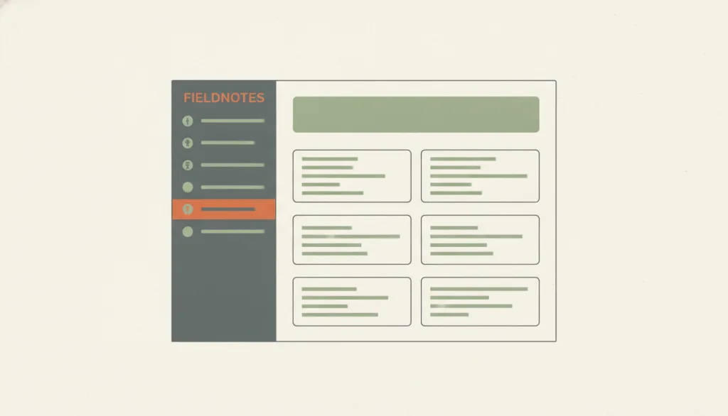
Recognizing it
- A vertical region fixed to one side of the page that keeps its position and width across pages
- Rows or groups of icon-plus-label items inside the region, with the current location clearly highlighted
- The main content takes the remaining width while the side region stays roughly constant as the viewport changes
Concept boundary
A sidebar is a persistent page-level region whose contents may be navigation, filters, or a tool panel; it is not necessarily a list of objects. That separates it from master-detail, where selecting an item in the side list drives the detail content; a sidebar has no such selection link with the main area. It also differs from single-column, which deliberately keeps one content column, whereas a sidebar always places a supporting region beside the main content. A sidebar that collapses into a drawer on narrow screens is still a sidebar layout.
When to consider it
- The product has many peer top-level sections that people switch between at any time and that may keep growing
- Filters or tools must stay visible and adjustable while people browse the main content
- Desktop-first workspaces or admin consoles where people stay for long sessions and frequently move across sections
When to be cautious
- The content is mainly read in sequence or filled in field by field; a side region would only narrow the body without adding value
- There are only two or three top-level sections; top navigation is enough, and a sidebar would only lower the content-to-chrome ratio
- Selecting an item in the side list is supposed to drive a detail view on the right; design that as master-detail instead
Tradeoff
Navigation and tools stay within reach and are easy to extend and scan; but the region permanently consumes horizontal space, long menus may push items out of view, and narrow screens still need a separate collapse or drawer treatment.
Conditional rules · Editorial advice
Related entries
Both look like split columns, but in master-detail the side list's selection drives the detail; a sidebar carries navigation or tools, and the main content is not determined by selecting an object in the side region.
Single-column gives the full width to sequential content; a sidebar trades part of the width for navigation or tools that are always reachable.
Faceted filters are often placed in a sidebar beside the results so the result context is not lost while adjusting criteria.
A collapsible sidebar reclaims width through on-demand disclosure, but a recognizable entry point must remain after it collapses.
Sources and what they support
States that left-side vertical navigation can absorb additional categories without redesigning the navigation UI, that visual search is more efficient in a vertical list than a horizontal one, and that it adapts more easily across screen widths; the costs are a smaller content area and long menus whose items may fall below the fold; it recommends never hiding labels behind icons alone and not collapsing navigation into a hamburger menu on desktop where space allows.
Retrieved: 2026-09-15Explains that the navigation landmark identifies groups of links used for site or page navigation (the HTML nav element), and the complementary landmark marks a supporting section beside the main content that remains meaningful on its own (the aside element); when a page has more than one landmark of the same type, each should have a unique accessible name.
Retrieved: 2026-09-15Definitions reference these sources. Digital specimens, selection advice, relationships, and recipes are editorial work and have not been validated through user research.
Type extensions and implementation notes
No operable specimen yet; the illustration is an editorial sketch. When applied to a product, still verify that the sidebar has a landmark role and accessible name, that the current item is exposed to assistive technology, that primary navigation remains legible with text after collapsing on narrow screens, and that sidebar width and order stay consistent across pages.
{
  "states": [
    "expanded",
    "collapsed",
    "drawer"
  ],
  "a11y": [
    "The sidebar uses a named landmark role so landmark navigation can jump to or skip it",
    "The current location is exposed to assistive technology, for example with aria-current, not only through color",
    "In the collapsed state the expand control has a text name and is keyboard operable"
  ],
  "motion": "Collapse and expand may use a brief transition and should respect the reduced-motion preference"
}
Full Agent entry JSON
{
  "id": "sidebar-layout",
  "type": "layout",
  "name": {
    "zh": "侧栏布局",
    "en": "Sidebar Layout"
  },
  "aliases": [
    "侧边栏布局",
    "Side Navigation",
    "Vertical Navigation"
  ],
  "granularity": "page",
  "intents": [
    "organize-content",
    "navigate-sections"
  ],
  "tags": [
    "sidebar",
    "navigation",
    "split view",
    "persistent region",
    "layout"
  ],
  "definition": "Keep a persistent vertical side region beside the main content for navigation, filters, or tools; NN/g reports that left-side vertical navigation is easy to scan, accommodates more categories, and reflows more easily across screen widths.",
  "boundary": "A sidebar is a persistent page-level region whose contents may be navigation, filters, or a tool panel; it is not necessarily a list of objects. That separates it from master-detail, where selecting an item in the side list drives the detail content; a sidebar has no such selection link with the main area. It also differs from single-column, which deliberately keeps one content column, whereas a sidebar always places a supporting region beside the main content. A sidebar that collapses into a drawer on narrow screens is still a sidebar layout.",
  "signature": [
    "A vertical region fixed to one side of the page that keeps its position and width across pages",
    "Rows or groups of icon-plus-label items inside the region, with the current location clearly highlighted",
    "The main content takes the remaining width while the side region stays roughly constant as the viewport changes"
  ],
  "when": [
    "The product has many peer top-level sections that people switch between at any time and that may keep growing",
    "Filters or tools must stay visible and adjustable while people browse the main content",
    "Desktop-first workspaces or admin consoles where people stay for long sessions and frequently move across sections"
  ],
  "when_not": [
    "The content is mainly read in sequence or filled in field by field; a side region would only narrow the body without adding value",
    "There are only two or three top-level sections; top navigation is enough, and a sidebar would only lower the content-to-chrome ratio",
    "Selecting an item in the side list is supposed to drive a detail view on the right; design that as master-detail instead"
  ],
  "tradeoff": "Navigation and tools stay within reach and are easy to extend and scan; but the region permanently consumes horizontal space, long menus may push items out of view, and narrow screens still need a separate collapse or drawer treatment.",
  "comparison": {
    "focus": "Keeping section navigation or tools reachable while people browse the main content",
    "mechanism": "A persistent vertical region placed beside the main content",
    "cost": "Permanent width cost; long menus and narrow-screen collapse must be handled"
  },
  "sources": [
    {
      "id": "sidebar-layout-nng-vertical-nav",
      "title": "Nielsen Norman Group · Left-Side Vertical Navigation on Desktop: Scalable, Responsive, and Easy to Scan",
      "url": "https://www.nngroup.com/articles/vertical-nav/",
      "claim": "States that left-side vertical navigation can absorb additional categories without redesigning the navigation UI, that visual search is more efficient in a vertical list than a horizontal one, and that it adapts more easily across screen widths; the costs are a smaller content area and long menus whose items may fall below the fold; it recommends never hiding labels behind icons alone and not collapsing navigation into a hamburger menu on desktop where space allows.",
      "checkedAt": "2026-09-15",
      "archive": {
        "lookupUrl": "https://web.archive.org/web/20260915*/https://www.nngroup.com/articles/vertical-nav/",
        "status": "available",
        "checkedAt": "2026-09-15T18:40:26.536Z",
        "jobId": "spn2-388ac0cfd714da5185952c4d5b0a215b09ef4952",
        "url": "https://web.archive.org/web/20260915184207/https://www.nngroup.com/articles/vertical-nav/",
        "timestamp": "20260915184207"
      }
    },
    {
      "id": "sidebar-layout-aria-landmarks",
      "title": "W3C WAI · ARIA Authoring Practices Guide · Landmark Regions",
      "url": "https://www.w3.org/WAI/ARIA/apg/practices/landmark-regions/",
      "claim": "Explains that the navigation landmark identifies groups of links used for site or page navigation (the HTML nav element), and the complementary landmark marks a supporting section beside the main content that remains meaningful on its own (the aside element); when a page has more than one landmark of the same type, each should have a unique accessible name.",
      "checkedAt": "2026-09-15",
      "archive": {
        "lookupUrl": "https://web.archive.org/web/20260915*/https://www.w3.org/WAI/ARIA/apg/practices/landmark-regions/",
        "status": "available",
        "checkedAt": "2026-09-15T18:40:47.348Z",
        "jobId": "spn2-7fee77c1ec866b3d7956157b38f2310d2fc743d7",
        "url": "https://web.archive.org/web/20260915184238/https://www.w3.org/WAI/ARIA/apg/practices/landmark-regions/",
        "timestamp": "20260915184238"
      }
    }
  ],
  "relations": [
    {
      "target": "master-detail",
      "kind": "related",
      "condition": "Deciding whether a selection link exists between the side region and the main content",
      "reason": "Both look like split columns, but in master-detail the side list's selection drives the detail; a sidebar carries navigation or tools, and the main content is not determined by selecting an object in the side region.",
      "basis": "editorial"
    },
    {
      "target": "single-column",
      "kind": "alternative",
      "condition": "Deciding whether the page keeps a persistent supporting region",
      "reason": "Single-column gives the full width to sequential content; a sidebar trades part of the width for navigation or tools that are always reachable.",
      "basis": "editorial"
    },
    {
      "target": "search-and-filter",
      "kind": "composes_with",
      "condition": "There are many filter criteria that must stay visible while browsing results",
      "reason": "Faceted filters are often placed in a sidebar beside the results so the result context is not lost while adjusting criteria.",
      "basis": "editorial"
    },
    {
      "target": "progressive-disclosure",
      "kind": "composes_with",
      "condition": "The sidebar needs to collapse on narrow screens or in a focus mode",
      "reason": "A collapsible sidebar reclaims width through on-demand disclosure, but a recognizable entry point must remain after it collapses.",
      "basis": "editorial"
    }
  ],
  "rules": [
    {
      "when": "The page contains a sidebar region",
      "instruction": "Mark the sidebar with a landmark role (nav/navigation for navigation, aside/complementary for supporting content) and give it an accessible name, especially when more than one landmark of that type exists.",
      "strength": "must",
      "basis": "editorial"
    },
    {
      "when": "The viewport becomes too narrow to show the sidebar beside the main content",
      "instruction": "Let the sidebar collapse or become a drawer, but do not hide primary navigation behind icons without text labels; keep the labels or provide a clearly labeled control to expand it.",
      "strength": "recommend",
      "basis": "editorial"
    },
    {
      "when": "People move between pages of the same product",
      "instruction": "Keep the sidebar's position, width, and item order stable so that spatial memory keeps working from page to page.",
      "strength": "recommend",
      "basis": "editorial"
    }
  ],
  "behavior": {
    "states": [
      "expanded",
      "collapsed",
      "drawer"
    ],
    "a11y": [
      "The sidebar uses a named landmark role so landmark navigation can jump to or skip it",
      "The current location is exposed to assistive technology, for example with aria-current, not only through color",
      "In the collapsed state the expand control has a text name and is keyboard operable"
    ],
    "motion": "Collapse and expand may use a brief transition and should respect the reduced-motion preference"
  },
  "demo": null,
  "version": "0.1.0",
  "editorialStatus": "drafted",
  "requirements": [],
  "demoCapabilities": [],
  "implementationNote": "No operable specimen yet; the illustration is an editorial sketch. When applied to a product, still verify that the sidebar has a landmark role and accessible name, that the current item is exposed to assistive technology, that primary navigation remains legible with text after collapsing on narrow screens, and that sidebar width and order stay consistent across pages.",
  "image": {
    "src": "/images/sidebar-layout.webp",
    "alt": "A fictional FIELDNOTES app screen: a narrow dark vertical sidebar on the left lists icon-plus-label navigation rows, one highlighted in terracotta as the current item; on the right a wide main content area holds a heading bar and two columns of cards."
  },
  "searchTerms": [
    "侧栏",
    "导航",
    "分栏",
    "持久区域",
    "布局"
  ]
}