VOCABULARY / ENTRY
Mega Menu
mega-menu
A large two-dimensional panel that opens from the navigation bar: the options under one section are laid out in several groups at once, all visible without scrolling, expressing structure through layout and headings rather than successive expansion.
Recognizing it
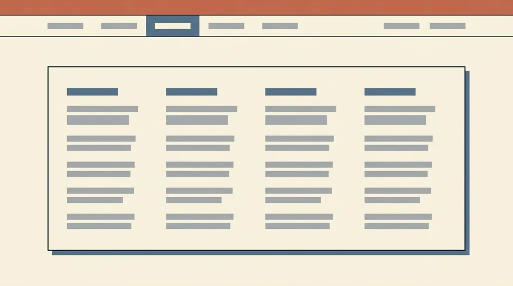
- Opening reveals a rectangular panel divided into titled columns
- Every option is visible at once and the panel itself does not scroll
- Structure is carried by layout, headings, and optional icons rather than step-by-step expansion
Concept boundary
The test is a two-dimensional panel whose groups are visible at once without scrolling, not "a dropdown with a lot in it". It does not replace hierarchical navigation: a mega menu exposes two or three levels and anything deeper still needs in-page navigation. It is not a dialog either — the panel is a fleeting presence and is a poor home for forms, settings, or anything the user must stay in. Once the content forces the panel to scroll, the premise of the pattern, seeing it all at once, no longer holds.
When to consider it
- A section holds many options and step-by-step expansion makes users wait repeatedly
- Users need to see what a section contains before entering it
- The options fall into clear groups that are worth expressing through layout
When to be cautious
- There are few enough options for an ordinary single-column dropdown
- The panel would need a form, settings, or any interaction the user must stay in
- The content forces the panel to scroll, so the premise of seeing it all at once no longer holds
Tradeoff
Showing a whole section at once saves repeated clicks and waits, at the cost of covering a large part of the page — and it depends on a hover or click trigger that makes the screen flicker if it is too eager and feels unresponsive if it is too slow.
Conditional rules · Editorial advice
Related entries
The mega menu spreads the top levels out horizontally while hierarchical navigation carries the depth after entry; they complement rather than replace each other.
A mega menu is a fleeting overlay that may close at any moment; an interaction that needs staying power belongs in a dialog with a defined way to dismiss it.
A mega menu serves navigation before a task and a footer serves after one; they can coexist and their content often overlaps.
Sources and what they support
The article (26 March 2017) describes a mega menu as an expandable menu presenting many choices in a two-dimensional dropdown layout, characterised by big two-dimensional panels divided into groups of navigation options, structure carried by layout and typography and sometimes icons, everything visible at once with no scrolling, and options revealed on hover, click, or tap. It also advises that hover-dependent elements wait until the pointer has rested for 0.5 seconds, or the screen flickers insufferably. This entry paraphrases the definition and the trigger timing from it.
Retrieved: 2026-09-16The tutorial explains that navigation menus need markup expressing their structure and the current location, and requires every menu item to be reachable and operable from the keyboard. This entry takes the keyboard and structure requirements from it; the tutorial remains the reference for implementation detail.
Retrieved: 2026-09-16 · Snapshot unconfirmedDefinitions reference these sources. Digital specimens, selection advice, relationships, and recipes are editorial work and have not been validated through user research.
Type extensions and implementation notes
This entry has no runnable specimen; the illustration is an editorial sketch of the panel’s grouped layout, not a verified implementation. Before shipping, test the hover delay and the keyboard path, and confirm there is a non-hover fallback on narrow screens.
{
  "states": [
    "closed",
    "open",
    "wide",
    "compact"
  ],
  "a11y": [
    "The trigger exposes its expanded state and the panel is associated with it",
    "Escape and moving focus away both close it, and focus returns to the trigger",
    "On narrow screens it degrades into a list that expands step by step rather than being hidden"
  ],
  "motion": "Opening may be instant, with no transition under a reduced-motion preference"
}
Full Agent entry JSON
{
  "id": "mega-menu",
  "type": "layout",
  "name": {
    "zh": "超级菜单",
    "en": "Mega Menu"
  },
  "aliases": [
    "Megamenu",
    "Mega Dropdown",
    "大型下拉菜单",
    "巨型菜单"
  ],
  "granularity": "component",
  "intents": [
    "navigate-sections",
    "find-option"
  ],
  "tags": [
    "navigation",
    "dropdown",
    "grouping",
    "site structure",
    "all visible"
  ],
  "definition": "A large two-dimensional panel that opens from the navigation bar: the options under one section are laid out in several groups at once, all visible without scrolling, expressing structure through layout and headings rather than successive expansion.",
  "boundary": "The test is a two-dimensional panel whose groups are visible at once without scrolling, not \"a dropdown with a lot in it\". It does not replace hierarchical navigation: a mega menu exposes two or three levels and anything deeper still needs in-page navigation. It is not a dialog either — the panel is a fleeting presence and is a poor home for forms, settings, or anything the user must stay in. Once the content forces the panel to scroll, the premise of the pattern, seeing it all at once, no longer holds.",
  "signature": [
    "Opening reveals a rectangular panel divided into titled columns",
    "Every option is visible at once and the panel itself does not scroll",
    "Structure is carried by layout, headings, and optional icons rather than step-by-step expansion"
  ],
  "when": [
    "A section holds many options and step-by-step expansion makes users wait repeatedly",
    "Users need to see what a section contains before entering it",
    "The options fall into clear groups that are worth expressing through layout"
  ],
  "when_not": [
    "There are few enough options for an ordinary single-column dropdown",
    "The panel would need a form, settings, or any interaction the user must stay in",
    "The content forces the panel to scroll, so the premise of seeing it all at once no longer holds"
  ],
  "tradeoff": "Showing a whole section at once saves repeated clicks and waits, at the cost of covering a large part of the page — and it depends on a hover or click trigger that makes the screen flicker if it is too eager and feels unresponsive if it is too slow.",
  "comparison": {
    "focus": "Seeing a whole section before entering it",
    "mechanism": "A grouped two-dimensional panel from the navigation bar, visible all at once",
    "cost": "It covers the page and its trigger timing needs careful tuning"
  },
  "sources": [
    {
      "id": "megamenu-nng",
      "title": "NN/g · Mega Menus Work Well for Site Navigation",
      "url": "https://www.nngroup.com/articles/mega-menus-work-well/",
      "claim": "The article (26 March 2017) describes a mega menu as an expandable menu presenting many choices in a two-dimensional dropdown layout, characterised by big two-dimensional panels divided into groups of navigation options, structure carried by layout and typography and sometimes icons, everything visible at once with no scrolling, and options revealed on hover, click, or tap. It also advises that hover-dependent elements wait until the pointer has rested for 0.5 seconds, or the screen flickers insufferably. This entry paraphrases the definition and the trigger timing from it.",
      "checkedAt": "2026-09-16",
      "archive": {
        "lookupUrl": "https://web.archive.org/web/20260916*/https://www.nngroup.com/articles/mega-menus-work-well/",
        "status": "available",
        "checkedAt": "2026-09-16T13:28:24.880Z",
        "jobId": "spn2-3e1e9ae4ef1d6b7e89929a9c96957f6fb257fb94",
        "url": "https://web.archive.org/web/20260916132849/https://www.nngroup.com/articles/mega-menus-work-well/",
        "timestamp": "20260916132849"
      }
    },
    {
      "id": "megamenu-w3c-menus",
      "title": "W3C WAI · Menus Tutorial",
      "url": "https://www.w3.org/WAI/tutorials/menus/",
      "claim": "The tutorial explains that navigation menus need markup expressing their structure and the current location, and requires every menu item to be reachable and operable from the keyboard. This entry takes the keyboard and structure requirements from it; the tutorial remains the reference for implementation detail.",
      "checkedAt": "2026-09-16",
      "archive": {
        "lookupUrl": "https://web.archive.org/web/20260916*/https://www.w3.org/WAI/tutorials/menus/",
        "status": "pending",
        "checkedAt": "2026-09-22T11:59:24.307Z",
        "error": "status-request-failed",
        "jobId": "spn2-8d402eb47e447b21e7455690a332bb137d7f6fca"
      }
    }
  ],
  "relations": [
    {
      "target": "hierarchical-navigation",
      "kind": "composes_with",
      "condition": "The site hierarchy runs deeper than the two or three levels a mega menu can expose",
      "reason": "The mega menu spreads the top levels out horizontally while hierarchical navigation carries the depth after entry; they complement rather than replace each other.",
      "basis": "editorial"
    },
    {
      "target": "modal-dialog",
      "kind": "alternative",
      "condition": "The panel would contain an interaction the user has to stay in to complete",
      "reason": "A mega menu is a fleeting overlay that may close at any moment; an interaction that needs staying power belongs in a dialog with a defined way to dismiss it.",
      "basis": "editorial"
    },
    {
      "target": "site-footer",
      "kind": "related",
      "condition": "Site-map-style links need one place to be presented",
      "reason": "A mega menu serves navigation before a task and a footer serves after one; they can coexist and their content often overlaps.",
      "basis": "editorial"
    }
  ],
  "rules": [
    {
      "when": "The menu opens on hover",
      "instruction": "Delay opening by about half a second and keep a short grace period after the pointer leaves, so the panel does not flicker as the pointer sweeps across the bar.",
      "strength": "recommend",
      "basis": "editorial"
    },
    {
      "when": "The menu is used on touch or with a keyboard alone",
      "instruction": "Provide a way to open that does not depend on hover, let the panel be entered and left from the keyboard, and keep the top-level item itself activatable.",
      "strength": "must",
      "basis": "editorial"
    }
  ],
  "behavior": {
    "states": [
      "closed",
      "open",
      "wide",
      "compact"
    ],
    "a11y": [
      "The trigger exposes its expanded state and the panel is associated with it",
      "Escape and moving focus away both close it, and focus returns to the trigger",
      "On narrow screens it degrades into a list that expands step by step rather than being hidden"
    ],
    "motion": "Opening may be instant, with no transition under a reduced-motion preference"
  },
  "demo": null,
  "version": "0.1.0",
  "editorialStatus": "drafted",
  "requirements": [],
  "demoCapabilities": [],
  "implementationNote": "This entry has no runnable specimen; the illustration is an editorial sketch of the panel’s grouped layout, not a verified implementation. Before shipping, test the hover delay and the keyboard path, and confirm there is a non-hover fallback on narrow screens.",
  "image": {
    "src": "/images/mega-menu.webp",
    "alt": "A fictional FIELDNOTES web page sketch: one item in the top navigation bar is active and a rectangular panel spanning most of the page width is open below it, divided into four columns, each with a small heading bar and several link placeholder bars."
  },
  "searchTerms": [
    "导航",
    "下拉菜单",
    "分组",
    "站点结构",
    "一次可见"
  ]
}