VOCABULARY / ENTRY
Modular Grid
modular-grid
Divides a page with both horizontal rows and vertical columns at once; where the rows and columns overlap, they form uniformly sized modules, and content is placed across a predictable number of modules instead of relying on a single-direction grid whose only variable is column width. IxDF states a modular grid is built from horizontal divisions running top to bottom together with vertical divisions running left to right, a system that Müller-Brockmann and other Swiss graphic designers established. Smashing Magazine's grid-based approach article explains that grid units must stay a consistent size: short content aligns to grid boundaries, while longer content spans multiple units or is shortened to fit the standard unit.
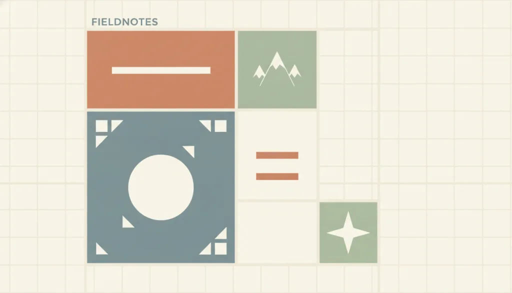
Recognizing it
- Vertical column lines and horizontal row lines exist on the page at once, and their intersections form modules of uniform size
- Different content blocks align to whole-module widths and heights, such as 2x1, 1x2, or 2x2
- Spacing between modules stays consistent across the page, and the edges of a block spanning multiple modules still land on grid lines
Concept boundary
A modular grid requires both rows and columns to participate in the division, producing modules that can be counted along two axes; a grid that only splits into columns, with row heights left free to follow content, does not qualify. Bento is a specific compositional style built on top of a modular grid: it deliberately uses blocks of different sizes to create visual hierarchy. A modular grid itself makes no assumption about which module matters more; it only supplies a shared coordinate system. A card grid is a homogeneous, repeating special case of a modular grid: every card occupies the same number of modules with an identical structure, whereas a modular grid allows different blocks to span different numbers of modules without requiring them to match. The three should be discussed separately.
When to consider it
- A page needs to hold content blocks of varying sizes (headline, image, summary, quote) that still need to align with and be comparable to one another
- An editorial or portfolio page needs blocks that span multiple columns or rows arranged within one shared coordinate system, rather than positioned freely one by one
- Content will be added or removed across versions and needs a reusable set of proportions to keep the layout consistent
When to be cautious
- All content is naturally the same width and height and only needs to repeat; a homogeneous card grid is more direct and avoids maintaining an extra row grid
- Content only needs to be split into reading-order columns without blocks spanning rows; an ordinary column grid is already enough, and a modular grid would add unnecessary constraints
- Content length and subject matter are highly unpredictable, and forcing it into whole modules would interrupt the content's own rhythm; the module size should not be imposed in that case
Tradeoff
A shared row-and-column coordinate system lets differently sized content blocks still align and be compared, and blocks spanning multiple modules read as restrained and rhythmic; but module and gutter sizes must be planned ahead, content length must fit whole multiples of the module, and changing the module proportions later costs more than adjusting a freely positioned layout.
Conditional rules · Editorial advice
Related entries
Bento is a specific compositional style layered on top of a modular grid that deliberately uses block size to create primary/secondary emphasis; a modular grid itself only supplies a shared coordinate system and assumes no block matters more than another.
A card grid is a homogeneous special case of a modular grid: every card spans the same number of modules with an identical structure, whereas a modular grid allows different blocks to span different numbers of modules.
Swiss-style layout often uses a modular grid as its structural skeleton, arranging type, whitespace, and alignment on top of it; the two frequently appear together but sit at different conceptual levels.
A single-column layout deliberately gives up horizontal division and keeps one sequential content stream; a modular grid trades that away for a row-and-column coordinate system that supports cross-module alignment and comparison.
Sources and what they support
Defines a modular grid as built from horizontal divisions running top to bottom together with vertical divisions running left to right, with the resulting modules controlling the placement and cropping of images and text; and notes that Müller-Brockmann and other Swiss graphic designers established this modular grid approach.
Retrieved: 2026-09-15 · Snapshot unconfirmedExplains that a grid's basic units must stay a consistent size, so design should align short content to grid boundaries and let longer content span multiple grid units or shrink to fit the standard unit, keeping the layout consistent and predictable across revisions.
Retrieved: 2026-09-15 · Archived 2026-09-16States that grid placement should only be used for visual rearrangement, not to change the document's logical order: non-visual media (such as speech) and sequential navigation (such as Tab traversal) both follow DOM order rather than the visual arrangement.
Retrieved: 2026-09-15Definitions reference these sources. Digital specimens, selection advice, relationships, and recipes are editorial work and have not been validated through user research.
Type extensions and implementation notes
No operable specimen yet; the illustration is an editorial sketch. When applied to a product, still verify: whether module and gutter sizes keep a consistent ratio across responsive breakpoints, whether the reading order of blocks spanning multiple modules still matches DOM order after collapsing to a single column on narrow screens, and whether changes in content length break module alignment.
{
  "states": [
    "multi-column-multi-row",
    "collapsed-single-column"
  ],
  "a11y": [
    "Grid placement performs visual rearrangement only; DOM order stays consistent with speech output and Tab traversal order",
    "Blocks spanning multiple modules still carry a clear heading or starting cue, helping non-visual access understand their boundaries"
  ],
  "motion": "None"
}
Full Agent entry JSON
{
  "id": "modular-grid",
  "type": "layout",
  "name": {
    "zh": "模块化网格",
    "en": "Modular Grid"
  },
  "aliases": [
    "模块网格",
    "Grid System",
    "Module Grid"
  ],
  "granularity": "page",
  "intents": [
    "overview",
    "organize-content"
  ],
  "tags": [
    "grid",
    "modules",
    "typography",
    "alignment",
    "layout"
  ],
  "definition": "Divides a page with both horizontal rows and vertical columns at once; where the rows and columns overlap, they form uniformly sized modules, and content is placed across a predictable number of modules instead of relying on a single-direction grid whose only variable is column width. IxDF states a modular grid is built from horizontal divisions running top to bottom together with vertical divisions running left to right, a system that Müller-Brockmann and other Swiss graphic designers established. Smashing Magazine's grid-based approach article explains that grid units must stay a consistent size: short content aligns to grid boundaries, while longer content spans multiple units or is shortened to fit the standard unit.",
  "boundary": "A modular grid requires both rows and columns to participate in the division, producing modules that can be counted along two axes; a grid that only splits into columns, with row heights left free to follow content, does not qualify. Bento is a specific compositional style built on top of a modular grid: it deliberately uses blocks of different sizes to create visual hierarchy. A modular grid itself makes no assumption about which module matters more; it only supplies a shared coordinate system. A card grid is a homogeneous, repeating special case of a modular grid: every card occupies the same number of modules with an identical structure, whereas a modular grid allows different blocks to span different numbers of modules without requiring them to match. The three should be discussed separately.",
  "signature": [
    "Vertical column lines and horizontal row lines exist on the page at once, and their intersections form modules of uniform size",
    "Different content blocks align to whole-module widths and heights, such as 2x1, 1x2, or 2x2",
    "Spacing between modules stays consistent across the page, and the edges of a block spanning multiple modules still land on grid lines"
  ],
  "when": [
    "A page needs to hold content blocks of varying sizes (headline, image, summary, quote) that still need to align with and be comparable to one another",
    "An editorial or portfolio page needs blocks that span multiple columns or rows arranged within one shared coordinate system, rather than positioned freely one by one",
    "Content will be added or removed across versions and needs a reusable set of proportions to keep the layout consistent"
  ],
  "when_not": [
    "All content is naturally the same width and height and only needs to repeat; a homogeneous card grid is more direct and avoids maintaining an extra row grid",
    "Content only needs to be split into reading-order columns without blocks spanning rows; an ordinary column grid is already enough, and a modular grid would add unnecessary constraints",
    "Content length and subject matter are highly unpredictable, and forcing it into whole modules would interrupt the content's own rhythm; the module size should not be imposed in that case"
  ],
  "tradeoff": "A shared row-and-column coordinate system lets differently sized content blocks still align and be compared, and blocks spanning multiple modules read as restrained and rhythmic; but module and gutter sizes must be planned ahead, content length must fit whole multiples of the module, and changing the module proportions later costs more than adjusting a freely positioned layout.",
  "comparison": {
    "focus": "Arranging differently sized content blocks that still need to align within one shared coordinate system",
    "mechanism": "Equal-sized modules formed where rows and columns intersect, with content spanning a set number of modules",
    "cost": "Module and gutter sizes must be defined up front, and content length has to fit whole multiples of the module"
  },
  "sources": [
    {
      "id": "modular-grid-ixdf",
      "title": "Interaction Design Foundation · What are Grid Systems?",
      "url": "https://ixdf.org/literature/topics/grid-systems",
      "claim": "Defines a modular grid as built from horizontal divisions running top to bottom together with vertical divisions running left to right, with the resulting modules controlling the placement and cropping of images and text; and notes that Müller-Brockmann and other Swiss graphic designers established this modular grid approach.",
      "checkedAt": "2026-09-15",
      "archive": {
        "lookupUrl": "https://web.archive.org/web/20260915*/https://ixdf.org/literature/topics/grid-systems",
        "status": "unconfirmed",
        "checkedAt": "2026-09-16T04:05:57.254Z",
        "error": "error:no-request",
        "jobId": "spn2-0cb950ff84cb17c5f74108fb6c1ea108475b4ea2"
      }
    },
    {
      "id": "modular-grid-smashing",
      "title": "Smashing Magazine · Designing With Grid-Based Approach",
      "url": "https://www.smashingmagazine.com/2007/04/designing-with-grid-based-approach/",
      "claim": "Explains that a grid's basic units must stay a consistent size, so design should align short content to grid boundaries and let longer content span multiple grid units or shrink to fit the standard unit, keeping the layout consistent and predictable across revisions.",
      "checkedAt": "2026-09-15",
      "archive": {
        "lookupUrl": "https://web.archive.org/web/20260915*/https://www.smashingmagazine.com/2007/04/designing-with-grid-based-approach/",
        "status": "available",
        "checkedAt": "2026-09-16T04:05:57.287Z",
        "jobId": "spn2-52ca147afab10746928190fbae563328a21b832a",
        "url": "https://web.archive.org/web/20260916040712/https://www.smashingmagazine.com/2007/04/designing-with-grid-based-approach/",
        "timestamp": "20260916040712"
      }
    },
    {
      "id": "modular-grid-mdn-a11y",
      "title": "MDN · Grid layout and accessibility",
      "url": "https://developer.mozilla.org/en-US/docs/Web/CSS/CSS_grid_layout/Grid_layout_and_accessibility",
      "claim": "States that grid placement should only be used for visual rearrangement, not to change the document's logical order: non-visual media (such as speech) and sequential navigation (such as Tab traversal) both follow DOM order rather than the visual arrangement.",
      "checkedAt": "2026-09-15",
      "archive": {
        "lookupUrl": "https://web.archive.org/web/20260915*/https://developer.mozilla.org/en-US/docs/Web/CSS/CSS_grid_layout/Grid_layout_and_accessibility",
        "status": "available",
        "checkedAt": "2026-09-15T18:29:58.748Z",
        "jobId": "spn2-bf1ca2741c8446f855c995e13f036afd2ef6e6ab",
        "url": "https://web.archive.org/web/20260915183028/https://developer.mozilla.org/en-US/docs/Web/CSS/Guides/Grid_layout/Accessibility",
        "timestamp": "20260915183028"
      }
    }
  ],
  "relations": [
    {
      "target": "bento",
      "kind": "related",
      "condition": "Deciding whether differences in block size are themselves meant to express hierarchy",
      "reason": "Bento is a specific compositional style layered on top of a modular grid that deliberately uses block size to create primary/secondary emphasis; a modular grid itself only supplies a shared coordinate system and assumes no block matters more than another.",
      "basis": "editorial"
    },
    {
      "target": "card-grid",
      "kind": "related",
      "condition": "Deciding whether the blocks are homogeneous and always span the same number of modules",
      "reason": "A card grid is a homogeneous special case of a modular grid: every card spans the same number of modules with an identical structure, whereas a modular grid allows different blocks to span different numbers of modules.",
      "basis": "editorial"
    },
    {
      "target": "swiss",
      "kind": "composes_with",
      "condition": "The page adopts a Swiss-style visual language",
      "reason": "Swiss-style layout often uses a modular grid as its structural skeleton, arranging type, whitespace, and alignment on top of it; the two frequently appear together but sit at different conceptual levels.",
      "basis": "editorial"
    },
    {
      "target": "single-column",
      "kind": "alternative",
      "condition": "Deciding whether a multi-directional coordinate system is needed, versus a single sequential content stream",
      "reason": "A single-column layout deliberately gives up horizontal division and keeps one sequential content stream; a modular grid trades that away for a row-and-column coordinate system that supports cross-module alignment and comparison.",
      "basis": "editorial"
    }
  ],
  "rules": [
    {
      "when": "A page uses a modular grid to arrange multiple content blocks",
      "instruction": "Keep module size and spacing consistent across the whole page, so the module spans of different blocks (such as 2x1, 1x2, 2x2) remain directly comparable.",
      "strength": "recommend",
      "basis": "editorial"
    },
    {
      "when": "Grid placement causes a block's visual position to diverge from its order in the source",
      "instruction": "Use grid placement only for visual arrangement; never use the visual grid to reorder content away from its logical (DOM) order. Speech output and sequential navigation should still follow the logical order.",
      "strength": "must",
      "basis": "editorial"
    },
    {
      "when": "Content length or structure does not cleanly match the module size",
      "instruction": "Do not truncate or stretch content just to fill whole modules and disrupt its natural reading rhythm; allow that block's module span to be an exception when needed.",
      "strength": "recommend",
      "basis": "editorial"
    }
  ],
  "behavior": {
    "states": [
      "multi-column-multi-row",
      "collapsed-single-column"
    ],
    "a11y": [
      "Grid placement performs visual rearrangement only; DOM order stays consistent with speech output and Tab traversal order",
      "Blocks spanning multiple modules still carry a clear heading or starting cue, helping non-visual access understand their boundaries"
    ],
    "motion": "None"
  },
  "demo": null,
  "version": "0.1.0",
  "editorialStatus": "drafted",
  "requirements": [],
  "demoCapabilities": [],
  "implementationNote": "No operable specimen yet; the illustration is an editorial sketch. When applied to a product, still verify: whether module and gutter sizes keep a consistent ratio across responsive breakpoints, whether the reading order of blocks spanning multiple modules still matches DOM order after collapsing to a single column on narrow screens, and whether changes in content length break module alignment.",
  "image": {
    "src": "/images/modular-grid.webp",
    "alt": "A fictional FIELDNOTES editorial page laid over a visible row-and-column modular grid, with blocks spanning 2x1, 1x2, and 2x2 modules and faint grid lines showing through between them."
  },
  "searchTerms": [
    "网格",
    "模块",
    "版式",
    "对齐",
    "布局"
  ]
}