VOCABULARY / ENTRY
Preppy (Collegiate)
preppy
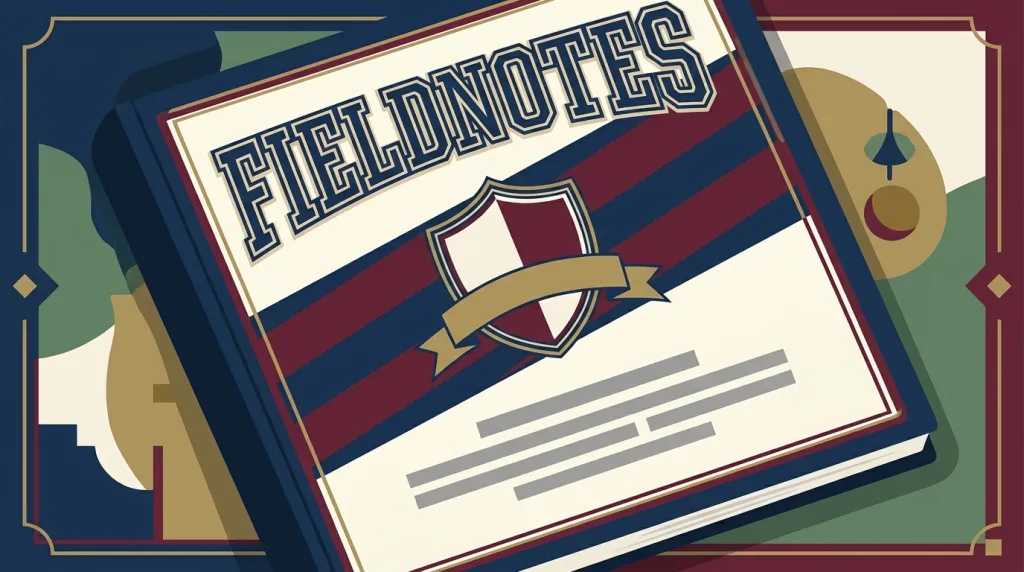
A graphic language borrowed from the visual tradition of Northeastern American preparatory schools and Ivy League campuses: shield crests and heraldic devices, varsity-style bold letters and numerals, navy with burgundy or deep green stripes, and traditional serif type — used to signal heritage, legitimacy, and old-money respectability.
Recognizing it
- Shields, ribbons, or laurel devices sit at the heart of the mark
- Heavy varsity letters, numerals, or a founding year, often outlined
- Navy, burgundy, deep green, and cream arranged as stripes or checks
Concept boundary
This entry covers how the graphic language is used in branding, packaging, and interfaces; it does not summarise preppy as a clothing taste or a class marker. The test is the combination of heraldry, varsity lettering, and traditional serif typesetting — not "navy blue" or "looks formal". It differs from Art Deco, whose geometric motifs serve modernity, while preppy crests and stripes suggest provenance. That provenance is a visual rhetoric, not a claim about any institution’s real history: putting a crest on a product with no such history is only borrowing the sign.
When to consider it
- The brand needs to express continuity, legitimacy, or a link to educational and sporting tradition
- A product line uses a repeatable set of crests and colorways to distinguish series or years
- The audience already reads campus and club visual conventions
When to be cautious
- The brand stands for breaking with tradition, where heraldry signals the opposite
- A crest and a founding year imply an institutional history that does not exist
- The interface is dense and an intricate crest degrades into a blur at small sizes
Tradeoff
It establishes a steady, credible impression quickly, at the cost of carrying explicit class and regional associations — and a crest needs a separate simplified version for small and single-color use.
Conditional rules · Editorial advice
Related entries
Art Deco uses geometricised ornament for modernity and luxury; preppy uses heraldry and stripes for heritage and legitimacy. The two nostalgias point at different eras and different values.
The crest carries identity while the grid and typographic hierarchy carry readability; the two roles do not conflict.
Stripes put one run of text over backgrounds of different lightness; the worst case is the real contrast.
Sources and what they support
The article describes preppy as a subculture associated with alumni of Northeastern American preparatory schools, whose dress derives from those schools’ early-to-mid twentieth-century fashions and is linked to the Ivy League. This entry takes the provenance of the visual signs from it; translating them into a brand and interface language is editorial judgement.
Retrieved: 2026-09-16 · Snapshot unconfirmedThe article records that The Official Preppy Handbook was published by Workman Publishing in October 1980 as a written codification of the taste. This entry cites it to date when the signs were explicitly codified; it does not treat the book as a design specification.
Retrieved: 2026-09-16 · Snapshot unconfirmedDefinitions reference these sources. Digital specimens, selection advice, relationships, and recipes are editorial work and have not been validated through user research.
Type extensions and implementation notes
This entry has no runnable specimen; the illustration is an editorial sketch using a fictional crest and represents no real institution. Before shipping, confirm that any wording in the crest is true, and measure both small-size recognisability and contrast over striped grounds.
{
  "tokens": {
    "surface": "#f3efe4",
    "ink": "#152a44",
    "accent": "#7a2230",
    "radiusPx": 2,
    "shadow": "none"
  },
  "tokenScope": "This sample recipe — cream ground, navy ink, burgundy accent — is one common reading of the style, not any institution’s official colors. Real work should re-pick values for its own brand context and verify text contrast over dark stripes."
}
Full Agent entry JSON
{
  "id": "preppy",
  "type": "visual",
  "name": {
    "zh": "学院风",
    "en": "Preppy (Collegiate)"
  },
  "aliases": [
    "Collegiate Style",
    "Ivy Style",
    "常春藤风格",
    "校园徽章风"
  ],
  "granularity": "experience",
  "intents": [
    "express-brand",
    "organize-content"
  ],
  "tags": [
    "crest",
    "campus",
    "stripes",
    "serif type",
    "heritage"
  ],
  "definition": "A graphic language borrowed from the visual tradition of Northeastern American preparatory schools and Ivy League campuses: shield crests and heraldic devices, varsity-style bold letters and numerals, navy with burgundy or deep green stripes, and traditional serif type — used to signal heritage, legitimacy, and old-money respectability.",
  "boundary": "This entry covers how the graphic language is used in branding, packaging, and interfaces; it does not summarise preppy as a clothing taste or a class marker. The test is the combination of heraldry, varsity lettering, and traditional serif typesetting — not \"navy blue\" or \"looks formal\". It differs from Art Deco, whose geometric motifs serve modernity, while preppy crests and stripes suggest provenance. That provenance is a visual rhetoric, not a claim about any institution’s real history: putting a crest on a product with no such history is only borrowing the sign.",
  "signature": [
    "Shields, ribbons, or laurel devices sit at the heart of the mark",
    "Heavy varsity letters, numerals, or a founding year, often outlined",
    "Navy, burgundy, deep green, and cream arranged as stripes or checks"
  ],
  "when": [
    "The brand needs to express continuity, legitimacy, or a link to educational and sporting tradition",
    "A product line uses a repeatable set of crests and colorways to distinguish series or years",
    "The audience already reads campus and club visual conventions"
  ],
  "when_not": [
    "The brand stands for breaking with tradition, where heraldry signals the opposite",
    "A crest and a founding year imply an institutional history that does not exist",
    "The interface is dense and an intricate crest degrades into a blur at small sizes"
  ],
  "tradeoff": "It establishes a steady, credible impression quickly, at the cost of carrying explicit class and regional associations — and a crest needs a separate simplified version for small and single-color use.",
  "comparison": {
    "focus": "Signalling legitimacy through symbols of campus heritage",
    "mechanism": "Heraldry, varsity lettering, and traditional striped colorways",
    "cost": "The symbols carry class associations and need a small-size simplification"
  },
  "sources": [
    {
      "id": "preppy-wikipedia",
      "title": "Wikipedia · Preppy",
      "url": "https://en.wikipedia.org/wiki/Preppy",
      "claim": "The article describes preppy as a subculture associated with alumni of Northeastern American preparatory schools, whose dress derives from those schools’ early-to-mid twentieth-century fashions and is linked to the Ivy League. This entry takes the provenance of the visual signs from it; translating them into a brand and interface language is editorial judgement.",
      "checkedAt": "2026-09-16",
      "archive": {
        "lookupUrl": "https://web.archive.org/web/20260916*/https://en.wikipedia.org/wiki/Preppy",
        "status": "unconfirmed",
        "checkedAt": "2026-09-16T13:01:42.423Z",
        "error": "status-request-failed",
        "jobId": "spn2-c4b21dcb1a4aa584439055baec53bb436cc1f379"
      }
    },
    {
      "id": "preppy-handbook",
      "title": "Wikipedia · The Official Preppy Handbook",
      "url": "https://en.wikipedia.org/wiki/The_Official_Preppy_Handbook",
      "claim": "The article records that The Official Preppy Handbook was published by Workman Publishing in October 1980 as a written codification of the taste. This entry cites it to date when the signs were explicitly codified; it does not treat the book as a design specification.",
      "checkedAt": "2026-09-16",
      "archive": {
        "lookupUrl": "https://web.archive.org/web/20260916*/https://en.wikipedia.org/wiki/The_Official_Preppy_Handbook",
        "status": "unconfirmed",
        "checkedAt": "2026-09-16T13:01:42.425Z",
        "error": "status-request-failed",
        "jobId": "spn2-fa87bb50129c701168bf6b431e7da93b5b11e813"
      }
    }
  ],
  "relations": [
    {
      "target": "art-deco",
      "kind": "alternative",
      "condition": "A retro brand language with decorative motifs is needed",
      "reason": "Art Deco uses geometricised ornament for modernity and luxury; preppy uses heraldry and stripes for heritage and legitimacy. The two nostalgias point at different eras and different values.",
      "basis": "editorial"
    },
    {
      "target": "swiss",
      "kind": "composes_with",
      "condition": "The crest is the brand mark while body text and navigation still need a clear information hierarchy",
      "reason": "The crest carries identity while the grid and typographic hierarchy carry readability; the two roles do not conflict.",
      "basis": "editorial"
    },
    {
      "target": "contrast-legibility",
      "kind": "conflicts_when",
      "condition": "Small text or icons are placed directly on dark striped backgrounds",
      "reason": "Stripes put one run of text over backgrounds of different lightness; the worst case is the real contrast.",
      "basis": "editorial"
    }
  ],
  "rules": [
    {
      "when": "The crest has to appear as an icon, favicon, or at small sizes",
      "instruction": "Prepare a simplified version that drops detail and keeps the main silhouette, and check that it is still recognisable at the real minimum size.",
      "strength": "must",
      "basis": "editorial"
    },
    {
      "when": "The crest contains a year, Latin wording, or institutional phrasing",
      "instruction": "Use only facts the product actually has; do not let visual signs imply a history or credential that does not exist.",
      "strength": "must",
      "basis": "editorial"
    }
  ],
  "visual": {
    "tokens": {
      "surface": "#f3efe4",
      "ink": "#152a44",
      "accent": "#7a2230",
      "radiusPx": 2,
      "shadow": "none"
    },
    "tokenScope": "This sample recipe — cream ground, navy ink, burgundy accent — is one common reading of the style, not any institution’s official colors. Real work should re-pick values for its own brand context and verify text contrast over dark stripes."
  },
  "demo": null,
  "version": "0.1.0",
  "editorialStatus": "drafted",
  "requirements": [],
  "demoCapabilities": [],
  "implementationNote": "This entry has no runnable specimen; the illustration is an editorial sketch using a fictional crest and represents no real institution. Before shipping, confirm that any wording in the crest is true, and measure both small-size recognisability and contrast over striped grounds.",
  "image": {
    "src": "/images/preppy.webp",
    "alt": "A fictional FIELDNOTES collegiate cover: a shield crest with a ribbon at the centre, heavy varsity letters above it, navy and burgundy diagonal stripes behind, and cream placeholder text bars below."
  },
  "searchTerms": [
    "徽章",
    "校园",
    "条纹",
    "衬线字体",
    "传统"
  ]
}