VOCABULARY / ENTRY
Contrast and Legibility
contrast-legibility
Body text must reach a specified minimum contrast against its background, and interface control boundaries and state indicators must reach a separate, lower minimum contrast; this is a measurable pass/fail check, not the name of a visual style.
Recognizing it
- Body text reaches the specified minimum contrast against every background it can actually appear over, including translucent and image backgrounds
- Control boundaries, checkboxes, radio buttons, and other state indicators reach the minimum non-text contrast against adjacent colors
- Contrast is measured from the actual rendered result, not from an isolated color swatch on a design file
Concept boundary
Figure-ground describes the perceptual mechanism by which the eye separates a foreground from its background. This entry is the quantified check for whether that separation is "clear enough" — using a contrast-ratio number to decide whether text and controls can actually be read. The two address different questions and can apply at the same time. Low contrast is not shorthand for any one visual style: glassmorphism, minimalism, flat design, maximalism, and Memphis can all produce low contrast when implemented carelessly, and the fix is to bring that style's text and controls up to the measured threshold, not to abandon the style.
When to consider it
- Designing or reviewing body text, captions, labels, or other text meant to be read
- Designing or reviewing form controls, button boundaries, checked states, or other elements that need to be identified
- Text or controls sit over a translucent layer, gradient, or image background
When to be cautious
- Treating "this looks like a popular visual style" as proof that contrast already passes
- Measuring contrast once on a clean mockup and assuming every real rendering condition passes
- Applying the same mandatory threshold to purely decorative graphics that are not needed to understand the content
Tradeoff
Raising contrast keeps text and controls legible across more lighting conditions and visual abilities, but pushing contrast too high or thickening every border indiscriminately can flatten visual hierarchy so everything looks equally important.
Conditional rules · Editorial advice
Related entries
Figure-ground describes the perceptual mechanism that separates foreground from background; this entry is the quantified check for whether that separation clears a measurable threshold. They are complementary but measure different things.
Glassmorphism relies on translucency and background show-through for its texture, but if the resulting composited contrast falls below the specified threshold, that is a defect under this entry — fix it by adjusting opacity, deepening the overlay, or changing the color, not by abandoning the style.
Minimalism often reduces visual noise by removing elements, but if that pushes body text or control-boundary contrast below the specified minimum, that is a measurable defect; adjust color while keeping the minimal look, rather than treating the style itself as the fix.
A focus indicator must first clear the non-text contrast minimum to be visible at all; this entry supplies that threshold, while the focus-indicator entry covers the specific rules for its visibility and discoverability.
Sources and what they support
WCAG 2.2 Success Criterion 1.4.3 (Level AA) requires a contrast ratio of at least 4.5:1 for body text against its background, and at least 3:1 for large-scale text (18 point, or 14 point bold and larger).
Retrieved: 2026-09-15 · Snapshot unconfirmedWCAG 2.2 Success Criterion 1.4.11 (Level AA) requires a contrast ratio of at least 3:1 for visual information used to identify user interface components and their states, and for the parts of graphical objects required to understand the content.
Retrieved: 2026-09-15 · Snapshot unconfirmedWCAG 2.2 Success Criterion 1.4.12 (Level AA) requires that content not lose functionality or be clipped when a user sets line height to at least 1.5 times the font size, paragraph spacing to 2 times the font size, letter spacing to 0.12 times the font size, and word spacing to 0.16 times the font size.
Retrieved: 2026-09-15 · Snapshot unconfirmedDefinitions reference these sources. Digital specimens, selection advice, relationships, and recipes are editorial work and have not been validated through user research.
Type extensions and implementation notes
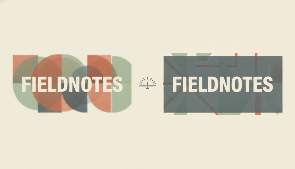
No operable specimen exists yet; the illustration is editorial, meant to convey that contrast is a measurable, quantified check, and does not represent a verified implementation. Before shipping in a real product, contrast still needs to be measured with actual color values and rendering conditions, covering light and dark themes, hover states, and disabled states.
{
  "evidenceType": "A measurable success criterion from a W3C accessibility standard",
  "limit": "This entry covers only the WCAG 2.2 Level AA contrast and text-spacing values listed here; the higher Level AAA thresholds and finer-grained legibility concerns such as color-blindness simulation are out of scope and need separate evaluation."
}
Full Agent entry JSON
{
  "id": "contrast-legibility",
  "type": "principle",
  "name": {
    "zh": "对比与可读性",
    "en": "Contrast and Legibility"
  },
  "aliases": [
    "Contrast Ratio",
    "对比度",
    "文字可读性"
  ],
  "granularity": "component",
  "intents": [
    "read-content",
    "include-users"
  ],
  "tags": [
    "contrast ratio",
    "legibility",
    "accessibility",
    "text",
    "quantified check"
  ],
  "definition": "Body text must reach a specified minimum contrast against its background, and interface control boundaries and state indicators must reach a separate, lower minimum contrast; this is a measurable pass/fail check, not the name of a visual style.",
  "boundary": "Figure-ground describes the perceptual mechanism by which the eye separates a foreground from its background. This entry is the quantified check for whether that separation is \"clear enough\" — using a contrast-ratio number to decide whether text and controls can actually be read. The two address different questions and can apply at the same time. Low contrast is not shorthand for any one visual style: glassmorphism, minimalism, flat design, maximalism, and Memphis can all produce low contrast when implemented carelessly, and the fix is to bring that style's text and controls up to the measured threshold, not to abandon the style.",
  "signature": [
    "Body text reaches the specified minimum contrast against every background it can actually appear over, including translucent and image backgrounds",
    "Control boundaries, checkboxes, radio buttons, and other state indicators reach the minimum non-text contrast against adjacent colors",
    "Contrast is measured from the actual rendered result, not from an isolated color swatch on a design file"
  ],
  "when": [
    "Designing or reviewing body text, captions, labels, or other text meant to be read",
    "Designing or reviewing form controls, button boundaries, checked states, or other elements that need to be identified",
    "Text or controls sit over a translucent layer, gradient, or image background"
  ],
  "when_not": [
    "Treating \"this looks like a popular visual style\" as proof that contrast already passes",
    "Measuring contrast once on a clean mockup and assuming every real rendering condition passes",
    "Applying the same mandatory threshold to purely decorative graphics that are not needed to understand the content"
  ],
  "tradeoff": "Raising contrast keeps text and controls legible across more lighting conditions and visual abilities, but pushing contrast too high or thickening every border indiscriminately can flatten visual hierarchy so everything looks equally important.",
  "comparison": {
    "focus": "Whether text and controls reach a specified minimum contrast-ratio number",
    "mechanism": "Compute the contrast ratio between foreground and background colors — including the actual composited color behind translucency — and compare it against the specified threshold",
    "cost": "Requires remeasuring under every real background condition and repeatedly reconciling a visual style with the threshold"
  },
  "sources": [
    {
      "id": "wcag-contrast-minimum",
      "title": "W3C WAI · Understanding SC 1.4.3 Contrast (Minimum)",
      "url": "https://www.w3.org/WAI/WCAG22/Understanding/contrast-minimum.html",
      "claim": "WCAG 2.2 Success Criterion 1.4.3 (Level AA) requires a contrast ratio of at least 4.5:1 for body text against its background, and at least 3:1 for large-scale text (18 point, or 14 point bold and larger).",
      "checkedAt": "2026-09-15",
      "archive": {
        "lookupUrl": "https://web.archive.org/web/20260915*/https://www.w3.org/WAI/WCAG22/Understanding/contrast-minimum.html",
        "status": "pending",
        "checkedAt": "2026-09-16T05:52:47.510Z",
        "error": "status-request-failed",
        "jobId": "spn2-aaf35e85f6721a576e2120d151675a94b3ebc3e0"
      }
    },
    {
      "id": "wcag-non-text-contrast",
      "title": "W3C WAI · Understanding SC 1.4.11 Non-text Contrast",
      "url": "https://www.w3.org/WAI/WCAG22/Understanding/non-text-contrast.html",
      "claim": "WCAG 2.2 Success Criterion 1.4.11 (Level AA) requires a contrast ratio of at least 3:1 for visual information used to identify user interface components and their states, and for the parts of graphical objects required to understand the content.",
      "checkedAt": "2026-09-15",
      "archive": {
        "lookupUrl": "https://web.archive.org/web/20260915*/https://www.w3.org/WAI/WCAG22/Understanding/non-text-contrast.html",
        "status": "pending",
        "checkedAt": "2026-09-16T05:52:52.102Z",
        "error": "status-request-failed",
        "jobId": "spn2-cf85e71cf3338249ce7764cb535e017ff5de05ba"
      }
    },
    {
      "id": "wcag-text-spacing",
      "title": "W3C WAI · Understanding SC 1.4.12 Text Spacing",
      "url": "https://www.w3.org/WAI/WCAG22/Understanding/text-spacing.html",
      "claim": "WCAG 2.2 Success Criterion 1.4.12 (Level AA) requires that content not lose functionality or be clipped when a user sets line height to at least 1.5 times the font size, paragraph spacing to 2 times the font size, letter spacing to 0.12 times the font size, and word spacing to 0.16 times the font size.",
      "checkedAt": "2026-09-15",
      "archive": {
        "lookupUrl": "https://web.archive.org/web/20260915*/https://www.w3.org/WAI/WCAG22/Understanding/text-spacing.html",
        "status": "pending",
        "checkedAt": "2026-09-16T05:53:26.469Z",
        "error": "status-request-failed",
        "jobId": "spn2-292cc6729740f2beb21addea2125d2b260fcd314"
      }
    }
  ],
  "relations": [
    {
      "target": "figure-ground",
      "kind": "related",
      "condition": "Both concern the separation of foreground from background",
      "reason": "Figure-ground describes the perceptual mechanism that separates foreground from background; this entry is the quantified check for whether that separation clears a measurable threshold. They are complementary but measure different things.",
      "basis": "editorial"
    },
    {
      "target": "glassmorphism",
      "kind": "conflicts_when",
      "condition": "A translucent frosted-glass layer lowers the contrast between text or controls and their actual background",
      "reason": "Glassmorphism relies on translucency and background show-through for its texture, but if the resulting composited contrast falls below the specified threshold, that is a defect under this entry — fix it by adjusting opacity, deepening the overlay, or changing the color, not by abandoning the style.",
      "basis": "editorial"
    },
    {
      "target": "minimalism",
      "kind": "conflicts_when",
      "condition": "Pursuing a minimal look with light-gray text or borderless controls drops contrast below the threshold",
      "reason": "Minimalism often reduces visual noise by removing elements, but if that pushes body text or control-boundary contrast below the specified minimum, that is a measurable defect; adjust color while keeping the minimal look, rather than treating the style itself as the fix.",
      "basis": "editorial"
    },
    {
      "target": "focus-indicator",
      "kind": "composes_with",
      "condition": "Designing the color of a keyboard focus ring or other state indicator",
      "reason": "A focus indicator must first clear the non-text contrast minimum to be visible at all; this entry supplies that threshold, while the focus-indicator entry covers the specific rules for its visibility and discoverability.",
      "basis": "editorial"
    }
  ],
  "rules": [
    {
      "when": "Designing or implementing body text, captions, or other content meant to be read",
      "instruction": "Ensure text reaches the specified minimum contrast against every background it can actually appear over, including translucent composites, images, or gradients; large text may use the lower threshold.",
      "strength": "must",
      "basis": "editorial"
    },
    {
      "when": "Designing or implementing form-control boundaries, checkboxes, radio buttons, or other state indicators",
      "instruction": "Ensure the visual information used to identify a control and its state reaches the specified minimum non-text contrast against adjacent colors.",
      "strength": "must",
      "basis": "editorial"
    },
    {
      "when": "Reviewing whether contrast passes",
      "instruction": "Measure contrast in the actual rendering environment — real backgrounds, real states, both light and dark themes — rather than sampling an isolated swatch on a design file.",
      "strength": "recommend",
      "basis": "editorial"
    }
  ],
  "principle": {
    "evidenceType": "A measurable success criterion from a W3C accessibility standard",
    "limit": "This entry covers only the WCAG 2.2 Level AA contrast and text-spacing values listed here; the higher Level AAA thresholds and finer-grained legibility concerns such as color-blindness simulation are out of scope and need separate evaluation."
  },
  "demo": null,
  "version": "0.1.0",
  "editorialStatus": "drafted",
  "requirements": [],
  "demoCapabilities": [],
  "implementationNote": "No operable specimen exists yet; the illustration is editorial, meant to convey that contrast is a measurable, quantified check, and does not represent a verified implementation. Before shipping in a real product, contrast still needs to be measured with actual color values and rendering conditions, covering light and dark themes, hover states, and disabled states.",
  "image": {
    "src": "/images/contrast-legibility.webp",
    "alt": "A fictional FIELDNOTES text block shown twice side by side: on the left it sits over a busy translucent panel and reads as blurry and washed out; on the right it has a solid backing plate with a crisp, clearly separated edge and reads clearly; a small ratio-scale motif sits between the two, in a flat muted warm palette of cream, terracotta, sage, and slate."
  },
  "searchTerms": [
    "对比度",
    "可读性",
    "无障碍",
    "文字",
    "量化检查"
  ]
}