VOCABULARY / ENTRY
Rule of Thirds
rule-of-thirds
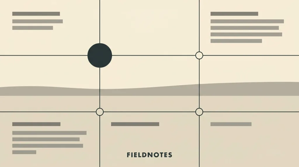
A compositional rule of thumb: imagine the frame divided into nine equal parts by two evenly spaced horizontal lines and two evenly spaced vertical lines, and place the important elements along those lines or at their intersections rather than dead centre.
Recognizing it
- The frame is divided into nine equal parts by two horizontal and two vertical lines
- Important elements sit on the dividing lines or near the four intersections
- A long edge such as a horizon sits on one horizontal line rather than centred
Concept boundary
This is a rule of thumb, not a law: it describes a common and safe framing habit rather than an empirical finding about how people look. This entry covers only its use as a starting point for composition and does not claim that departing from it makes an image worse. It differs from visual hierarchy: the rule of thirds says where in the frame an element sits, while visual hierarchy says which elements matter more — position is only one means of creating hierarchy, and size, contrast, and whitespace work just as well. Its reach in interfaces is far narrower than in photography, because interface elements are placed by reading order, tappable area, and responsive breakpoints rather than by the frame.
When to consider it
- A placement decision has to be made for one image or one frame
- The frame has one clear subject and the composition needs a safe starting point
- Several people shoot or make one set of assets and need a shared framing convention
When to be cautious
- It is treated as a rule that must be obeyed, even where centring or symmetry is the intent
- It is used to place interface elements whose positions actually follow reading order and breakpoints
- The frame will be cropped to several ratios, where fixed intersection points no longer hold
Tradeoff
One simple placement convention gives composition a discussable, restatable starting point, at the cost of caring only about geometry inside the frame: it does not say which element should be the subject, and it does not survive the frame being cropped to different ratios.
Conditional rules · Editorial advice
Related entries
The rule of thirds decides position while visual hierarchy decides weight; position is one means of creating hierarchy, but size and contrast usually work harder.
Focal point answers which element seizes attention first, and the rule of thirds answers where in the frame to put it.
The intersections move as the frame changes, so a responsive setting should specify a safe region rather than fixed geometric points.
Sources and what they support
The article explicitly calls the rule of thirds a rule of thumb for composing visual art such as designs, films, paintings, and photographs, and explains that the guideline proposes imagining the image as divided into nine equal parts by two equally spaced horizontal lines and two equally spaced vertical lines, with important elements placed along them; it also records that an intersection is sometimes called a power point or a crash point. This entry takes both the definition and the rule-of-thumb standing from it.
Retrieved: 2026-09-16 · Snapshot unconfirmedDefinitions reference these sources. Digital specimens, selection advice, relationships, and recipes are editorial work and have not been validated through user research.
Type extensions and implementation notes
This entry has no runnable specimen; the illustration is an editorial sketch of how the thirds grid and its intersections relate, and represents no measured finding about photography or interfaces. Before shipping, mark a safe region for any image that will be cropped.
{
  "evidenceType": "A long-standing compositional rule of thumb, which the source itself calls a rule of thumb rather than an empirical law of perception",
  "limit": "This entry does not claim that following the rule makes an image better and offers no measurement of gaze behaviour; it records the convention and where it applies."
}
Full Agent entry JSON
{
  "id": "rule-of-thirds",
  "type": "principle",
  "name": {
    "zh": "三分法",
    "en": "Rule of Thirds"
  },
  "aliases": [
    "Thirds Grid",
    "Power Points",
    "三分构图",
    "井字构图"
  ],
  "granularity": "component",
  "intents": [
    "organize-content",
    "express-brand"
  ],
  "tags": [
    "composition",
    "framing",
    "thirds grid",
    "focal placement",
    "rule of thumb"
  ],
  "definition": "A compositional rule of thumb: imagine the frame divided into nine equal parts by two evenly spaced horizontal lines and two evenly spaced vertical lines, and place the important elements along those lines or at their intersections rather than dead centre.",
  "boundary": "This is a rule of thumb, not a law: it describes a common and safe framing habit rather than an empirical finding about how people look. This entry covers only its use as a starting point for composition and does not claim that departing from it makes an image worse. It differs from visual hierarchy: the rule of thirds says where in the frame an element sits, while visual hierarchy says which elements matter more — position is only one means of creating hierarchy, and size, contrast, and whitespace work just as well. Its reach in interfaces is far narrower than in photography, because interface elements are placed by reading order, tappable area, and responsive breakpoints rather than by the frame.",
  "signature": [
    "The frame is divided into nine equal parts by two horizontal and two vertical lines",
    "Important elements sit on the dividing lines or near the four intersections",
    "A long edge such as a horizon sits on one horizontal line rather than centred"
  ],
  "when": [
    "A placement decision has to be made for one image or one frame",
    "The frame has one clear subject and the composition needs a safe starting point",
    "Several people shoot or make one set of assets and need a shared framing convention"
  ],
  "when_not": [
    "It is treated as a rule that must be obeyed, even where centring or symmetry is the intent",
    "It is used to place interface elements whose positions actually follow reading order and breakpoints",
    "The frame will be cropped to several ratios, where fixed intersection points no longer hold"
  ],
  "tradeoff": "One simple placement convention gives composition a discussable, restatable starting point, at the cost of caring only about geometry inside the frame: it does not say which element should be the subject, and it does not survive the frame being cropped to different ratios.",
  "comparison": {
    "focus": "Deciding where the subject sits inside the frame",
    "mechanism": "The lines and intersections of a thirds grid as placement references",
    "cost": "It governs only in-frame geometry and survives neither cropping nor hierarchy decisions"
  },
  "sources": [
    {
      "id": "thirds-wikipedia",
      "title": "Wikipedia · Rule of thirds",
      "url": "https://en.wikipedia.org/wiki/Rule_of_thirds",
      "claim": "The article explicitly calls the rule of thirds a rule of thumb for composing visual art such as designs, films, paintings, and photographs, and explains that the guideline proposes imagining the image as divided into nine equal parts by two equally spaced horizontal lines and two equally spaced vertical lines, with important elements placed along them; it also records that an intersection is sometimes called a power point or a crash point. This entry takes both the definition and the rule-of-thumb standing from it.",
      "checkedAt": "2026-09-16",
      "archive": {
        "lookupUrl": "https://web.archive.org/web/20260916*/https://en.wikipedia.org/wiki/Rule_of_thirds",
        "status": "unconfirmed",
        "checkedAt": "2026-09-16T17:39:03.667Z",
        "error": "status-request-failed",
        "jobId": "spn2-820a1e3e403b8af74fa3d1f79829b59474a92ad1"
      }
    }
  ],
  "relations": [
    {
      "target": "visual-hierarchy",
      "kind": "related",
      "condition": "One element needs to be seen first",
      "reason": "The rule of thirds decides position while visual hierarchy decides weight; position is one means of creating hierarchy, but size and contrast usually work harder.",
      "basis": "editorial"
    },
    {
      "target": "focal-point",
      "kind": "composes_with",
      "condition": "A subject has already been settled on for the frame",
      "reason": "Focal point answers which element seizes attention first, and the rule of thirds answers where in the frame to put it.",
      "basis": "editorial"
    },
    {
      "target": "adaptive-multipane",
      "kind": "conflicts_when",
      "condition": "One image has to appear across several frames and breakpoints",
      "reason": "The intersections move as the frame changes, so a responsive setting should specify a safe region rather than fixed geometric points.",
      "basis": "editorial"
    }
  ],
  "rules": [
    {
      "when": "An image will be cropped into containers of several ratios",
      "instruction": "Mark the safe region the subject must keep, instead of recording only which intersection it sits on.",
      "strength": "must",
      "basis": "editorial"
    },
    {
      "when": "The compositional intent is centring, symmetry, or facing the viewer head on",
      "instruction": "Keep that intent; the rule of thirds is a starting point rather than a requirement, and a composition that works need not be changed to satisfy it.",
      "strength": "recommend",
      "basis": "editorial"
    }
  ],
  "principle": {
    "evidenceType": "A long-standing compositional rule of thumb, which the source itself calls a rule of thumb rather than an empirical law of perception",
    "limit": "This entry does not claim that following the rule makes an image better and offers no measurement of gaze behaviour; it records the convention and where it applies."
  },
  "demo": null,
  "version": "0.1.0",
  "editorialStatus": "drafted",
  "requirements": [],
  "demoCapabilities": [],
  "implementationNote": "This entry has no runnable specimen; the illustration is an editorial sketch of how the thirds grid and its intersections relate, and represents no measured finding about photography or interfaces. Before shipping, mark a safe region for any image that will be cropped.",
  "image": {
    "src": "/images/rule-of-thirds.webp",
    "alt": "A composition sketch: a landscape frame divided into nine parts by two horizontal and two vertical lines, a horizon sitting on the lower horizontal line, a dark round subject at the upper-left intersection, and all four intersections marked with small circles."
  },
  "searchTerms": [
    "构图",
    "取景",
    "九宫格",
    "视觉重心",
    "经验法则"
  ]
}