VOCABULARY / ENTRY
Visual Hierarchy
visual-hierarchy
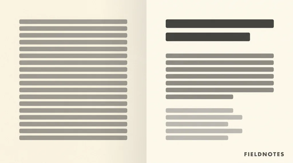
Making the elements on a page carry a perceivable order of importance through differences in size, weight, color, contrast, and grouping, so that a reader sees the most important part first and the rest in turn.
Recognizing it
- Neighbouring levels differ visibly rather than subtly
- Elements on one level stay consistent in size, color, and spacing
- Few elements are emphasised, so emphasis is not diluted
Concept boundary
Visual hierarchy is about relationships between elements, not the absolute value of any one: enlarging a heading does not create hierarchy by itself, only a difference from its surroundings large enough to be seen does. It is not information architecture either: architecture decides how content is categorised and nested, while visual hierarchy decides who is seen first on one screen. It must agree with the structural hierarchy — whatever looks like a heading should be marked up as one, or screen-reader users and sighted users receive two different orders. When everything on a page is emphasised the hierarchy disappears; emphasis is a relative resource and spends down the more it is used.
When to consider it
- Several kinds of information share one screen and readers need to know where to start
- The page has one primary action that must stand out from the rest
- The content is meant to be scanned rather than read word by word
When to be cautious
- Everything is enlarged and bolded until the elements cancel out and nothing stands out
- The visual order disagrees with the markup so screen-reader users get a different one
- Hierarchy is used to push unfavourable information to near-invisibility when it ought to be seen
Tradeoff
Emphasising a few elements speeds up scanning markedly, at the cost of a fixed budget: every extra emphasis weakens what already stood out, until everything settles back to one level.
Conditional rules · Editorial advice
Related entries
The focal point is the hierarchy’s first level: the hierarchy arranges the whole order and the focal point is where that order starts.
Spacing decides grouping and grouping is part of hierarchy: form the groups first, then set weight between them.
Fading text is the most common way to demote it, but it drops secondary text below the readable contrast threshold; demote with size and spacing first.
Hierarchy is a way of guiding; using it to bury what a user ought to know turns it into visual interference.
Sources and what they support
The article explains that visual hierarchy, in Gestalt psychology, describes how particular elements in a visual field stand out more than others to create a perceived order of importance; that this order is created by the visual contrast between forms in a field of perception, with objects of the highest contrast to their surroundings recognised first; and that the term is most often used in design, where elements are arranged to appear more important than others. This entry takes the definition and the mechanism from it.
Retrieved: 2026-09-16 · Archived 2026-09-22The article explains that a clear visual hierarchy guides the eye to the most important elements on the page and can be created through variations in color and contrast, scale, and grouping, and illustrates the failure case: when elements are relatively equal in size and color and lack breathing room, readers struggle to find where to begin. This entry takes the means of creating hierarchy and the emphasise-everything failure from it.
Retrieved: 2026-09-16 · Snapshot unconfirmedDefinitions reference these sources. Digital specimens, selection advice, relationships, and recipes are editorial work and have not been validated through user research.
Type extensions and implementation notes
This entry has no runnable specimen; the illustration is an editorial sketch contrasting a page with hierarchy against one without, not a verified implementation. Before shipping, confirm the markup agrees with the visual order and verify contrast separately for any demoted text.
{
  "evidenceType": "An organising principle from Gestalt perception theory, widely used in design practice; this entry cites no specific gaze measurements",
  "limit": "This entry prescribes no particular type-size ratio or contrast value and does not claim any one arrangement is universally best; it only records that hierarchy comes from relative difference and must agree with the markup."
}
Full Agent entry JSON
{
  "id": "visual-hierarchy",
  "type": "principle",
  "name": {
    "zh": "视觉层级",
    "en": "Visual Hierarchy"
  },
  "aliases": [
    "Visual Order",
    "Information Hierarchy",
    "视觉次序",
    "信息层级"
  ],
  "granularity": "experience",
  "intents": [
    "organize-content",
    "read-content"
  ],
  "tags": [
    "hierarchy",
    "contrast",
    "scale",
    "grouping",
    "attention"
  ],
  "definition": "Making the elements on a page carry a perceivable order of importance through differences in size, weight, color, contrast, and grouping, so that a reader sees the most important part first and the rest in turn.",
  "boundary": "Visual hierarchy is about relationships between elements, not the absolute value of any one: enlarging a heading does not create hierarchy by itself, only a difference from its surroundings large enough to be seen does. It is not information architecture either: architecture decides how content is categorised and nested, while visual hierarchy decides who is seen first on one screen. It must agree with the structural hierarchy — whatever looks like a heading should be marked up as one, or screen-reader users and sighted users receive two different orders. When everything on a page is emphasised the hierarchy disappears; emphasis is a relative resource and spends down the more it is used.",
  "signature": [
    "Neighbouring levels differ visibly rather than subtly",
    "Elements on one level stay consistent in size, color, and spacing",
    "Few elements are emphasised, so emphasis is not diluted"
  ],
  "when": [
    "Several kinds of information share one screen and readers need to know where to start",
    "The page has one primary action that must stand out from the rest",
    "The content is meant to be scanned rather than read word by word"
  ],
  "when_not": [
    "Everything is enlarged and bolded until the elements cancel out and nothing stands out",
    "The visual order disagrees with the markup so screen-reader users get a different one",
    "Hierarchy is used to push unfavourable information to near-invisibility when it ought to be seen"
  ],
  "tradeoff": "Emphasising a few elements speeds up scanning markedly, at the cost of a fixed budget: every extra emphasis weakens what already stood out, until everything settles back to one level.",
  "comparison": {
    "focus": "Deciding who is seen first on one screen",
    "mechanism": "Visible differences in size, weight, color, contrast, and grouping",
    "cost": "Emphasis has a fixed budget and must agree with the markup"
  },
  "sources": [
    {
      "id": "visualhierarchy-wikipedia",
      "title": "Wikipedia · Visual hierarchy",
      "url": "https://en.wikipedia.org/wiki/Visual_hierarchy",
      "claim": "The article explains that visual hierarchy, in Gestalt psychology, describes how particular elements in a visual field stand out more than others to create a perceived order of importance; that this order is created by the visual contrast between forms in a field of perception, with objects of the highest contrast to their surroundings recognised first; and that the term is most often used in design, where elements are arranged to appear more important than others. This entry takes the definition and the mechanism from it.",
      "checkedAt": "2026-09-16",
      "archive": {
        "lookupUrl": "https://web.archive.org/web/20260916*/https://en.wikipedia.org/wiki/Visual_hierarchy",
        "status": "available",
        "checkedAt": "2026-09-22T11:56:40.708Z",
        "jobId": "spn2-b7eba1c09595f9fe1c984a76be0289018decfc71",
        "url": "https://web.archive.org/web/20260922115705/https://en.wikipedia.org/wiki/Visual_hierarchy",
        "timestamp": "20260922115705"
      }
    },
    {
      "id": "visualhierarchy-nng",
      "title": "NN/g · Visual Hierarchy in UX: Definition",
      "url": "https://www.nngroup.com/articles/visual-hierarchy-ux-definition/",
      "claim": "The article explains that a clear visual hierarchy guides the eye to the most important elements on the page and can be created through variations in color and contrast, scale, and grouping, and illustrates the failure case: when elements are relatively equal in size and color and lack breathing room, readers struggle to find where to begin. This entry takes the means of creating hierarchy and the emphasise-everything failure from it.",
      "checkedAt": "2026-09-16",
      "archive": {
        "lookupUrl": "https://web.archive.org/web/20260916*/https://www.nngroup.com/articles/visual-hierarchy-ux-definition/",
        "status": "pending",
        "checkedAt": "2026-09-22T11:57:01.012Z",
        "error": "status-request-failed",
        "jobId": "spn2-391e964af384ee6889215ec08209d6527818763d"
      }
    }
  ],
  "relations": [
    {
      "target": "focal-point",
      "kind": "composes_with",
      "condition": "The top of the hierarchy has to land on one concrete element",
      "reason": "The focal point is the hierarchy’s first level: the hierarchy arranges the whole order and the focal point is where that order starts.",
      "basis": "editorial"
    },
    {
      "target": "proximity",
      "kind": "composes_with",
      "condition": "Elements on one level need to read as a group",
      "reason": "Spacing decides grouping and grouping is part of hierarchy: form the groups first, then set weight between them.",
      "basis": "editorial"
    },
    {
      "target": "contrast-legibility",
      "kind": "conflicts_when",
      "condition": "Lower levels are created by reducing text contrast",
      "reason": "Fading text is the most common way to demote it, but it drops secondary text below the readable contrast threshold; demote with size and spacing first.",
      "basis": "editorial"
    },
    {
      "target": "visual-interference",
      "kind": "conflicts_when",
      "condition": "Important information is deliberately placed at the bottom of the hierarchy to reduce the chance of being seen",
      "reason": "Hierarchy is a way of guiding; using it to bury what a user ought to know turns it into visual interference.",
      "basis": "editorial"
    }
  ],
  "rules": [
    {
      "when": "Elements are visually arranged as headings, body, or captions",
      "instruction": "Make the markup agree with the visual order: whatever looks like a heading uses real heading markup, with levels continuous and unskipped.",
      "strength": "must",
      "basis": "editorial"
    },
    {
      "when": "More than two or three elements seem to need emphasis",
      "instruction": "Re-rank the priorities instead of adding more emphasis: settle on one first level and demote everything else relative to it.",
      "strength": "recommend",
      "basis": "editorial"
    }
  ],
  "principle": {
    "evidenceType": "An organising principle from Gestalt perception theory, widely used in design practice; this entry cites no specific gaze measurements",
    "limit": "This entry prescribes no particular type-size ratio or contrast value and does not claim any one arrangement is universally best; it only records that hierarchy comes from relative difference and must agree with the markup."
  },
  "demo": null,
  "version": "0.1.0",
  "editorialStatus": "drafted",
  "requirements": [],
  "demoCapabilities": [],
  "implementationNote": "This entry has no runnable specimen; the illustration is an editorial sketch contrasting a page with hierarchy against one without, not a verified implementation. Before shipping, confirm the markup agrees with the visual order and verify contrast separately for any demoted text.",
  "image": {
    "src": "/images/visual-hierarchy.webp",
    "alt": "A side-by-side sketch: on the left a page where every grey placeholder bar is nearly the same size and tone with even spacing; on the right the same content resolved into three visible levels — one heavy heading bar, several medium body bars, and a group of smaller, paler caption bars, with whitespace between the groups."
  },
  "searchTerms": [
    "层级",
    "对比",
    "尺寸",
    "分组",
    "注意力"
  ]
}