VOCABULARY / ENTRY
Baroque
baroque-ornament
A graphic language of symmetrical, full-bodied acanthus and scroll ornament, strong light-to-dark contrast, gold and bronze highlights on deep grounds, and display serif type with heavy stress and shadow — confident, visibly in motion, and theatrically solemn and rich.
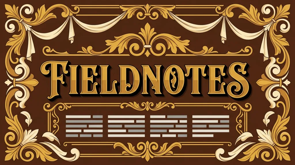
Recognizing it
- Symmetrically arranged acanthus, scrolls, and ribbons form a full border
- Gold and bronze highlights on a deep ground create strong tonal steps
- Display serif type carries pronounced thick–thin contrast and a drop shadow
Concept boundary
This entry covers only the graphic language Baroque left for flat and interface work. It does not summarise seventeenth-century Baroque across architecture, sculpture, painting, and music, nor its historical relation to the Catholic Counter-Reformation. The test is the combination of symmetrical, full-bodied acanthus ornament, strong tonal contrast, and gold on a deep ground — not "looks lavish". It differs from Rococo, which inherits the same curves but turns to lightness, pale color, and intimate asymmetry, while Baroque keeps symmetry, weight, and drama. It also differs from Art Deco, whose motifs are Cubist geometric zigzags rather than organic acanthus and scrolls.
When to consider it
- The brand needs to express gravity, historical depth, and high-value ceremony
- The composition can afford one clear centre and a symmetrical ornamental frame
- Output is mainly print, packaging, or large-format visuals where detail survives
When to be cautious
- The product stands for approachability, lightness, or affordability, where heavy ornament signals the opposite
- The interface needs dense information and frequent actions, where an ornamental frame permanently consumes space
- Gold text on a deep ground is used for body copy, which tires readers over long passages
Tradeoff
It establishes gravity and high value at first glance, at the cost of ornament consuming space, a dark high-contrast palette that is unkind to long text, and a need for extra simplified assets in responsive and small-size contexts.
Conditional rules · Editorial advice
Related entries
Baroque expresses gravity through symmetry, weight, and strong contrast; Rococo expresses sweetness through asymmetry, lightness, and pale color. They share the curve motif but oppose each other in character.
Maximalism names the strategy of winning through abundance; Baroque is one concrete realisation of it with defined historical motifs and symmetry rules.
Metallic colors render on screen as low-saturation mid tones; over a deep, ornamented ground the real contrast often fails.
Sources and what they support
The term entry describes Baroque as the dominant style in seventeenth-century art and architecture, characterised by self-confidence, dynamism, and a realistic approach, with dynamic movement, bold realism, and direct emotional appeal at its core. This entry paraphrases that character from it; translating it into a flat and interface language is editorial judgement.
Retrieved: 2026-09-16The article explains that Baroque began in early seventeenth-century Rome and spread across Europe, using exaggerated motion, rich ornamental detail, and light-and-dark contrast to produce drama. This entry paraphrases the ornamental density and tonal method from it, and uses it to distinguish the later Rococo.
Retrieved: 2026-09-16 · Snapshot unconfirmedDefinitions reference these sources. Digital specimens, selection advice, relationships, and recipes are editorial work and have not been validated through user research.
Type extensions and implementation notes
This entry has no runnable specimen; the illustration is an editorial sketch of how the ornament is organised symmetrically and tonally, not a verified implementation. Before shipping, measure contrast for gold elements and prepare simplified ornament for narrow screens.
{
  "tokens": {
    "surface": "#1d1a17",
    "ink": "#f2e8d8",
    "accent": "#c9a227",
    "radiusPx": 0,
    "shadow": "0 6px 20px rgba(0, 0, 0, 0.35)"
  },
  "tokenScope": "This sample recipe — deep brown ground, warm white ink, gold accent — sketches the common gold-on-deep-ground direction and is not a historical standard. Real work should re-pick values for its brand context and verify contrast for gold text separately."
}
Full Agent entry JSON
{
  "id": "baroque-ornament",
  "type": "visual",
  "name": {
    "zh": "巴洛克风格",
    "en": "Baroque"
  },
  "aliases": [
    "Baroque Ornament",
    "巴洛克装饰",
    "巴洛克视觉语言"
  ],
  "granularity": "experience",
  "intents": [
    "express-brand",
    "organize-content"
  ],
  "tags": [
    "ornament",
    "chiaroscuro",
    "symmetry",
    "drama",
    "luxury"
  ],
  "definition": "A graphic language of symmetrical, full-bodied acanthus and scroll ornament, strong light-to-dark contrast, gold and bronze highlights on deep grounds, and display serif type with heavy stress and shadow — confident, visibly in motion, and theatrically solemn and rich.",
  "boundary": "This entry covers only the graphic language Baroque left for flat and interface work. It does not summarise seventeenth-century Baroque across architecture, sculpture, painting, and music, nor its historical relation to the Catholic Counter-Reformation. The test is the combination of symmetrical, full-bodied acanthus ornament, strong tonal contrast, and gold on a deep ground — not \"looks lavish\". It differs from Rococo, which inherits the same curves but turns to lightness, pale color, and intimate asymmetry, while Baroque keeps symmetry, weight, and drama. It also differs from Art Deco, whose motifs are Cubist geometric zigzags rather than organic acanthus and scrolls.",
  "signature": [
    "Symmetrically arranged acanthus, scrolls, and ribbons form a full border",
    "Gold and bronze highlights on a deep ground create strong tonal steps",
    "Display serif type carries pronounced thick–thin contrast and a drop shadow"
  ],
  "when": [
    "The brand needs to express gravity, historical depth, and high-value ceremony",
    "The composition can afford one clear centre and a symmetrical ornamental frame",
    "Output is mainly print, packaging, or large-format visuals where detail survives"
  ],
  "when_not": [
    "The product stands for approachability, lightness, or affordability, where heavy ornament signals the opposite",
    "The interface needs dense information and frequent actions, where an ornamental frame permanently consumes space",
    "Gold text on a deep ground is used for body copy, which tires readers over long passages"
  ],
  "tradeoff": "It establishes gravity and high value at first glance, at the cost of ornament consuming space, a dark high-contrast palette that is unkind to long text, and a need for extra simplified assets in responsive and small-size contexts.",
  "comparison": {
    "focus": "Expressing solemnity and richness through symmetrical, weighty ornament",
    "mechanism": "Acanthus-and-scroll frames, strong tonal contrast, gold on a deep ground",
    "cost": "It consumes space, is unkind to long text, and needs extra simplified assets"
  },
  "sources": [
    {
      "id": "baroque-tate",
      "title": "Tate · Art Term: Baroque",
      "url": "https://www.tate.org.uk/art/art-terms/b/baroque",
      "claim": "The term entry describes Baroque as the dominant style in seventeenth-century art and architecture, characterised by self-confidence, dynamism, and a realistic approach, with dynamic movement, bold realism, and direct emotional appeal at its core. This entry paraphrases that character from it; translating it into a flat and interface language is editorial judgement.",
      "checkedAt": "2026-09-16",
      "archive": {
        "lookupUrl": "https://web.archive.org/web/20260916*/https://www.tate.org.uk/art/art-terms/b/baroque",
        "status": "available",
        "checkedAt": "2026-09-16T13:05:45.684Z",
        "jobId": "spn2-73ef10c5a7e6295627d26b5fe3703dc0acb12238",
        "url": "https://web.archive.org/web/20260916130611/https://www.tate.org.uk/art/art-terms/b/baroque",
        "timestamp": "20260916130611"
      }
    },
    {
      "id": "baroque-wikipedia",
      "title": "Wikipedia · Baroque",
      "url": "https://en.wikipedia.org/wiki/Baroque",
      "claim": "The article explains that Baroque began in early seventeenth-century Rome and spread across Europe, using exaggerated motion, rich ornamental detail, and light-and-dark contrast to produce drama. This entry paraphrases the ornamental density and tonal method from it, and uses it to distinguish the later Rococo.",
      "checkedAt": "2026-09-16",
      "archive": {
        "lookupUrl": "https://web.archive.org/web/20260916*/https://en.wikipedia.org/wiki/Baroque",
        "status": "unconfirmed",
        "checkedAt": "2026-09-16T13:05:53.336Z",
        "error": "status-request-failed",
        "jobId": "spn2-64e3fc37cc5be36c55c1886cbf856e649f83ceb1"
      }
    }
  ],
  "relations": [
    {
      "target": "rococo",
      "kind": "alternative",
      "condition": "A historical decorative language is needed to express luxury",
      "reason": "Baroque expresses gravity through symmetry, weight, and strong contrast; Rococo expresses sweetness through asymmetry, lightness, and pale color. They share the curve motif but oppose each other in character.",
      "basis": "editorial"
    },
    {
      "target": "maximalism",
      "kind": "related",
      "condition": "The surface is deliberately filled with dense ornament",
      "reason": "Maximalism names the strategy of winning through abundance; Baroque is one concrete realisation of it with defined historical motifs and symmetry rules.",
      "basis": "editorial"
    },
    {
      "target": "contrast-legibility",
      "kind": "conflicts_when",
      "condition": "Body text is set in gold or bronze on a deep ornamented ground",
      "reason": "Metallic colors render on screen as low-saturation mid tones; over a deep, ornamented ground the real contrast often fails.",
      "basis": "editorial"
    }
  ],
  "rules": [
    {
      "when": "Gold or bronze is used as a text or icon color",
      "instruction": "Measure contrast against the color as actually rendered rather than assuming gold reads as bright; switch to a high-contrast neutral when it fails.",
      "strength": "must",
      "basis": "editorial"
    },
    {
      "when": "The ornamental frame has to adapt to narrow screens or small sizes",
      "instruction": "Prepare progressively simplified versions — full acanthus, reduced scroll, corner motif only — and state which level each breakpoint uses.",
      "strength": "recommend",
      "basis": "editorial"
    }
  ],
  "visual": {
    "tokens": {
      "surface": "#1d1a17",
      "ink": "#f2e8d8",
      "accent": "#c9a227",
      "radiusPx": 0,
      "shadow": "0 6px 20px rgba(0, 0, 0, 0.35)"
    },
    "tokenScope": "This sample recipe — deep brown ground, warm white ink, gold accent — sketches the common gold-on-deep-ground direction and is not a historical standard. Real work should re-pick values for its brand context and verify contrast for gold text separately."
  },
  "demo": null,
  "version": "0.1.0",
  "editorialStatus": "drafted",
  "requirements": [],
  "demoCapabilities": [],
  "implementationNote": "This entry has no runnable specimen; the illustration is an editorial sketch of how the ornament is organised symmetrically and tonally, not a verified implementation. Before shipping, measure contrast for gold elements and prepare simplified ornament for narrow screens.",
  "image": {
    "src": "/images/baroque-ornament.webp",
    "alt": "A fictional FIELDNOTES cover on a deep ground: gold acanthus and scroll ornament framing it symmetrically, a display serif title with heavy thick–thin contrast and a drop shadow at the centre, and warm white placeholder text bars below."
  },
  "searchTerms": [
    "装饰",
    "明暗对比",
    "对称",
    "戏剧感",
    "奢华"
  ]
}