VOCABULARY / ENTRY
Rococo
rococo
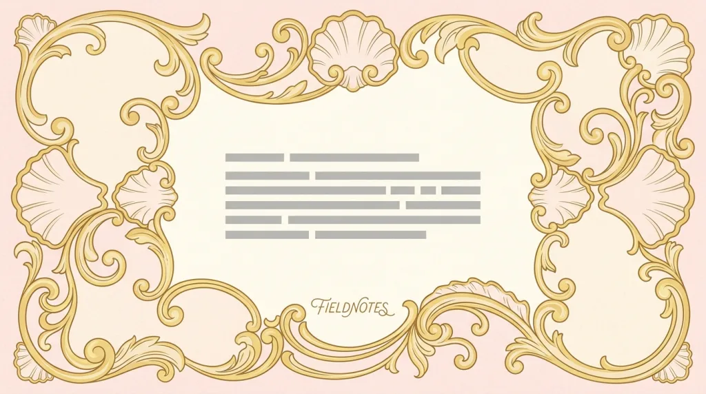
A decorative graphic language of short C- and S-curves, scrollwork and shell-shaped borders, deliberately asymmetric composition, and pastel color with gilt accents — light, sweet, and ornate, in contrast to the heavy solemnity of Baroque.
Recognizing it
- Scrolls and shell borders made of short C- and S-curves
- Deliberately asymmetric composition where the two sides differ in ornament yet stay balanced
- Pale pinks, sky blues, and creams paired with gold details
Concept boundary
This entry covers Rococo only as a graphic language usable in branding and interfaces: curved borders, asymmetric composition, and pastel-with-gilt color. It does not summarise the full history of eighteenth-century French Rococo in painting, sculpture, interiors, and furniture. Its relation to Baroque is succession, not identity: Baroque emphasises movement, drama, and high tonal contrast, while Rococo pushes the same curves toward lightness, intimacy, and sweetness at a smaller scale in paler tones. A pastel palette or a script logotype alone is not enough; scroll- or shell-shaped curved ornament has to be present too.
When to consider it
- The brand needs to express refinement, softness, and handcrafted luxury
- Packaging or covers can spare enough room for borders and breathing space
- Clear separation is wanted from the minimal, geometric direction common in the category
When to be cautious
- The interface is information-dense, where ornate borders squeeze usable space
- Ornament is laid directly over body text or controls, blurring their boundaries
- The brand stands for plainness, industry, or low cost, where ornament signals the opposite
Tradeoff
Ornate curves establish refinement and softness at first glance, at the cost of consuming a lot of the layout, losing all detail at small sizes, and being harder to reuse across formats because the composition is asymmetric.
Conditional rules · Editorial advice
Related entries
Baroque expresses luxury through mass, strong chiaroscuro, and solemnity; Rococo does it through light curves, pale color, and intimate scale. The impressions point in opposite directions.
Both are curve-led, but Rococo’s curves come from shell-and-rock ornament and court decoration, while Art Nouveau’s come from plant growth and insist that ornament and structure are one.
Minimalism builds order by removing; Rococo builds refinement by adding. They are two ends of the same trade-off.
Sources and what they support
The term entry describes Rococo as a light, sensuous, intensely decorative style developed in early eighteenth-century France, named from the French rocaille (rock-work) and based on the forms of sea shells and corals, realised in practice as short curves, scrolls, and counter curves often elaborated with fantasy. This entry paraphrases the formal description from it.
Retrieved: 2026-09-16The article records that Rococo emerged in France in the 1720s–1730s as a reaction against the solemn earlier Baroque, characterised by asymmetry, curves, pale colors, and gilded ornament. This entry takes the succession from and the difference with Baroque from it.
Retrieved: 2026-09-16 · Snapshot unconfirmedDefinitions reference these sources. Digital specimens, selection advice, relationships, and recipes are editorial work and have not been validated through user research.
Type extensions and implementation notes
This entry has no runnable specimen; the illustration is an editorial sketch of how the curved ornament is organised, not a verified implementation. Before shipping, measure contrast for text and controls on the pale ground and confirm that the ornament stays recognisable at small sizes.
{
  "tokens": {
    "surface": "#faf1ea",
    "ink": "#4a3b46",
    "accent": "#c08a4e",
    "radiusPx": 18,
    "shadow": "0 2px 10px rgba(74, 59, 70, 0.12)"
  },
  "tokenScope": "This sample recipe — pale cream-pink ground, soft plum-brown ink, one gilt accent — sketches one reading of the style, not a historical standard. Real work still needs its own curved ornament assets and must verify text contrast on the pale ground."
}
Full Agent entry JSON
{
  "id": "rococo",
  "type": "visual",
  "name": {
    "zh": "洛可可风格",
    "en": "Rococo"
  },
  "aliases": [
    "Rocaille",
    "洛可可",
    "贝壳曲线装饰风格"
  ],
  "granularity": "experience",
  "intents": [
    "express-brand",
    "organize-content"
  ],
  "tags": [
    "curvilinear ornament",
    "asymmetry",
    "pastel",
    "scrollwork",
    "ornate"
  ],
  "definition": "A decorative graphic language of short C- and S-curves, scrollwork and shell-shaped borders, deliberately asymmetric composition, and pastel color with gilt accents — light, sweet, and ornate, in contrast to the heavy solemnity of Baroque.",
  "boundary": "This entry covers Rococo only as a graphic language usable in branding and interfaces: curved borders, asymmetric composition, and pastel-with-gilt color. It does not summarise the full history of eighteenth-century French Rococo in painting, sculpture, interiors, and furniture. Its relation to Baroque is succession, not identity: Baroque emphasises movement, drama, and high tonal contrast, while Rococo pushes the same curves toward lightness, intimacy, and sweetness at a smaller scale in paler tones. A pastel palette or a script logotype alone is not enough; scroll- or shell-shaped curved ornament has to be present too.",
  "signature": [
    "Scrolls and shell borders made of short C- and S-curves",
    "Deliberately asymmetric composition where the two sides differ in ornament yet stay balanced",
    "Pale pinks, sky blues, and creams paired with gold details"
  ],
  "when": [
    "The brand needs to express refinement, softness, and handcrafted luxury",
    "Packaging or covers can spare enough room for borders and breathing space",
    "Clear separation is wanted from the minimal, geometric direction common in the category"
  ],
  "when_not": [
    "The interface is information-dense, where ornate borders squeeze usable space",
    "Ornament is laid directly over body text or controls, blurring their boundaries",
    "The brand stands for plainness, industry, or low cost, where ornament signals the opposite"
  ],
  "tradeoff": "Ornate curves establish refinement and softness at first glance, at the cost of consuming a lot of the layout, losing all detail at small sizes, and being harder to reuse across formats because the composition is asymmetric.",
  "comparison": {
    "focus": "Expressing refinement and sweetness through light curved ornament",
    "mechanism": "Scroll-and-shell borders, asymmetric composition, pastel with gilt",
    "cost": "It consumes layout, degrades when small, and resists one reuse rule"
  },
  "sources": [
    {
      "id": "rococo-tate",
      "title": "Tate · Art Term: Rococo",
      "url": "https://www.tate.org.uk/art/art-terms/r/rococo",
      "claim": "The term entry describes Rococo as a light, sensuous, intensely decorative style developed in early eighteenth-century France, named from the French rocaille (rock-work) and based on the forms of sea shells and corals, realised in practice as short curves, scrolls, and counter curves often elaborated with fantasy. This entry paraphrases the formal description from it.",
      "checkedAt": "2026-09-16",
      "archive": {
        "lookupUrl": "https://web.archive.org/web/20260916*/https://www.tate.org.uk/art/art-terms/r/rococo",
        "status": "available",
        "checkedAt": "2026-09-16T13:04:19.202Z",
        "jobId": "spn2-8210aa46ee4eadafcbd912daaceba052a99f3907",
        "url": "https://web.archive.org/web/20260916130448/https://www.tate.org.uk/art/art-terms/r/rococo",
        "timestamp": "20260916130448"
      }
    },
    {
      "id": "rococo-wikipedia",
      "title": "Wikipedia · Rococo",
      "url": "https://en.wikipedia.org/wiki/Rococo",
      "claim": "The article records that Rococo emerged in France in the 1720s–1730s as a reaction against the solemn earlier Baroque, characterised by asymmetry, curves, pale colors, and gilded ornament. This entry takes the succession from and the difference with Baroque from it.",
      "checkedAt": "2026-09-16",
      "archive": {
        "lookupUrl": "https://web.archive.org/web/20260916*/https://en.wikipedia.org/wiki/Rococo",
        "status": "unconfirmed",
        "checkedAt": "2026-09-16T13:04:26.782Z",
        "error": "error:not-found",
        "jobId": "spn2-223452af24a683589477108da9db6e932e7afd46"
      }
    }
  ],
  "relations": [
    {
      "target": "baroque-ornament",
      "kind": "alternative",
      "condition": "A historical decorative language is needed to express luxury",
      "reason": "Baroque expresses luxury through mass, strong chiaroscuro, and solemnity; Rococo does it through light curves, pale color, and intimate scale. The impressions point in opposite directions.",
      "basis": "editorial"
    },
    {
      "target": "art-nouveau",
      "kind": "related",
      "condition": "The composition is built from organic curves throughout",
      "reason": "Both are curve-led, but Rococo’s curves come from shell-and-rock ornament and court decoration, while Art Nouveau’s come from plant growth and insist that ornament and structure are one.",
      "basis": "editorial"
    },
    {
      "target": "minimalism",
      "kind": "alternative",
      "condition": "Deciding how much ornament a product carries at all",
      "reason": "Minimalism builds order by removing; Rococo builds refinement by adding. They are two ends of the same trade-off.",
      "basis": "editorial"
    }
  ],
  "rules": [
    {
      "when": "Curved borders surround body text or a form area",
      "instruction": "Stop the ornament outside the content area and keep that area’s boundary clearly readable, instead of overlapping scrollwork into it.",
      "strength": "must",
      "basis": "editorial"
    },
    {
      "when": "One visual system must cover both large posters and small icons",
      "instruction": "Prepare a simplified version for small sizes that keeps only the main curve silhouette, and test recognisability at the real minimum size.",
      "strength": "recommend",
      "basis": "editorial"
    }
  ],
  "visual": {
    "tokens": {
      "surface": "#faf1ea",
      "ink": "#4a3b46",
      "accent": "#c08a4e",
      "radiusPx": 18,
      "shadow": "0 2px 10px rgba(74, 59, 70, 0.12)"
    },
    "tokenScope": "This sample recipe — pale cream-pink ground, soft plum-brown ink, one gilt accent — sketches one reading of the style, not a historical standard. Real work still needs its own curved ornament assets and must verify text contrast on the pale ground."
  },
  "demo": null,
  "version": "0.1.0",
  "editorialStatus": "drafted",
  "requirements": [],
  "demoCapabilities": [],
  "implementationNote": "This entry has no runnable specimen; the illustration is an editorial sketch of how the curved ornament is organised, not a verified implementation. Before shipping, measure contrast for text and controls on the pale ground and confirm that the ornament stays recognisable at small sizes.",
  "image": {
    "src": "/images/rococo.webp",
    "alt": "A fictional FIELDNOTES cover: gilt scroll and shell-shaped borders curling around a pale pink and cream ground, grey placeholder text bars in the clearing at the centre, and a fine script wordmark below them."
  },
  "searchTerms": [
    "曲线装饰",
    "不对称",
    "粉彩",
    "涡卷",
    "繁复"
  ]
}