VOCABULARY / ENTRY
Comparison Table
comparison-table
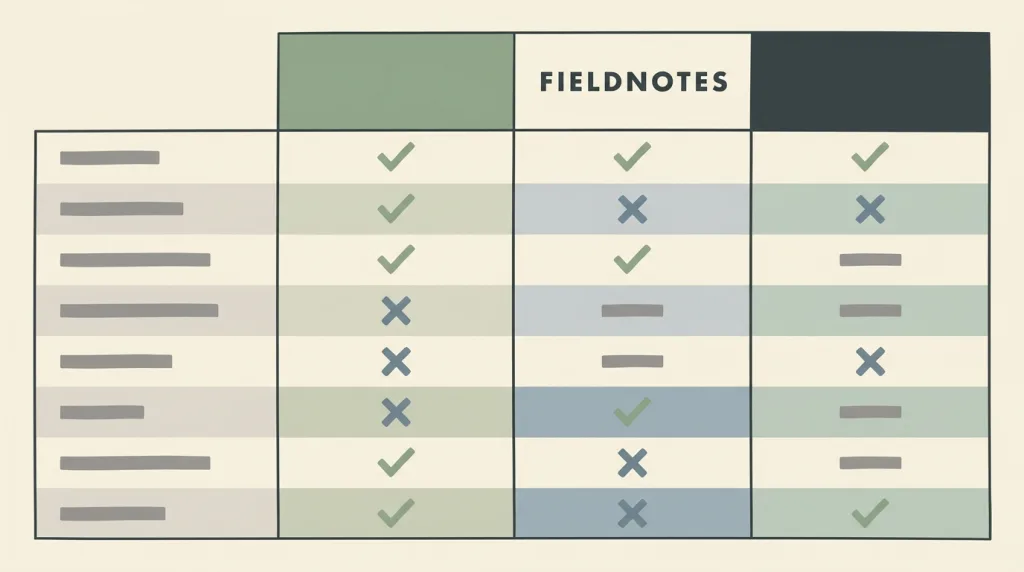
A table that puts a few options in columns and the attributes they share in rows: the values of one attribute line up across a single row, so a small number of options can be compared item by item without anything having to be remembered.
Recognizing it
- Columns are the options and rows are the attributes they share
- Values in a row use the same basis and can be read straight across
- There are few options and the attributes are chosen rather than exhaustive
Concept boundary
The test is that one attribute occupies one row and can be scanned across, not that a table is used for layout. It is not a product listing: a listing is for filtering and discovery, while a comparison table is for deciding among candidates already narrowed down. Nor is it a synonym for a pricing page; plans are simply its most common content. Every attribute must be filled in truthfully for every option: listing only the rows that favour one’s own plan, or leaving a blank to imply "not supported", turns a comparison tool into a persuasion tool.
When to consider it
- Users have narrowed the field to a few candidates and need to weigh them item by item
- The decision depends on several attributes and no single one settles it
- The same attributes are scattered across detail pages and need to be gathered
When to be cautious
- There are many candidates and what users need now is filtering, not comparison
- The rows have been cherry-picked to keep only what favours one option
- Values in a row use different bases, so reading across yields a wrong conclusion
Tradeoff
Aligning attributes into rows sharply lowers the memory cost of comparing, at the cost of width that grows with the number of options: on narrow screens few columns are visible at once and users are back to remembering.
Conditional rules · Editorial advice
Related entries
The landing page owns the persuasive order of the page and the comparison table structures the comparing step inside it.
A card grid favours browsing and discovery with each card standing alone, while a comparison table favours reading across with attributes aligned: the first for many items, the second for deciding.
A comparison table is only worth anything if the basis is consistent; leaving certain charges out of the price row makes the horizontal reading wrong.
Sources and what they support
The article (9 February 2024) describes a comparison table as a GUI tool for deciding among multiple attributes of a small number of offerings, notes that such information is usually scattered across detail pages and forces users to remember or open several tabs, and warns that fewer rows are visible on smaller screens, putting more strain on short-term memory. This entry paraphrases the definition and the narrow-screen trade-off from it.
Retrieved: 2026-09-16The tutorial explains that data tables need markup expressing the relationship between each cell and its row and column headers, so that screen-reader users know which row and column a cell belongs to when they move to it. This entry takes the structural-markup requirement from it, without citing every detail of its markup guidance.
Retrieved: 2026-09-16Definitions reference these sources. Digital specimens, selection advice, relationships, and recipes are editorial work and have not been validated through user research.
Type extensions and implementation notes
This entry has no runnable specimen; the illustration is an editorial sketch of how columns and rows align, not a verified implementation, and the plans and values in it are fictional. Before shipping, confirm every row uses one basis and check on narrow screens that the attribute names stay visible.
{
  "states": [
    "wide",
    "compact"
  ],
  "a11y": [
    "Real table markup is used, associating each cell with its row and column headers",
    "The horizontally scrollable region is keyboard-operable and has an accessible name"
  ],
  "motion": "No motion; showing and hiding columns takes effect directly"
}
Full Agent entry JSON
{
  "id": "comparison-table",
  "type": "layout",
  "name": {
    "zh": "对比表布局",
    "en": "Comparison Table"
  },
  "aliases": [
    "Comparison Matrix",
    "Feature Comparison",
    "比较表",
    "功能对比表"
  ],
  "granularity": "component",
  "intents": [
    "browse-detail",
    "organize-content"
  ],
  "tags": [
    "comparison",
    "table",
    "attribute",
    "plan",
    "decision"
  ],
  "definition": "A table that puts a few options in columns and the attributes they share in rows: the values of one attribute line up across a single row, so a small number of options can be compared item by item without anything having to be remembered.",
  "boundary": "The test is that one attribute occupies one row and can be scanned across, not that a table is used for layout. It is not a product listing: a listing is for filtering and discovery, while a comparison table is for deciding among candidates already narrowed down. Nor is it a synonym for a pricing page; plans are simply its most common content. Every attribute must be filled in truthfully for every option: listing only the rows that favour one’s own plan, or leaving a blank to imply \"not supported\", turns a comparison tool into a persuasion tool.",
  "signature": [
    "Columns are the options and rows are the attributes they share",
    "Values in a row use the same basis and can be read straight across",
    "There are few options and the attributes are chosen rather than exhaustive"
  ],
  "when": [
    "Users have narrowed the field to a few candidates and need to weigh them item by item",
    "The decision depends on several attributes and no single one settles it",
    "The same attributes are scattered across detail pages and need to be gathered"
  ],
  "when_not": [
    "There are many candidates and what users need now is filtering, not comparison",
    "The rows have been cherry-picked to keep only what favours one option",
    "Values in a row use different bases, so reading across yields a wrong conclusion"
  ],
  "tradeoff": "Aligning attributes into rows sharply lowers the memory cost of comparing, at the cost of width that grows with the number of options: on narrow screens few columns are visible at once and users are back to remembering.",
  "comparison": {
    "focus": "Choosing among a small number of candidates",
    "mechanism": "Options as columns and attributes as rows, with values aligned across",
    "cost": "Width grows with the options and narrow screens cannot show them at once"
  },
  "sources": [
    {
      "id": "comparison-nng",
      "title": "NN/g · Comparison Tables for Products, Services, and Features",
      "url": "https://www.nngroup.com/articles/comparison-tables/",
      "claim": "The article (9 February 2024) describes a comparison table as a GUI tool for deciding among multiple attributes of a small number of offerings, notes that such information is usually scattered across detail pages and forces users to remember or open several tabs, and warns that fewer rows are visible on smaller screens, putting more strain on short-term memory. This entry paraphrases the definition and the narrow-screen trade-off from it.",
      "checkedAt": "2026-09-16",
      "archive": {
        "lookupUrl": "https://web.archive.org/web/20260916*/https://www.nngroup.com/articles/comparison-tables/",
        "status": "available",
        "checkedAt": "2026-09-16T13:27:45.051Z",
        "jobId": "spn2-ee4e9770dca209ad9d34997db1423ded5640e9d1",
        "url": "https://web.archive.org/web/20260916132810/https://www.nngroup.com/articles/comparison-tables/",
        "timestamp": "20260916132810"
      }
    },
    {
      "id": "comparison-w3c-tables",
      "title": "W3C WAI · Tables Tutorial",
      "url": "https://www.w3.org/WAI/tutorials/tables/",
      "claim": "The tutorial explains that data tables need markup expressing the relationship between each cell and its row and column headers, so that screen-reader users know which row and column a cell belongs to when they move to it. This entry takes the structural-markup requirement from it, without citing every detail of its markup guidance.",
      "checkedAt": "2026-09-16",
      "archive": {
        "lookupUrl": "https://web.archive.org/web/20260916*/https://www.w3.org/WAI/tutorials/tables/",
        "status": "available",
        "checkedAt": "2026-09-16T13:27:49.759Z",
        "jobId": "spn2-fa150e20224ba3dc7d3956cd9de7d4493623801a",
        "url": "https://web.archive.org/web/20260916132814/https://www.w3.org/WAI/tutorials/tables/",
        "timestamp": "20260916132814"
      }
    }
  ],
  "relations": [
    {
      "target": "landing-page",
      "kind": "composes_with",
      "condition": "The plan or pricing section of a landing page needs item-by-item comparison",
      "reason": "The landing page owns the persuasive order of the page and the comparison table structures the comparing step inside it.",
      "basis": "editorial"
    },
    {
      "target": "card-grid",
      "kind": "alternative",
      "condition": "Presenting several options of the same kind",
      "reason": "A card grid favours browsing and discovery with each card standing alone, while a comparison table favours reading across with attributes aligned: the first for many items, the second for deciding.",
      "basis": "editorial"
    },
    {
      "target": "hidden-costs",
      "kind": "conflicts_when",
      "condition": "The price row omits charges that will certainly be added",
      "reason": "A comparison table is only worth anything if the basis is consistent; leaving certain charges out of the price row makes the horizontal reading wrong.",
      "basis": "editorial"
    }
  ],
  "rules": [
    {
      "when": "The table cannot show all its columns on a narrow screen",
      "instruction": "Keep the attribute names visible — a fixed first column or a repeated header per block — instead of offering only horizontal scrolling and leaving users without a reference.",
      "strength": "must",
      "basis": "editorial"
    },
    {
      "when": "An option has no value for some attribute",
      "instruction": "Write \"not supported\" or \"not applicable\" explicitly rather than leaving a blank for users to guess at.",
      "strength": "must",
      "basis": "editorial"
    }
  ],
  "behavior": {
    "states": [
      "wide",
      "compact"
    ],
    "a11y": [
      "Real table markup is used, associating each cell with its row and column headers",
      "The horizontally scrollable region is keyboard-operable and has an accessible name"
    ],
    "motion": "No motion; showing and hiding columns takes effect directly"
  },
  "demo": null,
  "version": "0.1.0",
  "editorialStatus": "drafted",
  "requirements": [],
  "demoCapabilities": [],
  "implementationNote": "This entry has no runnable specimen; the illustration is an editorial sketch of how columns and rows align, not a verified implementation, and the plans and values in it are fictional. Before shipping, confirm every row uses one basis and check on narrow screens that the attribute names stay visible.",
  "image": {
    "src": "/images/comparison-table.webp",
    "alt": "A fictional FIELDNOTES comparison table sketch: the leftmost column holds grey placeholder attribute names and three plan columns sit to the right, with ticks, crosses, or short placeholder bars aligned across each row."
  },
  "searchTerms": [
    "对比",
    "表格",
    "属性",
    "方案",
    "决策"
  ]
}