VOCABULARY / ENTRY
Coquette
coquette
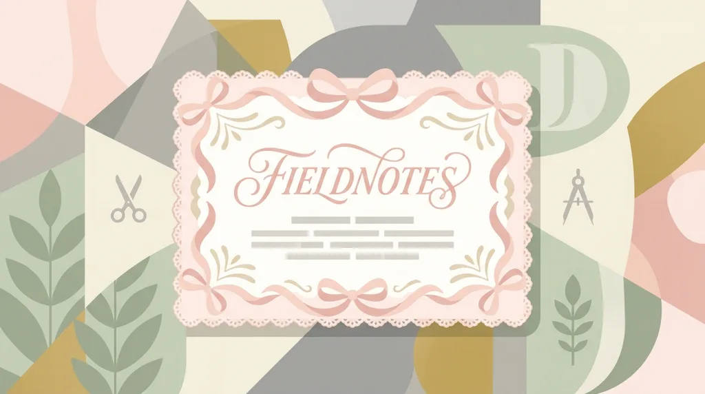
A graphic visual language of bows and ribbons, lace trim, a pale ballet-pink and cream palette, and fine script or italic lettering — used in packaging and social imagery to express softness, girlishness, and a knowingly playful sweetness.
Recognizing it
- Ribbon bows recur as the signature decorative component
- Lace trim or scalloped edges outline cards and images
- Fine script or italic lettering with a lot of pale pink, cream, and off-white
Concept boundary
This entry covers how the graphic language is used in branding, packaging, and social imagery; it does not summarise coquette as a clothing trend or online subculture, and it does not adjudicate the criticism around it. It is a recent trend with a definite date, not a long-stable historical style: using it as a primary brand language means accepting the cost of redoing the work when the trend passes. The test is the combination of bows, lace, and script lettering — not "uses pink". It is adjacent to Rococo but different: Rococo’s sweetness comes from a decorative tradition of scrollwork, shells, and gilding, while coquette’s comes from borrowed clothing trim.
When to consider it
- The product speaks to an audience that already reads the trend, in a context about softness and the personal
- The need is a one-off campaign, seasonal packaging, or social imagery rather than a long-term brand skeleton
- Contrast is wanted with the neutral, minimal direction common in the category
When to be cautious
- It is adopted as a long-term brand language with no plan for when the trend fades
- The low-contrast pale pink-on-cream pairing is used directly for body text and controls
- Neither audience nor context relates to the trend, so the signs read as bolted on
Tradeoff
It quickly evokes recognition and warmth in a specific audience, at the cost of being tied to one period of online trend — and its pale, low-contrast palette needs extra work to stay readable.
Conditional rules · Editorial advice
Related entries
The impressions are close, but Rococo’s sweetness comes from an eighteenth-century tradition of scroll-and-shell ornament, while coquette’s comes from borrowed contemporary clothing trim; their origins and lifespans differ.
The palette sits entirely in the high-lightness range, so body text and controls easily fall below the contrast threshold.
Minimalism keeps long-term stability by removing ornament; coquette trades immediate resonance for a pile of of-the-moment signs. The trade-offs run opposite ways.
Sources and what they support
The article describes coquette as a 2020s fashion trend that emphasises femininity through lace, flounces, pastel colors, and bows, popular on Tumblr in the early 2010s and spreading on TikTok around 2021, often compared with balletcore and cottagecore. This entry takes its visual elements and dating from it.
Retrieved: 2026-09-16 · Snapshot unconfirmedThe article lists coquette’s components among 2020s trends — cherry patterns, ballet shoes, hair bows, pigtails, and lace dresses — and records that writers have criticised the trend. This entry cites it to show that the trend is recent and contested; it does not adjudicate the criticism.
Retrieved: 2026-09-16 · Snapshot unconfirmedDefinitions reference these sources. Digital specimens, selection advice, relationships, and recipes are editorial work and have not been validated through user research.
Type extensions and implementation notes
This entry has no runnable specimen; the illustration is an editorial sketch of how the decorative signs combine, not a verified implementation. The style is tied to a 2020s online trend, so weigh the migration cost before adopting it for a long-term brand, and measure contrast in the pale palette.
{
  "tokens": {
    "surface": "#fdf1f1",
    "ink": "#4a3038",
    "accent": "#d98ba3",
    "radiusPx": 14,
    "shadow": "0 2px 10px rgba(74, 48, 56, 0.10)"
  },
  "tokenScope": "This sample recipe — pale pink ground, deep plum-brown ink, rose accent — sketches one set of values. Real work must pick a separate dark color for body text and verify contrast over the pale ground case by case."
}
Full Agent entry JSON
{
  "id": "coquette",
  "type": "visual",
  "name": {
    "zh": "娇柔风",
    "en": "Coquette"
  },
  "aliases": [
    "Coquette Aesthetic",
    "蝴蝶结少女风",
    "芭蕾粉风格"
  ],
  "granularity": "experience",
  "intents": [
    "express-brand",
    "organize-content"
  ],
  "tags": [
    "bows",
    "lace",
    "pink",
    "script type",
    "social media"
  ],
  "definition": "A graphic visual language of bows and ribbons, lace trim, a pale ballet-pink and cream palette, and fine script or italic lettering — used in packaging and social imagery to express softness, girlishness, and a knowingly playful sweetness.",
  "boundary": "This entry covers how the graphic language is used in branding, packaging, and social imagery; it does not summarise coquette as a clothing trend or online subculture, and it does not adjudicate the criticism around it. It is a recent trend with a definite date, not a long-stable historical style: using it as a primary brand language means accepting the cost of redoing the work when the trend passes. The test is the combination of bows, lace, and script lettering — not \"uses pink\". It is adjacent to Rococo but different: Rococo’s sweetness comes from a decorative tradition of scrollwork, shells, and gilding, while coquette’s comes from borrowed clothing trim.",
  "signature": [
    "Ribbon bows recur as the signature decorative component",
    "Lace trim or scalloped edges outline cards and images",
    "Fine script or italic lettering with a lot of pale pink, cream, and off-white"
  ],
  "when": [
    "The product speaks to an audience that already reads the trend, in a context about softness and the personal",
    "The need is a one-off campaign, seasonal packaging, or social imagery rather than a long-term brand skeleton",
    "Contrast is wanted with the neutral, minimal direction common in the category"
  ],
  "when_not": [
    "It is adopted as a long-term brand language with no plan for when the trend fades",
    "The low-contrast pale pink-on-cream pairing is used directly for body text and controls",
    "Neither audience nor context relates to the trend, so the signs read as bolted on"
  ],
  "tradeoff": "It quickly evokes recognition and warmth in a specific audience, at the cost of being tied to one period of online trend — and its pale, low-contrast palette needs extra work to stay readable.",
  "comparison": {
    "focus": "Expressing softness and girlishness through borrowed clothing trim",
    "mechanism": "Bows, lace edges, and fine script in a pale palette",
    "cost": "It is tied to a recent trend and its pale low contrast needs compensating"
  },
  "sources": [
    {
      "id": "coquette-wikipedia",
      "title": "Wikipedia · Coquette aesthetic",
      "url": "https://en.wikipedia.org/wiki/Coquette_aesthetic",
      "claim": "The article describes coquette as a 2020s fashion trend that emphasises femininity through lace, flounces, pastel colors, and bows, popular on Tumblr in the early 2010s and spreading on TikTok around 2021, often compared with balletcore and cottagecore. This entry takes its visual elements and dating from it.",
      "checkedAt": "2026-09-16",
      "archive": {
        "lookupUrl": "https://web.archive.org/web/20260916*/https://en.wikipedia.org/wiki/Coquette_aesthetic",
        "status": "unconfirmed",
        "checkedAt": "2026-09-16T13:03:34.106Z",
        "error": "status-request-failed",
        "jobId": "spn2-89858d3b5dd80a679db2c10e23e76d0f285e1164"
      }
    },
    {
      "id": "coquette-2020s-fashion",
      "title": "Wikipedia · 2020s in fashion",
      "url": "https://en.wikipedia.org/wiki/2020s_in_fashion",
      "claim": "The article lists coquette’s components among 2020s trends — cherry patterns, ballet shoes, hair bows, pigtails, and lace dresses — and records that writers have criticised the trend. This entry cites it to show that the trend is recent and contested; it does not adjudicate the criticism.",
      "checkedAt": "2026-09-16",
      "archive": {
        "lookupUrl": "https://web.archive.org/web/20260916*/https://en.wikipedia.org/wiki/2020s_in_fashion",
        "status": "unconfirmed",
        "checkedAt": "2026-09-16T13:03:58.490Z",
        "error": "status-request-failed",
        "jobId": "spn2-83d84924f1fb2f6d73c2f3fdb6263a9aabc5dbbd"
      }
    }
  ],
  "relations": [
    {
      "target": "rococo",
      "kind": "related",
      "condition": "A decorative language centred on sweetness and softness is needed",
      "reason": "The impressions are close, but Rococo’s sweetness comes from an eighteenth-century tradition of scroll-and-shell ornament, while coquette’s comes from borrowed contemporary clothing trim; their origins and lifespans differ.",
      "basis": "editorial"
    },
    {
      "target": "contrast-legibility",
      "kind": "conflicts_when",
      "condition": "Pale pink text sits directly on cream or off-white",
      "reason": "The palette sits entirely in the high-lightness range, so body text and controls easily fall below the contrast threshold.",
      "basis": "editorial"
    },
    {
      "target": "minimalism",
      "kind": "alternative",
      "condition": "Deciding the ornament density for a product aimed at the same audience",
      "reason": "Minimalism keeps long-term stability by removing ornament; coquette trades immediate resonance for a pile of of-the-moment signs. The trade-offs run opposite ways.",
      "basis": "editorial"
    }
  ],
  "rules": [
    {
      "when": "Pale pink and cream carry text or controls",
      "instruction": "Choose a sufficiently dark neutral for body text and interactive elements and measure contrast against the real background instead of reusing the brand color.",
      "strength": "must",
      "basis": "editorial"
    },
    {
      "when": "The style is adopted for a long-term brand rather than a single campaign",
      "instruction": "Confine it to replaceable surface layers — imagery, ornament, campaign pages — and keep layout, hierarchy, and components trend-independent so they can be swapped later.",
      "strength": "recommend",
      "basis": "editorial"
    }
  ],
  "visual": {
    "tokens": {
      "surface": "#fdf1f1",
      "ink": "#4a3038",
      "accent": "#d98ba3",
      "radiusPx": 14,
      "shadow": "0 2px 10px rgba(74, 48, 56, 0.10)"
    },
    "tokenScope": "This sample recipe — pale pink ground, deep plum-brown ink, rose accent — sketches one set of values. Real work must pick a separate dark color for body text and verify contrast over the pale ground case by case."
  },
  "demo": null,
  "version": "0.1.0",
  "editorialStatus": "drafted",
  "requirements": [],
  "demoCapabilities": [],
  "implementationNote": "This entry has no runnable specimen; the illustration is an editorial sketch of how the decorative signs combine, not a verified implementation. The style is tied to a 2020s online trend, so weigh the migration cost before adopting it for a long-term brand, and measure contrast in the pale palette.",
  "image": {
    "src": "/images/coquette.webp",
    "alt": "A fictional FIELDNOTES packaging graphic in pale pink: ribbon bows and scalloped lace edging around a card, a fine script title at the centre, and grey placeholder text bars below."
  },
  "searchTerms": [
    "蝴蝶结",
    "蕾丝",
    "粉色",
    "手写体",
    "社交媒体"
  ]
}