VOCABULARY / ENTRY
Frutiger Aero
frutiger-aero
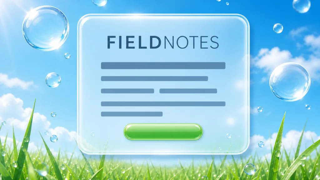
A visual language that expresses an optimistic mood of technology in harmony with nature, using glossy, translucent, rounded graphics with nature imagery — blue skies, grass, water droplets, bubbles, aurorae — in bright blues and greens with humanist sans-serif type. It corresponds to the look of consumer electronics and the web from roughly the mid-2000s to the early 2010s.
Recognizing it
- Rounded buttons, bubbles, and panels with specular highlights and translucent edges
- Nature imagery — blue sky and clouds, grass, water drops, fish, aurorae — as backgrounds or decoration
- Bright blues, greens, and aquas with humanist sans-serif type
Concept boundary
"Frutiger Aero" is a retrospective internet label: the look had no common name while it was popular, and the name was proposed by an online aesthetics-cataloguing community around 2018, combining the Frutiger typeface with the Windows Aero design language. It does not mean the interfaces of the time actually used Frutiger, and it is not any company's official design guideline. This entry covers only the reusable graphic moves; it does not cover the history, debates, and aesthetic offshoots (such as Dark Aero) of the internet subculture and nostalgia community around it. The test is the combination of gloss and translucency, nature imagery of sky, water, and greenery, a bright blue-green palette, and an optimistic sense of technology. It differs from glassmorphism, which addresses only the material treatment of translucency and background blur, without nature imagery or glossy highlights. It is related to but distinct from skeuomorphism: skeuomorphism borrows the form of a physical object to explain a function, and Frutiger Aero often carries skeuomorphic icons, but its core is the mood created by glossy finish and nature themes.
When to consider it
- The brand wants to evoke the optimistic tech nostalgia of the years after 2000
- A campaign page, illustration, or promotional material needs a bright, fresh, glossy character
- The product relates to environment, water, or wellness, so nature imagery serves the content directly
When to be cautious
- Tool interfaces used for long periods, where glossy highlights and background imagery interfere with scanning
- Applying retro gloss as an off-the-shelf skin when the content has nothing to do with technology and nature
- Reusing the wallpapers, icons, or interface elements of a particular operating system or brand
Tradeoff
Gloss, translucency, and nature imagery quickly evoke the optimism of an era and are highly recognizable. The cost is that highlights and background imagery raise visual noise and let contrast drift with the background, the graphic assets are costly to produce, and the nostalgic tone ties the brand firmly to associations with one period.
Conditional rules · Editorial advice
Related entries
Glassmorphism deals only with the material of translucency and background blur; Frutiger Aero also depends on glossy highlights, nature imagery, and a blue-green palette. The former can be one component of the latter, but not the other way round.
Frutiger Aero often carries skeuomorphic icons, but skeuomorphism is about borrowing an object's form to explain a function, whereas Frutiger Aero is about the optimistic mood built from gloss and nature themes.
Flat design replaced this glossy look in the early 2010s by removing exactly the highlights, gradients, and volume; the two take opposite positions on simulating light and material.
Background imagery and highlights keep changing the lightness behind the text, so effective contrast is set by the brightest or busiest spot.
Sources and what they support
The article explains that the style had no common name during its peak and was named in 2018 by Sofi Xian of the Consumer Aesthetics Research Institute, combining the Frutiger typeface with the Windows Aero design language. It places the style roughly from the mid-2000s to the early 2010s, lists vibrant colors, three-dimensional graphics and glossy textures, skeuomorphic icons, nature imagery such as blue skies, grass, aurorae, and bokeh, blues and greens, and translucent elements, and records its revival as an internet nostalgia aesthetic in 2023–2024. It also cites commentary that the Frutiger family was never used in a major interface associated with the style. This entry takes the retrospective naming and the formal traits from it.
Retrieved: 2026-10-20 · Snapshot unconfirmedThe page is the entry from the institute where the name originated. It gives a popular period of roughly 2005–2013 and lists traits including skeuomorphic UI, glossy design, Frutiger/humanist sans-serif type, glassy and transparent materials, aurora and bokeh photography, and macro photographs of grass, and explains that the name combines Windows Vista's Aero design guideline with Adrian Frutiger's typeface. The page credits the name inconsistently across sections, so this entry does not assert a specific coiner in its prose.
Retrieved: 2026-10-20 · Snapshot unconfirmedThe article explains that Windows Aero is the Microsoft design language introduced with Windows Vista in 2006 and continued in Windows 7 in 2009, emphasizing animation, glass, and translucent window borders. This entry uses it to explain where the "Aero" in the name comes from, without equating Frutiger Aero with that official design language.
Retrieved: 2026-10-20 · Snapshot unconfirmedDefinitions reference these sources. Digital specimens, selection advice, relationships, and recipes are editorial work and have not been validated through user research.
Type extensions and implementation notes
This entry has no runnable specimen; the illustration is an editorial sketch, and its sky, bubbles, and glossy buttons are drawn originally and copy no operating system's or brand's wallpaper or icons. Before shipping, test text contrast over imagery and highlights, and confirm the copyright and licensing of the assets.
{
  "tokens": {
    "surface": "#e6f4fb",
    "ink": "#123247",
    "accent": "#3fae6a",
    "radiusPx": 14,
    "shadow": "inset 0 1px 0 rgba(255, 255, 255, 0.7), 0 6px 18px rgba(18, 50, 71, 0.18)"
  },
  "tokenScope": "This sample recipe — pale sky-blue ground, deep blue ink, grass-green accent, plus an inner highlight and soft shadow to suggest a glossy button. The real effect depends on imagery of sky, water, and greenery; real work needs original or licensed assets and must verify text contrast over the imagery."
}
Open the Agent JSON file for this entryThis file repeats every field of this entry verbatim and adds its sources, archive status, and editorial scope.