VOCABULARY / ENTRY
Hub-and-Spoke Structure
hub-and-spoke
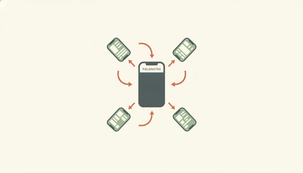
Make a single central hub screen the only entry point, with independent, mutually isolated task sections (spokes) hanging off it: people leave the hub to enter one section, and once they finish or abandon it they must return to the hub before entering another section, since sections have no direct route between them. NN/g describes this navigation hub as usually the homepage, listing every navigation option; reaching a new destination requires going back to the hub and then choosing one of the options there. Smashing Magazine describes the central screen as a launchpad for exploration, with links pointing outward to other sections of the site or to independent, siloed applications.
Recognizing it
- There is exactly one central hub screen listing every branch's entry point; each branch is self-contained and not directly connected to any other
- Going back from any branch always returns to the hub, never sideways into another branch, and there is no shortcut around the hub
- A branch can have its own secondary navigation or state internally, but leaving it for somewhere else always passes through the hub first
Concept boundary
Hub-and-spoke is an information architecture with a single central hub screen whose spokes are independent and share no navigation path with each other; switching tasks always means returning to the hub first. It differs from hierarchical navigation structure, which is a tree that can be drilled into level by level and whose sibling branches can be moved between laterally or revisited; the spokes in a hub-and-spoke structure are mutually isolated with no sibling relationship, and returning to the hub is the only way to switch, not a step through an intermediate tree level. It also differs from linear flow structure, which has only one predetermined sequence with no branch to choose from; hub-and-spoke instead radiates from one point to several independent branches, and moving between branches is a choice, not a step forward in a sequence.
When to consider it
- Screen space is limited (typically mobile), so every branch's navigation cannot be laid out at once or given a persistent entry point
- Within a single session, people typically stay focused on one branch to complete a task and rarely need to switch back and forth between branches
- The branches are genuinely independent and share no context or state, so forcing a lateral route between them would only add complexity
When to be cautious
- People frequently need to switch between several branches within the same session; returning to the hub each time creates a lot of repeated back-tapping
- The content is actually an explorable multi-level tree with sibling relationships between branches; hierarchical navigation structure fits better
- The task itself has only one fixed sequence; linear flow structure should be used instead of branches plus a hub
Tradeoff
The structure is simple and the mental model is clear: people always know that returning to the hub gets them anywhere, and no branch page needs to carry a full global navigation of its own. The cost is the round trip: switching tasks means walking back to the hub first, and the more often branches are alternated, the more frequent and more annoying that round trip becomes; if a persistent tab bar is added to ease that cost, the structure is no longer strictly a hub-and-spoke where switching can only happen through the hub.
Conditional rules · Editorial advice
Related entries
Hierarchical navigation structure lets people move laterally between sibling branches of a tree and revisit them; the spokes in hub-and-spoke are mutually isolated with no sibling relationship, and returning to the hub is the only way to switch.
Linear flow structure is a single predetermined path with no branch; hub-and-spoke instead radiates from a hub to several independent branches, and moving between them is a choice rather than a step forward in a sequence.
The hub page usually only needs to list branch entry points, and a single column makes it easy to rank them vertically by priority; a single task page inside a branch also often uses a single column to carry that branch's content without splitting attention.
Sources and what they support
Describes the navigation hub as usually a homepage that lists every navigation option; reaching a new destination requires first going back to the hub and then choosing one of the options there. States that this pattern routes every navigation through the homepage and adds an extra step (back to the hub) for each use, making it suited to task-based sites or apps, especially when people tend to stay within a single branch of the navigation hierarchy during one session (for example, most United Airlines users either book a ticket or check in, rarely both). Contrasts this with tab bars, which stay persistently on screen and let people switch directly between sections rather than routing back through a homepage.
Retrieved: 2026-09-15 · Snapshot unconfirmedDescribes the hub-and-spoke model as using a central screen as a launchpad for exploration, with links pointing outward to other sections of the site or to independent, siloed applications. States that this pattern lets each section skip carrying a full global navigation of its own, since people expect to return to the hub before going elsewhere, making it suited to contexts that want to keep attention locked on a single task with minimal distraction.
Retrieved: 2026-09-15 · Archived 2026-09-16Definitions reference these sources. Digital specimens, selection advice, relationships, and recipes are editorial work and have not been validated through user research.
Type extensions and implementation notes
No operable specimen exists yet; the illustration is an editorial sketch. Before shipping, still verify: whether every branch offers a return-to-hub entry point in the same place, how often people actually switch branches within one session (which determines whether the round-trip cost is acceptable), which repeated in-branch actions should not be forced through the hub, and whether documentation and design specs are updated to call the pattern tab bar navigation rather than hub-and-spoke once a persistent tab bar or other cross-branch shortcut is added.
{
  "states": [
    "hub",
    "spoke"
  ],
  "a11y": [
    "Every branch entry point on the hub screen has a readable text label, not an icon alone",
    "The return-to-hub control inside a branch has a clear text name (such as \"Back to home\"), is keyboard-operable, and is not an unlabeled icon",
    "The page title updates when entering or leaving a branch, so a screen reader announces whether the current location is the hub or a specific branch"
  ],
  "motion": "Entering a branch and returning to the hub can use a consistent, brief transition direction to express \"outward from the center / back to the center,\" and should respect reduced-motion preferences"
}
Full Agent entry JSON
{
  "id": "hub-and-spoke",
  "type": "layout",
  "name": {
    "zh": "中心辐射结构",
    "en": "Hub-and-Spoke Structure"
  },
  "aliases": [
    "轮辐式结构",
    "Hub and Spoke Navigation",
    "中心枢纽导航"
  ],
  "granularity": "experience",
  "intents": [
    "navigate-sections",
    "organize-content"
  ],
  "tags": [
    "hub-and-spoke structure",
    "navigation hub",
    "return hub",
    "task isolation",
    "information architecture"
  ],
  "definition": "Make a single central hub screen the only entry point, with independent, mutually isolated task sections (spokes) hanging off it: people leave the hub to enter one section, and once they finish or abandon it they must return to the hub before entering another section, since sections have no direct route between them. NN/g describes this navigation hub as usually the homepage, listing every navigation option; reaching a new destination requires going back to the hub and then choosing one of the options there. Smashing Magazine describes the central screen as a launchpad for exploration, with links pointing outward to other sections of the site or to independent, siloed applications.",
  "boundary": "Hub-and-spoke is an information architecture with a single central hub screen whose spokes are independent and share no navigation path with each other; switching tasks always means returning to the hub first. It differs from hierarchical navigation structure, which is a tree that can be drilled into level by level and whose sibling branches can be moved between laterally or revisited; the spokes in a hub-and-spoke structure are mutually isolated with no sibling relationship, and returning to the hub is the only way to switch, not a step through an intermediate tree level. It also differs from linear flow structure, which has only one predetermined sequence with no branch to choose from; hub-and-spoke instead radiates from one point to several independent branches, and moving between branches is a choice, not a step forward in a sequence.",
  "signature": [
    "There is exactly one central hub screen listing every branch's entry point; each branch is self-contained and not directly connected to any other",
    "Going back from any branch always returns to the hub, never sideways into another branch, and there is no shortcut around the hub",
    "A branch can have its own secondary navigation or state internally, but leaving it for somewhere else always passes through the hub first"
  ],
  "when": [
    "Screen space is limited (typically mobile), so every branch's navigation cannot be laid out at once or given a persistent entry point",
    "Within a single session, people typically stay focused on one branch to complete a task and rarely need to switch back and forth between branches",
    "The branches are genuinely independent and share no context or state, so forcing a lateral route between them would only add complexity"
  ],
  "when_not": [
    "People frequently need to switch between several branches within the same session; returning to the hub each time creates a lot of repeated back-tapping",
    "The content is actually an explorable multi-level tree with sibling relationships between branches; hierarchical navigation structure fits better",
    "The task itself has only one fixed sequence; linear flow structure should be used instead of branches plus a hub"
  ],
  "tradeoff": "The structure is simple and the mental model is clear: people always know that returning to the hub gets them anywhere, and no branch page needs to carry a full global navigation of its own. The cost is the round trip: switching tasks means walking back to the hub first, and the more often branches are alternated, the more frequent and more annoying that round trip becomes; if a persistent tab bar is added to ease that cost, the structure is no longer strictly a hub-and-spoke where switching can only happen through the hub.",
  "comparison": {
    "focus": "Giving independent task sections one shared switching point",
    "mechanism": "A single central hub screen plus independent branches that can only reach each other through it",
    "cost": "Switching branches requires a round trip to the hub; adding a persistent tab bar breaks the strict hub-only rule"
  },
  "sources": [
    {
      "id": "hub-and-spoke-nng-mobile-navigation-patterns",
      "title": "Nielsen Norman Group · Basic Patterns for Mobile Navigation: A Primer",
      "url": "https://www.nngroup.com/articles/mobile-navigation-patterns/",
      "claim": "Describes the navigation hub as usually a homepage that lists every navigation option; reaching a new destination requires first going back to the hub and then choosing one of the options there. States that this pattern routes every navigation through the homepage and adds an extra step (back to the hub) for each use, making it suited to task-based sites or apps, especially when people tend to stay within a single branch of the navigation hierarchy during one session (for example, most United Airlines users either book a ticket or check in, rarely both). Contrasts this with tab bars, which stay persistently on screen and let people switch directly between sections rather than routing back through a homepage.",
      "checkedAt": "2026-09-15",
      "archive": {
        "lookupUrl": "https://web.archive.org/web/20260915*/https://www.nngroup.com/articles/mobile-navigation-patterns/",
        "status": "unconfirmed",
        "checkedAt": "2026-09-16T05:41:39.059Z",
        "error": "save-request-failed"
      }
    },
    {
      "id": "hub-and-spoke-smashing-wayfinding-mobile-web",
      "title": "Smashing Magazine · Wayfinding For The Mobile Web",
      "url": "https://www.smashingmagazine.com/2014/10/wayfinding-for-the-mobile-web/",
      "claim": "Describes the hub-and-spoke model as using a central screen as a launchpad for exploration, with links pointing outward to other sections of the site or to independent, siloed applications. States that this pattern lets each section skip carrying a full global navigation of its own, since people expect to return to the hub before going elsewhere, making it suited to contexts that want to keep attention locked on a single task with minimal distraction.",
      "checkedAt": "2026-09-15",
      "archive": {
        "lookupUrl": "https://web.archive.org/web/20260915*/https://www.smashingmagazine.com/2014/10/wayfinding-for-the-mobile-web/",
        "status": "available",
        "checkedAt": "2026-09-16T05:41:59.968Z",
        "jobId": "spn2-a7335c5afb850dce2a079c7d11f73d326c3521a8",
        "url": "https://web.archive.org/web/20260916054320/https://www.smashingmagazine.com/2014/10/wayfinding-for-the-mobile-web/",
        "timestamp": "20260916054320"
      }
    }
  ],
  "relations": [
    {
      "target": "hierarchical-navigation",
      "kind": "alternative",
      "condition": "The sections actually have a parent-child or sibling relationship that calls for drilling down level by level or browsing laterally",
      "reason": "Hierarchical navigation structure lets people move laterally between sibling branches of a tree and revisit them; the spokes in hub-and-spoke are mutually isolated with no sibling relationship, and returning to the hub is the only way to switch.",
      "basis": "editorial"
    },
    {
      "target": "linear-flow",
      "kind": "alternative",
      "condition": "The task itself has only one predetermined sequence and does not require choosing among several independent branches",
      "reason": "Linear flow structure is a single predetermined path with no branch; hub-and-spoke instead radiates from a hub to several independent branches, and moving between them is a choice rather than a step forward in a sequence.",
      "basis": "editorial"
    },
    {
      "target": "single-column",
      "kind": "composes_with",
      "condition": "Designing the hub screen itself, or the pages inside a single branch",
      "reason": "The hub page usually only needs to list branch entry points, and a single column makes it easy to rank them vertically by priority; a single task page inside a branch also often uses a single column to carry that branch's content without splitting attention.",
      "basis": "editorial"
    }
  ],
  "rules": [
    {
      "when": "People are inside any branch",
      "instruction": "Provide a clear, consistently placed control for returning to the hub (such as a back button or hub icon in a fixed position); do not rely on the system back gesture alone, so people can find their way back to the hub from any branch at any time.",
      "strength": "must",
      "basis": "editorial"
    },
    {
      "when": "An action is something people repeat routinely within the same branch",
      "instruction": "Do not force people back to the hub and back into the branch to perform this action again; let the branch keep its own internal navigation, and reserve the trip to the hub for when people genuinely need to switch tasks.",
      "strength": "recommend",
      "basis": "editorial"
    },
    {
      "when": "A persistent tab bar or other cross-branch direct entry point is added to ease the round-trip cost",
      "instruction": "State explicitly in the design spec or interaction documentation that once branches have a direct route between them that bypasses the hub, the structure is no longer a strict hub-and-spoke; check it against tab bar navigation rules for consistency and reachability instead of continuing to apply hub assumptions.",
      "strength": "recommend",
      "basis": "editorial"
    }
  ],
  "behavior": {
    "states": [
      "hub",
      "spoke"
    ],
    "a11y": [
      "Every branch entry point on the hub screen has a readable text label, not an icon alone",
      "The return-to-hub control inside a branch has a clear text name (such as \"Back to home\"), is keyboard-operable, and is not an unlabeled icon",
      "The page title updates when entering or leaving a branch, so a screen reader announces whether the current location is the hub or a specific branch"
    ],
    "motion": "Entering a branch and returning to the hub can use a consistent, brief transition direction to express \"outward from the center / back to the center,\" and should respect reduced-motion preferences"
  },
  "demo": null,
  "version": "0.1.0",
  "editorialStatus": "drafted",
  "requirements": [],
  "demoCapabilities": [],
  "implementationNote": "No operable specimen exists yet; the illustration is an editorial sketch. Before shipping, still verify: whether every branch offers a return-to-hub entry point in the same place, how often people actually switch branches within one session (which determines whether the round-trip cost is acceptable), which repeated in-branch actions should not be forced through the hub, and whether documentation and design specs are updated to call the pattern tab bar navigation rather than hub-and-spoke once a persistent tab bar or other cross-branch shortcut is added.",
  "image": {
    "src": "/images/hub-and-spoke.webp",
    "alt": "A fictional FIELDNOTES app diagram: a home screen sits at the center, with four task screens arranged around it, each connected to the center by an arrow pointing back to the home screen; there are no arrows between the task screens themselves; the palette is a flat, muted mix of cream, terracotta, sage, and slate."
  },
  "searchTerms": [
    "中心辐射结构",
    "导航中枢",
    "返回枢纽",
    "任务隔离",
    "信息架构"
  ]
}