VOCABULARY / ENTRY
Linear Flow Structure
linear-flow
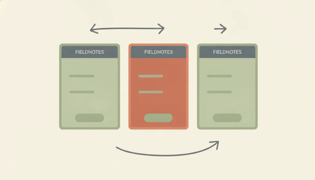
Arrange every screen a task needs into one predetermined sequence with no branches or side paths, so people move forward along a single route (account onboarding, checkout, guided setup); Baymard's checkout flow optimization guide argues the process should be completely linear, never show the same screen twice, and let backward navigation keep the data already entered.
Recognizing it
- Screens are arranged in one fixed order; each screen points only to the next one, with no optional branch or bypass
- Every screen states the total step count and the current position, for example "Step 2 of 4" or an equivalent progress indicator
- A control returns to the previous screen, and anything already entered or chosen is still there afterward without re-entry
Concept boundary
Linear flow structure describes an information-architecture-level ordering relationship - arranging a task's screens into one path - and does not by itself prescribe any interaction control. A wizard is the most common interaction pattern that realizes this structure, supplying next/back controls and progress indicators; but the same linear path can also be presented with a plain "continue" link or a full-page redirect, and the structure is still linear even without the wizard pattern. It differs from progressive disclosure, where the user decides when to expand secondary content and the number and order of screens are not fixed. It also differs from hierarchical navigation structure, which is an explorable tree that lets people move sideways between sibling branches and revisit them; a linear flow has only one path, no sibling nodes to choose among, and is not meant to be revisited.
When to consider it
- The task must follow a dependency order, where a later step relies on information or a decision already made in an earlier one, as in checkout or account setup
- You want to keep attention on a single path and reduce the chance of people getting distracted or wandering into other sections mid-task
- The task is normally done once or very rarely repeated, so there is no need to keep an explorable structure around for later
When to be cautious
- The content has no sequential dependency and people may only want one or two pieces of it; progressive disclosure that expands on demand fits better
- People need to browse repeatedly, compare, or jump between peer sections; hierarchical navigation structure or a plain list fits better
- The number of steps changes often, or some users need to skip steps; forcing everyone into one fixed order only adds friction
Tradeoff
A single path keeps cognitive load low - people never have to decide where to go next and rarely get lost - but it sacrifices flexibility and parallel work on multiple decisions; a flow that runs too long or folds in content with no real dependency slows down a task that could otherwise proceed in parallel.
Conditional rules · Editorial advice
Related entries
A wizard is the most common interaction pattern that realizes a linear flow structure, supplying next/back controls and a progress indicator; the structure itself prescribes no control, and a wizard is only one way to implement it.
Hierarchical navigation structure lets people move sideways between sibling branches and revisit them; a linear flow structure has only one path, no sibling nodes to choose among, and is not meant to be revisited.
Each screen only carries the content the current step needs; a single-column layout keeps that step's fields and copy in order without splitting attention.
Sources and what they support
Argues the checkout process should be "completely linear" and should never show the same screen twice; it should support the browser back button and ensure all entered form data is preserved so people are not forced to re-enter it; if the checkout uses multiple steps, the progress indicator must map 1:1 to the actual steps, since hiding or grouping steps causes disorientation.
Retrieved: 2026-09-15 · Archived 2026-09-16Explains that a wizard feels to the user like one linear screen after another, even when the system branches internally based on answers; recommends enforcing a clear step order and not letting people jump to a step they have not reached yet, and building a clear mental model by showing a list or diagram of the steps with the current one highlighted; also recommends supporting saved progress so people can resume where they left off.
Retrieved: 2026-09-15 · Archived 2026-09-16A Level A success criterion requiring that information a person has already supplied, or that the system already has for them, be auto-populated or offered for selection rather than requiring manual re-entry when it is needed again in the same multi-step process; intended to reduce cognitive load, especially for people with short-term working-memory difficulty, with exceptions when re-entry is essential to the activity, required for security, or the original data is no longer valid.
Retrieved: 2026-09-15 · Archived 2026-09-16Definitions reference these sources. Digital specimens, selection advice, relationships, and recipes are editorial work and have not been validated through user research.
Type extensions and implementation notes
No operable specimen yet; the illustration is an editorial sketch. When applied to a product, still verify: that every screen supports going back without losing data, that the progress indicator maps 1:1 to the actual steps rather than hiding or grouping them, that no undeclared optional branch has been folded into the flow, and that repeated information is auto-populated or offered for selection per WCAG 3.3.7 instead of forced re-entry.
{
  "states": [
    "first-step",
    "middle-step",
    "last-step"
  ],
  "a11y": [
    "The step count and current position are conveyed as text on every screen, not only through progress-bar color or shape",
    "The back control has a text name and is keyboard operable, and returning restores form data programmatically to the original fields",
    "The page title or heading level updates on each screen transition so assistive technology announces the current step"
  ],
  "motion": "Forward and backward transitions between screens may use a brief, direction-consistent transition and should respect the reduced-motion preference"
}
Full Agent entry JSON
{
  "id": "linear-flow",
  "type": "layout",
  "name": {
    "zh": "线性流程结构",
    "en": "Linear Flow Structure"
  },
  "aliases": [
    "顺序流程",
    "Sequential Flow",
    "Linear Flow"
  ],
  "granularity": "experience",
  "intents": [
    "organize-content"
  ],
  "tags": [
    "linear flow",
    "sequential structure",
    "no branching",
    "information architecture",
    "guided flow"
  ],
  "definition": "Arrange every screen a task needs into one predetermined sequence with no branches or side paths, so people move forward along a single route (account onboarding, checkout, guided setup); Baymard's checkout flow optimization guide argues the process should be completely linear, never show the same screen twice, and let backward navigation keep the data already entered.",
  "boundary": "Linear flow structure describes an information-architecture-level ordering relationship - arranging a task's screens into one path - and does not by itself prescribe any interaction control. A wizard is the most common interaction pattern that realizes this structure, supplying next/back controls and progress indicators; but the same linear path can also be presented with a plain \"continue\" link or a full-page redirect, and the structure is still linear even without the wizard pattern. It differs from progressive disclosure, where the user decides when to expand secondary content and the number and order of screens are not fixed. It also differs from hierarchical navigation structure, which is an explorable tree that lets people move sideways between sibling branches and revisit them; a linear flow has only one path, no sibling nodes to choose among, and is not meant to be revisited.",
  "signature": [
    "Screens are arranged in one fixed order; each screen points only to the next one, with no optional branch or bypass",
    "Every screen states the total step count and the current position, for example \"Step 2 of 4\" or an equivalent progress indicator",
    "A control returns to the previous screen, and anything already entered or chosen is still there afterward without re-entry"
  ],
  "when": [
    "The task must follow a dependency order, where a later step relies on information or a decision already made in an earlier one, as in checkout or account setup",
    "You want to keep attention on a single path and reduce the chance of people getting distracted or wandering into other sections mid-task",
    "The task is normally done once or very rarely repeated, so there is no need to keep an explorable structure around for later"
  ],
  "when_not": [
    "The content has no sequential dependency and people may only want one or two pieces of it; progressive disclosure that expands on demand fits better",
    "People need to browse repeatedly, compare, or jump between peer sections; hierarchical navigation structure or a plain list fits better",
    "The number of steps changes often, or some users need to skip steps; forcing everyone into one fixed order only adds friction"
  ],
  "tradeoff": "A single path keeps cognitive load low - people never have to decide where to go next and rarely get lost - but it sacrifices flexibility and parallel work on multiple decisions; a flow that runs too long or folds in content with no real dependency slows down a task that could otherwise proceed in parallel.",
  "comparison": {
    "focus": "Presenting a task's screens in one fixed order",
    "mechanism": "A predetermined path with no branch or bypass, paired with a position and step-count indicator",
    "cost": "Lost flexibility and parallelism; a poorly designed step count or unrelated content padded in will slow the task down"
  },
  "sources": [
    {
      "id": "linear-flow-baymard-checkout",
      "title": "Baymard Institute · Checkout Flow UX Optimization Guide",
      "url": "https://baymard.com/learn/checkout-flow-ux-optimization",
      "claim": "Argues the checkout process should be \"completely linear\" and should never show the same screen twice; it should support the browser back button and ensure all entered form data is preserved so people are not forced to re-enter it; if the checkout uses multiple steps, the progress indicator must map 1:1 to the actual steps, since hiding or grouping steps causes disorientation.",
      "checkedAt": "2026-09-15",
      "archive": {
        "lookupUrl": "https://web.archive.org/web/20260915*/https://baymard.com/learn/checkout-flow-ux-optimization",
        "status": "available",
        "checkedAt": "2026-09-16T04:18:30.964Z",
        "jobId": "spn2-e9ce7fc1e227c543c8e2631f5b56598c3c3c02f7",
        "url": "https://web.archive.org/web/20260916041859/https://baymard.com/learn/checkout-flow-ux-optimization",
        "timestamp": "20260916041859"
      }
    },
    {
      "id": "linear-flow-nng-wizards",
      "title": "Nielsen Norman Group · Wizards: Definition and Design Recommendations",
      "url": "https://www.nngroup.com/articles/wizards/",
      "claim": "Explains that a wizard feels to the user like one linear screen after another, even when the system branches internally based on answers; recommends enforcing a clear step order and not letting people jump to a step they have not reached yet, and building a clear mental model by showing a list or diagram of the steps with the current one highlighted; also recommends supporting saved progress so people can resume where they left off.",
      "checkedAt": "2026-09-15",
      "archive": {
        "lookupUrl": "https://web.archive.org/web/20260915*/https://www.nngroup.com/articles/wizards/",
        "status": "available",
        "checkedAt": "2026-09-16T04:18:31.200Z",
        "jobId": "spn2-68c8f2410a7c9c9c5a1635be180c8e07a9e17593",
        "url": "https://web.archive.org/web/20260916041857/https://www.nngroup.com/articles/wizards/",
        "timestamp": "20260916041857"
      }
    },
    {
      "id": "linear-flow-wcag-redundant-entry",
      "title": "W3C WAI · WCAG 2.2 Understanding SC 3.3.7 Redundant Entry",
      "url": "https://www.w3.org/WAI/WCAG22/Understanding/redundant-entry.html",
      "claim": "A Level A success criterion requiring that information a person has already supplied, or that the system already has for them, be auto-populated or offered for selection rather than requiring manual re-entry when it is needed again in the same multi-step process; intended to reduce cognitive load, especially for people with short-term working-memory difficulty, with exceptions when re-entry is essential to the activity, required for security, or the original data is no longer valid.",
      "checkedAt": "2026-09-15",
      "archive": {
        "lookupUrl": "https://web.archive.org/web/20260915*/https://www.w3.org/WAI/WCAG22/Understanding/redundant-entry.html",
        "status": "available",
        "checkedAt": "2026-09-16T04:19:11.084Z",
        "jobId": "spn2-7f13ad73a95fde3c32f93308701438b13ad1ea73",
        "url": "https://web.archive.org/web/20260916042025/https://www.w3.org/WAI/WCAG22/Understanding/redundant-entry.html",
        "timestamp": "20260916042025"
      }
    }
  ],
  "relations": [
    {
      "target": "wizard",
      "kind": "realized_by",
      "condition": "The path needs a concrete on-screen realization",
      "reason": "A wizard is the most common interaction pattern that realizes a linear flow structure, supplying next/back controls and a progress indicator; the structure itself prescribes no control, and a wizard is only one way to implement it.",
      "basis": "editorial"
    },
    {
      "target": "hierarchical-navigation",
      "kind": "alternative",
      "condition": "Deciding whether the information architecture is a single path or an explorable tree",
      "reason": "Hierarchical navigation structure lets people move sideways between sibling branches and revisit them; a linear flow structure has only one path, no sibling nodes to choose among, and is not meant to be revisited.",
      "basis": "editorial"
    },
    {
      "target": "single-column",
      "kind": "composes_with",
      "condition": "Designing an individual step screen inside a linear flow",
      "reason": "Each screen only carries the content the current step needs; a single-column layout keeps that step's fields and copy in order without splitting attention.",
      "basis": "editorial"
    }
  ],
  "rules": [
    {
      "when": "The person is on any screen of the linear flow other than the first",
      "instruction": "A control to return to the previous screen must be present, and whatever was already entered or chosen must still be there afterward; do not require re-entering information already provided.",
      "strength": "must",
      "basis": "editorial"
    },
    {
      "when": "The flow is presented as linear with no branching",
      "instruction": "Do not insert optional branches or side detours into it; if some content is genuinely optional, present it outside the flow via progressive disclosure instead of folding it into what is supposed to be a single path as a hidden fork.",
      "strength": "recommend",
      "basis": "editorial"
    },
    {
      "when": "The flow spans more than one screen",
      "instruction": "State the total step count and current position on every screen, for example \"Step N of M\" or an equivalent indicator that maps 1:1 to the actual steps, without hiding or grouping steps.",
      "strength": "recommend",
      "basis": "editorial"
    }
  ],
  "behavior": {
    "states": [
      "first-step",
      "middle-step",
      "last-step"
    ],
    "a11y": [
      "The step count and current position are conveyed as text on every screen, not only through progress-bar color or shape",
      "The back control has a text name and is keyboard operable, and returning restores form data programmatically to the original fields",
      "The page title or heading level updates on each screen transition so assistive technology announces the current step"
    ],
    "motion": "Forward and backward transitions between screens may use a brief, direction-consistent transition and should respect the reduced-motion preference"
  },
  "demo": null,
  "version": "0.1.0",
  "editorialStatus": "drafted",
  "requirements": [],
  "demoCapabilities": [],
  "implementationNote": "No operable specimen yet; the illustration is an editorial sketch. When applied to a product, still verify: that every screen supports going back without losing data, that the progress indicator maps 1:1 to the actual steps rather than hiding or grouping them, that no undeclared optional branch has been folded into the flow, and that repeated information is auto-populated or offered for selection per WCAG 3.3.7 instead of forced re-entry.",
  "image": {
    "src": "/images/linear-flow.webp",
    "alt": "A fictional FIELDNOTES app screen showing three connected screens in a row, joined by forward arrows and a return arrow pointing back from right to left; the middle screen is highlighted in terracotta as the current step, in a flat, muted, warm palette of cream, terracotta, and sage."
  },
  "searchTerms": [
    "线性流程",
    "顺序结构",
    "无分支",
    "信息架构",
    "引导式流程"
  ]
}