VOCABULARY / ENTRY
Mobile-First
mobile-first
Designing a product for the smallest screen and the mobile context first, then expanding to larger screens: the small screen forces the team to decide early what matters most, and capabilities specific to mobile devices enter the design from the start, instead of a desktop version being finished and then cut down into a mobile one.
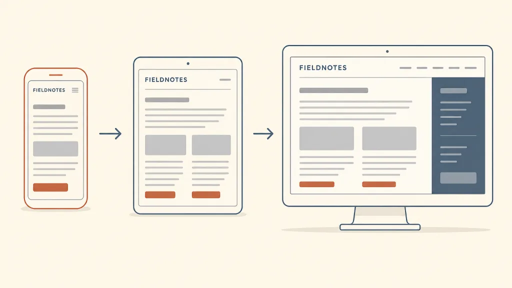
Recognizing it
- The first layout and the first content choices are made on the smallest screen
- Layouts for larger screens add columns, information, and actions to the small-screen version rather than removing them in reverse
- Mobile capabilities such as location, touch, and the camera are considered at the requirements stage
Concept boundary
Mobile-first is a position about the order of design and its tradeoffs, not a layout technique. It is not responsive design: responsive design is the means — fluid grids, flexible images, and media queries — by which one page adapts to different widths, and it can be written from desktop down or from mobile up; mobile-first answers which context the tradeoffs are made for first. It also differs from progressive enhancement: progressive enhancement layers features on top of a baseline according to browser and network capability, and asks whether the core task still works under the worst conditions; mobile-first orders by screen and context, and the smallest screen is not necessarily the least capable environment. Nor does it mean building only for mobile or turning the desktop version into an enlarged phone interface — larger screens deserve a fitting layout as the design scales up.
When to consider it
- A substantial share of use happens on phones, or that share is growing
- A page carries so much content and functionality that the team cannot agree on priorities
- The product genuinely benefits from mobile capabilities such as location, touch, or sensors
When to be cautious
- The main tasks depend on a large screen and a precise pointer, such as dense data editing or professional drawing tools
- The small-screen version is simply stretched into the desktop version, wasting the wide screen
- Content that users need on every device is removed because it does not fit on mobile
Tradeoff
Starting from the smallest screen forces priorities to be set early, yields a more focused core experience, and brings mobile capabilities into early design; the cost is that dense desktop tasks can become an afterthought, and once a small-screen tradeoff is treated as a decision about the content itself, people on larger screens lose information they need.
Conditional rules · Editorial advice
Related entries
Both start small and add upward, but progressive enhancement layers by browser and network capability while mobile-first orders by screen and context of use; the smallest screen is not necessarily the least capable environment, and the two axes can be applied together.
The small-screen baseline is usually one column of content from top to bottom, with larger screens adding columns on top of it.
Mobile-first decides the baseline content, and adaptive multi-pane layouts describe how a large screen lays that content side by side instead of enlarging the phone interface.
The constraint of a small screen forces the team to drop non-essential elements, which also reduces how much users must handle at once.
Sources and what they support
In this article of 3 November 2009, Luke Wroblewski argues that web applications should be designed for mobile before the desktop, for three reasons: mobile use is growing fast; the constraints of a small screen force teams to set priorities and keep only the key tasks; and mobile platforms offer capabilities such as location, a compass, multi-touch, and accelerometers that desktop browsers lack. This entry takes its definition and the three points of growth, constraints, and capabilities from it; the usage forecast the article cites is a figure of its time and is not repeated here.
Retrieved: 2026-10-20 · Snapshot unconfirmedThe author's book page states that Mobile First was published by A Book Apart in October 2011, argues that websites and applications should increasingly be designed for mobile first and that starting with the desktop may be an increasingly backwards way of thinking, and covers how teams move from desktop to mobile design in organisation, actions, input, and layout. This entry uses it for the origin and scope of the position.
Retrieved: 2026-10-20 · Snapshot unconfirmedThis article by Ethan Marcotte, published on 25 May 2010, introduced responsive web design, naming fluid grids, flexible images, and media queries as its three technical ingredients and replacing separate per-device sites with one adaptive experience. This entry uses it only to draw the line: responsive design is a means of implementation, while mobile-first is a position on design order and tradeoffs.
Retrieved: 2026-10-20 · Snapshot unconfirmedDefinitions reference these sources. Digital specimens, selection advice, relationships, and recipes are editorial work and have not been validated through user research.
Type extensions and implementation notes
This entry has no runnable specimen; the illustration is an editorial sketch showing one fictional page expanding step by step from phone to desktop to convey design order, and represents no particular breakpoints or framework. Before applying it to a product, check the tradeoffs at each size with real devices and real tasks.
{
  "values": [
    "Decide what matters most before deciding how much to show",
    "Design should start from the most constrained context of use"
  ],
  "tension": "Between the focus a small screen brings and the information density that large-screen tasks need",
  "questions": [
    "If this page could hold only one thing, what would it be?",
    "Is this cut a choice about position, or a choice about content?",
    "What do users gain when the screen gets bigger?"
  ]
}
Open the Agent JSON file for this entryThis file repeats every field of this entry verbatim and adds its sources, archive status, and editorial scope.