VOCABULARY / ENTRY
Norman Door
norman-door
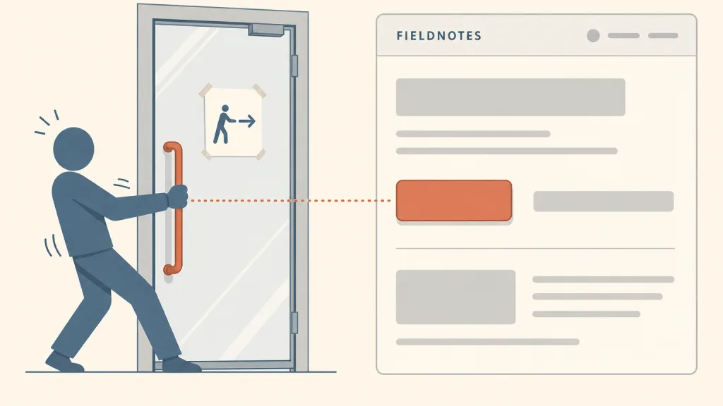
An object whose appearance signals a way of operating it that contradicts, or leaves unclear, how it actually works: the classic case is a door that must be pushed but carries a pull handle, so a “push” sign has to be added before anyone can use it. Interface design borrows the term for the same problem — things that look clickable but are not, and things that look like plain text but are.
Recognizing it
- The control’s form suggests one action while it actually needs another (a door with a pull handle that must be pushed)
- It needs an added text or pictorial sign before people use it correctly
- First attempts often fail, and people find the right action only after failing
Concept boundary
This term comes from physical objects and is used here as interface vocabulary. It targets cues that contradict or fail to show how something is operated, not operations that are complex in themselves: a flow with many steps, each of them clear, is not a Norman door. It also differs from deceptive designs such as visual interference, which deliberately distort how prominent choices are in order to steer users: a Norman door usually comes from oversight rather than intent. In Don Norman’s distinction, an affordance is an action possible between an object and the person using it, and a signifier is a perceivable cue that tells people where and how to act; a Norman door fails at the signifier. The test: if a control needs extra explanatory text to be operated correctly, and its form could have carried that meaning, it is a Norman door.
When to consider it
- Auditing which controls in an interface depend on explanatory text to be used correctly
- Explaining in usability tests why people keep clicking wrong in the same place
When to be cautious
- Patching it with a line of instructions instead of changing the control’s form
- Labeling every user error a Norman door — some errors come from the task itself, not the cues
Tradeoff
The repair is to let form explain use: what can be clicked looks clickable, what cannot does not imitate a button, and one appearance maps to one action across the whole product. The cost is less visual freedom — for instance, once a flat style drops borders and shadows, the cues for clickability have to be restored some other way.
Conditional rules · Editorial advice
Related entries
Flat design is not a Norman door in itself, but when the cues are removed and nothing replaces them, it is the easiest way to produce buttons nobody can tell are buttons.
People judge the next similar control by the last one; once appearance and action stop corresponding reliably, every control has to be tried afresh.
Error prevention asks that misleading cues be removed before people err, and a Norman door puts the misleading cue in the very form people see first.
Immediate feedback such as a pressed state confirms “this can be pressed” during an attempt, but it appears only after trying and cannot replace cues in the form before trying.
Sources and what they support
The publisher’s page lists the Revised and Expanded Edition as published by Basic Books on 5 November 2013 (ISBN 9780465050659); its description says that people unsure whether to push, pull, or slide a door are facing design that ignores users’ needs and cognitive psychology, not a failing of their own, and summarizes the book’s principles of making controls visible, using natural relationships between controls and functions, and using constraints. This entry cites it for where the problem the name refers to comes from and for the direction of repair.
Retrieved: 2026-10-20 · Snapshot unconfirmedIn this 2008 essay published in ACM Interactions, Don Norman explains that J. J. Gibson coined “affordance” for the actions possible for an agent in an environment whether or not they are perceivable, that he brought the word into design in 1988 to mean perceivable affordances, and defines a signifier as a signal in the physical or social world that can be interpreted meaningfully; he argues designers should provide signifiers rather than focus on affordances. This entry paraphrases the distinction between affordances and signifiers from it.
Retrieved: 2026-10-20 · Snapshot unconfirmedOn 27 February 2016, Don Norman’s personal site featured a Vox Media video and short article by Joe Posner: the author describes an office door he always opens the wrong way, places the fault with the door’s design rather than with the user, and argues that a well-designed door needs no labels or instructions; the piece connects the problem to The Design of Everyday Things. This entry cites it for the everyday use of the name “Norman door”; it has not verified who first coined the name and makes no claim about it.
Retrieved: 2026-10-20 · Snapshot unconfirmedDefinitions reference these sources. Digital specimens, selection advice, relationships, and recipes are editorial work and have not been validated through user research.
Type extensions and implementation notes
This is a warning entry and not a recommendation; it comes from physical objects and is used in this catalog as interface vocabulary. The door and the web page in the illustration are invented. When auditing an interface, treat every “click here” or “clickable” note as a clue: it often marks a place where the control’s form failed to say enough.
{
  "harm": "People keep trying and blame themselves for failing, and the object or interface works only with added signs",
  "repair": "Let form do the explaining: what can be operated looks operable, what cannot does not imitate a control, and one appearance always maps to one action; explanatory text only supplements."
}
Open the Agent JSON file for this entryThis file repeats every field of this entry verbatim and adds its sources, archive status, and editorial scope.