VOCABULARY / ENTRY
Pressed-State Feedback
pressed-state
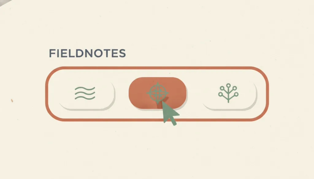
While a user is pressing or clicking an actionable control (between pointer down and release, matched by :active in CSS), the control immediately shows a visible change, optionally with haptic or audio feedback, confirming that the press was received; the action itself completes on release.
Recognizing it
- The control's fill, shadow, scale, or color changes the instant the pointer or finger goes down
- The change reverts immediately on release or when the pointer leaves the control, leaving no persistent trace
- The pressed style is visually distinguishable from the control's hover, focus, and selected states
Concept boundary
The pressed state only answers whether the system received the press, in the brief window between down and release. It is not hover (pointer resting without pressing), not the focus indicator (where keyboard focus is), and not the selected or toggled state (which persists after release). It also does not show the result of the action; that is the job of a status message or content change.
When to consider it
- Touch interfaces have no hover state, so press feedback is the only signal that the user hit the target
- Buttons, links, or cards have custom styling that overrides the platform's default pressed style
- The action requires a network round trip or lengthy processing, and users may tap again before the result appears
When to be cautious
- Do not let the down-event itself trigger an irreversible action; users then cannot cancel by moving the pointer away
- Do not reuse the selected style for the pressed state; users will assume the toggle already completed
- Do not express the press only through translation or scale animation; under reduced motion the feedback disappears entirely
Tradeoff
Obvious press feedback makes every click feel like it landed, but it can look jarring in an extremely flat or quiet visual system; the compromise is a subtle yet contrast-distinguishable fill or shadow change rather than omitting the state.
Conditional rules · Editorial advice
Related entries
Both are state styles on a control but answer different questions: the focus indicator says where the action will land, the pressed state says the press was received, and they must be distinguishable.
The pressed state only confirms the input was received; the outcome still needs follow-up feedback such as a status message.
Direct manipulation depends on an immediate visible response to every input step, and the pressed state is the first link in that feedback chain.
Once depth cues are removed without adding other press feedback, users cannot confirm whether a click landed.
Sources and what they support
The :active pseudo-class matches an element being activated by the user; with a mouse, activation typically starts when the primary button is pressed and ends on release, it is commonly used on <a> and <button>, and it should follow the LVHA order after other link pseudo-classes.
Retrieved: 2026-09-15 · Archived 2026-09-16WCAG 2.2 SC 2.5.2 (Level A) requires single-pointer functionality to satisfy one of: the down-event executes no part of the function, completion happens on the up-event with a way to abort or undo, the up-event reverses the down-event, or completing on the down-event is essential; the intent is that users can cancel an accidental press by moving the pointer away before release.
Retrieved: 2026-09-15 · Snapshot unconfirmedNielsen states that about 0.1 second is the limit for users to feel the system reacts instantaneously, needing no special feedback beyond displaying the result; about 1 second is the limit for uninterrupted flow of thought; about 10 seconds is the limit for keeping attention on the dialogue.
Retrieved: 2026-09-15 · Archived 2026-09-16The article lists a color change once the user has clicked a button as the simplest form of immediate feedback and holds that immediate feedback on interactive events helps users spot and fix errors quickly; it states no specific time threshold.
Retrieved: 2026-09-15 · Archived 2026-09-16Definitions reference these sources. Digital specimens, selection advice, relationships, and recipes are editorial work and have not been validated through user research.
Type extensions and implementation notes
This entry has no operable specimen yet; the illustration is an editorial sketch. When applied to a product, hold down every control type on a real touch device and with a mouse to verify that press feedback appears immediately, is distinguishable from hover, focus, and selected states, and that releasing outside the control does not trigger the action; re-check under the system's reduced-motion setting.
{
  "states": [
    "rest",
    "hover",
    "pressed",
    "released"
  ],
  "a11y": [
    "Press feedback does not rely on color alone; layer shadow, fill, or border changes on top",
    "The action completes on release, and moving off the control before releasing cancels it",
    "The pressed state can coexist with the focus indicator and selected state without hiding either"
  ],
  "motion": "Color or inset changes apply instantly on press with no entry delay; scale or translation animation is omitted under reduced motion, keeping only color and shadow changes"
}
Full Agent entry JSON
{
  "id": "pressed-state",
  "type": "micro",
  "name": {
    "zh": "按下状态反馈",
    "en": "Pressed-State Feedback"
  },
  "aliases": [
    "Active State",
    "按下态",
    "Press Feedback"
  ],
  "granularity": "state",
  "intents": [
    "inform",
    "prevent-error"
  ],
  "tags": [
    "pressed",
    "immediate feedback",
    "control state",
    "touch",
    "active"
  ],
  "definition": "While a user is pressing or clicking an actionable control (between pointer down and release, matched by :active in CSS), the control immediately shows a visible change, optionally with haptic or audio feedback, confirming that the press was received; the action itself completes on release.",
  "boundary": "The pressed state only answers whether the system received the press, in the brief window between down and release. It is not hover (pointer resting without pressing), not the focus indicator (where keyboard focus is), and not the selected or toggled state (which persists after release). It also does not show the result of the action; that is the job of a status message or content change.",
  "signature": [
    "The control's fill, shadow, scale, or color changes the instant the pointer or finger goes down",
    "The change reverts immediately on release or when the pointer leaves the control, leaving no persistent trace",
    "The pressed style is visually distinguishable from the control's hover, focus, and selected states"
  ],
  "when": [
    "Touch interfaces have no hover state, so press feedback is the only signal that the user hit the target",
    "Buttons, links, or cards have custom styling that overrides the platform's default pressed style",
    "The action requires a network round trip or lengthy processing, and users may tap again before the result appears"
  ],
  "when_not": [
    "Do not let the down-event itself trigger an irreversible action; users then cannot cancel by moving the pointer away",
    "Do not reuse the selected style for the pressed state; users will assume the toggle already completed",
    "Do not express the press only through translation or scale animation; under reduced motion the feedback disappears entirely"
  ],
  "tradeoff": "Obvious press feedback makes every click feel like it landed, but it can look jarring in an extremely flat or quiet visual system; the compromise is a subtle yet contrast-distinguishable fill or shadow change rather than omitting the state.",
  "comparison": {
    "focus": "Confirming that the press was received by the system while leaving room to cancel before release",
    "mechanism": "An immediate style change during the press (:active or the platform pressed state), with the action executed on release",
    "cost": "Requires maintaining a pressed style for every pressable control type that stays distinguishable from hover, focus, and selected"
  },
  "sources": [
    {
      "id": "mdn-active",
      "title": "MDN · :active",
      "url": "https://developer.mozilla.org/en-US/docs/Web/CSS/:active",
      "claim": "The :active pseudo-class matches an element being activated by the user; with a mouse, activation typically starts when the primary button is pressed and ends on release, it is commonly used on <a> and <button>, and it should follow the LVHA order after other link pseudo-classes.",
      "checkedAt": "2026-09-15",
      "archive": {
        "lookupUrl": "https://web.archive.org/web/20260915*/https://developer.mozilla.org/en-US/docs/Web/CSS/:active",
        "status": "available",
        "checkedAt": "2026-09-16T03:50:08.267Z",
        "jobId": "spn2-b504ce815111741ffd708408cfe2e4792b52f495",
        "url": "https://web.archive.org/web/20260916035032/https://developer.mozilla.org/en-US/docs/Web/CSS/Reference/Selectors/:active",
        "timestamp": "20260916035032"
      }
    },
    {
      "id": "wcag22-pointer-cancellation",
      "title": "W3C WAI · Understanding SC 2.5.2 Pointer Cancellation (Level A)",
      "url": "https://www.w3.org/WAI/WCAG22/Understanding/pointer-cancellation.html",
      "claim": "WCAG 2.2 SC 2.5.2 (Level A) requires single-pointer functionality to satisfy one of: the down-event executes no part of the function, completion happens on the up-event with a way to abort or undo, the up-event reverses the down-event, or completing on the down-event is essential; the intent is that users can cancel an accidental press by moving the pointer away before release.",
      "checkedAt": "2026-09-15",
      "archive": {
        "lookupUrl": "https://web.archive.org/web/20260915*/https://www.w3.org/WAI/WCAG22/Understanding/pointer-cancellation.html",
        "status": "pending",
        "checkedAt": "2026-09-16T04:20:14.606Z",
        "error": "status-request-failed",
        "jobId": "spn2-0ab2c1d4f375c084ccb894f74855d7b6dec69ae0"
      }
    },
    {
      "id": "nng-response-times",
      "title": "Nielsen Norman Group · Response Times: The 3 Important Limits",
      "url": "https://www.nngroup.com/articles/response-times-3-important-limits/",
      "claim": "Nielsen states that about 0.1 second is the limit for users to feel the system reacts instantaneously, needing no special feedback beyond displaying the result; about 1 second is the limit for uninterrupted flow of thought; about 10 seconds is the limit for keeping attention on the dialogue.",
      "checkedAt": "2026-09-15",
      "archive": {
        "lookupUrl": "https://web.archive.org/web/20260915*/https://www.nngroup.com/articles/response-times-3-important-limits/",
        "status": "available",
        "checkedAt": "2026-09-16T03:50:36.309Z",
        "jobId": "spn2-a445b35eeb0d266caa0107c5f3694ef90bec60e8",
        "url": "https://web.archive.org/web/20260916035201/https://www.nngroup.com/articles/response-times-3-important-limits/",
        "timestamp": "20260916035201"
      }
    },
    {
      "id": "nng-visibility-system-status",
      "title": "Nielsen Norman Group · Visibility of System Status",
      "url": "https://www.nngroup.com/articles/visibility-system-status/",
      "claim": "The article lists a color change once the user has clicked a button as the simplest form of immediate feedback and holds that immediate feedback on interactive events helps users spot and fix errors quickly; it states no specific time threshold.",
      "checkedAt": "2026-09-15",
      "archive": {
        "lookupUrl": "https://web.archive.org/web/20260915*/https://www.nngroup.com/articles/visibility-system-status/",
        "status": "available",
        "checkedAt": "2026-09-16T03:50:48.236Z",
        "jobId": "spn2-2b8f64f0221fac8cb374582c6ce79b84f5e28f16",
        "url": "https://web.archive.org/web/20260916035119/https://www.nngroup.com/articles/visibility-system-status/",
        "timestamp": "20260916035119"
      }
    }
  ],
  "relations": [
    {
      "target": "focus-indicator",
      "kind": "related",
      "condition": "The same control supports both keyboard and pointer input",
      "reason": "Both are state styles on a control but answer different questions: the focus indicator says where the action will land, the pressed state says the press was received, and they must be distinguishable.",
      "basis": "editorial"
    },
    {
      "target": "status-message",
      "kind": "composes_with",
      "condition": "The action's result takes time or happens out of view",
      "reason": "The pressed state only confirms the input was received; the outcome still needs follow-up feedback such as a status message.",
      "basis": "editorial"
    },
    {
      "target": "direct-manipulation",
      "kind": "composes_with",
      "condition": "Users drag, hold, or continuously operate on-screen objects",
      "reason": "Direct manipulation depends on an immediate visible response to every input step, and the pressed state is the first link in that feedback chain.",
      "basis": "editorial"
    },
    {
      "target": "flat-design",
      "kind": "conflicts_when",
      "condition": "A flat style omits the difference between pressed and hover for the sake of purity",
      "reason": "Once depth cues are removed without adding other press feedback, users cannot confirm whether a click landed.",
      "basis": "editorial"
    }
  ],
  "rules": [
    {
      "when": "Any pressable control is pressed by a pointer or finger",
      "instruction": "Show visible press feedback that is distinguishable from the hover, focus, and selected states, and revert it immediately on release or when the pointer leaves.",
      "strength": "must",
      "basis": "editorial"
    },
    {
      "when": "The control triggers an action with real consequences",
      "instruction": "Execute the action only on release (the up-event) so users can cancel by moving the pointer away before releasing; if it must execute on the down-event, provide undo.",
      "strength": "must",
      "basis": "editorial"
    },
    {
      "when": "Designing the pressed style and its motion",
      "instruction": "Make the feedback appear within about 100 ms and ensure it does not rely on motion alone, so a color or shadow change remains visible under reduced motion.",
      "strength": "recommend",
      "basis": "editorial"
    }
  ],
  "behavior": {
    "states": [
      "rest",
      "hover",
      "pressed",
      "released"
    ],
    "a11y": [
      "Press feedback does not rely on color alone; layer shadow, fill, or border changes on top",
      "The action completes on release, and moving off the control before releasing cancels it",
      "The pressed state can coexist with the focus indicator and selected state without hiding either"
    ],
    "motion": "Color or inset changes apply instantly on press with no entry delay; scale or translation animation is omitted under reduced motion, keeping only color and shadow changes"
  },
  "demo": null,
  "version": "0.1.0",
  "editorialStatus": "drafted",
  "requirements": [],
  "demoCapabilities": [],
  "implementationNote": "This entry has no operable specimen yet; the illustration is an editorial sketch. When applied to a product, hold down every control type on a real touch device and with a mouse to verify that press feedback appears immediately, is distinguishable from hover, focus, and selected states, and that releasing outside the control does not trigger the action; re-check under the system's reduced-motion setting.",
  "image": {
    "src": "/images/pressed-state.webp",
    "alt": "On a fictional FIELDNOTES toolbar with three identical buttons, the middle one is pressed under a cursor with a darker, inset fill while the two beside it stay light and at rest."
  },
  "searchTerms": [
    "按下",
    "即时反馈",
    "控件状态",
    "触控",
    "active"
  ]
}