VOCABULARY / ENTRY
Product Detail Page
product-detail-page
The page on an e-commerce site that presents everything about a single product and where the purchase decision is made: it usually combines a product image area, a buy section with the price and the add-to-cart button, variant selectors such as colour and size, the description and specifications, shipping and returns information, user reviews, and related products.
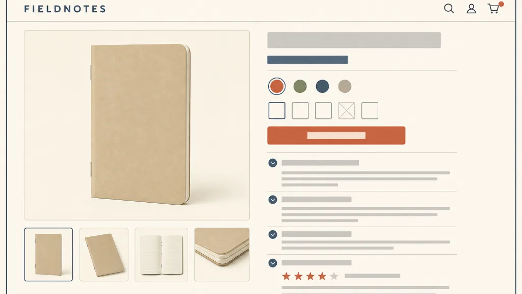
Recognizing it
- The image area and the buy section (price, variant selection, add to cart) sit side by side near the top
- Description, specifications, shipping and returns, and reviews are split into headed sections
- When a variant changes, the images, price and stock update with it
Concept boundary
The test is “one product, all of its attributes, chosen and added to the cart on the page”. It is not a landing page: a landing page tells only what one conversion needs and orders it for persuasion, while a product page answers every pre-purchase question and users skim it in their own order. Nor is it master–detail: master–detail keeps the selectable list and the detail on the same screen, while a product page is usually a separate page reached from a product list that does not stay in view. Product lists and comparison tables are for choosing among several products; the product page is for confirming one. Prices, stock and reviews on the page must be genuine: hiding unavoidable costs, inventing scarcity or faking reviews are anti-patterns and fall outside this entry.
When to consider it
- Users need to confirm a product’s appearance, specifications, price and delivery terms before buying
- The product has variants such as colour or size that must be chosen before purchase
- Other buyers’ reviews and questions genuinely help the decision
When to be cautious
- The goal is to persuade new visitors for one campaign rather than to cover every attribute of a product
- Users need to compare several products side by side, which calls for a list or comparison table first
- The product has a single variant and little information, so a separate page only adds a click
Tradeoff
Gathering everything about one product on one page lets users answer their pre-purchase questions without leaving; the cost is a long page where the order and collapsing of sections decide whether users find key content such as reviews and shipping, and one template has to serve products whose amount of information varies widely.
Conditional rules · Editorial advice
Related entries
A landing page tells only what supports the conversion, in persuasive order; a product page covers the whole product and tolerates skimming. Use the former for a campaign and the latter for the standing catalogue.
Both are “pick one item from a list and see its detail”, but master–detail keeps the list on the same screen while a product page is usually a separate page; consider the former when users switch between products often.
The product page confirms one product, the comparison table weighs a few candidates; offering an add-to-compare entry from the product page spares users from juggling tabs and memory.
The product page is where users make the purchase decision; holding back unavoidable costs until the end robs the price shown here of its value as a basis for that decision.
Sources and what they support
Baymard’s public research overview states that nearly all users go through a product page before making any purchase, and says its large-scale usability testing produced more than 110 product page guidelines covering layout, product images, video and 360-degree views, the “buy” section with the add-to-cart button and price, shipping and returns, variant selection, product descriptions, specification sheets, user reviews, auxiliary content such as Q&A, and cross-sells; most detailed findings require paid access. This entry lists the page’s components from it and cites no paid content.
Retrieved: 2026-10-20 · Snapshot unconfirmedAlan Blackwood’s article (published 17 October 2018, updated 8 July 2026) reports that test participants often missed core content such as reviews, shipping and specifications when it sat in horizontal tabs, and therefore recommends not using horizontal tabs for the main product page sections: expanded vertical sections on desktop, and collapsible sections for longer pages on mobile. This entry paraphrases its layout rule from it; tabs remain usable for subsections inside one section.
Retrieved: 2026-10-20 · Snapshot unconfirmedDefinitions reference these sources. Digital specimens, selection advice, relationships, and recipes are editorial work and have not been validated through user research.
Type extensions and implementation notes
This entry has no runnable specimen; the illustration is an editorial sketch of how the image area, buy section and the information sections below relate, its products, prices and reviews are invented, and it does not represent a verified implementation. Before shipping, check with real product data that every section stays readable when the amount of information varies widely.
{
  "states": [
    "wide",
    "compact",
    "expanded",
    "collapsed"
  ],
  "a11y": [
    "Product images have alternative text describing their content, and the gallery can be operated with the keyboard",
    "Variant controls have readable names and current values, and unavailability is not conveyed by colour alone",
    "Changes to price or stock after a selection are announced as status messages"
  ],
  "motion": "Gallery changes may have a brief transition; under a reduced-motion preference they switch directly"
}
Open the Agent JSON file for this entryThis file repeats every field of this entry verbatim and adds its sources, archive status, and editorial scope.