VOCABULARY / ENTRY
Wabi-Sabi
wabi-sabi
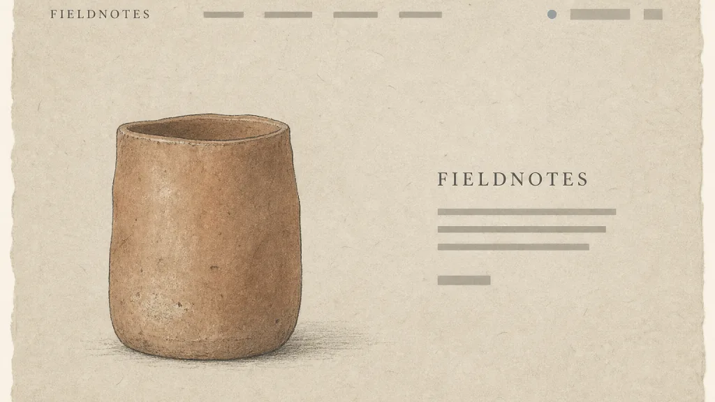
A visual language that organizes the picture around the attitude of the Japanese wabi-sabi aesthetic — accepting imperfection and impermanence: muted earth tones and greys, visible textures of paper, clay, stone, or fabric, deliberate asymmetry and empty space, and shapes and lines that show the hand rather than machine precision.
Recognizing it
- Muted earth tones, greys, and off-whites, colors that look sun-faded and worn
- Real textures of paper, clay, stone, or linen used as surfaces
- Asymmetric composition with irregular hand-drawn shapes, rough edges, and brush marks
Concept boundary
This entry covers only the wabi-sabi graphic moves that interface and brand design borrow. It does not fully explain wabi and sabi as Japanese aesthetic and Buddhist ideas, and it does not cover the conventions or connoisseurship of the tea ceremony. The test is the combination of muted natural color, visible texture, deliberate asymmetry, and the marks of the hand — not "beige plus white space". It differs from minimalism: minimalism cuts elements down to what is necessary and aims for clean order, while wabi-sabi does not aim to reduce elements and instead keeps roughness, wear, and irregularity as part of the content. A page can be minimal with no wabi-sabi feel at all (clean sans-serif and flat color blocks), or feel wabi-sabi without being minimal. "Imperfection" means irregular materials and forms, never unreliable interface behavior: controls, text, and feedback must stay clearly legible.
When to consider it
- The brand is about handmade goods, crafted objects, natural materials, or a slower way of living
- The aim is to convey warmth and a sense of time rather than technology and efficiency
- The content is mostly a few high-quality images and short text
When to be cautious
- Task-focused, high-frequency product interfaces, where texture and asymmetry slow down scanning
- Extending "imperfection" to control states, alignment, and feedback, so the interface looks broken
- Passing off beige and white space as wabi-sabi when it has nothing to do with the materials or character of the content
Tradeoff
Natural color, real texture, and asymmetry make a picture feel gentle, aged, and unlike a production-line product. The cost is that texture images add page weight, the muted palette narrows the usable contrast, and deliberate irregularity takes strong judgment if it is not to read as sloppiness or error.
Conditional rules · Editorial advice
Related entries
Minimalism reaches clean order by cutting elements; wabi-sabi keeps roughness, wear, and asymmetry as content. Both are quiet, but one pursues purity and the other accepts traces.
Both favor natural materials and handmade marks; bohemian layers diverse patterns and colors to feel rich and casual, while wabi-sabi uses a few muted materials to feel still.
Craftsmanship stresses commitment to materials and the making process; wabi-sabi treats the traces that commitment leaves as visible aesthetics.
A muted palette already narrows the lightness difference, and texture makes the background uneven, so small text loses legibility first.
Sources and what they support
Sections 3 to 5 describe wabi as understated, austere beauty, explain that Rikyū's wabi tea deliberately chose less-than-perfect utensils and left the walls and timber of the tea hut raw and unfinished, and note that Raku ware is often asymmetrical and imperfect in form and finish; section 5 connects sabi with patina and the beauty of old things. This entry paraphrases the wabi-sabi orientation toward imperfection, rough materials, and the marks of time from it; the graphic guidance is editorial.
Retrieved: 2026-10-20 · Snapshot unconfirmedThe article summarises wabi-sabi as a traditional Japanese aesthetic centered on accepting transience and imperfection, lists characteristics including asymmetry, roughness, simplicity, austerity, and appreciation of natural objects, and records Leonard Koren's 1994 book as introducing the concept to Western designers. This entry takes the borrowable formal traits from it and notes that its spread in design circles is a secondhand interpretation.
Retrieved: 2026-10-20 · Snapshot unconfirmedDefinitions reference these sources. Digital specimens, selection advice, relationships, and recipes are editorial work and have not been validated through user research.
Type extensions and implementation notes
This entry has no runnable specimen; the illustration is an editorial sketch, and its textures and vessel shapes are drawn originally. Before shipping, test text contrast over texture and the page weight, and confirm that "imperfection" has not spread to control states and alignment.
{
  "tokens": {
    "surface": "#ece4d6",
    "ink": "#3b3a35",
    "accent": "#9a6a4a",
    "radiusPx": 3,
    "shadow": "none"
  },
  "tokenScope": "This sample recipe — greyed off-white paper ground, warm grey ink, and clay accent — suggests the muted natural direction. The real effect depends on texture assets; these colors alone only give an ordinary beige page, so real work needs its own textures and must verify text contrast over them."
}
Open the Agent JSON file for this entryThis file repeats every field of this entry verbatim and adds its sources, archive status, and editorial scope.