VOCABULARY / ENTRY
Zebra Striping
zebra-striping
Giving adjacent rows of a data table or list alternating background colours (usually one row plain and the next light grey), so users scanning across a whole row do not slip onto the row above or below.
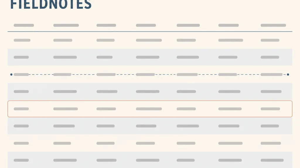
Recognizing it
- Adjacent rows alternate in background colour at low contrast, without pulling attention from the data itself
- Each stripe spans the full row, from the first column to the last
- Stripes keep strictly alternating after sorting, filtering, or adding and removing rows
Concept boundary
Zebra striping is a static way of separating rows, not a state: it does not change with what the user does, unlike hover highlighting and selected rows, which mark "the row I am looking at" or "the row I chose". Nor is it grouping: alternating backgrounds say only "this is another row", not that some rows belong together, and using them to suggest groups misleads. The evidence on whether it actually helps reading is mixed: a 2008 online experiment found no significant difference in accuracy and no consistent difference in speed, though more participants preferred striped tables (46%) than chose either other option; this entry therefore treats it as a cheap, preference-driven aid rather than a proven gain in efficiency.
When to consider it
- The table is wide, has generous column spacing, or scrolls horizontally, so the eye easily drifts off a row midway
- There are many short rows whose data looks similar in shape from one row to the next
- The table has no horizontal rules and users still need help staying on the same row
When to be cautious
- The table has only a handful of rows or columns, where stripes add nothing but visual noise
- The alternating background is too close to the selected, hover, or status colour, so users cannot tell which row is selected
- Rows already carry grouping or hierarchy, and alternating stripes would break the rhythm the groups provide
Tradeoff
Zebra striping takes almost no space and is cheap to build; on wide tables it can spare users from holding their place with a finger or mouse, and users often find it more attractive. The cost is that measurable efficiency gains are inconsistent, and it competes with hover, selection, and status colours for the same visual channel, which grows more confusing as the colour system gets richer.
Conditional rules · Editorial advice
Related entries
Zebra striping helps the eye travel along a single attribute row without slipping onto the rows above or below.
When columns are far apart and proximity alone no longer ties a row's cells together, an alternating background restores the row's unity through a shared region.
Text on striped rows will have lower contrast than on plain rows, so text contrast must be checked on both row backgrounds.
Similarity leads users to read same-coloured rows as one kind, so an alternating background that resembles a semantic colour gets misread as a state or a group.
Sources and what they support
The usage guidance lists zebra stripes as an optional data table modifier that colours table rows in alternating colours to make scanning horizontal information easier for the user; it does not set conditions under which they must be used. This entry takes the definition and purpose from it; the conditions of use are editorial.
Retrieved: 2026-10-20 · Snapshot unconfirmedIn a two-week online experiment the author gathered usable data from 244 participants, comparing a fictional table of 15 rows and 9 columns with and without stripes. After unreliable questions were excluded, accuracy showed no statistically significant difference; of six questions, two were slower and four faster with stripes, with only one difference significant; 46% of participants preferred stripes and 33% had no preference. The author concludes there is no consistent evidence that striping improves accuracy or speed, and none that it harms them, noting that only one data set was used and that wider column spacing or horizontal scrolling might show a larger effect. This entry relies on it to label the evidence honestly as mixed.
Retrieved: 2026-10-20 · Snapshot unconfirmedUnder the task of locating relevant information, the article says the visual design must let users keep their place as they move their eyes across the table, and names borders, zebra striping, and hover highlighting of a record as aids for doing so. This entry uses it to place zebra striping among several interchangeable and combinable ways of keeping one's row, rather than as the only answer.
Retrieved: 2026-10-20 · Archived 2026-09-16Definitions reference these sources. Digital specimens, selection advice, relationships, and recipes are editorial work and have not been validated through user research.
Type extensions and implementation notes
This entry has no runnable specimen; the illustration is an editorial sketch with the table data shown as placeholder bars. Before shipping, check text contrast on each row background, confirm stripes are distinguishable from selected and hover states, and recheck that the alternation stays correct after sorting and filtering.
{
  "states": [
    "odd-row",
    "even-row",
    "hover",
    "selected"
  ],
  "a11y": [
    "Text meets contrast requirements on every row background",
    "Selected and hover states are not expressed only by a background close to the stripe colour",
    "Stripes are a visual aid only; row and column relationships are still expressed by the table's semantic structure"
  ],
  "motion": "Stripes are static and not animated; after sorting or filtering they update instantly as rows reorder"
}
Open the Agent JSON file for this entryThis file repeats every field of this entry verbatim and adds its sources, archive status, and editorial scope.